| |

Once I was passing the house of a certain great man, the central gate was open and I could see a palm-leaf carriage, which was beautiful and new, and had inside blinds of a delightful orange tint. It made a splendid sight as it stood there with its shafts resting on the trestles. --from ch. 41 of the Pillow Book of Sei Shonagon translated by the late, great Ivan Morris
 elcome to the travel and transportation section. This page consists of mostly of links that were kicked out of the architecture and design page when it got too crowded. Here you will find widely varied links to and regarding airlines, airports, civil aviation in general, geography, cartography, mass transit agencies, postal agencies, railways, national telecoms, interesting tourist bureaus and services, and any travel-related concerns.
(Incidentally, military aviation, military technology, and aerospace topics are covered in the dedicated military aviation and technology page.) In other words, this section tries to be about the various means of moving people, things, or information around the world. Seemingly lacking in ostensible parameters or a solid theme, this page ultimately also reflects my obsession with British, Canadian, Dutch, German-speaking, and Scandinavian cultures as well as aviation disasters.
Last but not least, Japanese travel-related links and telecom corporations can be found at my Japan page. This page has been divided into the following sections: elcome to the travel and transportation section. This page consists of mostly of links that were kicked out of the architecture and design page when it got too crowded. Here you will find widely varied links to and regarding airlines, airports, civil aviation in general, geography, cartography, mass transit agencies, postal agencies, railways, national telecoms, interesting tourist bureaus and services, and any travel-related concerns.
(Incidentally, military aviation, military technology, and aerospace topics are covered in the dedicated military aviation and technology page.) In other words, this section tries to be about the various means of moving people, things, or information around the world. Seemingly lacking in ostensible parameters or a solid theme, this page ultimately also reflects my obsession with British, Canadian, Dutch, German-speaking, and Scandinavian cultures as well as aviation disasters.
Last but not least, Japanese travel-related links and telecom corporations can be found at my Japan page. This page has been divided into the following sections:

Burning Airlines Give You So Much More
Brian Eno (1974)
When I got back home I found a message on the door
Sweet Regina's gone to China crosslegged on the floor
Of a burning jet that's smoothly flying
Burning airlines give you so much more
How does she intend to live when she's in far Cathay?
I somehow can't imagine her just planting rice all day
Maybe she will do a bit of spying
With microcameras hidden in her hair
I guess Regina's on the plane, a NEWSWEEK on her knees
While miles below her the curlews call from strangely stunted trees
The painted sage sits just as though he's flying
Regina's jet disturbs his wispy beard
When you reach Kyoto send a postcard if you can
And please convey my fond regards to Chih-Hao's girl Yu-Lan
I heard a rumour they were getting married
But someone left the papers in Japan
Left them in Japan, left them in Japan...
- AeroSite is a fun place dedicated mostly to airline logos and liveries.
- airarchive.com is the pictorial archive of the American Airways magazine.
- Air Canada has yet another bold but interesting new corporate identity makeover by Landor.
- Air France. Is there any sexier brief combination of words than this phrase?
- Airbus may be the most successful passenger aircraft manufacturer at the moment, but nothing beats the experience of being
inside a Boeing 777 during takeoff and feeling the sheer force of its powerful engines.
- Aircraft Accidents.
- Airline Codes Web Site has an easy-to-use interface that also does searches for airport codes.
- airlineimage.com. Graphic designer R.P. Abraham's portfolio of airline liveries (actual and proposed).
- Airline Meals are exactly what this site is dedicated to. Bon appétit!
- Airline route maps from around the world scanned and archived here.
- Airliners.net. Quite simply, this is one of the most useful sites on the net (right up there with Internet Movie Database). You can even search its exhaustive archive of civil aviation photos by airliners as well as by type of aircraft. Remember to come here often since it's updated almost daily.
- Airwise. The Airport and Air Travel Guide.
- Alaska Airlines is convenient for travelling to and within the Northwest. What's with those Bible quote cards included in snack trays?
- Amsterdam Schiphol (AMS). Along with Changi, this is the mother of all model airports.
It's like a posh shopping centre with lounges disguised as an airport.
As you may have also noticed, I enjoy well-designed and well-operated airports.
I especially love those distinctive and neat yellow and green signs, originally developed by Benno Wessing of Total Design and revised by Paul Mijksenaar in 1993.
Schiphol is also the Changi Airport of Europe.
Arriving here and experiencing its staggering wealth of civilised amenities (like decent chairs for sleeping in) can be breathtaking,
especially if you've just flown in from places like Heathrow, or anywhere else around the world.
- ANA. All Nippon Airways.
- William B. Hartsfield Atlanta International Airport (ATL). The prototypical modern mega-airport with a parallel piers layout. My favourite American hub. Doesn't everybody have one?
- Aviation Accident Database. I've always had a morbid fascination with aviation disasters, and ever since I was a kid, I still dream about them quite frequently. Strangely enough, I'm always the horrified onlooker in these dreams and never one of the crash victims. The most horrific part of these dreams is seeing the planes flying in an abnormal trajectory that would inevitably lead to a crash. Anyway, this is a thoroughly engrossing site.
- Aviation Disasters has some very dramatic accounts of selected accidents.
- Boeing.
Despite the dominance of Airbus, and despite continued presence of centre seats on economy class cabins (and let's not even go into the sadistic 5-seats in a row of some American carriers),
and the continued management problems since merger with McDonnell Douglas notwithstanding, you can't help but feel a sense of awe for its illustrious history and its product line past and present.
Strangely enough, going out one day to the Boeing assembly plant in Everett and seeing Old Glory hanging inside the world's largest building (in terms of volume) triggered one of the rare instances of unabashed patriotism within me.
Seeing the impressive row upon row of 747s, 767s, and 777 widebodies being manufactured in that great big building certainly drives the point home.
The only thing more impressive than the engineering was the staggering logistics of putting together a plane such as the 747-400, which has more than six million components.
God bless America!
- British Airways.
Well-designed site with cool descriptions of their enormous fleet.
If you're into BA / BOAC history and heritage, you stop by British Airways Museum Collection.
Also be sure to check out Mike Barth's extensive and impressive site about BA's bold new liveries,
whose adverse, and even hostile reactions (shaded by xenophobia) from the public really surprised me.
- British Midland. BMI also offers a good trans-Atlantic product.
- Cathay Pacific. When we were wee lads, green was our favourite colour.
Logically, this was my favourite airline. The Landor Associates makeover made its livery even better and sexier. The green is still there. Anyway, like the almighty Singapore Airlines, Cathay hires people not because they are physically attractive (which they often are), but because they are smart at dealing with people, while simultaneously facilitatingg great customer service, regardless of what class your in. (A super talented and dedicated Cathay flight attendant once got us out of one of the most embarrassinglt stupid binds we've ever experienced anywhere.
It involved a small but critical piece of dental work inadvertently left on a dining tray that had been collected after meal service.
Sure enough, she miraculously found it and retrieved it. We are forever indebted and grateful.)
- Changi International Airport (SIN).
Singapore's airport has often been rated best in the world.
- Concorde SST, an exhaustive site with so much goodies on these sexy aircrafts.
- Dallas/Fort Worth International Airport (DFW).
I’m actually going to say something nice about something in a red state. The new international terminal D at DFW is rather nice.
It’s a refreshing change from the vast majority of U.S. airports. First of all, it’s rather spacious and doesn’t feel claustrophobic at all, even during busy periods.
Even with the addition of all the clunky security equipment and procedural spaces, there’s still plenty of room to move around.
The airside departure lounges feel even more spacious, and the facilities there aren’t too shabby either.
(The family restrooms come in handy.)
Secondly (American designers of international airport terminals should really take note), the international arriving passengers aren’t relegated as second-class citizens to the dark bowels below the bright and airy departure levels.
In fact, as an international passenger arriving at DFW, you literally look down on the departing passengers and get great views of the terminal building and the airside tarmac.
This celebration of arrival actually makes much more sense than what is normally the case at almost all other international airports in America.
The latter usually allocates all the architectural glamour for departing passengers and screws the arriving ones with nothing (e.g., SFO, LAX, ORD, JFK, and the litany is endless) except dark, cramped spaces.
This is such a travesty since most people’s first impressions of a city is its airport and in particular its arrivals facilities.
Finally, the automated monorail system Skylink that connects all the terminals airside is definitely an ‘E’ ticket ride.
In fact, it’s much better than the cheesy rides at Disney’s Magic Kingdoms let alone the other people-mover system in other airports in that you get a great overview of the utter vastness of DFW.
In addition to being a quick and efficient transit system for connecting passengers, this is a unique experience in which you get glimpses of the interior of the new international terminal, as well as the thrill of riding high above the all those endless rows of parked airliners.
- Delta Air Lines. Old but generally reliable carrier, but very slow site.
Anyway, for me, commenting on Delta is a little like commenting on your own parents; it's rather difficult, complicated, and you're often ambivalent on the issue.
There are a few things I would like to point out through:
- Somebody get them some competent graphic designers, quick!
Their corporate identity and the corresponding environmental graphics and (non-existent) graphic standards are an utter mess.
When you travel on Delta, you get fragments of graphics from the 60s, 70s, 80s, 90s, and now the mid-late 00's. That's more often than normal.
Compared to American, it's schizophrenic.
I concede that the implementation of a coherent corporate identity takes time and is affected by economic constraints, but it seems that Delta isn't even trying.
You get boarding pass sleeves with the name "Delta" printed with different fonts than the ones which appear on their signs, or on their planes, or even on sleeves issued from different cities.
Some Delta publications may use one italicised, serif font for the word "Delta", while others may use an entirely different one, without italics.
All of these of course are different from the distinctive sans serif font used on some of their planes.
They're so varied that I don't even know what's a typical Delta livery anymore.
In their latest so far half-assed corporate identity makeover, they are now known as only "Delta," without the "Air Lines."
However, it's supposedly designed by Landor, so it should be promising. Let's hope they have the gumption to keep it up.
- The quality of the shuttle coach service between LAX and SFO has noticeably decreased over the past few years.
You used to be able to get snacks and fruits served in distinctive, well-designed, and colourful packages as well as a choice of beverages.
Now you only have a choice of three drinks and no snacks whatsoever. That's domestic travel for you.
- Fortunately, the coach service between ATL and LAX is as benign as ever, most of the time, which I reckon is as best as you can possibly hope for on a large American carrier.
- Flughafen Frankfurt Main (FRA) seems to have the splashiest site for an airport.
As large and impressively varied in terms of facilities as it is, the airport does have rather confusing interior layouts.
More than once, I've found myself having to go through security again after leaving a secured area unintentionally, in order to find where I want to go.
- London Heathrow (LHR).
There are a lot of things I can say about Heathrow, mostly bad. It's like the LAX of Britain.
One thing that really irritates me about Heathrow and other BAA airports like Gatwick is that they don't tell you which gate you would be boarding your plane until about 45 minutes before your flight.
As a result, after you've checked-in and cleared passport controls, you are left hanging; you don't know where to go, except perhaps to just wait in front of the departures boards for your gate assignment to be revealed at the last moment.
They don't tell you exactly when the assignment going to be posted either. You just have to be patient and wait.
However, I still like the BAA logo, and that's why it's still here.
- Airport Authority Hong Kong (HKG). BTW, do you know your airport codes?
- IATA. International Air Transport Association actually has quite a beautiful site.
- Jane's. The one and only. 411 on everything.
 Japan Air Lines. Japan Air Lines.
The 1989 Landor Associates' redesign of their corporate identity is quite impressive.
I'm not so sure about Landor's own late 2002 makeover though.- JetsPhotos.Net. It looks like Airliners.Net. It feels like Airliners.Net...
- Kansai International Airport (KIX). Check out the story of this huge project by Renzo Piano, et al. BTW, you can also visit Narita (NRT) where you can see me and Robert.
- Křbenhavns Lufthavn (CPH). This is a very well-designed site for the rapidly-growing Copenhagen Airport at Kastrup.

Koninklijke Luchtvaart Maatschappij NV. It amazes me that they have not changed their distinctive light blue/ dark blue livery and corporate identity for so long.
The KLM is a classic scheme that should never be changed. However, they began to modify it to their planes in November 2002, and I don't think it's a good idea.
The Northwest alliance logo has been moved to a less awkward spot near the cockpit, but the lower dark blue stripe is now thinner, and the white stripe below that is now gone, and this doesn't look as cool.- Los Angeles International Airport (LAX) is almost surreal, like L.A. itself. After using it for decades, it still feels like a weird place that can overwhelm. Continuously busy, it's gigantic, and the quality of the terminals varies. Some of them are downright skanky, and some, like the Delta terminal, are decent. Everybody, from donation solicitors to people who want to clean your windscreens to panhandlers, wants your money. It feel liks the Third World.

I love the yellow and metallic colour schemes. What a great airline. What more can I say.- Northwest Airlines brought me and my family to America as immigrants from Taiwan. Even though I like the red livery scheme, designed again by Landor Associates, I'm glad that it didn't affect KLM's classic blue livery scheme when they entered the partnership.
- Oakland International Airport (OAK) is generally easy and pleasant to use. However, those AirBART shuttles are such rip-offs.
- Ontario International Airport (ONT) is the place I fly into whenever I go home. The approach to the airport is an exciting descent into a blanket of Inland Empire smog.
- Orbitz is a place to begin your search for tickets.
It gives a fairly good idea of the going rate for a particular destination.
- Aéroports de Paris. Chief architect and engineer Paul Andreu has guided the design of one sublime airport terminal after another at Roissy (CDG) over the past thirty plus years.
Neil Denari once tried to describe evocatively, albeit somewhat awkwardly, the legendary Aérogare 1:
The walk from the plane to the terminal below ground was mind-blowing. Memory burn. The tunnel was a kind of carpeted brutalism that I had not experienced before-- at least it was not like any [Paul] Rudolph building I had seen. It was light and heavy all at the same time, supersmooth plaster and concrete. It seemed to float like the interior of a submarine, opaque yet buoyant, with relentless indirect artificial lighting systems directing the disembarking passengers. The tunnel had a camber to it, so there seemed to be a horizon line in the middle, with people in the distance rising and falling in relation to it. Something strangely aquatic about it. Upon seeing the inaccessible void at the center of the huge concrete torus terminal, I felt as though this place was beyond architecture itself. I suddenly experienced it as a galaxy with its own gravity, its own event horizon and black hole, moving people in the circulation tubes as if they were helpless particles being spun into another time cusp by the effluvial forces acting in the void.
Planespotter, a civil aviation spotter page from Germany. Be sure to check out the extensive collection of safety information cards.
Portland International Airport (PDX) has a cool new signage system and is relatively easily to use. PDX also has easy light-rail connection into town.
San Francisco International Airport (SFO). There are so many reasons to hate this place.
Due to the chronic low visibility of its location and the too closely-spaced runways, SFO is synonymous with delays.
As a longtime user, I don't remember ever leaving on-time or arriving on-time. I had even spent one night sleeping in one of its lounges due to my inability to make a connection.
Seating suitable for sleeping were nonexistent.
Avoid SFO if you can, especially when you have to make a connection there.
Anyway, the airport is a physical mess right now due to massive construction and chronic overcrowding, but it does has a well-designed website, and the Skidmore-designed international depatures hall is impressive.
As usual with international arrival halls in American airports however, it's dark, cramped, and downright shitty.
San Jose International Airport. (SJC) Cool for the South Bay, and you're avoiding SFO.
SAS. Scandinavian Airlines.
Even though Scandinavians are ostensibly so competent in everything, they seem to have so much trouble running an international airline.
They are even eliminating the old beloved CPH-SEA service. Nonetheless, I still love their beautiful new blue, white, red liveries. Inflight service is still good.
However, there's an aspect of the new corporate graphic identity programme that bothers me to no end, since everything else is so perfect.
I think the word "Airlines" on the fuselage of a SAS plane is totally overkill. The large Rotis sans serif "Scandinavian" alone is more than enough.
 operates Sea-Tac (SEA).
Crowded and overburdened in every respect, the airport is undergoing extremely slow, painful, and expensive expansion pains.
Everything notwithstanding, every time I fly into Seatac, I feel somewhat privileged to be living in such a beautiful corner of the earth, no matter how glamourous a place I’ve just flown from.
This is especially true when on a rare, clear day, you can see on one side the Olympics rise dramatically over the Puget Sound, dotted with forested islands.
On the other, you may see the jagged Cascades rise beyond Lake Washington and Lake Sammamish.
Oh yeah, Mt. Rainier is nice too. Even on the typical grey days, I still somehow feel glad to see below me the likes of Burien and White Center—places that are usually cringe-worthy when I’m on the ground and unwittingly take my life here for granted.
Incidentally, it's kind of unusual for Americans to use Helvetica like this, non?
Singapore Airlines. What a great airline!
From the perspective as a passenger, it's perhaps my favourite.
Southwest Airlines. I'm a bit ambivalent about them, but I do use their services quite often. The Southwest staff often has a fun and irreverent attitude that somehow almost compensates the grab-a-number-as-soon-as-you-can policy. operates Sea-Tac (SEA).
Crowded and overburdened in every respect, the airport is undergoing extremely slow, painful, and expensive expansion pains.
Everything notwithstanding, every time I fly into Seatac, I feel somewhat privileged to be living in such a beautiful corner of the earth, no matter how glamourous a place I’ve just flown from.
This is especially true when on a rare, clear day, you can see on one side the Olympics rise dramatically over the Puget Sound, dotted with forested islands.
On the other, you may see the jagged Cascades rise beyond Lake Washington and Lake Sammamish.
Oh yeah, Mt. Rainier is nice too. Even on the typical grey days, I still somehow feel glad to see below me the likes of Burien and White Center—places that are usually cringe-worthy when I’m on the ground and unwittingly take my life here for granted.
Incidentally, it's kind of unusual for Americans to use Helvetica like this, non?
Singapore Airlines. What a great airline!
From the perspective as a passenger, it's perhaps my favourite.
Southwest Airlines. I'm a bit ambivalent about them, but I do use their services quite often. The Southwest staff often has a fun and irreverent attitude that somehow almost compensates the grab-a-number-as-soon-as-you-can policy.
 We've enter the age where even a national airline like Swissair or Sabena can collapse; there's no telling who else can go.
Anyway, here was another airline I had never flown with, but I have enjoyed their classically modernist corporate identity and environmental graphics over the years.
While it had been taken over by its Crossair subsidiary and now called SWISS International, the airline still (this being Switzerland, after all) sports a very well designed site with a new corporate identity scheme (courtesy of that Wallpaper* sexyboy Tyler Brűlé no less) that, while compelling, still may require some getting used to.
Last but not least, Lufthansa took over this new airline in 2006, so it's not really even Swiss.
Somehow the whole affair feels anaemic, and very un-Swiss.
Sydney (Kingsford-Smith) International Airport (SYD).
This is a great unofficial site written by an aviation enthusiast.
Thai Airways International. Although I've never flew with them, this surprisingly extensive site provides a tremendous amount of introductory material on many aspects of Thai and Southeast Asian cultures.
Turkish Airlines. Ubiquitous behemonth that you really can't avoid these days, especially if you're faithful to Star Alliance, but fortunately, its products are good, even in economy. It can approach perfection once transfers through old and insanely crowded IST are moved to the new airport.
United Airlines. Have you noticed the recent subtle corporate identity massaging by good old Pentagram?
It's sans serif bold now, and like Delta, no "Airlines" whenever possible. (This reminds me of Kentucky Fried Chicken morphing into "KFC," partly to get rid of "fried.")
Because I'm suckered into their frequent flier programme, I find myself on one of their planes most frequently, but I'm pretty much indifferent towards them at best.
However, if you wanna bitch about them (and I'm sure you do), you can visit Unitied Airlines, an informative site that allows you to vent as well as read loads of stuff United wouldn't want you to know.
By the way, it's completely sadistic and mean for U.S. carriers like United to force economy class passengers into 2-5-2 configuration on 777s.
Imagine being anywhere in those middle seats.
Unusual Aviation Pictures site is an awesome page. If you are as perversely fascinated by big-planes-in-distress as much as I do, a visit here is a must.
Vancouver International Airport (YVR). How did it ever get such an unpleasant code? Here's what Douglas Coupland has to say about YVR in City of Glass:
We've enter the age where even a national airline like Swissair or Sabena can collapse; there's no telling who else can go.
Anyway, here was another airline I had never flown with, but I have enjoyed their classically modernist corporate identity and environmental graphics over the years.
While it had been taken over by its Crossair subsidiary and now called SWISS International, the airline still (this being Switzerland, after all) sports a very well designed site with a new corporate identity scheme (courtesy of that Wallpaper* sexyboy Tyler Brűlé no less) that, while compelling, still may require some getting used to.
Last but not least, Lufthansa took over this new airline in 2006, so it's not really even Swiss.
Somehow the whole affair feels anaemic, and very un-Swiss.
Sydney (Kingsford-Smith) International Airport (SYD).
This is a great unofficial site written by an aviation enthusiast.
Thai Airways International. Although I've never flew with them, this surprisingly extensive site provides a tremendous amount of introductory material on many aspects of Thai and Southeast Asian cultures.
Turkish Airlines. Ubiquitous behemonth that you really can't avoid these days, especially if you're faithful to Star Alliance, but fortunately, its products are good, even in economy. It can approach perfection once transfers through old and insanely crowded IST are moved to the new airport.
United Airlines. Have you noticed the recent subtle corporate identity massaging by good old Pentagram?
It's sans serif bold now, and like Delta, no "Airlines" whenever possible. (This reminds me of Kentucky Fried Chicken morphing into "KFC," partly to get rid of "fried.")
Because I'm suckered into their frequent flier programme, I find myself on one of their planes most frequently, but I'm pretty much indifferent towards them at best.
However, if you wanna bitch about them (and I'm sure you do), you can visit Unitied Airlines, an informative site that allows you to vent as well as read loads of stuff United wouldn't want you to know.
By the way, it's completely sadistic and mean for U.S. carriers like United to force economy class passengers into 2-5-2 configuration on 777s.
Imagine being anywhere in those middle seats.
Unusual Aviation Pictures site is an awesome page. If you are as perversely fascinated by big-planes-in-distress as much as I do, a visit here is a must.
Vancouver International Airport (YVR). How did it ever get such an unpleasant code? Here's what Douglas Coupland has to say about YVR in City of Glass:
...YVR is pretty well the best airport going. Aside from the fact that it operates smoothly and serenely, it also offers the air traveller a crash course in Vancouver style: smooth river rock; stone from Whistler; glass, glass, glass; teal- and grey-coloured carpets and textiles; cedar woodwork; and best of all, a truly stunning gathering of West Coast Native art. Had the airport been done incorrectly, it could have been a sort of Disney version of Vancouver style.

- 4rail.net features many pics of Finnish train sets.
- AC Transit serves Alameda and western Contra Costa counties. While not as bad as MUNI, sometimes you have no choice but to keep a stiff upper lip and ride in them.
- Arriva Trains Wales is the Deutsche Bahn AG-owned franchise that controls the Welsh network.
 Bay Area Rapid Transit operates sleek trains whose beautiful exteriors seem to look the best from about 20 metres away.
Like many of its longtime riders, I have mixed feelings about the system. My masters thesis partially dealt with BART stations and their built context.
Its modern surfaces notwithstanding, BART has too many skanky stations and escalators which can take months to get fixed.
(Whose stupid idea was it when they originally did not put canopies over the escalators? No wonder they don't work half the time.)
I resent the high ticket prices.
(Did you know that because of its broad-gauge (5’-6”) tracks, BART utilises carriages that are actually 40% more expensive than even TGV carriages (which come with much more amenities such as washrooms)?
Perhaps that's partially why it's so expensive.)
I hate the ancient ticket dispensers that only work half the time (always couldn't get those damn bills in).
I get exceedingly angry when trains are late during rush hours and passengers accumulating on the platforms are then forced to be packed into cars like sardines when they finally do arrive.
Oh, yeah, what's with the cheesy route maps? Can't they hire a competent graphic designer to come up with something worthy of the system?
Lastly, has anybody noticed how fucking awesome the BART logo looks. It's a classic that has endured well after all these years.
I'm going to be quite pissed if they decide to change it. SFO connection: cool. Bay Area Rapid Transit operates sleek trains whose beautiful exteriors seem to look the best from about 20 metres away.
Like many of its longtime riders, I have mixed feelings about the system. My masters thesis partially dealt with BART stations and their built context.
Its modern surfaces notwithstanding, BART has too many skanky stations and escalators which can take months to get fixed.
(Whose stupid idea was it when they originally did not put canopies over the escalators? No wonder they don't work half the time.)
I resent the high ticket prices.
(Did you know that because of its broad-gauge (5’-6”) tracks, BART utilises carriages that are actually 40% more expensive than even TGV carriages (which come with much more amenities such as washrooms)?
Perhaps that's partially why it's so expensive.)
I hate the ancient ticket dispensers that only work half the time (always couldn't get those damn bills in).
I get exceedingly angry when trains are late during rush hours and passengers accumulating on the platforms are then forced to be packed into cars like sardines when they finally do arrive.
Oh, yeah, what's with the cheesy route maps? Can't they hire a competent graphic designer to come up with something worthy of the system?
Lastly, has anybody noticed how fucking awesome the BART logo looks. It's a classic that has endured well after all these years.
I'm going to be quite pissed if they decide to change it. SFO connection: cool.- Bay Area Transit Information is a very useful site.
- BC Ferries. Some boats among their fleet can use can an update or replacement, but I'm eternally thankful that this service exists in this beautiful part of the world. In their cafeterias, BC Ferries even serve, God bless them, a local specialty, the very sweet Nanaimo bar. Here again is Vancouver native Douglas Coupland writing evocatively about the BC Ferries (which also can easily be applied to the Washington State Ferries experience):
The ferry is technically what you might call a "frozen freeway"-- it's all of the people and cars you would have met if there were a freeway between here and [Vancouver Island]. Ferries are wonderfully democratic, and to walk the deck of one is to garner a good cross-sectional view of society: bureaucrats, loggers students, retirees with their Winnebagoes, and always lots of sugar-fuelled tots... The proper protocol for being on a ferry is this: the moment after you've locked your car (assuming you drove on), you rush like mad up to the cafeteria lineup and stand there for a godly amount of time waiting to get your BC Ferry Burger with Sunshine Sauce. Red Jello cubes are also sold.
BC Transit.
Berliner Verkehrsbetriebe (BVG).
CN Railway. Canadian National.
CP Railway. Canadian Pacific.
Cap'n Transit Rides Again in America, and thank God!
Central Trains is the franchise that runs an extensive network of lines over the Midlands.

In recent years, DB has surprisingly become a savvy, profitable commercial entity, according to a 05 July article in the Economist:
There is no doubt that Germany's state-owned railway is at the forefront of Europe's rail revolution.
Hartmut Mehdorn, chief executive of DB, has turned a chronic loss-making railway into a powerful international business which plans to float some 30% of its shares next year.
It is already a world-class logistics company, with a global business based on its international rail-freight activity.
That could prove to be a useful hedge against greater competition in passenger rail... DB carries twice as much freight and three times as many passengers as SNCF and owns and operates more than 90% of Germany's rail network.
DB Museum Nürnberg is a pilgrimage I've made.
Eiretrains - Irish Rails Past and Present are exactly what this site delivers.
European Railway Server provides "information about the European railways, for railway fans as well as for travellers who wish to explore Europe by train."
Eurostar runs Channel service.
First Great Western runs most trains out west from Paddington.
First ScotRail. First now runs the Scottish franchise too. Let's see what happens...
Fyra.
OMG, even the Europeans are now into bland corporate branding with names that mean nothing (offensive) in any language. The colours are ugly, and the trains are uglier. Somehow you expect more from NS Hispeed.
GMPTE. Greater Manchester Passenger Transport Executive is the operating arm of the Greater Manchester Passenger Transport Authority. Complicated, eh?
GNER. The Great North Eastern Railway controls the East Coast Line franchise and most trains out of King's Cross.
The Flying Scotsman used to run here, and the current company continues to utilise some rolling stock from British Rail, including the old InterCity trains. Update: the National Express took over the franchise in early 2007, but it had not been able to make it work financially. The route was subsequently re-nationalised. Again, this annoying Anglo-American tendency to privatise profits while nationalising debt is screwing the taxpayers. Stop the insanity and please bring back British Rail!
GVB.
Het Gemeentevervoerbedrijf of Amsterdam has a useful site which even explains, in English, how those bleedin' strippenkaarten work.
On a related note, a very fascinating fan site thoroughly examines het lijnkleurensysteem van het openbaar vervoer in Amsterdam.
Come here if you really like trams.
Human Transit is a great blog about transit around the world written by an Australia-based consultant, Jarrett Walker.
He is such a talented writer that his personal blog, Creature of the Shade approaches the realm of sublime prose.
Iarnród Éireann. I went all over the country with Irish Rail, which has a modest but relatively well-run network staffed by lots of nice people.
The trains aren't super fast, but they'll get you there.
iRail.co.uk is a British railway portal site.
Japan Train Blog is what it says it is, covering a nation of trains and railways.
JR East. The East Japan Railway Co. Also check out the East Japan Railway Culture Foundation.
Foothill Transit serves the east San Gabriel Valley region of SoCal.
JR Tokai. Serving the region between Tokyo and Kansai. There's also a JR Tokai Fan Club as well as the awesome TRAINWWW site (available also in English) for Japanese trainspotters.
 JR West serves the Kansai and western Honshu regions.
King County Metro. One of the most important pillars of faith that I have as a self-respecting progressive is faith in the importance and use of public transportation.
Effective public transportation is essential to decent living in an urbanised society. However, my relationship with Metro has tested and rocked the foundations of my faith.
Unfortunately, it's a familiar story. Ultimately, the problem comes from the selfish and irresponsible citizens of Washington state.
Public funding for infrastructure is a joke here. As a result, Metro is unreliable, chronically underfunded, and skanky as hell.
(Can't they fumigate or sanitise the buses on a regular basis? I would pay more for cleaner buses since the stench from homeless persons are just unbearable.
Don't even get me started on the grime and the unidentified fluids often found on the buses' interior surfaces.) To make things worse, Metro has perhaps the worst signage system of any transit agency I've ever come across.
Not only are they butt ugly, confusing, misleading, and uninformative, but you can't even tell exactly which buses run on which downtown streets because they actually exclude certain lines from the maps of the downtown core.
What's the point? The graphic designers and the administrators who approved the maps and signs in this instance should be drawn and quartered.
That's why so many people have to resort to bothering the cranky drivers for directions.
Light Rail Atlas is "Holland's Light Rail-pages for a world audience!" There's a lot here. JR West serves the Kansai and western Honshu regions.
King County Metro. One of the most important pillars of faith that I have as a self-respecting progressive is faith in the importance and use of public transportation.
Effective public transportation is essential to decent living in an urbanised society. However, my relationship with Metro has tested and rocked the foundations of my faith.
Unfortunately, it's a familiar story. Ultimately, the problem comes from the selfish and irresponsible citizens of Washington state.
Public funding for infrastructure is a joke here. As a result, Metro is unreliable, chronically underfunded, and skanky as hell.
(Can't they fumigate or sanitise the buses on a regular basis? I would pay more for cleaner buses since the stench from homeless persons are just unbearable.
Don't even get me started on the grime and the unidentified fluids often found on the buses' interior surfaces.) To make things worse, Metro has perhaps the worst signage system of any transit agency I've ever come across.
Not only are they butt ugly, confusing, misleading, and uninformative, but you can't even tell exactly which buses run on which downtown streets because they actually exclude certain lines from the maps of the downtown core.
What's the point? The graphic designers and the administrators who approved the maps and signs in this instance should be drawn and quartered.
That's why so many people have to resort to bothering the cranky drivers for directions.
Light Rail Atlas is "Holland's Light Rail-pages for a world audience!" There's a lot here.

While it's been falling apart for years, I think the tube is really turning into the New York subway system of the 1970s unless something drastic is done promptly.
Incidentally, don't forget to check out the fascinating site dedicated to the Jubilee Line Extension. Props must go to H.C. Beck, the great designer of the legendary Underground map, which has remained such a tremendous source of inspiration for graphic designers and information architects everywhere.
Los Angeles County Metropolitan Transportation Authority site is useful when I'm back home.
Incidentally, I was rather disappointed with the new Red Line stations. In almost every instance, not only are they architectutally uninspired and pedestrian, but they also actually contribute to bad urbanism.
Unfortunately, it's such a familiar story that I wrote a thesis about it. For instance, the North Hollywood terminus and the Hollywood and Vine stations are important nodes in the system, but their architectural forms are completely lacking.
In fact, both stations are downright ugly, and they totally ignore their urban responsibilities. In other words, these stations have the potential to be centres of the communities and cityscapes they serve in every respect.
Unfortunately, the MTA has chosen kitschky suburban forms that barely register in the built environment. Both stations have considerable setbacks and parking lots which isolate them from their urban contexts.
They are essentially tacky objects in the middle of nowhere.
Metrolink provides commuter train service for the LA region.
Metrolink also refers to the light rail network of Greater Manchester.
Metropolitan Transportation Commission "is the transportation planning, financing, and coordinating agency for the nine-county San Francisco Bay Area."
Midland Mainline is the current franchise running its namesake and most trains out of St. Pancras.
MUNI. San Francisco Municipal Railway. It's skanky. It's unreliable.
The drivers are psychotic. If you're poor or if believe in protecting the environment or if aren't brave enough to ride a bike on the City's murderous streets, you're stuck with it.
National Rail network of Britain.
This is the place to come if you want to know about and book rail travel in U.K.
What a bleedin' mess! Stop the insanity! This bloody site wouldn't even exist if travellers aren't as confused as they are.
What an eloquent example against privatisation!
Anyway, here's a quick cheat sheet.
National Railway Museum in York, England is perhaps the most sacred place of pilgrimage for railroad enthusiasts.
 Nederlandse Spoorwegen.
This is the not surprisingly well-designed site of the Dutch national railways.
As much as I am a big fan of the incredibly efficient Dutch railways, would it be too much to ask for free and clean modern toilets, particularly in obscure towns like, say Rotterdam or Amsterdam?
Network Rail is finally a start by the government to 'stop the insanity' of the disastrous and deadly Tory privatisation scheme.
It's a non-for-profit successor to Railtrack, the company owned most of Britain's railroad infrastructure after the Railways Act 1993.
NYC Subway Resources. This is such an awesome site since it includes maps, pictures, extensive histories, loads of facts and trivia, and descriptions of the trains. Be sure to also visit the official MTA. (I know I did!)
Northern Rail runs a huge network of local trains all over Yorkshire and Lancashire, but strangely enough, the TransPennine Express remains a separate entity also run by First.
Privatisation sure makes things confusing.
Orange County Transportation Authority runs buses in the OC.
The Overhead Wire is a blog that ruminates about transit in North America. Nederlandse Spoorwegen.
This is the not surprisingly well-designed site of the Dutch national railways.
As much as I am a big fan of the incredibly efficient Dutch railways, would it be too much to ask for free and clean modern toilets, particularly in obscure towns like, say Rotterdam or Amsterdam?
Network Rail is finally a start by the government to 'stop the insanity' of the disastrous and deadly Tory privatisation scheme.
It's a non-for-profit successor to Railtrack, the company owned most of Britain's railroad infrastructure after the Railways Act 1993.
NYC Subway Resources. This is such an awesome site since it includes maps, pictures, extensive histories, loads of facts and trivia, and descriptions of the trains. Be sure to also visit the official MTA. (I know I did!)
Northern Rail runs a huge network of local trains all over Yorkshire and Lancashire, but strangely enough, the TransPennine Express remains a separate entity also run by First.
Privatisation sure makes things confusing.
Orange County Transportation Authority runs buses in the OC.
The Overhead Wire is a blog that ruminates about transit in North America.
 Österreichische Bundesbahnen.
Don't you love how they not only incorporated the umlaut into its logo, but also made it its distinguishing feature.
Portland Streetcar. It's cool to see that some cities are bringing them back.
Portland Tri-Met. When you're living in Seattle, you can't help but asking, "Why can't Metro be anywhere as half as good?!"
Railfaneurope.net is one of the oldest sites on the web.
RailPictures.Net is like JetsPhotos.Net in format and architecture.
RailServe provides links to railfan (model and real) resources.
Railway Pictures are what you'll get here.
RandstadRail is the metro and light rail system of Den Haag.
RATP. Régie Autonome des Transports Parisiens dirigent les transports en Île-de-France.
Its logo is perhaps the most intriguing and poetic of any public agency I've ever come across.
RET (Rotterdamse Elektrische Tram) is Rotterdam's transit authority that operates the metro, trams, and buses.
Rhätische Bahn AG is yet another impeccably designed, multilingual Swiss website (can we expect anything less?) of the operator of the monumental Schweizer Erlebnisbahn-Bernina Express, Glacier Express, and Pullman services. Österreichische Bundesbahnen.
Don't you love how they not only incorporated the umlaut into its logo, but also made it its distinguishing feature.
Portland Streetcar. It's cool to see that some cities are bringing them back.
Portland Tri-Met. When you're living in Seattle, you can't help but asking, "Why can't Metro be anywhere as half as good?!"
Railfaneurope.net is one of the oldest sites on the web.
RailPictures.Net is like JetsPhotos.Net in format and architecture.
RailServe provides links to railfan (model and real) resources.
Railway Pictures are what you'll get here.
RandstadRail is the metro and light rail system of Den Haag.
RATP. Régie Autonome des Transports Parisiens dirigent les transports en Île-de-France.
Its logo is perhaps the most intriguing and poetic of any public agency I've ever come across.
RET (Rotterdamse Elektrische Tram) is Rotterdam's transit authority that operates the metro, trams, and buses.
Rhätische Bahn AG is yet another impeccably designed, multilingual Swiss website (can we expect anything less?) of the operator of the monumental Schweizer Erlebnisbahn-Bernina Express, Glacier Express, and Pullman services.
 Schweizerische Bundesbahn. It wouldn't surprise anyone that the Swiss have an incredible public railway system.
Seattle Transit Blog is exactly what it says it is.
Shinkansen fan page by Dave Fossett has been around for as long as I can remember. Schweizerische Bundesbahn. It wouldn't surprise anyone that the Swiss have an incredible public railway system.
Seattle Transit Blog is exactly what it says it is.
Shinkansen fan page by Dave Fossett has been around for as long as I can remember.
 Société nationale des chemins de fer.
Since I gave the Germans a link, I should give the French one too. This is the old logo from the 70s, which I prefer to the newer one that replaced it in the mid 00s.
Incidentally, Jean-Marie Duthilleul, SNCF's chief architect, has built up
quite an impressive body of work over the past two decades.
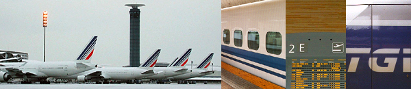
Last but not least, the sexy TGV has its own official site, but I would have to point out that the new TGV logo just doesn't work. I mean, just what the fuck was the SNCF thinking?!
We're dealing with the Train ŕ Grande Vitesse here, not the fucking Cirque du Soleil.
Finally, if you're in and around Paris a lot, you'll often run into signs that read 'Transilien.'
It even boasts a promotional short by Mathieu Kassovitz!
Sound Transit, the new regional transit system serving the Puget Sound, also operates the ST Express bus service.
It's also quite a touchy political issue in the Puget Sound region, but I won't get into it here.
Southern Railway is the franchise that currently dominates Victoria; it runs trains mostly to Surrey, Sussex, and parts of Hampshire and Kent.
South West Trains primarily run out of Waterloo.
STM. La Société de transport de Montréal.
Il y a également un website trčs bon, non officiel, bilingue sur tous les aspects du systčme de métro de Montréal.
Il a męme un aperçu de l'architecture des diverses stations!
Strathclyde Partnership for Transport (SPT) is the transit authority of the Glasgow region.
The Subway Page features links to metros around the world.
Swissmetro. Does a cooler transportation proposal exist? Société nationale des chemins de fer.
Since I gave the Germans a link, I should give the French one too. This is the old logo from the 70s, which I prefer to the newer one that replaced it in the mid 00s.
Incidentally, Jean-Marie Duthilleul, SNCF's chief architect, has built up
quite an impressive body of work over the past two decades.
Last but not least, the sexy TGV has its own official site, but I would have to point out that the new TGV logo just doesn't work. I mean, just what the fuck was the SNCF thinking?!
We're dealing with the Train ŕ Grande Vitesse here, not the fucking Cirque du Soleil.
Finally, if you're in and around Paris a lot, you'll often run into signs that read 'Transilien.'
It even boasts a promotional short by Mathieu Kassovitz!
Sound Transit, the new regional transit system serving the Puget Sound, also operates the ST Express bus service.
It's also quite a touchy political issue in the Puget Sound region, but I won't get into it here.
Southern Railway is the franchise that currently dominates Victoria; it runs trains mostly to Surrey, Sussex, and parts of Hampshire and Kent.
South West Trains primarily run out of Waterloo.
STM. La Société de transport de Montréal.
Il y a également un website trčs bon, non officiel, bilingue sur tous les aspects du systčme de métro de Montréal.
Il a męme un aperçu de l'architecture des diverses stations!
Strathclyde Partnership for Transport (SPT) is the transit authority of the Glasgow region.
The Subway Page features links to metros around the world.
Swissmetro. Does a cooler transportation proposal exist?
 HST service operating in the Benelux and northern France region.
Toronto Transit Commission wants you to "ride the rocket." Yeah, right.
Transbay Blog is for the Bay Area transit geek in you.
TransLink runs buses and the Skytrain in Metro Vancouver.
Transit Maps examines their designs, past and present, worldwide.
The Transport Politic is an excellent blog by Yonah Freemark that covers rail, transit, and planning issues throughout North America and beyond.
The maps and diagrams created for the site are awesome too.
U.K. Public Transport Information. Planes, trains, buses, and coaches.
U.K. Railpics has a great bank of images.
U.K. Railways on the Net. This site serves as a clearinghouse for information about and links to the now-privatised passenger railroad network.
U.K. Street Map Page is an extremely useful site.
UrbanRail.Net. This is a great site on transit systems throughout the world.
It comes with maps for all of them too.
Vancouver TransLink.
VIA Rail Canada maintains the remnants of a once-mighty passenger rail system.
Virgin Trains site actually provides a useful timetable for trains by all operators.
The Virgin franchise now controls a big portion of English railway network, including the West Coast Main Line and most trains out of Euston.
VR Henkilöliikenne provides Finnish national passenger rail service.
Christian Wolmar is a journalist specialising in transport subjects and issues in the U.K.
He is author of On the Wrong Line, a detailed account of British Rail's disastrous privatisation and Railtrack's demise.
His columns are archived here.
Washington State Ferries. I'd like to consider them as a discount cruise line.
They're one of the reasons why the Northwest is a cool place to live. HST service operating in the Benelux and northern France region.
Toronto Transit Commission wants you to "ride the rocket." Yeah, right.
Transbay Blog is for the Bay Area transit geek in you.
TransLink runs buses and the Skytrain in Metro Vancouver.
Transit Maps examines their designs, past and present, worldwide.
The Transport Politic is an excellent blog by Yonah Freemark that covers rail, transit, and planning issues throughout North America and beyond.
The maps and diagrams created for the site are awesome too.
U.K. Public Transport Information. Planes, trains, buses, and coaches.
U.K. Railpics has a great bank of images.
U.K. Railways on the Net. This site serves as a clearinghouse for information about and links to the now-privatised passenger railroad network.
U.K. Street Map Page is an extremely useful site.
UrbanRail.Net. This is a great site on transit systems throughout the world.
It comes with maps for all of them too.
Vancouver TransLink.
VIA Rail Canada maintains the remnants of a once-mighty passenger rail system.
Virgin Trains site actually provides a useful timetable for trains by all operators.
The Virgin franchise now controls a big portion of English railway network, including the West Coast Main Line and most trains out of Euston.
VR Henkilöliikenne provides Finnish national passenger rail service.
Christian Wolmar is a journalist specialising in transport subjects and issues in the U.K.
He is author of On the Wrong Line, a detailed account of British Rail's disastrous privatisation and Railtrack's demise.
His columns are archived here.
Washington State Ferries. I'd like to consider them as a discount cruise line.
They're one of the reasons why the Northwest is a cool place to live.

- 511.org provides real time traffic conditions in the Bay Area. Cool, eh?
- ANWB

Did you know that this organisation is responsible for all the distinctive signposting
(a design classic in and of itself) on Dutch highways? They also own the copyright on them.
- Brickboard is what I go to for maintenance tips on my vehicle. (Old school, rear-wheel Volvo cars are often called "bricks.")
- Caltrans. How I feel about it is quite complicated. (And, yes, I actually have opinions about Caltrans.)
- CBRD is Chris's British Road Directory.
If British motorway history, trivia, engineering, signposting, management, and other forms of arcana give you a hard-on, you can spend hours or days here.
- SABRE, the Society for All British Road Enthusiasts, is the foremost site for road geeks (think spotters for highways and motorways) in the U.K.
- Top Gear television programme on BBC Two is always a blast.
Jeremy Clarkson has his own website here.
- Volvo may have sold its cars division to Ford,
but they still make a whole lot of other motorised stuff.
- Volvo Owners' Club is where you can share your Volvo love as well as maintenance tips.
- Washington State Department of Transportation. Getting licence plates is a weird process in this state, non?
(You have to go to weird, non-governmental licence places in weirder locations like Factoria.) Alaskan Way? Get rid of it! Do not rebuild it. Do not encourage driving.
Learn from San Francisco and spend the money on mass transit instead. Floating bridges? Don't know yet.
My ex-boyfriend used to tell me "choppy on the north, sally forth; choppy on the south, stay in the house!"

- Britannia. Just a whole lotta stuff about the UK.
- Tourism British Columbia.
- Ministerie van Buitenlandse Zaken. The Dutch Ministry of Foreign Affairs is a good clearinghouse site for information regarding the Netherlands in general as well as living and working there as foreigners.
- Canadian Heritage Information Network. "Gateway to museums, galleries, and heritage information in Canada."
- Canadian Information by Subject as furnished by the National Library of Canada.
- Canadian National Parks courtesy of Parks Canada.
- Canadian Tourism Commission.
 Canada Post Corporation is here mainly because I admire its corporate identity programme. I also can't help but notice that Canada Post's corporate identity seems so much more elegant than our own, relatively recent makeover of the United States Postal Service. Incidentally, did you know that Karim Rashid helped design those red mail boxes? Canada Post Corporation is here mainly because I admire its corporate identity programme. I also can't help but notice that Canada Post's corporate identity seems so much more elegant than our own, relatively recent makeover of the United States Postal Service. Incidentally, did you know that Karim Rashid helped design those red mail boxes? - Deutsche Zentrale für Tourismus.
- Knowhere Guide to the UK. Covers almost every town. Find out where to pick up people as well as where all the skate shops are.
- Lonely Planet Guides are usually what I read and carry when I'm planning and travelling.
- Monk. It's kinda hard to describe these unusual travel writers.
- National Atlas of Canada Online.
- National Statistics Beginner's Guide to U.K. Geography is an incredibly useful page with maps galore (except, alas, road maps).
Learn more than you ever want to know about postal or administrative geography here.
- De Nederlandsche Bank NV has an interesting section that features information on its well-designed banknotes.
- Netherlands Board of Tourism.
- Ordnance Survey. Where would we possibly be without them?
- Oregon Tourism Commission.
- Post Danmark features another cool corporate identity programme.
- Die Post PTT. Swiss postal service.
- POSTBUS 51. Het informatieloket van de rijksovereid. It's the Dutch government clearinghouse site.
- PTT Museum.
 PTT Post B.V. It had a cool corporate identity ever since being privatised.
However, it had since moved on. PTT Post B.V. It had a cool corporate identity ever since being privatised.
However, it had since moved on. PTT Telecom B.V. It's here also because its old logo looked so cool. PTT Telecom B.V. It's here also because its old logo looked so cool.- Rand McNally satisfies the geography geek in you.
- Recreation.Gov provides information on recreational opportunities on Federal lands.
- The Savvy Traveler is PRI's cool travel programme.
- Schweizerische Nationalbank issues perhaps the most radically modern banknotes in the world.
Check these out!
- Ski Resort Info. If you like to explore ski resort options all over the world, this is a useful site to check out. All entries include stats and trail maps.
- Skilifts.org originally focused on North America, but the forum is very international and has become the meat of the site.
- Skimap.org collects high-definition versions from all over the world, and is a good reason to have the interwebs.
- The Transport Web covers just about everything.
- Tripadvisor reviews that I've written contain spelling mistakes, which I apologise for.
- United States Geological Survey.
- United States National Park Service.
- United States Postal Service.
- Washington State Tourism.
- World66. Extensive worldwide travel guide contributed by readers.
- Yukon Department of Tourism.


Reach us at 'bcbloke' on all the usual social media platforms
|