Historically, women have shouldered the brunt of unpaid labor and household chores. The insidious concept of women’s place is in the home helped to justify the separation of uses throughout modernist planning in the 20th century and subjugate women into the suburbs. In 1980, Dolores Hayden asked the question- “What would a non-sexist city look like?” surmising that, like many aspects of life in 1980, the city was designed not with women in mind. Land use patterns and transportation did not take into account that women moved around the city beyond just the commute. This disregard for gender differences had negative consequences, from travel time burden on women to increased carbon emissions due to a lack of viable public transportation options.
Nearly 40 years after Hayden asked this questions, I would like to investigate if, even with immense gains for women in the previous century, women are still inhibited by their transportation options.
I would like to look at this via trip chaining practices. Trip chaining describes a basic practice that most everyone outside of transportation planners consider often, how can I make the most of my journey by adding on stops? Those that are time constrained with multiple duties experience this kind of travel behavior at far greater rates. The mother or father that must pick up their child from school must also be coming from work and potentially also pick up food. However (as evidenced in my own household), anecdotally gender roles are shifting. Just this past Saturday, Saturday Night Live released a mock commercial that satirized these shifting gender roles- with a line of home appliances made for “Big Boys”.
And while GE Big Boys is entertaining, does it really reflect how Americans spend their time? If a gendered division of labor persists, what are the implications of an imbalance in unpaid labor on transportation systems. Can network design change have time saving benefits for primary care givers?
Gender Roles through Activities
To get at the difference between gendered activities, I analyzed the American Time Use Survey for the past 10 years. Despite the above anecdotal recognition of shifting gender roles, there appears to be little change in the amount of housework and caring responsibilities placed on women in the past 10 years. Women in the United States still are doing over an hour more of only the selected activities a day.
hours spent per day on “Caring” Activities
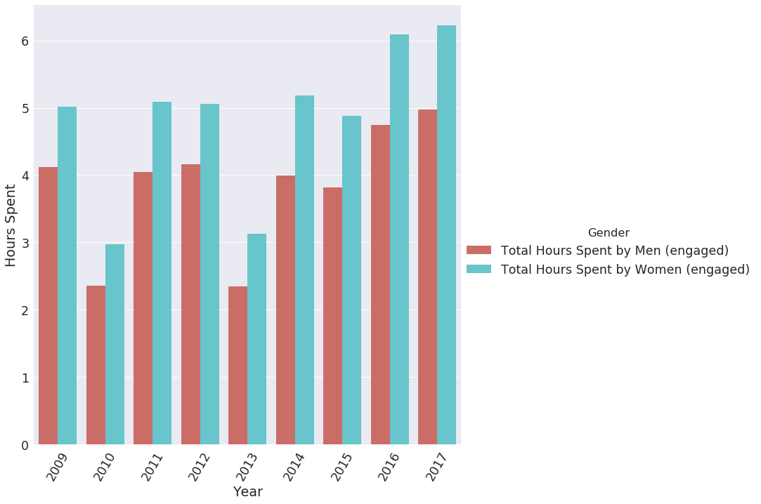
American Time Use Survey, Bureau of Labor Statistics (2009-2017)
The above looks at select activities, including:
- ‘Physical care for household children’,
- ‘Caring for and helping household adults’,’
- Caring for and helping household children (except activities related to education and health)’,
- ‘Travel related to caring for and helping household members’, and
- ‘Housework’
The basis for choosing these indicators was that these activities are indicative of chores and caring activities (that are not based around leisure) which is often a trip generator.
hours spent per day on “Working” Activities
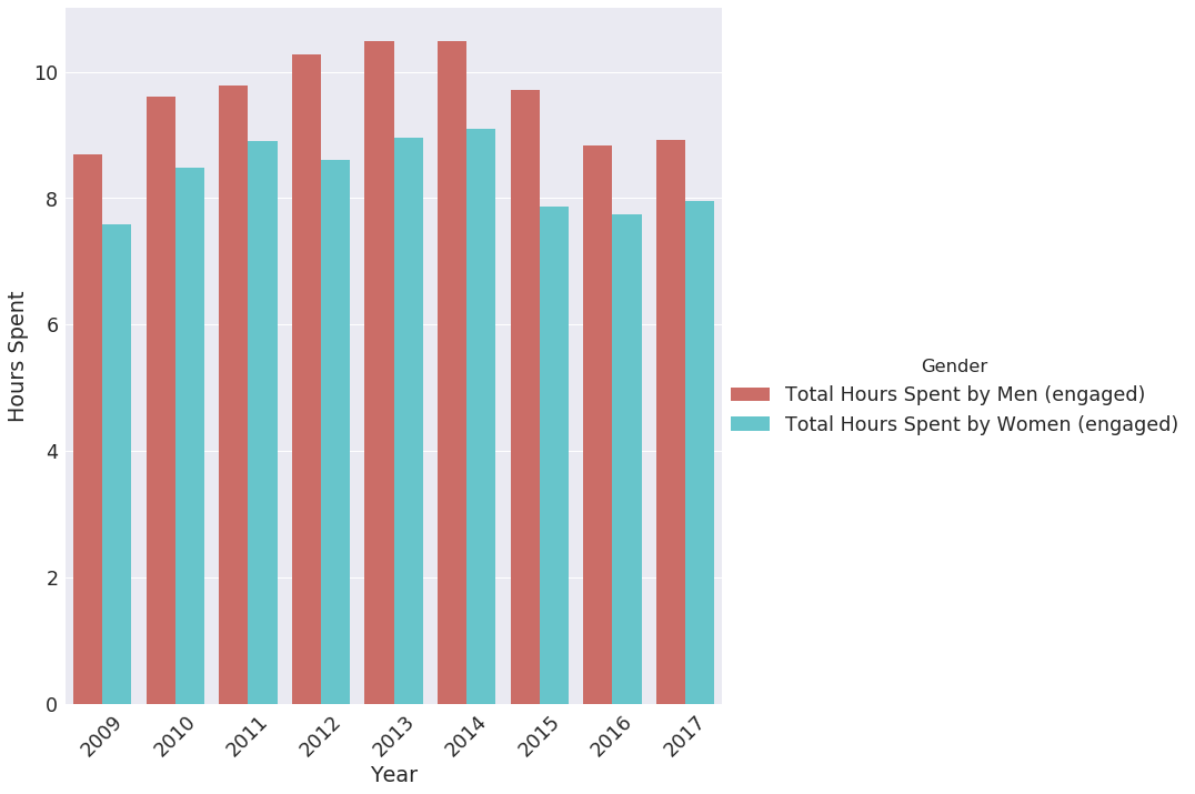
American Time Use Survey, Bureau of Labor Statistics (2009-2017)
The above includes work and travel related to work.
In contrast, women on average work fewer paid hours per day. We can surmise from this data that women are performing more trips associated with care related activities than paid work activities.
This distinction between caring unpaid work and paid work is important. While unpaid work is not included in calculations of GDP, it requires “daily effort, time, ability, and dedication” (de Madariaga, 2018) and is needed for sustaining daily life. By narrowly defining work as paid work, and discounting the necessity for these other trips, there are implications for transportation planning and the women that must use these systems.
Trip Chaining and the Mobility of Care
How visible are these trips in in our measurements? Ines Sanchez de Madariaga (2009, 2010, 2018) poses that the “mobility of care” is a counter part to the mobility of paid work. She argues that when analyzed as a separate category (as paid work is), care related trips comprise a significant amount of trips. She contends that these trips are distinct from leisure trips. If one can not pick up their child from school, they must either find another care giving to perform the task of they pay someone else to do it.
Women, likely in response to this gendered division of labor, partake in greater amounts of “trip chaining”- where multiple stops are included on a tour. The way we currently analyze these trips, through the National Household Travel Survey, is by breaking them up into individual trips. This discounts the nature of these trips and falsely surmises that they are not on the same trip. The design of networks and land use would shift dramatically.
The figure below shows a summary of typical travel patterns of surveyed caretakers and single working individuals in Vienna. The survey was conducted to understand the travel patterns of the people of Vienna. The researchers noted that the women tended to write far more content during the survey taking. Despite not intending to determined gender differences, they arose.
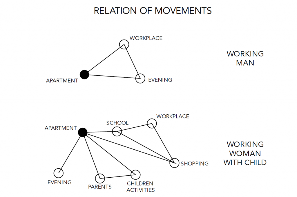
Given these travel patterns, the typical way of assessing commutes as from home to work would be insufficient for many trips. As mentioned previously, this trend is persisting in the United States, with women taking more of the care taking responsibilities.
The 2017 Household travel survey shows that women make more trips overall and when divided by purpose, they tend to be in the categories of home and errands. Men only surpassed women in work related trips. Given the time use survey data, this isn’t entirely unexpected. Also, considering the sheer amount of trips dedicated to errands and shopping, it is interesting to note that public transportation systems still rely very heavily on the commute focused network. However, these categories do not distinctly separate out care related trips with leisure for instance. Shopping and errands are lumped together, despite presumably having very different motivations.
Trip Purpose by Gender
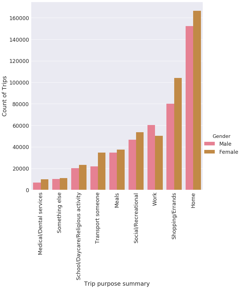
U.S. Department of Transportation, Federal Highway Administration, 2017 National Household Travel Survey
Moreover, women were more likely to take public transportation with the exception of Amtrak and commuter rail. The most noted difference is in bus networks. This could indicate that bus networks, which have the capability to go to destinations not typically included on traditional commute networks, would be more conducive to women’s travel patterns.
Public Transportation Usage by Gender
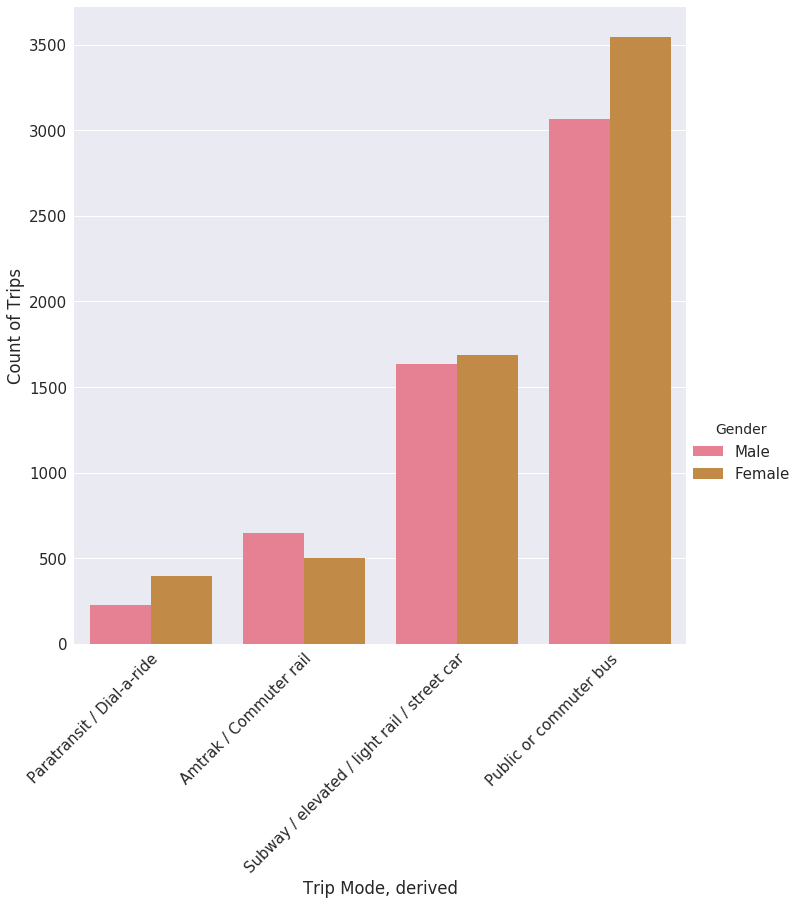
U.S. Department of Transportation, Federal Highway Administration, 2017 National Household Travel Survey
San Francisco and Trip Chaining
I wanted to test the network of the Bay Area’s most robust transportation network to see if it could accommodate multiple trips. First, I wanted to measure the amount of single mothers (those that are disproportionately affected by time pressures) and also the amount of families in San Francisco. Families tend to be concentrated in South San Francisco near the Bayview Hunters Point and Portola, and the Sunset. Single mother’s are also concentrated in Bayview Hunter’s point but are also more dispersed throughout the city. Interestingly, Treasure island has high percentages for both families and single mothers. This is likely due to low population numbers generally.
SAN FRANCISCO – Families and Single Mothers
ACS 2017 5 year estimates, Table B11005, Open Street Map
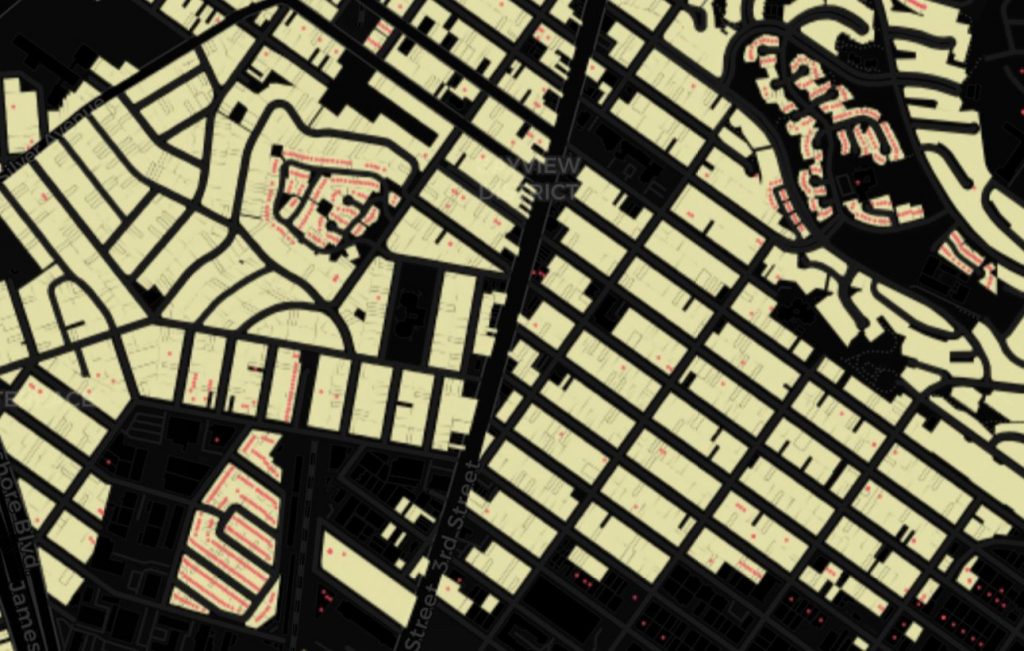
I decided to look at grocery stores and schools to see if travel times were sufficiently low that public transportation and walking could be a viable option. While Bayview Hunters point lacks grocery stores and schools, insinuating that there would be a large transit problem for single mothers attempting to reach schools and access to food. Portola has a large concentration of schools, but very few grocery store options. Similarly the Sunset has only a handful of grocery store options in that area.
Density of Schools, Groceries, and Transit Stops in San Francisco
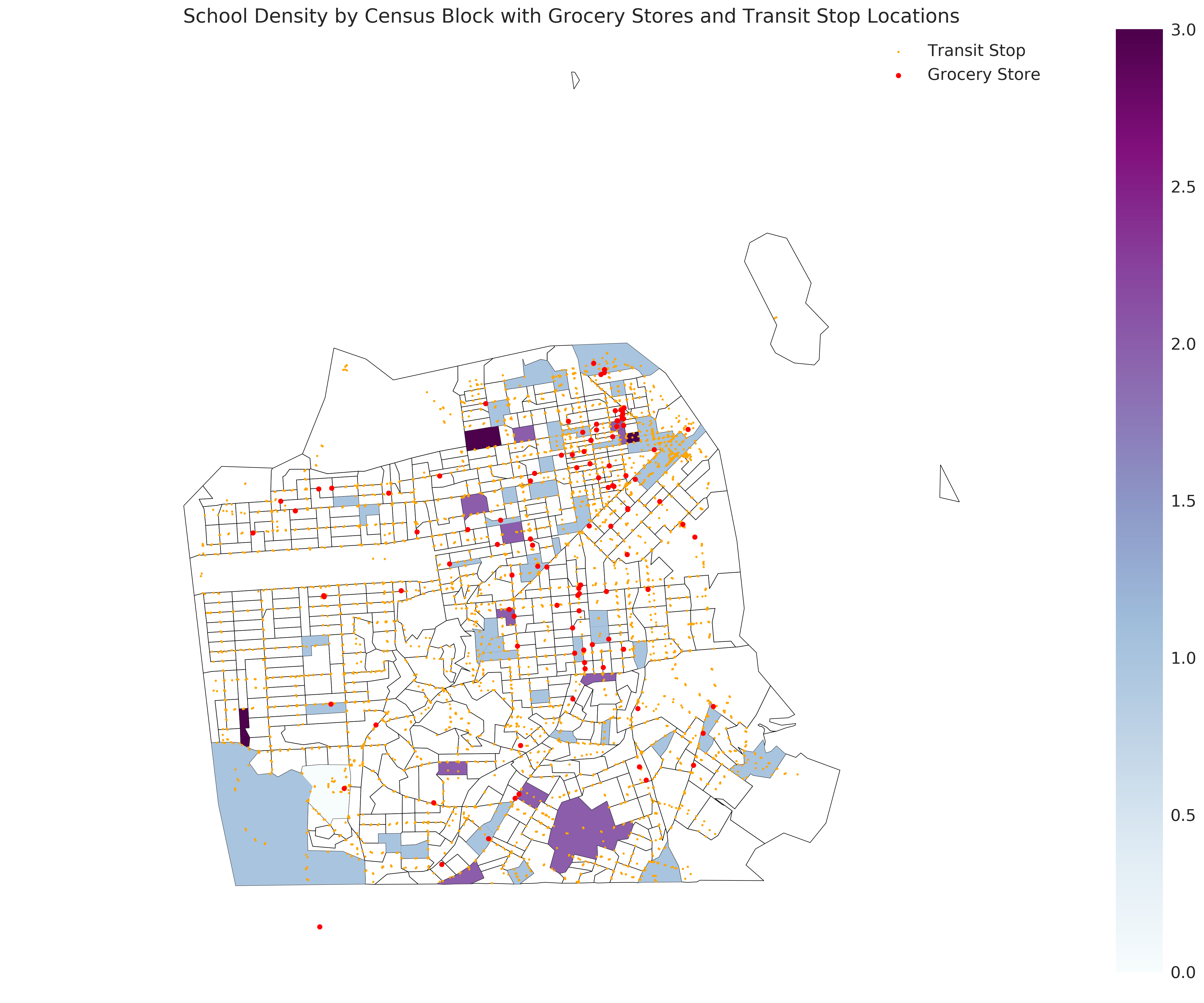
Open Street Maps
While the concentration of schools by block group can be misleading (some blocks are large than others, the map above does show some degree of separation of schools and groceries in certain areas of the city. The Outer Sunset and Portola have large amounts of schools, but very few or no grocery stores. In contrast, Downtown has a high concentration of grocery stores and very few schools. However, I would predict that because it is near a high frequency transit network, that the connection times would be minimal.
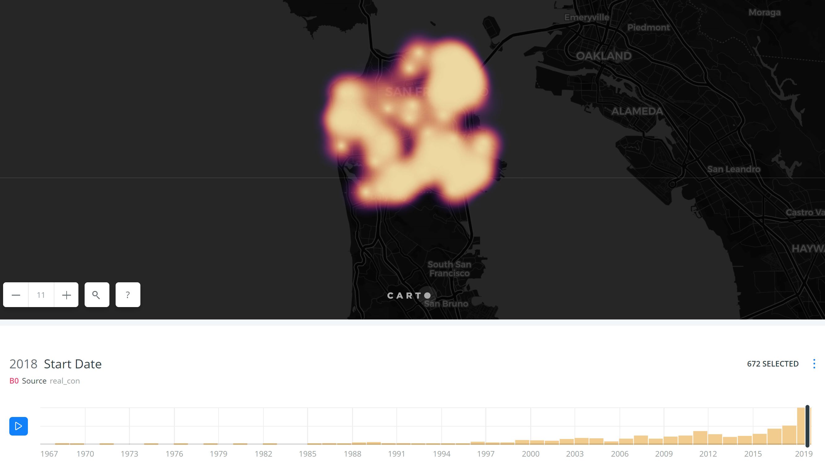
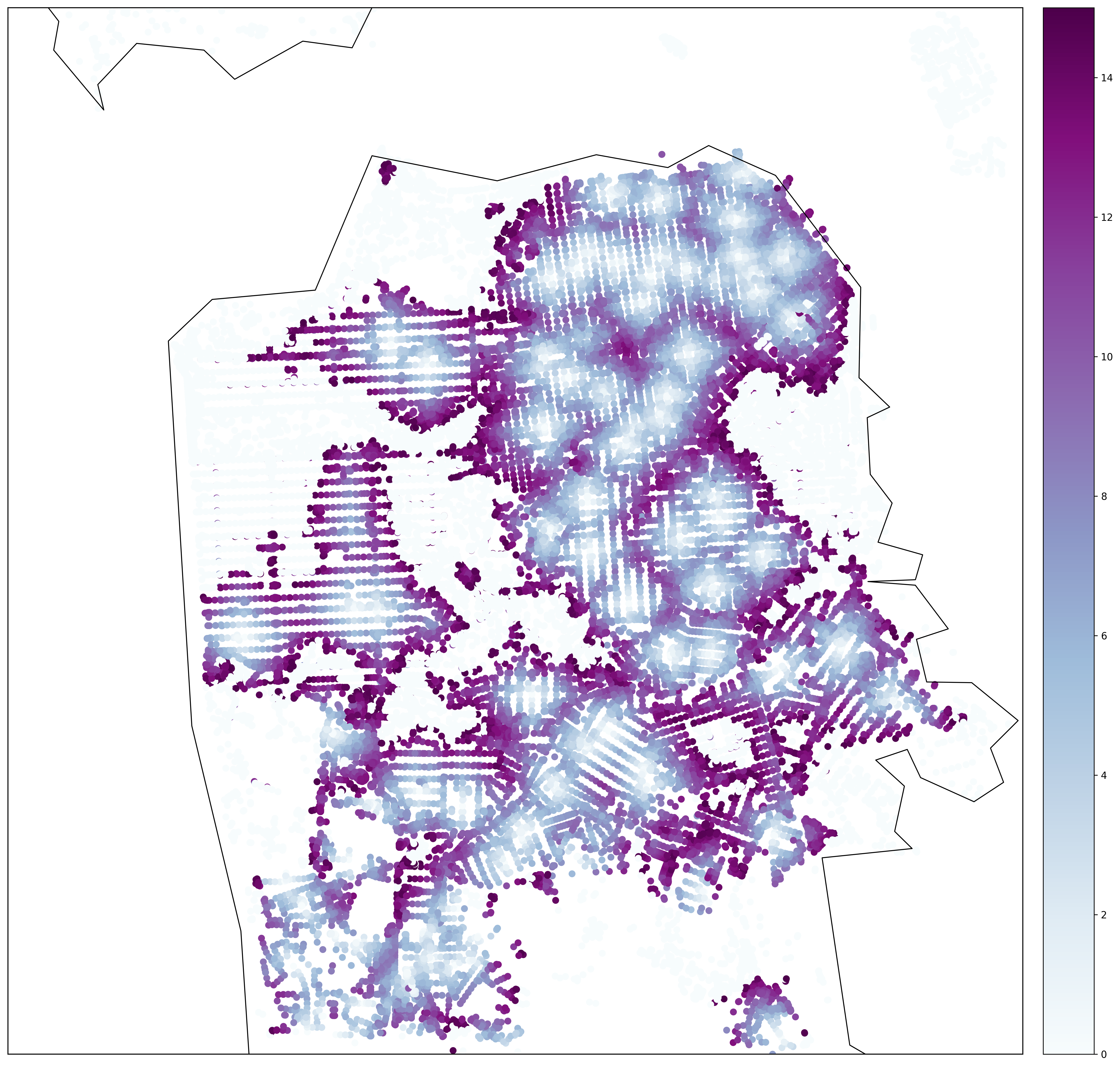
Network Analysis
While the above maps can give an idea of the deficiencies in the travel network, without an integrated pedestrian and transit assessment, it is difficult to determine how easily one can travel from a school and grocery store throughout the city. The below uses Urban Access, a tool developed by Sam Blanchard in his final year at UC Berkeley, to analyze travel times across San Francisco to Schools and Grocery stores within 15 minutes. It calculates travel times based on the headways, walking distances, and GTFS feeds from any node within San Francisco. I chose 15 minute travel times considering the already ample time constraints on primary care givers that also work and that there are multiple destinations. The time period assessed is from 3pm (around school pick up time) to 6pm (prime time for the grocery store).
Schools Travel Times
Grocery Stores Travel Times
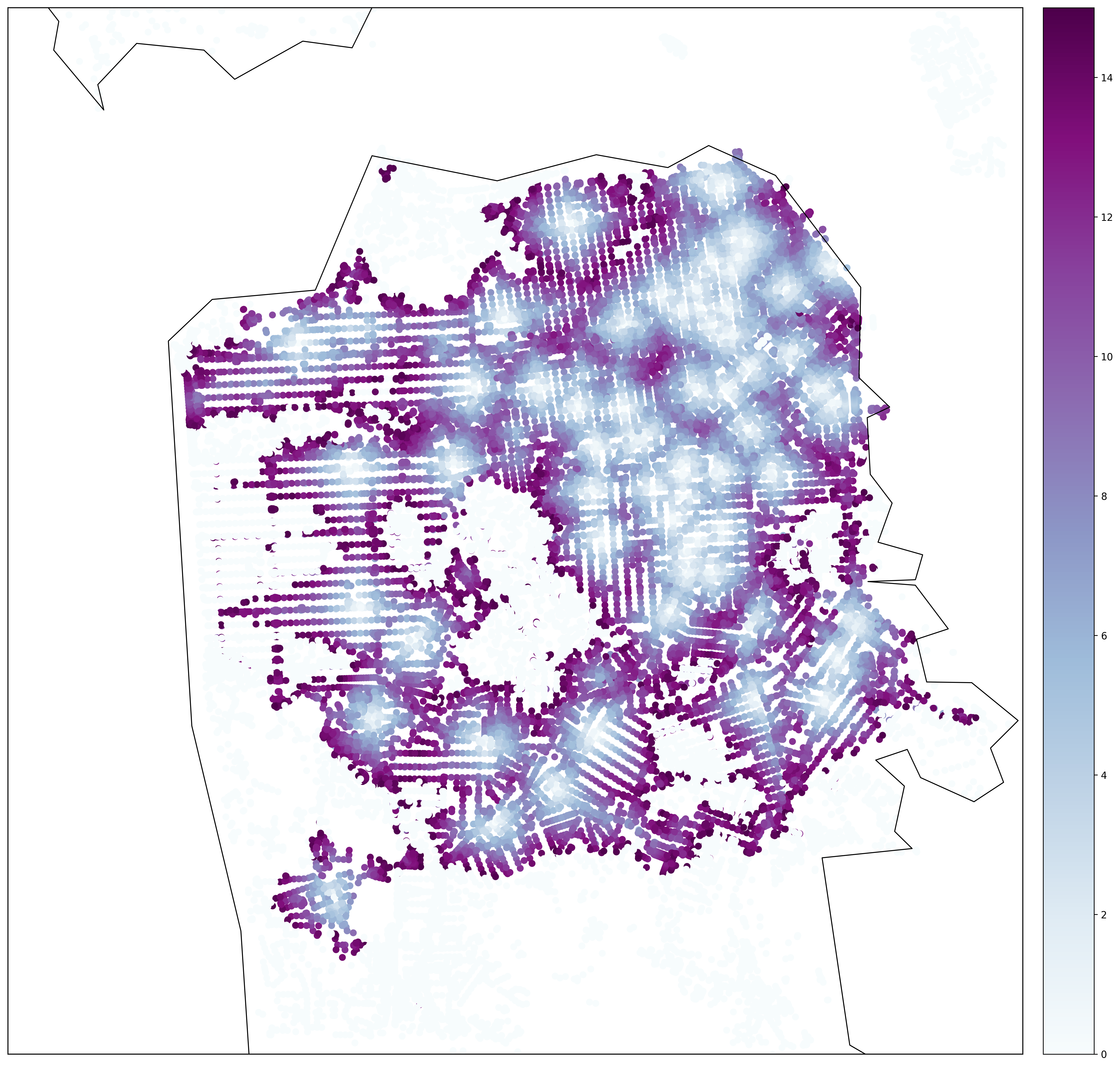
The network analysis shows that the easiest areas for access for both schools and grocery stores, unsurprisingly, are along Market Street and in Downtown San Francisco. However, these as shown in the map of families with children and single mothers, this is the area with the least amount of families.
Among the areas that have the most amount of families and single mothers, Hunter’s Point, Portola and the Outer Sunset are all areas that would be difficult to access the grocery store and school in a reasonable amount of time.
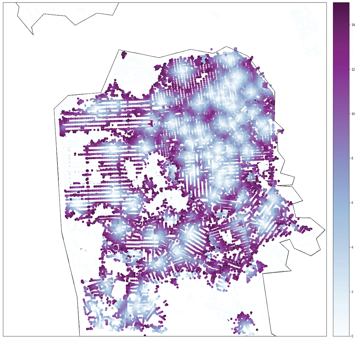
This network analysis is just a proxy, as it doesn’t actually take into account multiple destinations. I attempted to overlap the two points of interest to see, however, this doesn’t exactly give me the analysis that I’d like as I am look for sequential trips.
Composite Grocery Stores and Schools Travel Times
Further Questions/Analysis:
- How can I re-code specific trip purposes to unearth the full proportion of care related trip generators? (to be perfectly honest, I had difficulty with my dataframe and I’d like to continue to look into this).
- Can I do urban access with multiple destinations? I’m currently asking Sam and would like to see to properly assess trip chaining. This would be incredibly important to truly understand if multiple trips are accessible in a city.
- How can I account for time spent at destinations?
- Stockholm, Berlin, and London all redesigned their bus networks to better serve trip chaining activities- do they do better on these kind of tests than San Francisco? Can this be a proxy for how well transportation projects incorporate gender into their design?
Conclusion
I conclude that while it is definitely worthwhile to include these sorts of analyses into planning networks, the complexity is likely why it is not done more readily. Adding stops confuses the planning process exponentially. However, the gains that public transportation services could stand to gain from encouraging primary care givers to take public transportation more often could be immense. The population is already inclined to take buses and if more trips were in line with their travel behavior, it seems likely that there would be more public transportation trips.
We should also begin to reclassify trip purpose data to distinguish unpaid work from leisure activities so we can better assess the amount of trips for those purposes. Conflating leisure with unpaid care work diminishes the importance of this and therefore does not get incorporated into planning processes as readily.
Finally, the density of land uses stands as a backdrop for all of network planning. By locating services, schools, and other care related activities near transportation or within walkable distances of the home, the burden of care can be reduced.
References
Hayden, Dolores. “What Would a Non-Sexist City Look Like? Speculations on Housing, Urban Design and Human Work.” Gender Space Architecture: An Interdisciplinary Introduction, ed. Jane Rendell, ed. Barbara Penner, ed. Iain Borden, Taylor & Francis e-Library, 2003, pp. 266–281.
Madariaga, I. S., & Roberts, M. (2016). Fair shared cities: The impact of gender planning in Europe. London: Routledge.