Introduction
For my final project, I wanted to work with a really big dataset – one whose size would make it unfeasible to analyze and visualize using anything but the powerful Python tools now at our command. So I downloaded tens of gigabytes of data from the New York City Taxi and Limousine Commission and set out to produce some deep analyses of taxi and Uber ride patterns.
However, I soon discovered that there is big data, and then there is big data. Humongous tables – 14 million taxi trips per month – clogged my bandwidth, hogged my RAM, and stymied my efforts. So I have chosen to reduce my scope and demonstrate some core skills from this semester, and to conclude with thoughts on where I need to go next in order to continue to build my analytical capabilities.
Research question
I sought in my analysis to better understand the dynamics of taxi vehicles in New York City. What kind of trips are made in cabs? Where do those trips occur? What are the predominant costs and locations of taxi trips, and what are the planning implications of these findings?
Data collection
I’ve had my eye on several datasets pertaining to taxi and TNC operations in New York City for some time now. Chris Whong created a fairly famous visualization of “a day in the life of a NYC taxi” a couple of years ago; more recently, FiveThirtyEight acquired substantial amounts of Uber pickup data and wrote a series of pieces on what it demonstrated.
I began by following Whong’s footsteps and looking at the data he acquired via a Freedom Of Information Law (FOIL) request to the New York City Taxi and Limousine Commission (NYC TLC). TLC responded to his request by inviting him to bring a hard drive to their headquarters, then handing over CSV files corresponding to every yellow cab trip from calendar year 2013. Whong then shared these files widely, though not before he sensibly compressed them, reducing each file to one seventh its original size. (Pretty important when each monthly CSV is more than 2 GB in size uncompressed.) Those original files are available on archive.org.
However, in my examination of data sources, I soon learned that NYC TLC has begun regularly uploading data on yellow and green (so-called “Borough Taxi”) cab trips. In fact, their dataset goes back to 2009 and up to the present day – some 1.1 billion trips and counting. My original goal was to compare and contrast the spatial distribution of yellow cabs, green cabs, and Uber vehicles, and I knew that the Uber component would be the limiting factor. FiveThirtyEight also filed a FOIL request and was rewarded with twelve months of Uber data (April-September 2014 and January-June 2015). I therefore downloaded yellow and green taxi data from TLC for the period of April-September 2014.
TLC’s taxi dataset is very extensive and contains useful variables on price, duration, distance, passengers, date, time, and most importantly, origin and destination latitude/longitude coordinate pairs. The Uber data are much slimmer, consisting only of pickup time and coordinates. Nevertheless, as Uber has agreed this year to share data with the City of Boston for transportation planning purposes, it is within the realm of possibility that they may eventually release more extensive data for New York as well.
One primary goal of my analysis was to examine in- and outflows of taxis across boroughs and neighborhoods, so I needed to acquire shapefiles of each geography of interest. Boroughs were easily obtained, because each borough is its own county. I therefore grabbed the Census Bureau’s TIGER/Line shapefile for all counties in the United States, which was a good fit because it is not water-clipped and I could therefore be sure I was labeling all taxi coordinates anywhere within New York City.
Finally, I located an impressive shapefile of New York City neighborhoods from PediaCities. This is not an official file from the City of New York (whose data portal, Bytes of the Big Apple, is quite an impressive operation), but it passed the eyeball/sniff test, and it covered the entire land area of the city, again important to ensure that taxi pickups and dropoffs would be captured.
Data cleaning
As I dug into the data, I began to realize that the scale of the NYC TLC dataset was thoroughly overwhelming even for Python and pandas. The first file I opened, corresponding to yellow cab trips during April 2014, was 2.4 GB and contained more than 14 million rows. I also struggled to figure out properly vectorized methods of data cleaning, and was forced to use df.apply() frequently, which is better than iterating over the rows of a DataFrame but still quite slow. Simple operations such as transforming floating-point lat/long columns into shapely Points for a geopandas geometry field took nearly an hour. My 16 GB of RAM, generally enough for any task I take on, was quickly depleted. I realized I needed to scale things down.
I had originally wanted to examine data for a six month period. Ultimately, though, I found it necessary to constrain my analysis to just a single day. I selected Thursday, April 3, 2014, as it was a perfectly ordinary spring day; it was also my 28th birthday. There were 490,925 yellow taxi trips with valid pickup and dropoff coordinates whose pickup occurred between 12:00 am and 11:59 pm on April 3, 2014. While I was rescoping my project, I also considered that the yellow cab data were quite sufficient for the application of key techniques from this semester. I decided to save the green cab and Uber data for another day.
Working on the April 2014 yellow taxi CSV, I first subsetted the DataFrame to only those observations with valid coordinates. All rows listed coordinates, but a small proportion of rows had latitude and/or longitude equal to 0.000, a dummy value that was easy to remove. I then extracted the day of the month from the pickup_datetime datestamp and subsetted the data to April 3 only.
To conduct my spatial analysis of taxi trips, I transformed lat/long pairs for pickup and dropoff points into shapely Point geometries. I then used the Polygon .contains method to assign county names to each pickup and dropoff location. (This apply()-based step took especially long.) This approach allowed me to keep origins and destinations linked. For my neighborhood analysis, I was concerned only with origination counts, so I went elementwise through the short neighborhood polygon dataframe with a vectorized operation that counted the number of pickup points that were .within that polygon. This was a lot faster!
Statistical analysis
| Variable | Mean | SD | Median | Min | Max |
| Total fare | $15.42 | $12.44 | $11.50 | $3.00 | $450.00 |
| Tip percentage | 11.0% | 12.7% | 11.8% | 0.0% | 1516.7% |
| Trip distance | 2.88 mi | 3.41 mi | 1.70 mi | 0.0 mi | 92.9 mi |
The above table presents summary statistics for several measure of taxi trips. The statistics paint a fascinating picture of the patterns of taxi use: the median yellow taxi trip is only 1.7 miles, and the median total cost is $11.50, both lower than what I would have expected.
The picture that emerges is of a sizeable cohort of people for whom the taxi is a primary means of transportation. These people take short trips and, evidently, stiff their drivers: the 25th percentile tip is 0%! (I calculated tip amount as a percentage of all other costs, by subtracting tip_amount from total_amount and then dividing tip_amount by this result.) Even the mean and median tips are below 12%, a far cry from the 20-30% “recommended” in the cabs’ touch screen interface. Good to know – I’ve always tipped in the 20% range, which puts me in the upper quartile. Either I can save some money next time I take a cab, or I can feel better about being a good person.
There appears to be some noise in the data. I inspected the longest trip (92.9 miles!) and the most expensive trip ($450!!!) and found that their respective costs and mileages were zero, suggesting that these records may not be accurate. In future, it would be advisable to clean and validate these data more carefully.
Another feature stands out from these summary statistics: the minimum taxi trip cost is $3.00. This serves to underline how much this transportation mode is geared toward higher-income individuals: even the shortest cab ride costs more than the longest subway ride, so unless that cab is packed, the passengers are essentially burning money.
Static data visualizations
The bar chart below demonstrates how the vast majority of yellow cab pickups (93.8%, to be precise) occurring on April 3, 2014, took place within Manhattan. The other boroughs represent a very small fraction of yellow cab pickups. By comparison, only 89.1% of dropoffs occurred in Manhattan – still a very high proportion, of course, but perhaps indicative of asymmetrical commuting trends, such as workers taking the subway into Manhattan at normal commute hours, then working late and taking a taxi back home in the evening.
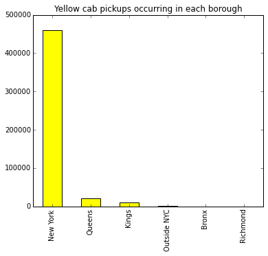
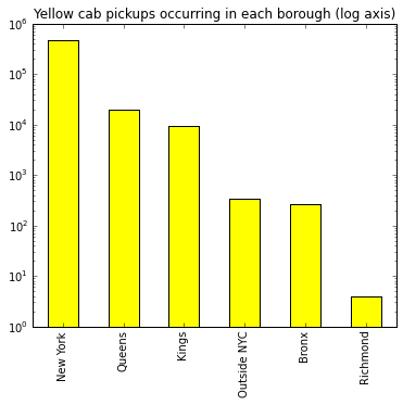
The variation in pickup counts by borough is so extreme that it is perhaps better visualized via a log plot. Yes, you are reading that correctly – there were only four yellow cab pickups in Richmond County (Staten Island) all day. It appears that other services, perhaps Uber/Lyft and green borough taxis, but also so-called “gypsy cabs,” are serving Staten Island’s taxi needs. On the other hand, Staten Island has a much more car-centric culture to begin with, so perhaps taxi demand is simply lower to begin with.
The following origin/destination table better characterizes the pickup and dropoff dynamics of yellow cabs. (I had originally intended to visualize these O/D pairs with a circular migration plot, but that work will have to wait until another time, one focused more on JavaScript skills.) Most striking, in my opinion, is the fact that fully 85.8% of trips occurring on the Thursday in question took place entirely within Manhattan. More Brooklyn-originating trips ended in Brooklyn than anywhere else, and substantially more Manhattan-originating trips ended in Brooklyn than vice versa, providing more evidence for the asymmetrical commute theory I mentioned earlier.
| To | |||||||
| From | Manhattan | Brooklyn | Queens | The Bronx | Staten Island | Outside NYC | Total |
| Manhattan | 421,498 | 16,947 | 18,788 | 1,952 | 76 | 1,314 | 460,575 |
| Brooklyn | 3,175 | 5,734 | 612 | 16 | 4 | 26 | 9,567 |
| Queens | 12,658 | 2,142 | 4,898 | 227 | 15 | 233 | 20,173 |
| The Bronx | 93 | 4 | 7 | 156 | 0 | 2 | 262 |
| Staten Island | 2 | 1 | 0 | 0 | 1 | 0 | 4 |
| Outside NYC | 58 | 1 | 9 | 0 | 0 | 276 | 344 |
| Total | 437,484 | 24,829 | 24,314 | 2,351 | 96 | 1,851 | 490,925 |
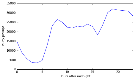
Below, a line chart tracks the number of pickups occurring by hour over the course of the day. The morning and evening rush hours are clearly visible, as is the infamous trough in pickups corresponding to the time when cab drivers change shifts, right before the afternoon rush. New York is an all-day and all-night kind of city, as evidenced by the quite high rate of pickups during the workday and especially on into the evening: more taxi trips began in the hour before midnight than in the peak morning rush hour. (Again, this is probably because workers take transit for their more predictable morning commute, then hit the town and cab home later.)
Finally, back to tips for a moment. Not all passengers are equally generous, as the below bar chart demonstrates. In fact, the few passengers (only 96!) who were dropped off in Staten Island (Richmond County) tipped their drivers at a substantially higher rate than passengers arriving elsewhere. People dropped off in Manhattan (New York County) are much stingier. Again, from a data cleanliness perspective, I find it difficult to believe that none of the more than two thousand passengers dropped off in the Bronx gave any tip at all. (The Bronx is a poorer area, but not that poor.)

Interactive maps
The choropleth map above clearly reveals the Manhattan-centric nature of yellow cab trips. I normalized the count of pickups in each neighborhood by the neighborhood’s polygon area. Most of Midtown and Downtown Manhattan is a red blur; JFK and LaGuardia Airports (whose originating trips overwhelmingly end up in Manhattan, as we saw in the origin/destination table above) are also major loci of taxi trips.
One might choose instead to normalize based on population, but land area is both more feasible (because neighborhood definitions do not align cleanly with Census blocks, block groups, or tracts) and more appropriate, because certain very taxi-heavy areas like Midtown and the Financial District have enormous job density but relatively few residents.
To supplement the aggregated display of taxi trips in the CartoDB map, I built a Leaflet map that visualizes individual pickup locations. It turns out that a GeoJSON containing nothing but lat/long pairs for 500,000 points is still 70 MB, much too large for use with Leaflet, so I used the modulus operator to select every 50th pickup location, resulting in about 10,000 points in 1.2 MB. Again, you can see how focused on Manhattan all this taxi traffic is.
Next steps
I was able, with significant effort, to deploy a wide range of techniques in Python, pandas, CartoDB, matplotlib, and Leaflet in the context of a very large data set from NYC TLC. However, one can always “run faster, stretch out [one’s] arms farther,” to paraphrase Fitzgerald.
I was rather unpleasantly surprised at the computational overhead associated with the original data sets. I had expected that Python would make short work of the tens of millions of trips per month, and that I could get quickly on to some exciting analyses and visualizations. I had some good ones in mind: I wanted to implement a d3.js circular migration plot, to graphically track taxi trips among boroughs, and, below the borough level, from neighborhood to neighborhood. I wanted to implement a slider above that circular migration plot, to enable users to examine how flows changed over the course of the day. I wanted to use the polyline package to decode compressed polyline responses from the Google Maps Directions API, to visualize individual taxi trips along New York’s street network.
All these tasks and projects are waiting for me, and I have some good resources to refer to: very impressive technical blog posts by Chris Whong and Todd Schneider point the way toward a formal database ecosystem much better suited to truly big data. Someday soon, I will dip my toes into PostgreSQL, BigTable, PostGIS, and the like.
And then I will write another blog post!
Hi Drew,
Could you share your codes of how you use shapely and polygon and to transform the lat/long? I am recently working on a project that also requires to map lat/long to specific areas. I really appreciate your help!
Thanks,
S.W