Making Neural Networks Comprehensible for Non-Technical Customers
Introduction
During my internship in a company that did consulting in the fields of AL and ML, my company was faced with the challenge of explaining the structure and functions of neural nets to customers with limited technical backgrounds. In particular, our clients were the Australian Government and one of the biggest Asia-Pacific law firms, thus all the data was highly classified, and in addition, we had to work with people with very limited technical and mostly legal backgrounds, and those people were the middlemen between the consulting company and technicians at the client companies. Most of the work involved sophisticated neural net structures, but because of the type of work, everything had to be greatly documented and illustrated, which posed a challenge due to the quite complex structures of neural nets. Even simple examples of two layer fully interconnected neural nets were hard to present. The part that made it even more complicated was that we had to present not the bare structure of the nets but the data flow in them.
In this project we put a goal to explore the ways to represent neural nets and data flow through them. The first paper we found provides a system called ShapeShop that demonstrates how classifiers select data for image classification. It makes simple visual representations of pixel selection used by multiclass classifiers to classify images with simple shapes. It uses low resolution images (28x28 pixels) that allow to see differences in learned representations of classes on pixel level. In addition, it lets a user to compare representations learned by convolutional neural networks (CNN) and multilayer perceptron (MLP), as well as different learning rate (step size) and number of learning cycles (epoch count).
Another system, TensorFlow Playground, provides a illustration of how different layers of deep neural networks function. In provides graphical interface for designing and training complex systems for classification and regression. It allows user to gain an intuitive understanding of how to best design a neural network and choose hyperparameters.
ActiVis provides many all the same functionality as TensorFlow playground but it greatly extends it to visualize real world datasets as opposed to pedagogical datasets.
Comparing Network Types and Hyperparameters
ShapeShop
Let’s take a look at the simplest two-class classification: two black images with a white square in the lower right and upper left corners. The simplicity lies in the clear difference between the images and the shapes that do not overlap.

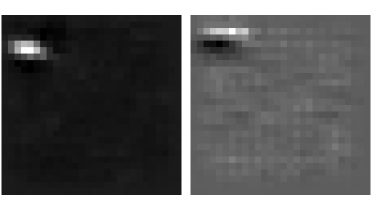
We train a CNN network with 0.005 step size and 100 epoch count. ShapeShop tool creates a prototypical representation of each class learned i.e. a visualization of each class by visualizing the weights on the first level of the network. The weights are normalized to 0 to 1 range (1 white and 0 black).
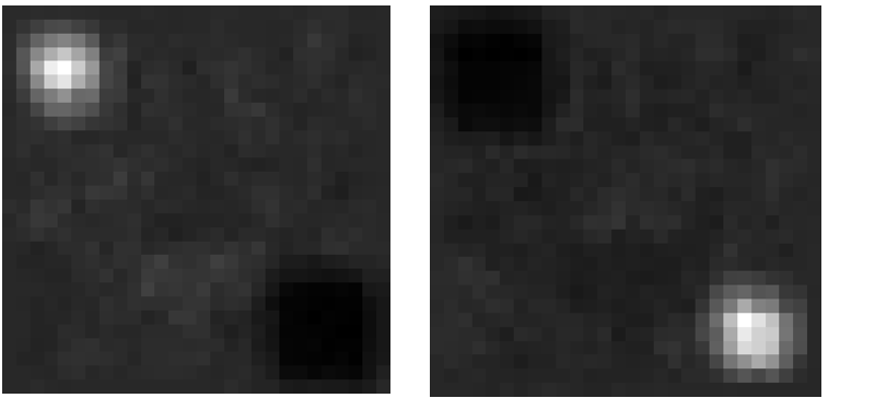
For the two-classes classifier, the difference is clear: the presence of white pixels in the lower right corner is the sign of image belonging to the first class. Another important aspect of this prototypical representation is the dark spots in the place where opposite class white square is.
The images have a quite low resolution (28 x 28 pixels) and this allows also to clearly compare the results to Multilayer Perceptron (MLP) trained with same parameters. The difference between the two classes is visible, however, it’s clear that MLP doesn’t do the job CNN does. This will be important as the complexity of the shapes and classes increases.
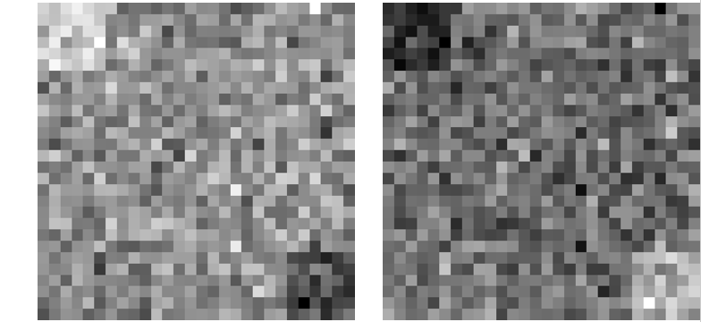
As discussed before, the learned representation maximizes the weight of pixels where the square is (white spot) and minimizes the weight of pixels where white square is of opposite class (dark spot). Anything in between is gray.
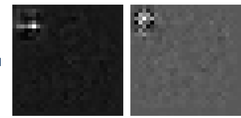
We train another classifier to illustrate how this change as the classes become more complex: we add another class with a white line in the middle. This gives the next three prototypical representations. Three things to notice here: a new black spot in the middle of the previous two classes. And two black spots in the lower right and upper left corners of the middle class. The last interesting point that this illustration reveals is that the middle class shows two separate white spots instead of a solid line. This is the result of filters in CNN and MLP that doesn’t apply filters present this class as a single line.


Now we add more complexity by training the model on quite similar classes:

While the two shapes differ by about a dozen of pixels, instead the CNN identifies a smaller subset of pixels to distinguishes two classes. Take a look at the right representation. There is one white pixel that stands out, and if you compare it to the original two classes, it’s clear that this one pixel is enough to classify an image as belonging to one class or another. This is a danger of training on a small dataset (in our case we have just one example of each class) and finding a local minimum. To fight getting stuck in this local minimum we increase step size to 0.01 and keep all other parameters the same. This gives a different picture, where the learned representation now depends on a bigger number of pixels. This is the essence of tuning the hyperparameters in a network. Increasing the epoch count, though, doesn’t change the pictures, since the classes are pretty simple and changing the epoch count from 50 to 250 doesn’t have a significant effect.

To see the effect of epoch count, we train the classifier on four similar images: a white shape of a line, square, triangle and circle in the upper left corner. Here is the learned representation of a line trained with 50 and 250 epoch count with fixed step size. While the difference is not that big, the classification doesn’t come down to one pixel when trained with a larger epoch count. To put it in numerical perspective, classifying a picture with the line shape with the first classifier gives 0.74 loss vs second having 0.66 loss.

Visualizing Network Activations
Other visualization tools allow us to inspect individual activations
of neurons in a neural network. One such tool is Tensorflow
Playground
One thing that Tensorflow Playground can illustrate is when a network has more neurons than actually needed. Click here to load such an example in the Tensorflow Playground instance above, and then click the play button to train it. You'll see that two neurons in the first hidden layer quickly learn the correct decision boundary, which suggests that the second hidden layer is probably not necessary. There are also two neurons in the first hidden layer with very light links to other neurons. The light links indicate weights close to zero, indicating that those two neurons are not being actively utilized and may not be necessary either.
But having a few extra neurons may be a good idea, for a network with the bare minimum number of neurons necessary is more prone to being stuck in local minima. The network in this example finds the optimal decision boundary most of the time, but sometimes gets stuck. Such a suboptimal solution, for example, results on the first run. Tensorflow Playground lets us analyze why this happens. If we analyze this network over many runs, we can observe that it works by learning the boundaries of a rounded triangle that encloses the region of blue points. Usually, each of the three neurons in the first hidden layer is able to learn a distinct edge of the triangle. However, sometimes two neurons learn the same edge. In the latter case, the network fails to classify the orange points on the side of the edge it didn't learn. Having more neurons would increase the probability that at least three of them learn a set of lines that encloses the region of blue dots.
ActiVis
Facebook has also developed an internal tool for visualizing neural
networks called ActiVis
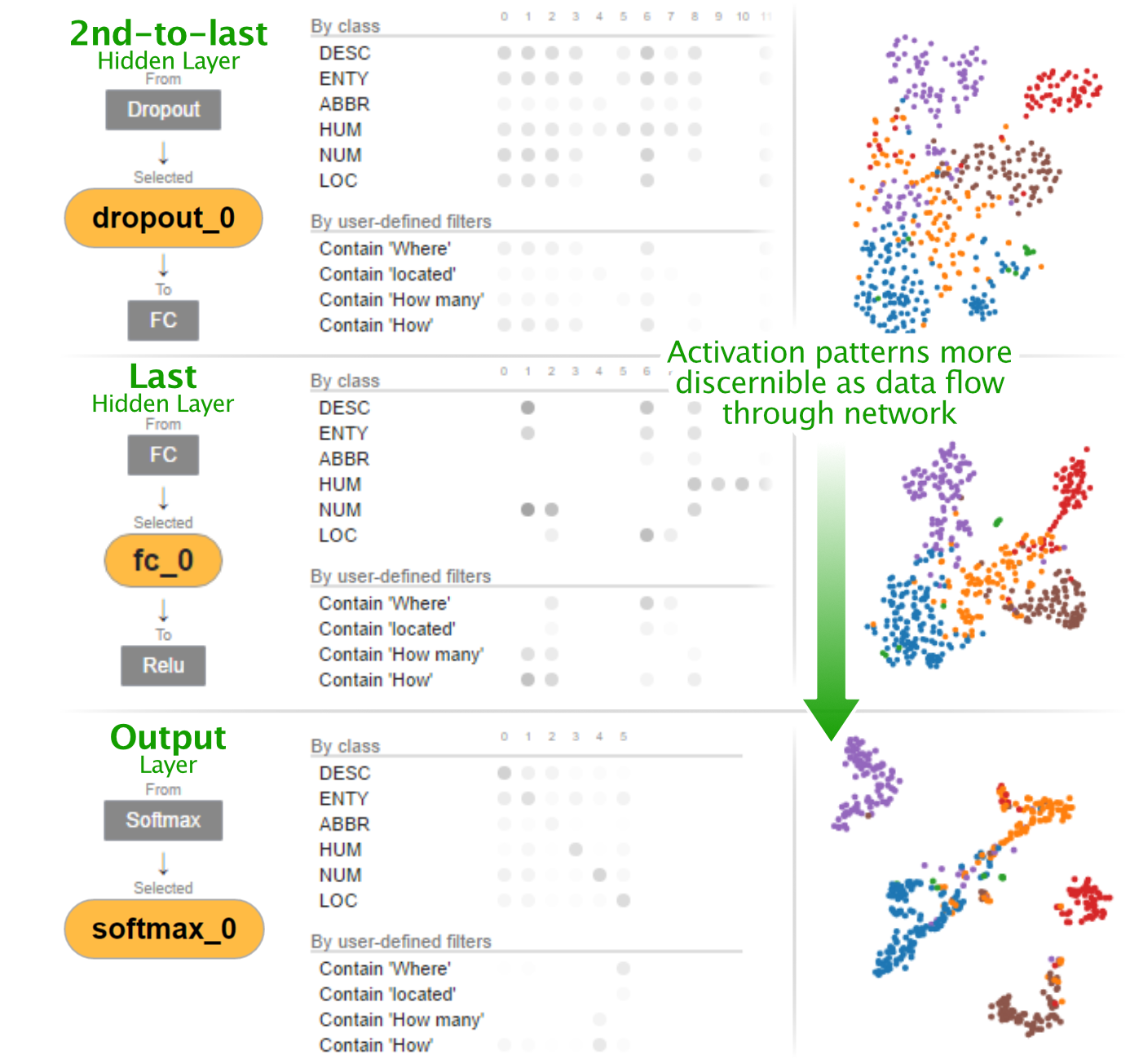
When a model is loaded into ActiVis, ActiVis displays a graph of the network's layers. One can then zoom in into each layer to see individual neurons. For each layer, ActiVis can show which neurons have the strongest activations for each class. One can then select individual neurons to show details for. In the individual neuron view, one can see a projection of each instance's activations for that neuron, projected into 2D space using a t-SNE embedding. Each instance is color-coded by which class it belongs to, which helps you to see whether that neuron is distinguishing between classes correctly.
ActiVis can also operate on individual instances or subsets of instances. One can select a group of instances by some feature (e.g. “Sentence contains the word ‘where’”), and ActiVis will display which neurons in each layer were most strongly activated for that instance or set of instances, as shown in the image below.
Conclusion
It is indeed well said that a picture is worth a thousand words. Visualizations enable a fresh means of understanding many concepts in the design and functioning of neural networks. Whereas it may be difficult to explain in verbal terms why a CNN usually outperforms an MLP in image recognition, the prototypical illustrations generated by ShapeShop illustrate the superior performance of CNNs in striking contrast. ShapeShop additionally even illustrates the subtleties of what convolutional filters actually recognize. Tensorflow Playground likewise clearly illustrates when a network has extra computational power than is being used.
Much progress remains to be achieved in the field of neural network visualization. Visualizing networks with LSTM units in a manner understandable by a beginner, for instance, remains a challenge without clearly satisfying solutions yet. Likewise, visualization of audio-recognition networks is an area of active research. Tools for visualizing real-life neural networks interactively also remain few and far between -- while Facebook has developed ActiVis tool, publicly available tools of its caliber remain to be developed.
There is no denying, however, that visualization is a powerful means of shedding light onto the inner workings of neural networks and deconstructing their black box reputation.