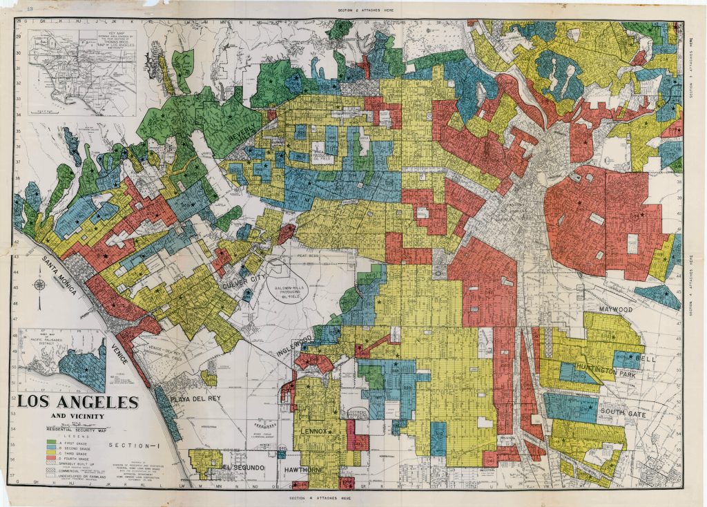
There were many forms of redlining; for our project we are focusing on housing specifically. This process began with maps created by the Home Owners Loan Corporation (HOLC) and later the Federal Housing Administration (FHA) that outlined “desirable” neighborhoods for banks to offer loans to and “hazardous” neighborhoods to avoid. Neighborhoods with a “D” or “hazardous” eating were shown in red on these maps, so they were referred to as redlined areas. The desirability of a neighborhood was often determined by the racial makeup rather than income levels or other financial factors. These maps were a tool for banks to discriminate against people of color and maintain racially segregated neighborhoods. This policy was officially in effect from the 1930s until it was outlawed by the Civil Rights Act in 1968, but its effects have been lasting. Affected neighborhoods lacked access to healthcare, retail, banking, and groceries. Also, since homeownership is one of the most significant ways to build wealth, redlining has contributed to a wealth gap between White and Black Americans that persists even today.
Redlining both reflected and reinforced segregation in many American cities, including Los Angeles. For our project, we wanted to explore whether houses in formerly redlined areas are any different than houses in other areas. Specifically, we wanted to see how current house values vary across Los Angeles according to the former redlining status of a neighborhood.