Maps

First, we used Carto to create a digital map of the formerly redlined areas of LA County. This data is from the University of Richmond’s project “Mapping Inequality: Redlining in New Deal America.”

Then, using 5-year data from the 2013-2017 American Community Survey, we created the following map of median house value for each census tract in Los Angeles County. Darker colors represent higher median values.

There appears to be some similarities between the two maps. To explore this, we used the “intersect and aggregate” analysis on Carto to map the current median housing values onto the neighborhoods shown in the redlining map. This is shown in the following map..

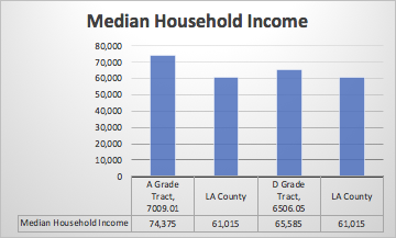
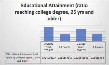
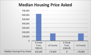
As we see on this map, neighborhoods in former “D” grade areas have lower median house values, on average, than do other areas. This suggests that while official redlining has been outlawed, its effects persist today. The old, largely racist HOLC maps have left their spatial mark on the city.


Charts

Comparing Educational Attainment, Median Household Income, and Median Price Asked in Historical Districts vs. La County

To follow up these maps we wanted to examine the housing conditions and education demographics of both an A grade and D grade census tract, and how they stack have progressed, or not, in relation to the entire county. We used both ACS 5-year estimates from 2017, as well as SF1 10-year surveys from 2000.

ACS Five-Year Survey Data: 2017, Table B19013
ACS Five-Year Survey Data: 2017, Table S1501
SF3 Sample Data: 2000, HO88

Note on the lack of data seen in the the D-grade census tract, 6506.05, for all years available of the ACS survey, there was a 0 recorded for all price levels. This may be because no homes were sold, but there was a varying margin of error from year to year, equal for all price levels. We even checked surrounding census tracts to no avail.

Otherwise, ere we see, as expected, that the A Grade census tract has much higher numbers in all categories reflecting median income as well as the ratio of residents with a college degree. When comparing the D grade to LA county we were surprised to see that the median income was significantly higher in a previously D grade tract than the entire county. This tract has not seen a continued cycle of decline that has been experienced in other redlining areas, maybe in part because of the explosion of opportunity in Los Angeles, or the fact perhaps this census tract in particular has seen an increase in what was once called a “grade” and found a way to improve despite its historical classification.