Building the Toolkit: Transportation Outcomes Metrics
I selected a few metrics in the Transportation Outcomes Measure Group to apply the skills I gained through this class. I applied the metrics on Los Angeles County as my case study region.
1. Diversity of Users: Poverty Rate by Census Tract
The jupyter notebook features drop down menus so the user can select the desired year, state, and county to query the Census API.
The jupyter notebook calculating poverty rate by census tract guides the user to generate an interactive map using Mapbox GL, which can be embedded on a website, as shown below:
Poverty Rate by Census Tract for Los Angeles County (2016)
2. Collisions: Percent of Households with No Vehicle and Collisions Involving Bicyclists and Pedestrians
The map below showcases Carto’s feature to visualize multiple layers.
The hypothesis of this spatial relationship is that census tracts where a large percentage of households don’t own a vehicle will have more collisions involving bicyclists and pedestrians because residents are walking, biking, and taking transit more frequently than tracts with lower rates of households with no vehicle. The factors that influence the amount people walk, bike, and take transit are more complex than just vehicle ownership, but the analysis, as shown in the map below, provides one perspective.
Percent of Households with No Vehicle and Collisions Involving Bicyclists and Pedestrians for Los Angeles County (2016)
3. Accessibility of Transportation System: Bicycle and Pedestrian Access Shed
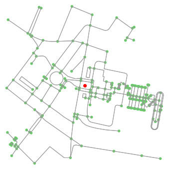
The jupyter notebook, which uses OSMnx, requires the user to input a latitude and longitude to generate a map that shows a quarter-mile access shed for pedestrians and another map that shows a half-mile access shed for bicyclists. The jupyter notebook saves the two images so the user can overlay them on other maps (e.g. using Adobe Illustrator).
Quarter-Mile Walking Access Shed from Los Angeles Union Station
Half-Mile Bicycling Access Shed from Los Angeles Union Station

This metric could be further developed by calculating the number of homes and jobs that can be reached within a specified distance (e.g. quarter-mile) or specified time frame (e.g. 15 minutes) by specified modes (e.g. walking, biking, transit, driving).
Bonus Metric: Transportation and Land Use
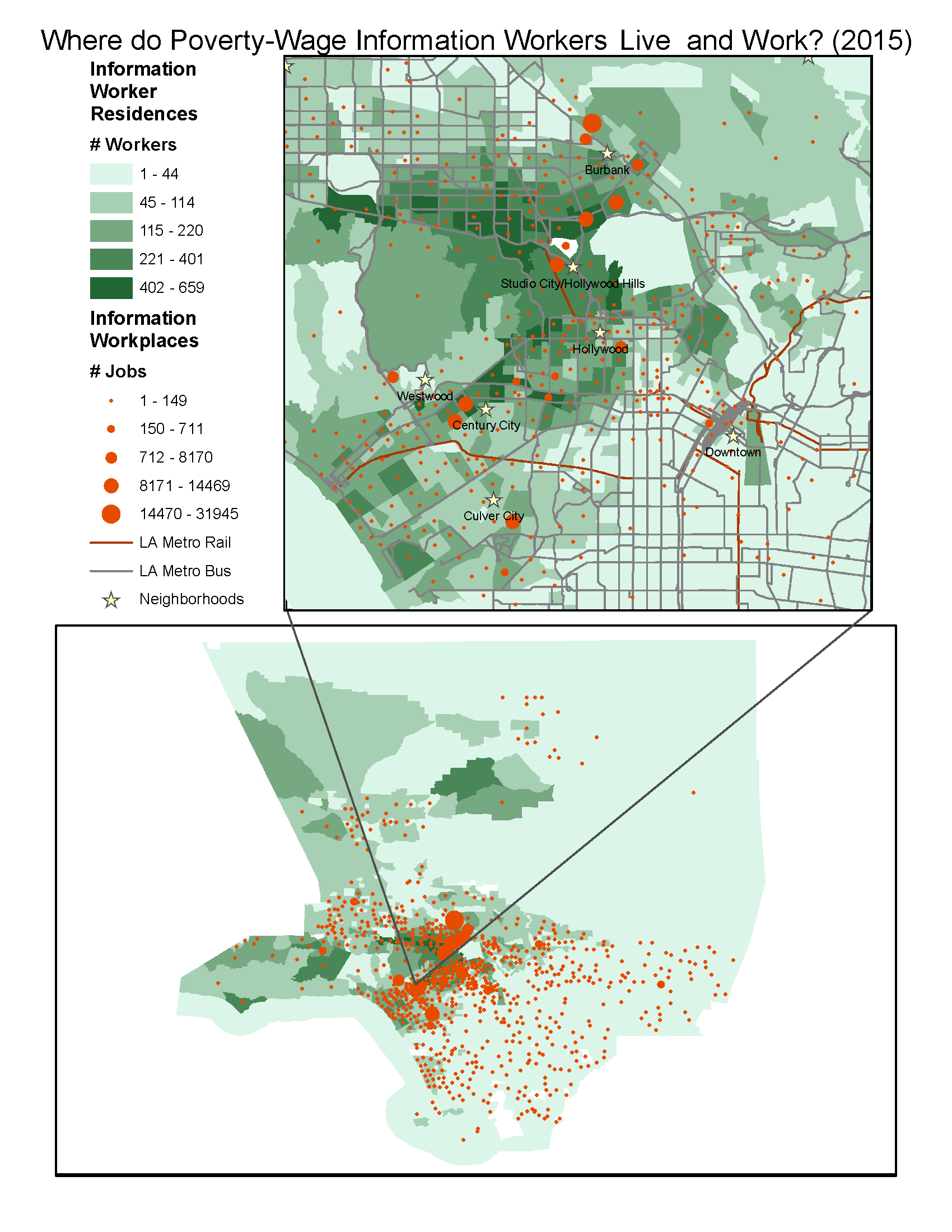
1. Accessibility of Destinations: Where People Live and Work
Data Source: Longitudinal Employer-Household Dynamics (LEHD) Origin-Destination data from the U.S. Census Bureau.
Notes:
The census tracts are shaded by the number of households that have one or more individuals who work in the Information sector and earn poverty-level wages. The graduated circles show the number of poverty-wage Information sector jobs in each census tract; note that the graduated circles are placed on the centroid of each census tract and do not represent the actual location of workplaces. The map also includes Los Angeles Metro rail lines, Bus-Rapid Transit bus routes, Limited Express bus routes, and local bus routes to visually assess transit connectivity. The map also includes a few relevant neighborhoods to provide context given Los Angeles County’s large geographic size.