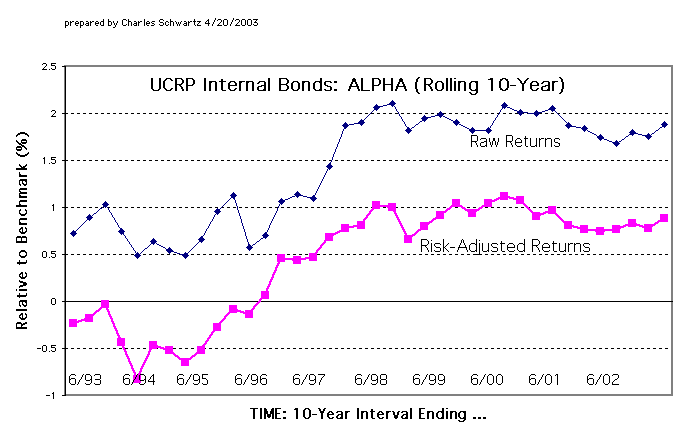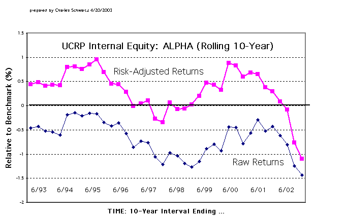
The two graphs below were presented to the Regents' Committee on
Investments on April 22, 2003. (See discussion of some reactions given
in Part 18, section D.)
These are improvements over the graphs of Risk-Adjusted Returns and Raw Returns, for UCRP Internal Equity and Bond portfolios, that were previously given in Part 17 of "What's Happening with the Pension Fund?"
The input data for these new graphs cover a longer period of time, going
back to 1983 rather than to 1992. Each point on these "Rolling 10-Year"
plots represents an average over the preceding 10-years' performance.
First is the graph for the Internal Equities. This shows that,
almost all the time, the risk-adjusted returns beat the benchmark (the
plotted points are above zero). This new data makes an even stronger case,
than was done in Part 17, for the conclusion that the Regents were badly
misled when they were shown only the "Raw Returns" graph and told how poorly
the internal equity investments had been managed.
Below is the graph for the Bonds, showing ahead-of-benchmark performance, even after risk-adjustment, except for the earlier years. This is not much different from the previous graph shown in Part 17.