By Lucas Bandarkar and Sophie Bandarkar
CP101 – Assignment 3
May 10, 2019
I. Introduction
The last 10 years have seen the stark rise of share-economy ride-share companies. Companies such as Uber and Lyft have fundamentally transformed the transportation sector. Across North America, an increasing amount of individuals are opting to use them over personal cars, taxis, and in some cases, public transportation. In fact, some cities are even piloting programs where they subsidize ride-share trips instead of investing in the expansion or refurbishment of public transportation. In rural or poor urban localities, where the public transportation system is not as comprehensive or costly, and distances are more significant, ride-share is an understandable alternative. However, little research has attempted to understand why individuals in urban environments with affordable and convenient public transportation options are still choosing to use more expensive ride-share services. We wanted to contribute to the literature on this issue by thinking about why people in urban environments, particularly those who have the flexibility to prioritize other factors then cost when choosing their transportation mode, choose to regularly use ride-share services. Their decision to opt for ride-share could be a function of several reasons. For example, are middle-to-high income workers choosing ride-share instead of public transportation in well-serviced urban environments because the supply does not meet demand, some inherent preference for car ridership, or to save time?
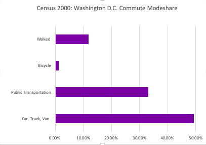
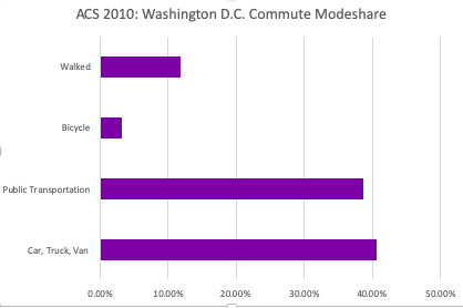
Since demand and inherent preference are difficult to measure, we decided to focus on time of trip. Specifically, we decided to examine if individuals are possibly choosing to use ride-share services instead of public transportation in order to save time, or other reasons. We proxied ride-share services for Uber trips and defined public transportation as bus and metro trips. In order to approach this question, we decided to choose Washington D.C., since its a city with an established metro and bus system that also has experienced a proliferation in the use of ride-share services. Historically, Washington D.C. also has a strong culture of investing in and using public transportation for commute, with about 30-40% of the population using bus or metro as their mode over the last four decades to get to work. This proportion of mode share is shown below from the ACS 2010 and Census 2000 survey.
We also decided to look at transit trips during morning rush hour (defined as 7-10 am), since that is a time of day where trips are consistent, often lengthened, and saving time can be especially crucial since the time commuters must arrive at work is usually inflexible. We used Washington D.C.’s open data portal to find the bus and metro stop locations, the American Community Survey to determine the densest residential census tracts, LEHD to find the most important commercial tracts in the city, Google Maps and Waze to manually determine the length of transit trips during morning rush hour, and Uber movement data to look at the average length of trips during the same time frame. We used tracts as our geographic unit, because it is the basic unit in the Uber movement data. On this page, we will outline our methodology, results, and then discuss our conclusion and further considerations.
II. Methodology
Our process was divided into three parts:
- Identifying target residential and commercial census tracts for our analysis by density
- Assigning those tracts a public transportation score in order to control for tracts in Washington D.C. that are well-serviced
- Determining and comparing Uber and Public Transportation trip lengths between those tracts during the morning rush hour window
Part I:
The map above shows the census tracts in the Washington Metropolitan Area and their corresponding Uber Movement ID.
In order to narrow the scope of our question to focus on the most important trips between residential and commercial areas in Washington D.C., we decided to identify the densest residential and commercial census tracts. Using the 2015 5-year American Community Survey, we downloaded the population density by tract table, and pulled out the Census tract numbers for the 20 densest populations by residence. These tracts had approximately 26,500-67,000 residents per square mile. Then, we used the 2015 LEHD data to determine the 20 tracts with the highest concentration of jobs. After eliminating the overlap, we had 15 commercial tracts and 21 residential tracts scattered all across the city. While we looked at the entire DC-DMV area, the 36 tracts in question all ended up being in D.C.-proper.
Uber Movement data assigns an address to each census tract number that is in the center of the tract. In order to match each address to the American Community Survey’s tract number, we had to identify the tract on a map by finding Uber’s central address. For example, census tract 30’s address is 3100 13th Street Northwest, which is located right at the heart of Columbia Heights. In order to match this tract with the metro and bus stop data, we manually determined each of the relevant census tract address’ geo-coordinates. After doing so, we were ready to make the public transportation score for the residential and commercial areas of key density.
Part 2:
Once we had the 21 residential and 15 commercial tracts, our next step was to control for tracts where there was little public transit accessibility. The reason for this is that if we want to compare commuting by Uber and public transportation, we can only use trips where public transportation is a real and viable option at both the start and end.
We did this by calculating a public transit score for each of the tracts. The idea behind this score was that it aggregates quantity and proximity of transit in the area. The equation uses location data for all WMATA stops (metro and bus) and uses the distance from the tract center to these stops. The score weighs metro stops significantly more, since they are the hub too many more routes at once and cover a larger distance. A census tract gets 1 point for every bus stop within 700m from its center, 2 points for every bus stop within 300m, 5 points for metro stops in a 2 km radius, and 15 points if there is a metro stop in the tract. Note that while it seems too heavily weigh metro stops, this aggregation was necessary because there are only around a hundred metro stops in the DC area but over 11,000 bus stops.
The map below visualizes the transit scores of the different tracts we looked at. The green markers represent residential tracts and the yellow commercial. The larger the size of the icon, the higher the public transportation score for that census tract. The maximum score received by one of the tracts we looked at was 114 and the minimum score was 13. As expected, we can see that the tracts with the highest transit scores tend to be near the city center.
Once we had these scores, we decided to choose the 8 tracts with the highest amount of public transportation in both the residential and commercial category (16 tracts in total). Because we have to manually determine the travel length, we thought this number was a feasible but still a comprehensive amount of trip permutations to examine. Then, we needed to find the average travel times using both Uber and public transportation for all 64 trips, from residential to commercial specifically.
Part 3:
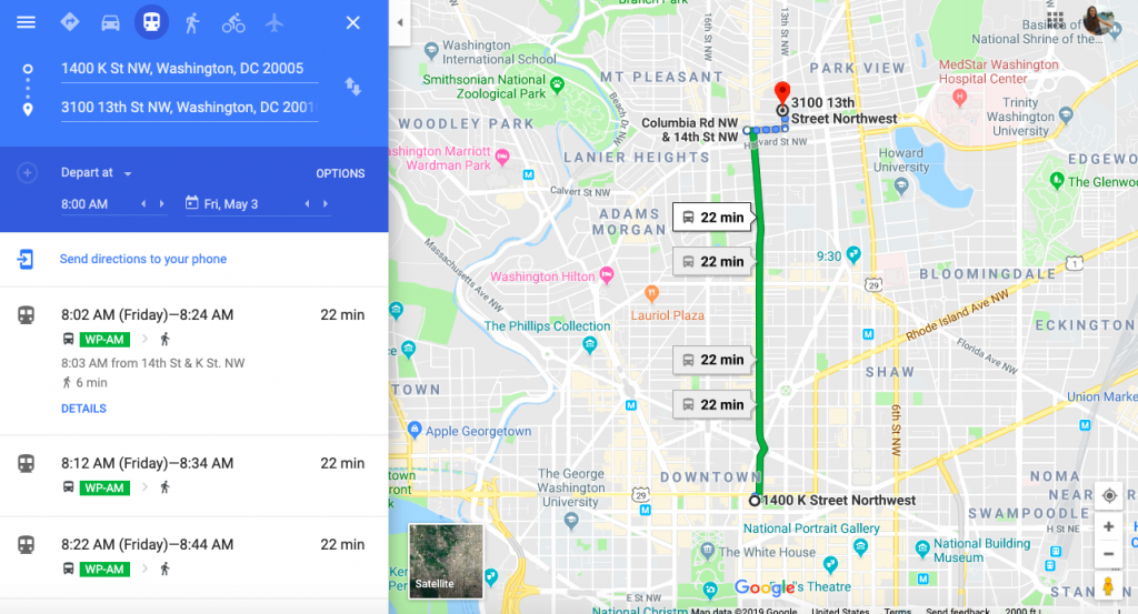
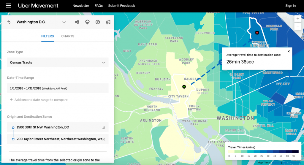
In order the determine the public transportation time, we checked the trip time on Google Maps and Waze across several days and times during the morning rush hour window (defined by Uber as 7-10 am) during the week of May 5th, and then used the average. Then, we downloaded Uber Movement data to obtain the average time of these routes using Uber. Uber movement data gave us an aggregated average time from January to March 2019 during the 7-10 am morning commute window. Since the data file available to download did not have all the combinations and times needed, we also had to manually check some routes. A visualization of our process can be see in the pictures below.
After getting both times, we imported the trip times into R and analyzed the differences. The map below shows all of the 64 routes examined between the 16 census tracts, with darker colors representing longer trip lengths.
III. Results
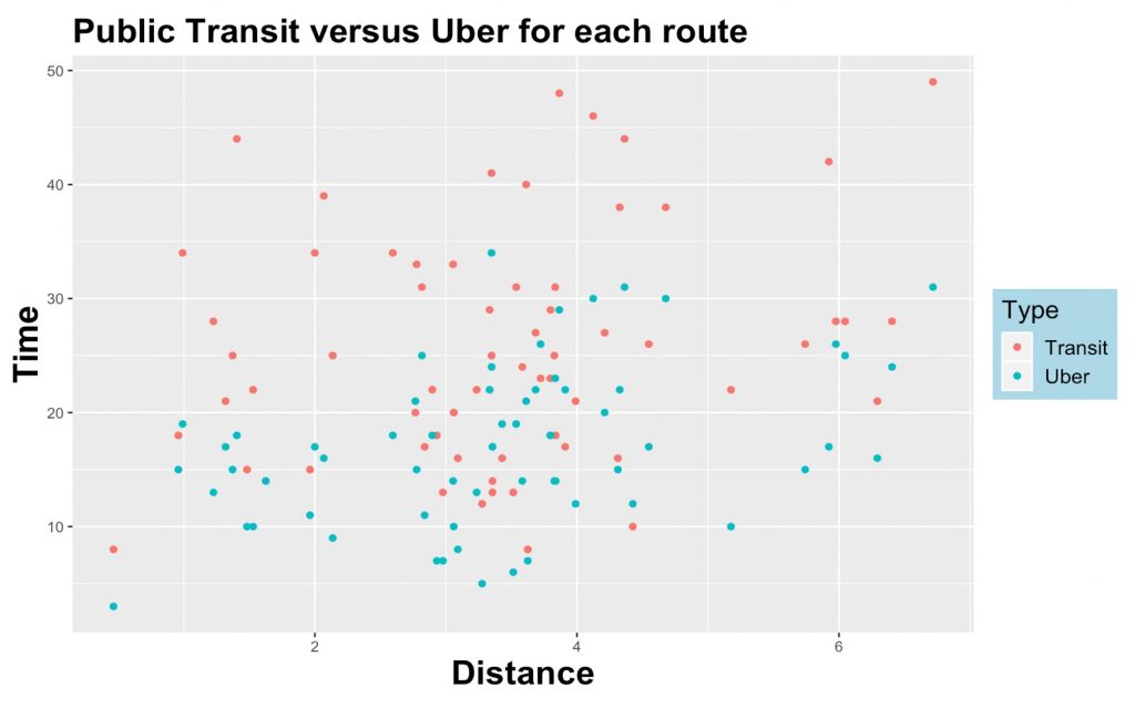
As demonstrated in our first graph, our results show that a striking majority of the transit trips take more time than the Uber ones. While we expected to see some trips, especially lengthier ones, be shorter using Uber, we were very surprised to find that such a high percentages took less time on Uber. Especially considering the limited road space in the D.C.-DMV area and how public transit-oriented Washington D.C.’s planning department is. These findings illustrate that residents who prioritize minimizing their travel time are incentivized to use Uber over transit.
Below is a different way to visualize our same results. Our second graph demonstrates how much faster Uber trips are than transit ones. The y = x axis shows the amount of trips which are the same time on public transportation and Uber, and the y = 2x shows the amount of trips that are twice as fast using Uber over public transportation. The graph shows there are more routes that take twice as long by transit (above the y = 2x line) than there are routes who take less time by transit (below the y = x line).
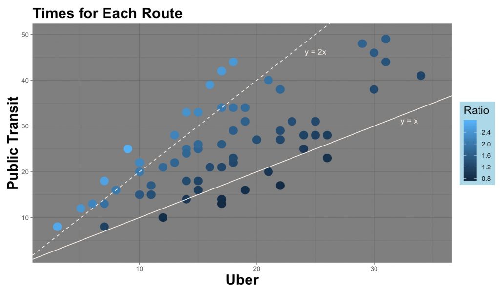
This was surprising, because it demonstrated that not only is Uber more advantageous in terms of time for most trips, but that the gap of time itself is much larger than expected.
To our surprise, we also found that there was an insignificant correlation between the distance of the trip and the ratio of public transit time to Uber time. This is visualized in our third graph below.
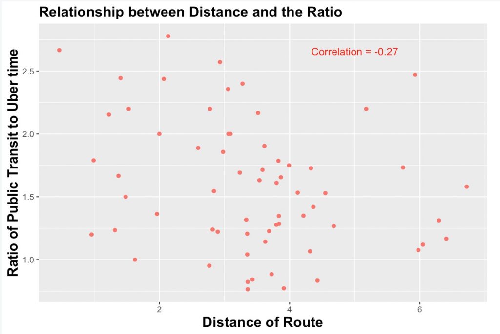
This means that given longer or shorter trips, we would expect transit to take a proportionally equivalent amount of time more than Uber or the ride-share.
IV. Conclusion & Further Considerations
If the most dense residential and commercial districts in a city such as Washington D.C., with such a rich history of transit investment and use, still see such a disparity in trip time between Uber and public transportation, it can be inferred that other major metropolitan areas in the United States have even further to go. In an era of rapid urbanization and displacement of poor individuals from city centers, expansive and resilient public transportation systems are necessary to promoting functioning, sustainable, and equitable cityscapes. Uber and other ride-share companies having the advantage of time over public transportation will negatively impact infrastructure, congestion, and city pollution. Since only individuals who can afford to use ride-share companies can prioritize time of trips, this disparity could exacerbate economic inequality and create a two-tiered transit system, where middle and upper income individuals can opt for ride-share and low-income individuals who are increasingly pushed further and further away from residential centers will continue to rely on public transportation systems. This will hurt city government’s farebox recovery ratios and risk dis-incentivizing investment in public transportation. The beginning of these effects have already been seen in cities across the United States, and will only continue to be exacerbated as ride-share companies evolve and become more deeply embedded into our culture.
Our findings suggest that more research needs to be done on how to incentivize individuals who can afford to prioritize time over cost to choose public transportation over ride-share. Similarly, more investment in public transportation is needed to lessen the difference in time between Uber and transit trips in Washington D.C. and cities across the United States. Policy solutions could include further taxing Uber use, repurposing roadway space to bus or carpool only lanes, rewarding employers who encourage their employees to use transit in their commute, and expanding the amount of bus and metro stops. These could be paired with awareness campaigns about the detrimental impacts of pollution and congestion on environmental sustainable, and how disinvestment in public transportation is an equity issue in quickly gentrifying and evolving United States cityscapes.