Building a typeface
Colorful Communication
Project Description:
A class project for “Interface Aesthetics:” designing a typeface using objects in our environment.
Approach:
I wanted my typeface to be lively and harmonic and chose to work with colored pencils. To offer continuity to my letters, I arranged the pencils based on gradient and then used them cyclically. Rather than using the pencils as lines, I chose to play with the materials and the white space. I used the orientation and points of the pencils to add as much color as possible.
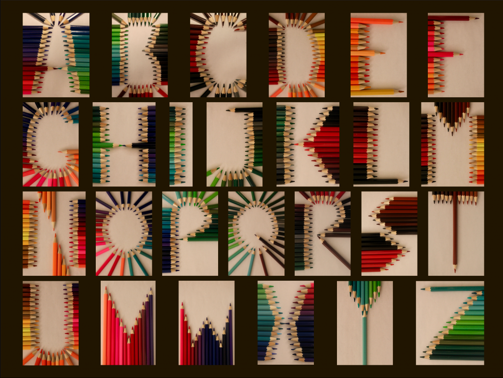
Main insights:
Striking the right balance between color and functionality is challenging and requires thoughtful design and many iterations. Especially when it comes to the use and utilization of colors, a universal design approach is essential. Unfortunately I didn’t take those constraints into account when I created this project, but hope to do so in future ones.
Note:
My poster is currently being featured in the lobby area of the Information School at UC Berkeley.