Project Overview
Bike share programs have risen in popularity in recent years and have been promoted as a lower carbon alternative to other forms of transit. Interest in bicycle sharing has been growing exponentially over the past decade, resulting in a proliferation of bike share systems in 712 cities across the world, encompassing 806,000 bicycles and 37,500 stations (Shaheen et al., 2014). This can be largely attributed to the successful incorporation of information technology in docking stations and mobile devices as well as improved logistics such as bicycle rebalancing to ensure responsive supply management. Cities often hope bike sharing will bring many benefits such as extending the reach of transit, substituting motorized trips, and encourage non-cyclists to try cycling (Shaheen et al., 2014).
The premise of bicycle sharing is that it is a short-term bike rental system, based on varying timed memberships. Members of the bike share network have access to stations, comprised of a pay-station and multiple bike docks, across the system where bikes can be checked out from one station and returned to another nearest to their destination. The appeal of membership is 24/7 access to an automated bike rental network and utility of bikes in completing “last-kilometer connections” (Shaheen et al., 2014) without the worry of storage or maintenance. The price system is set to encourage shorter trips (less than 30 minutes in time), with additional fees for any time used over that maximum.
There is evidence that bike share users switch to bike share from motorized transport, such as bus and auto (Shaheen et al., 2014), creating the potential for significant reductions in transportation related greenhouse gas or CO2e emissions. However, there is significant heterogeneity between different cities (Shaheen et al., 2014), showing that there is not a guaranteed CO2e reduction benefit from instituting bike share, especially if the trips would not have been made otherwise or are substituting walking and private bicycle trips.
This blog post analyses New York City’s Citi-Bike share system to understand the spatial design considerations as well as usage patterns that emerge from this analysis. The final goal is to use this analysis as the basis for developing CO2e emission numbers normalized by passenger kilometre travelled (PKT) for a bike share program so that it may be compared to other modes of transportation.
Data Sources and Methodology
New York City’s Citi Bike system operated by a private company named Motivate, was used for this analysis which focuses on the location of the bike docks, artificial rebalancing efforts within the system, usage patterns and user demographics. Data was obtained from the detailed trip data available on the Citi-Bike website’s open data portal, from their operating monthly reports on the New York City Open data portal as well as complementary statistics from the New York City Open Data Portal. Python’s analytical functions were used for generating descriptive statistics and visualizations were created using both Python’s visualization libraries as well as online visualization tools like MapBox and CartoDB.
The data about trips undertaken within the system was extremely detailed in terms of trips origin, trip destination, geo-locations of the stations and duration of trips along with description of the user in terms of gender, enrolment status and birth year. That combined with the large amount of trips undertaken on the system (~ 9 million trips in calendar year 2014), the system boundary for this particular analysis was limited to calendar year 2014. This particular year was chosen because it is the first year with a complete data set which was needed for analysing usage patterns across different months and seasons in a year.
Analysis and Visualizations
The Citi-bike trip data set was a massive in size containing over a million observations per month. So, in order to better understand data set for generating useful visualizations for developing more relevant insight about the system, a set of descriptive statistics were generated. The concise output of that analysis is illustrated in the table below.
From an environmental impact stand-point as well as the impact of bike-shares on ridership of other modes of transit it is very important to know all of the parameters mentioned above. The number of miles ridden per trip will allow us to estimate the nature of trips bikes are likely to replace. The number of miles ridden per bike combined with the life-times of bikes will allow us to estimate the average maintenance times which are an important contributor to the net environmental impact of the system as a whole.
Complementing the set of descriptive statistics above, I also created a dynamic visual for pictorially explaining the spatial spread of the system, MapBox was used in combination with Python to create a dynamic visualization of all the bike stations. The visualization is illustrated below and it clearly shows the much higher density of bike stations in downtown Manhattan as compared to the more peripheral areas of the city.
One group of the key parameters of interest for any bike share system operator are the usage patterns of their system. This is because for effective management of inventory the operator needs to know the variation in demand on a daily as well as monthly basis. This knowledge will help him plan the maintenance and rebalancing operations of bikes within the system without creating supply shortfall.
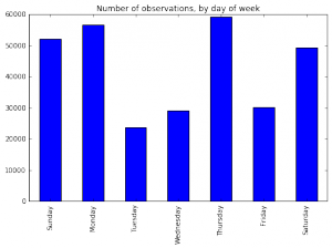
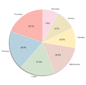
In order to understand the variations in usage of the system, trip data for January 2014 was analysed and visualized. The bar chart below shows the share of trips undertaken within the system classified by days of the week in absolute numbers while the pie chart illustrates the relative split in total trips taken by day of the week.
From the two graphs above, there is no observable trend in the variation of number of trips over the course of the week that might actually help the operator in adjusting his inventory on a daily basis. A more detailed investigation would be required to understand the reasons why the cumulative number of trips on a Thursday in January are thrice the total number of trips on a Tuesday.
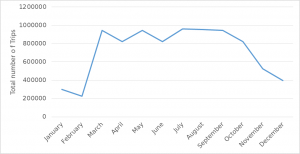
Using python, the cumulative number of trips per month in the system were generated and visualized using a line chart to understand the trends in usage across the entire year. From the graph below, it is very clear that summer months are peak time for bike usage while demand falls away dramatically during the colder winter months. However it is important to note that even in the coldest months, there is still a substantial user base that continues to use the system.
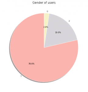
One additional parameter of interest was the demographic make-up of the users of the bike share system. Since the data set provides the gender of each user who rides on the system, a pie chart was created to get a sense of the gender split of users.
As the chart illustrates, 78.6% of all riders within the system for the month of January are males while 19% of the users are female. The data set had missing values for 2.4% of the all the riders in January. There is significant gender disparity between the users of the bike share system and without further data, it is difficult to hypothesize the reasons this.
Finally, one hotspot map each was created using CartoDB for visualizing the bike stations within the system: one for identifying stations from which maximum trips originated and one for identifying stations at which maximum trips terminated for the month of January 2014. The motivation behind this visualization was to better understand the self balancing capabilities of the system and how much artificial rebalancing needed to be undertaken in order to ensure that there are adequate bikes as well as free docks available across the system
The visual above represents the distribution of stations based on the number of trips that originated from a particular station in January 2014. The key take-away from this visualization is that maximum trips originate in the downtown area of the city close to the areas of the city with maximum density of public transit.
A similar visual was created for identifying the stations at which maximum trips terminate. The visual is shown below.
On comparing the two visuals it is clear that there is substantial internal balance in the system because the stations from where most trips originate are also the one where maximum number of trips terminate. This minimizes the need for artificial rebalancing efforts on the operator’s part using vans except for peak times when there would be greater difference in the number of trips originating and terminating at a particular station.
Conclusions
Based on the quantitative as well as visual analysis of the New York bike share system, a number of interesting insights were gained.
One obvious conclusion was that there is a strong seasonal variation in the system usage with maximum usage in summer and minimum usage in winter. This was initially hypothesized because of the harshness of New York’s harsh winters and the treacherous riding conditions that exist during that time. However, despite the adverse weather conditions, there is a strong core demographic that consistently uses the system. This conclusion is based on that fact that even during the months of January and February which are the peak winter months, there are more than two hundred thousand trips in the system.
Based on the hotspot analysis, it is clear that the most used bike stations are the ones closest to public transit. New York has a strong public transit system and the bike share system seems to complement it quite well with a majority of the highest used stations located either close to subway lines or the commuter rail stations in the city.
Based on the locations of the stations and the duration of trips, it can be hypothesized that bike shares are replacing last mile trips that would otherwise be done either on foot or on public transit. This is particularly true in case of New York where a combination of dense public transit network, the road congestion during peak hours and the average trip distance as calculated create a situation where the only potential trips that the bike share system is replacing currently are those that would otherwise have been undertaken either on foot or on public bus. However, more investigation needs to be undertaken before any definitive conclusions can be drawn on this particular hypothesis.
Future blog posts
One aspect of the data that I did not explore in great detail is the intra-day variation in usage of the system. This is also a key aspect that bike share system operators are very interested in because knowing the variation in demand on an hourly basis is another very useful metric for identifying the times of the day when the need for artificial rebalancing is maximum.
Additionally, this work will feed into a larger study calculating the life cycle environmental impacts of a bikeshare system and its ability to substitute other modes of transit with the aim of reducing the overall Greenhouse gas (GHG) emissions due to transportation.
References
Shaheen, S., Martin, E., Chan, N., Cohen, A., & Pogodzinsk, M. (2014). Public Bikesharing in North America During a Period of Rapid Expansion: Understanding Business Models, Industry Trends & User Impacts. All Mineta Transportation Institute Publications. Book 1. Retrieved from http://scholarworks.sjsu.edu/mti_all/1 on September 18, 2015.


