…sort of. I got it spinning, but it’s blurry, and it’s not the GIF I was hoping for.
This final weekly exercise for CP 255 was a good reminder of the way programming works, at least for me, which is as follows:
- I hear about a fantastic new library or function set, and dream of a cool usage for it. In this case, it was matplotlib.animation, which, combined with an orthographic projection in mpl_toolkits.basemap, promised to put me in charge of the earth’s spin. The evil scientist in me simply couldn’t resist.
- It is surprisingly easy to hack together a proof of concept of my new usage.
- It is then maddeningly impossible to get from 99% of where I want to be to 100% of where I want to be. (I also don’t find this to be the interesting or compelling part, double downer.)
In light of this (I imagine) near-universal experience, I had to make some compromises.
First, with time running out, I half-assed the data munging. My data consists of a hand-compiled CSV of the Beatles’ public performances, which I assembled from the ever-reliable Wikipedia. I concatenated city and country fields, and limited my DataFrame to unique values prior to feeding it to Google. One Swedish city had an unusual character in it, which created problems with the Google Maps Geocoding API. Rather than figure out how to do it right, I just dropped that city from my map. Mea culpa. Again, five cities mysteriously failed to receive lat/long pairs from the API. Away they went, though, sadly, they included some pretty important ones, like Tokyo.
Second, I had hoped to embed my animated map as a GIF, but I was unable to fix the integration of matplotlib and ImageMagick. Instead, I exported it as an MP4, which I have attempted to embed.
In case it doesn’t work for some reason (as I write this, it is not, despite my attempts to use both the native player and the WordPress Easy Video Player plugin, which is enormously frustrating), here is a download link, and here is a still image from the animation:
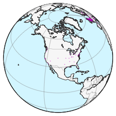
It is an orthographic projection that rotates, beginning with the United States, from east to west around the entire world.
The upshot of the rotation, incidentally, is that the Beatles may have been the biggest popular music act of the 20th century, or ever for that matter, but their physical presence in the Global South was nonexistent.
My other visualization was rather more successful, if less ambitious.
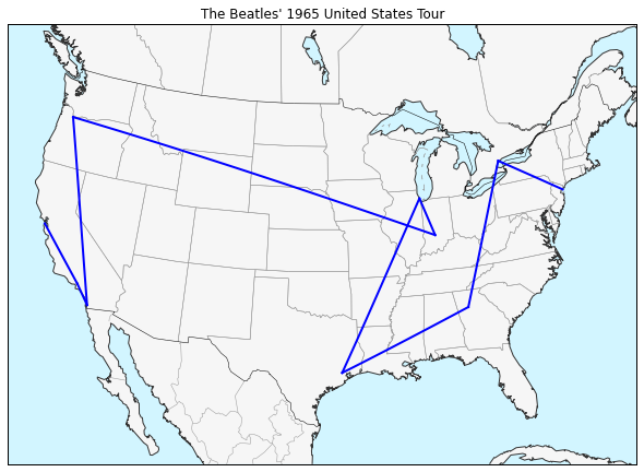
This map documents the Beatles’ famous 1965 United States tour, which began with sold-out performances at the then-new Shea Stadium in New York and marked the absolute height of Beatlemania, even as the group’s aesthetic sensibilities were changing and they chafed against the grueling tour schedule.
I used the basemap.drawgreatcircle() function to map crow-flies paths among each of the Beatles’ concert locations. Because the locations were all major venues, many of which still exist, most of these points are accurate to the rooftop level; other locations devolve to the city level, which is still plenty accurate for this sort of small-scale mapping. The projection is an Albers Conical Equal Area projection centered on the United States, by the way.
I am very interested in any comments on approaches I might take to get ImageMagick working, or embedding MP4 videos, or dealing with the fact that basemap.drawgreatcircle() breaks visually when the two points cross the outer boundaries of the projection surface. (I had meant to document an “Around the World in 80 Days”-style travelogue via spinning globe, but those details proved intractable.) Once more into the breach, say I. – D