Category: Uncategorized

Curbside Demand and Management in San Francisco

Addressing curbside demand and management for the loading and unloading of goods and passengers is a perennial planning issue in many major cities across the world. As businesses, residents and workers compete for a limited amount of curbside space, this frequently results in traffic violations as individuals give up on trying to find a legal opportunity to stop their vehicles. Curbside demand and management has become a particular topic of interest among many cities in North America as movements towards promoting density in urban cores and the proliferation of same-day delivery and TNCs such as Uber and Lyft have created new pressure on curbside space. Cities such as Seattle and Washington, D.C. have developed city-wide curbside demand and management strategies that work to balance goods movement and right-of-way access for multiple modes. San Francisco, with its dense core and constrained geography, is no exception to the previously identified trend of increased pressure  on curbside demand and management.


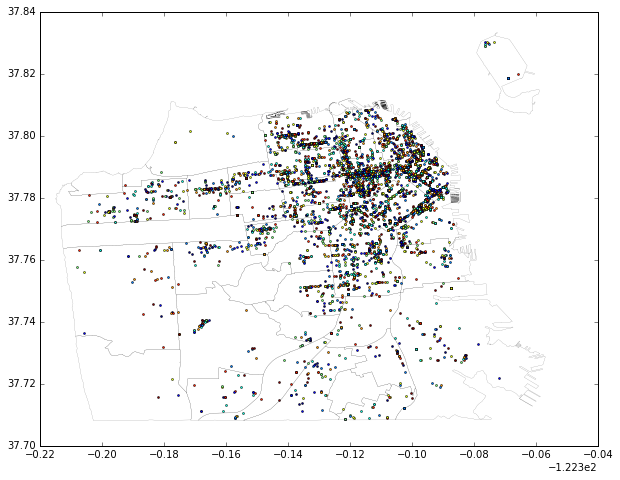
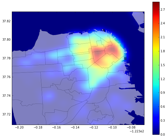
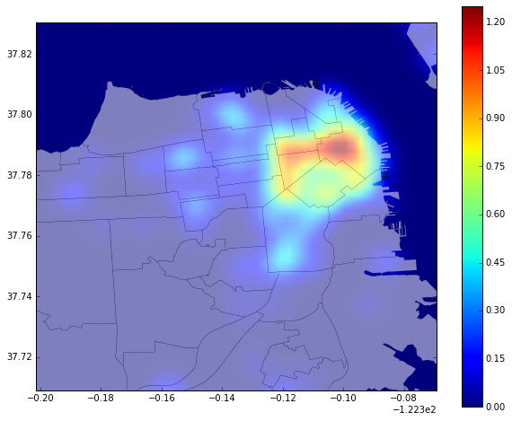
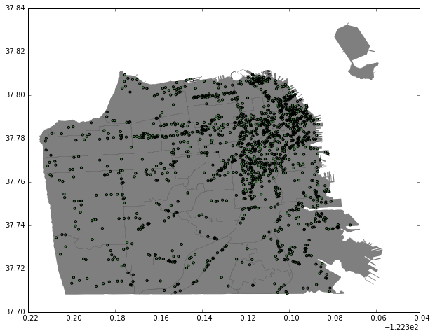
To approach the subject of curbside demand and management as it relates to passenger and commercial loading, it is important to understand the nature of demand placed on curbside loading space in San Francisco. Policies related to curbside demand and management have approached the problem in relationship to time and location of increased demand as well as adjacent land uses that potentially trigger demand for curbside loading. Research conducted by the SF Planning Department on urban freight movement in San Francisco found that conflict over freight movement is most often linked to a lack of adequate space, design issues, vehicle size and loading during peak periods. This frequently manifests as vehicles blocking the travel lane and bicycle facilities. To approach this problem, double parking violations in San Francisco is analyzed as a proxy for curbside demand (and potentially the failed management of curbside space). The location, time and adjacent land uses are examined to better understand what variables might be associated with curbside demand for future policy decisions.
Read more →

Mapping Double Parking in San Francisco

Double parking in San Francisco has become a recurring issue in Bay Area local media. There have been many theories for what has anecdotally become an increase in double parking: inadequate curbside loading,  the growth in transportation network companies such as as Uber and Lyft and the growth of residential and job density in some sections of the city. To better understand the issue, I obtained a data set containing over 65,000 parking violations given by parking control officers in San Francisco since 2014.


MAPPING WITH PYTHON/GEOPANDAS

To work the data, I first geocoded the double parking violations based on the approximate address given by the parking control officer. To do this, I cleaned the data in Python and then accessed both Google Maps and Nominatim through an API to convert street addressed into coordinates. After this process, I made a subset of the data based on 5,000 recent entries as a sample. This allowed me to work more efficiently with the data in the initial exploration phase. As the data included the date of the violation, I used a built in function in pandas to identify the day of the week of the violation. This makes it possible to see differences between weekday and weekend violations. This alone provided interesting insight into double parking. The most double parking violations in this sample occurred on a Wednesday (1,194) while the least occurred on Sundays (131).


Next, I did a simple plot of the data onto a basemap of San Francisco county with neighborhood borders. For this map and all of the following maps, I use WGS84 for the projection/coordinates.


Double Parking Violations in San Francisco: 1/2015 to 08/2016 Sample

Double Parking Violations in San Francisco: 1/2015 to 08/2016 Sample

Next, I created heat maps of this data based on weekday and weekend offenses.


Weekday Double Parking Violations: San Francisco Sample

Weekday Double Parking Violations: San Francisco Sample

Weekend Double Parking Violations: San Francisco Sample

Weekend Double Parking Violations: San Francisco Sample


These maps demonstrate that violations seem to be concentrated in the eastern neighborhoods of San Francisco. While there is some difference between the weekend and weekday maps, this seems to mostly be due to the volume of double parking rather than the areas where it is most present.


DOUBLE PARKING BY NEIGHBORHOOD

To get a better sense of where in San Francisco experiences the most double parking, I performed a spatial join of the basemap with neighborhood information to double parking violations. The results are included below.


Most Double Parking: 

  1. Financial District/South Beach (997 violations)
  2. Mission (880 violations)
  3. South of Market (577 violations)

Least Double Parking:

Seacliff, Twin Peaks and McLaren Park all tied for the least amount of double parking violations at 1 violation each.


OFF-STREET PARKING LOTS AND DOUBLE PARKING

Literature on parking violations related to urban freight movement note that some cities have moved forward with providing off-street loading facilities as a way to address loading demand. Could the better utilization of existing parking lots and structures help reduce double parking due to the lack of  curbside loading facilities in San Francisco’s eastern neighborhoods? To look into this, I was first curious as to where publicly available parking facilities are actually located. I loaded a data set showing all off street parking lots and structures open to the public in San Francisco. I then created a small buffer around these facilities to demonstrate a reasonable catchment area. As the following map shows, the eastern neighborhoods are well represented by these facilities. Given the concentration of double parking in this area as well as off-street parking facilities, it is worth exploring the possibility of utilizing existing off-street parking space to better serve loading demand in San Francisco.


Off-Street Publicly Available Garages with Buffer

Off-Street Publicly Available Garages with Buffer

SF Development Pipeline – Leaflet Edition


To work with Leaflet and HTML, I continued to use the development pipeline data from San Francisco for the second quarter of 2016. As this data shows the status of all projects, I used color to differentiate projects according to the following:

  • Red: Under construction
  • Green: Filed with the SF Planning Department
  • Blue: Building permit application filed

Clicking on each project allows the viewer to see the number of units, the neighborhood as well as more detailed information about the status of the project.

Mapping the San Francisco Development Project Pipeline

For this assignment, I worked with a web API from San Francisco’s open data portal. Specifically, I worked with the development pipeline data for projects in San Francisco for the second quarter of 2016. After connecting to the data, I created a CSV file that included important data points for these projects including the number of units, filing data and status. I then used Carto to visualize this data.


The distribution of projects shown is striking. Certain areas of the  city do show more intense development activity, including a clustering of projects in the South of Market area. On the other end of the spectrum, the Sunset has fewer proposed and approved development projects than other neighborhoods. While there is variance in development intensity among sections of the city, proposed and approved projects are widely represented across almost every neighborhood.

Mapping LGBT History in San Francisco

Google’s user-created custom maps have produced a number of fascinating and bizarre guides to restaurants, public schools and even fallout shelters. Custom maps are easily created by adding user-defined points onto the familiar Google Maps layout. Data from Google Custom Maps can be exported as a KML file, capturing user descriptions as well as exact coordinates. While easily achieved, Google Custom Maps lack much of the functionality of programs such as ArcMap and Carto. As such, Google Custom Maps cannot communicate elements such as change over time as effectively as other mapping programs.


To experiment with the functionality of Carto, I worked with data from a user created custom map from Google. Mike Stabile’s “Lost Gay Bars of San Francisco” shows closed LGBT businesses in San Francisco. In addition to the author’s original research, Stabile has encouraged members of the public to suggest locations. The result is a crowd-sourced vision of LGBT history that shows the rich history of San Francisco’s LGBT communities. While the original map is easily understood, the missing functionality of Google Maps does not allow the user to highlight change over time to show how LGBT businesses concentrate and move across the city.


To work with this data, I first exported Stabile’s map as a KML file and then converted to CSV. This allowed me to edit the data in Excel. By reviewing all of the entries, I was able to make a new column that included a date from the description to help place the location in a timeline. As the descriptions vary in terms of content, the data is limited in only showing the general era for each business rather than a precise opening or closing date. Data that did not include a date in the description was removed for this exercise.


The first map shows the location of businesses from Stabile’s original maps with color coded categories showing the decades associated with each location. By working with Carto’s formatting options, I allowed users to click on each entry to see the name, date and description associated with each closed business. The map includes many legendary local sites for LGBT history including Compton’s Cafeteria, the location of the famous riot against police harassment of transgender patrons in 1966.

While this map begins to show the way LGBT businesses moved across the city throughout the years, I thought it might be interesting to animate this data for a more compelling visualization. As historians such as Nan Boyd have pointed out, the Castro has not always been the center of LGBT business in the city. North Beach as well as Polk Street are historically significant centers of LGBT life in San Francisco. The following animated heat map helps illustrate this shift.

Consistent with historical accounts of LGBT life in San Francisco, the earliest businesses appear in North Beach and the Tenderloin. The Castro does not appear as a major hub until the 1970’s. The enhanced functionality of Carto is especially helpful in showing the timeline of these businesses as a proxy for LGBT communities. While the data used here is certainly limited, it does present a compelling story about the history of San Francisco.


Welcome!

My name is Evan Knopf, and I am a graduate student in the Master of City Planning program at UC Berkeley. I will be using this website to post various projects related to transportation and land use planning. I am particularly interested in using publicly available data provided by various agencies within San Francisco to understand potential impacts of Transportation Demand Management legislation.


I will also post an occasional cat meme.