by Holly Cheek, Justin Han, Isaac Schmidt, Leonard Yang
September 30, 2019
Due to changing consumer preferences, Mediocre Social Network Apps Incorporated (MSNAI) has struggled for the past few years. MSNAI’s stock price fell to an all time low this past quarter, causing investors to grow skeptical about the profitability of the company going forward.
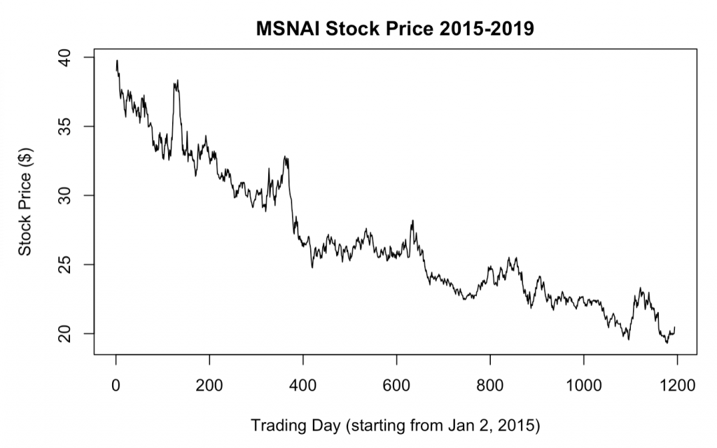
Stock price of MSNAI in dollars from 1/2/15 to 9/30/19. Each unit in the “Trading Day” axis refers to the number of trading days after 1/2/15. Generally, as we move forward in time, the stock price decreases.
MSNAI’s stock price has shown a downward trend since January 2, 2015. MSNAI closed the first trading day of the year with $39.02 per share. Four years later, MSNAI closed 47.5% lower at $20.48 per share on September 30, 2019.
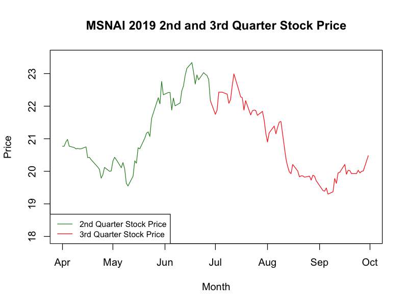
Johnny Appleseed, CEO of MSNAI, has expressed his optimism of the company for this fiscal year. “Our implementation of our state-of-the-art video sharing platform will surprise investors as to what it will do for this company going forward” said Appleseed at the annual Social Network App conference this past January. As predicted, MSNAI’s stock showed optimism during this year’s second quarter, as the company’s stock price made a 13.4% increase.
Stock prices of MSNAI over the past two quarters. Second quarter stock prices shot up 13.4% while third quarter stock prices fell 6.2%.
However, MSNAI’s stock price took a hit in the third quarter. Prices fell 6.2% overall this past quarter–dropping from as high as $23.34 to $19.30, the lowest recorded since its IPO. Investors are skeptical about whether MSNAI can achieve profitability in the future, but Stock Analysts from Jared Fisher Bank™ (JFB) have predicted otherwise.
Stock Analysts have predicted from these initiatives that the stock price is bound to increase for the next ten trading days. Appleseed has been working hard for the last month to drive the video initiatives to adapt MSNAI to changing consumer preferences.
Forecast of MSNAI closing stock prices for the next 10 trading days. JFB predicts a 0.7 % increase in stock price, showing optimism for the final quarter.
Analysts’ forecasts show a slight uptrend in the MSNAI stock price for the next ten business days. This short-term forecast shows that the closing price will be $20.63 on October 15th, 2019—about a 0.7% increase in its stock price from the last recorded price.
Over the entire 4 years, the stock has been decreasing in a non-linear manner, before appearing to bottom-out as recently. However, the stock doesn’t exactly follow the curved trend. Analysts accounted for these random variations by analyzing the stickiness of the stock prices–they can only deviate so much from day to day. Therefore, even though the stock looks to have flattened out, JFB analysts project a continued increase for the next ten days, as MSNAI’s stock price has been on the rise for the past month. The increase isn’t particularly steep because predicting into the future comes with uncertainty. It is always possible that the stock price could shoot way up, or crash down. Even though these extreme outcomes are unlikely, the model has to “hedge its bets” by accounting for these possibilities.
Given JFB Analysts’ predictions, MSNAI could see a slight uptick to its start of the fourth quarter, which hopefully sets the tone for a positive final quarter of the fiscal year. Appleseed and shareholders are hopeful to see MSNAI reverse its fortunes after four years of falling stock prices.
Bike lanes are often seen as harbingers of gentrification (Stein). Our analytical study attempts to find an association between the existence of bike lanes at gentrification, at the census tract level. We collected geospatial data on bicycle facilities from open data portals from four urban areas across the United States—San Francisco Bay Area, New York, Chicago, and Denver, and joined it with gentrification indicators provided by UC Berkeley professor Dr. Karen Chapple and the Urban Displacement Project.
After merging the data from the Urban Displacement Project with the bikes data according to GEOID for each city, respectively, we proceeded to conduct analysis looking to find relationships between the existence of bike lanes and their lengths with the processes and severity of displacement dynamics like exclusion and gentrification. What we found is exploratory in nature but fascinating nonetheless. In the four cities we examined, we discovered two distinct model relationships — a schism you can say — of the direction of the relationship between gentrification and bike lanes. In this bike lane and gentrification context, there seems to exist an East-West geographical divide in this regard. To see what we mean, take a tour with us below.
As concerns over the environmental problems of car use grow, and American urban areas slowly realize the consequences of sprawl and the benefits of density, there has been a movement towards making cities easier to navigate for pedestrians and bicyclists. To encourage “active movement,” cities have been redesigning streets to incorporate bike lanes and make them more pedestrian-friendly. However, there is also a competing concern over gentrification. Easy to recognize but hard to define, gentrification is a form of neighborhood change characterized by the displacement of one group of people by another. Often, those being forced out are minority or lower-income residents, and the replacements are wealthier and largely white.
The installation of a bike lane on a local street is increasingly seen as a sign of gentrification to come, just like the construction of loft apartments or the opening of a new expensive restaurant. Within the past decade, residents in Portland, Oregon, and Washington, D.C. have protested city plans to run bike lanes along their neighborhood streets, and political support for new lanes in bike-crazed New York has dwindled. While discussions over gentrification are often based on anecdotes and qualitative research, our analysis attempts to determine a quantifiable link between the existence of bike lanes and gentrification.
Data Collection and Cleaning
The first question we needed to answer is how to categorically determine if a given neighborhood is gentrifying or not. Fortunately, this work has been done for us by the Urban Displacement Project (UDP), built by researchers at UC Berkeley. Using data from the U.S. Census Bureau’s American Community Survey, and other indicators such as the existence of a commuter rail station, UDP categorizes census tracts in urban areas at different stages of gentrification, such as “At Risk,” “Ongoing Exclusion,” or “Not Losing Low-Income Households.” The website provides data for the San Francisco Bay Area and New York, among other cities, and Dr. Chapple provided us with similar data for the Chicago and Denver areas. For each census tract in the region, we have the gentrification status category as determined by UDP, along with the tract’s unique 11-digit FIPS ID.
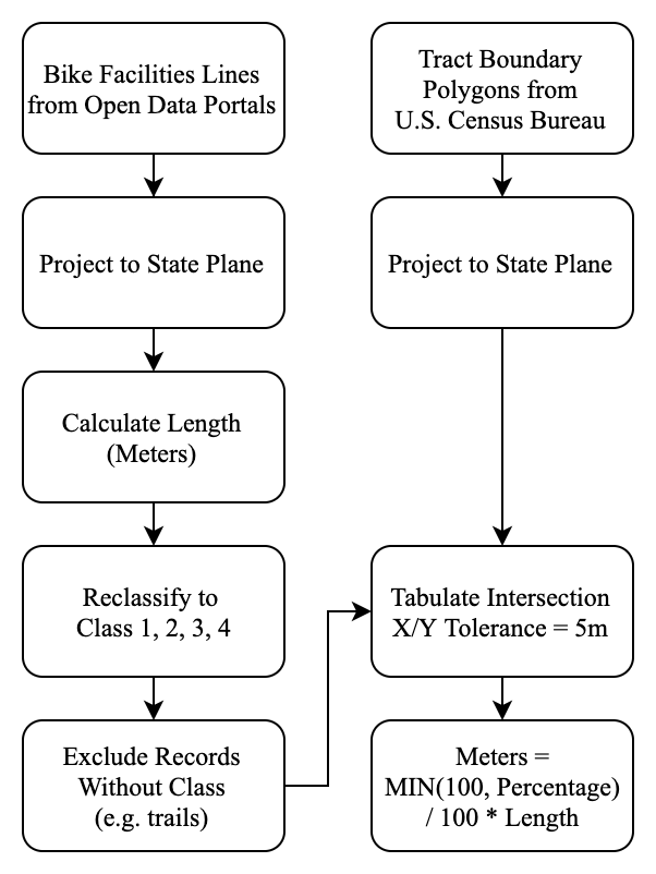
Flowchart for data processing in ArcMap
The next step was to determine the strength of the bike network within a tract. From municipal governments’ and regional associations’ open data portals, we we downloaded line vector shapefiles representing the existing bike facilities in each city. In most cases, the dataset was continuously kept up-to-date, with the most recent updates in February or March 2020, but the Bay Area dataset was dated to October 2018. The data was initially provided in the WGS84 projection, so the first thing we did was project each city’s data into the appropriate state plane projection, to ensure more accurate calculations. For each dataset, we then used the Calculate Geometry tool in ArcMap to determine each lane’s length in meters.
Each city’s original data contained a “class” attribute of some sort, but we needed to standardize it for the purposes of our analysis. We chose the breakdown explained here by the San Francisco Municipal Transportation Agency. Different cities had different starting places, but the end result was that each bike lane was assigned class 1, 2, 3, or 4. Class 3 only represents signage and road markings, as opposed to an actual segregated bike lane, so we chose not to include it in our analysis. Furthermore, the data provided by MTC did not denote any bike lanes as class 4, which limited our analysis in that regard. See the table below for the description of each class, and see the appendix for how we re-classified each dataset.
Class
Description
1
Off-street paved bike path, typically shared with pedestrians
2
Traditional bike lane, painted line separating bikes from vehicles
3
Not a separated lane, only symbols and signs promoting bike traffic, such as “sharrows”
4
Protected bike lane, separated from vehicles by a buffer or barrier, a.k.a. “cycle track”
The next step was to join this line data to the tract as a whole. We downloaded tract boundary TIGER/Line® shapefiles from the U.S. Census Bureau, for California, Colorado, Illinois, and New York, and again projected each into the appropriate state plane projection. We then used the Tabulate Intersection tool to determine what portion of each bike lane fell within each tract. To account for bike lanes along a tract boundary in real life, but which may not be purely coincident in their digitized representations, we included a small tolerance, so that if a bike lane was within 5 meters of a boundary in ArcMap, it would be considered as along that boundary and thus count for both tracts. For each city, the output was a table, where each row corresponded to a “lane-tract”—the specific portion of the bike lane that was in a given tract. Thus each lane could have multiple rows, as could each tract. Also included was the tract’s FIPS ID, along with the bike lane section’s length (in both meters and miles), its class, and the lane’s unique ID.
The resulting table allowed us to aggregate the data to find the total length of bike lanes within or along each tract. This data should perhaps have been normalized, such as by tract population or land area, or even more elaborate metrics such as the total length of the tract’s road network, or the size of the workforce it hosts. However, for the sake of time and simplicity, we chose to only look at lane-miles per tract.
Unfortunately, this form of data collection leads to limitations. One is the time mismatch between the bike data and the UDP data. For the most part, the data we collected are a snapshot of bike lanes now, as opposed to 2015, the date of the UDP. Furthermore, with the exception of San Francisco, the bike data only shows data for the central city, and not the region as a whole. Another revolves around the accuracy of the bike data. For example, personal observations showed that the Bay Area dataset was missing some bike lanes in Berkeley. Additionally, when there are bike lines on both sides of the street, the data sometimes treated this as one bike lane and in other cases as two bike lanes, which could lead to an over- or under-counting of the true total length of bike lanes. A deeper analysis would involve spending more time cleaning these datasets to ensure consistency and accuracy. Regardless of these issues, we hope that some conclusions can still be drawn from our research.
Methods
When we first started this project, our goal was to perform a time series analysis, where we could analyze a given tract over time, tracking its bike facilities and gentrification status over the years. Our hopes were quickly dashed as the UDP considers tracts at only one point in time, and for the most part, the bike lane data did not have information on when they were installed.
Because our data has limited capability, our analysis is more exploratory than truly concrete. For each urban area, we simply provide a chart showing the average total length of bike lanes (classes 1, 2, and 4) across all tracts with a given UDP type. We then briefly discuss these findings, and conclude with some trends that we found across all cities. Because the typologies across urban areas are not 100% consistent, we can not concretely compare the behavior of different typologies across cities, but we still discuss some qualitative insights.
Ethical Concerns
The biggest concern with our analysis is that the data is very coarse. One bike lane on a commercial thoroughfare probably does not have that large an effect on the makeup of overall tract, which usually spans dozens of blocks. Secondly, our analysis merely looks at a possible association between bike lanes and gentrification—nothing more. To say that the installation of a bike lane in a low-income neighborhood would or would not help bring about gentrification is misleading and probably incorrect. There are without a doubt underlying factors that impact both.
Another important point is that bike lanes are often used by people who live outside of the census tract. Many commutes and other trips cross multiple tracts, which means the beneficiaries of a bike lane consist of more than just tract residents. Further analysis could incorporate travel surveys or the American Community Survey to try and determine what portion of a bike lane’s users are actually local, and how that plays into neighborhood change.
Finally, whenever we build a model, especially in urban analytics, we are always missing context. The Urban Displacement Project has done a terrific job categorizing different neighborhoods, but it can not be taken entirely at face value. Looking at UDP’s maps, or our reproductions below, one might assume that two tracts in the a given category might be the “same”—that there is no difference between them. We must make this assumption for the purposes of our analysis, but by doing so we lose the individual stories that make cities, cities. While we present our results below and draw conclusions from them, it is important to be cognizant of what we are looking at and what we are not.
Results
San Francisco Bay Area
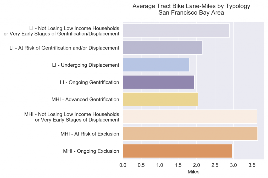
We begin with San Francisco, the closest city to Berkeley of the four. San Francisco is the financial capital of the west coast and one of the most famous — or rather infamous — cities that showcases the splendor and squalor of the modern American city. Vivid juxtaposition of wealthy elites and the homeless living within blocks of each other provides the setting for which the Urban Displacement Project is done. The development of ride-sharing services, especially that of bicycles, is a big development so far. The setting of SF is a perfect place for conducting analysis of gentrification typology and bike lanes. In this table, we can see that in SF, long bike lanes are correlated with generally low risk and mild forms of gentrification. More advanced patterns of displacement, exclusion, and gentrification are in general associated with shorter bike lengths. This realization is the basis of our first model that bike lane length is an indicator of the likelihood a particular community is at risk of being displaced and gentrified in San Francisco. We will call this the “San Francisco Model” going forward.
A clearer image of displacement in the city of San Francisco can be seen in the interactive map below:
Chicago
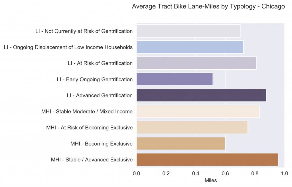
Ah, here we come to the “Windy City”. Chicago is the midwestern city we will be examining next. This will be an interesting case study because as we know, Chicago is a major leader in the US in terms of statistics like homicide rates and violent crime, not particularly things a city wants to be associated with. Let us continue our analysis. Before we begin, we would like to point out that the terminology that is being used is slightly different than that of SF but the general idea is the same. The trend seems to have detracted from that of what we see in San Francisco. For one, the highest amount of exclusion taking place in Chicago is correlated with longer average bike lane lengths. Lower levels of gentrification like “Not Currently at Risk of Gentrification” and “Early Ongoing Gentrification” has the lowest average bike lane lengths. We will call this the “Chicago Model” going forward.
This poses as perplexing question: Is the model of Chicago or San Francisco more revealing of more prominent and common patterns of bike lanes and gentrification?
Denver
The next city on our tour is Denver, Colorado. Although not as famous as its counterparts, Denver is a respectable city in its own right.
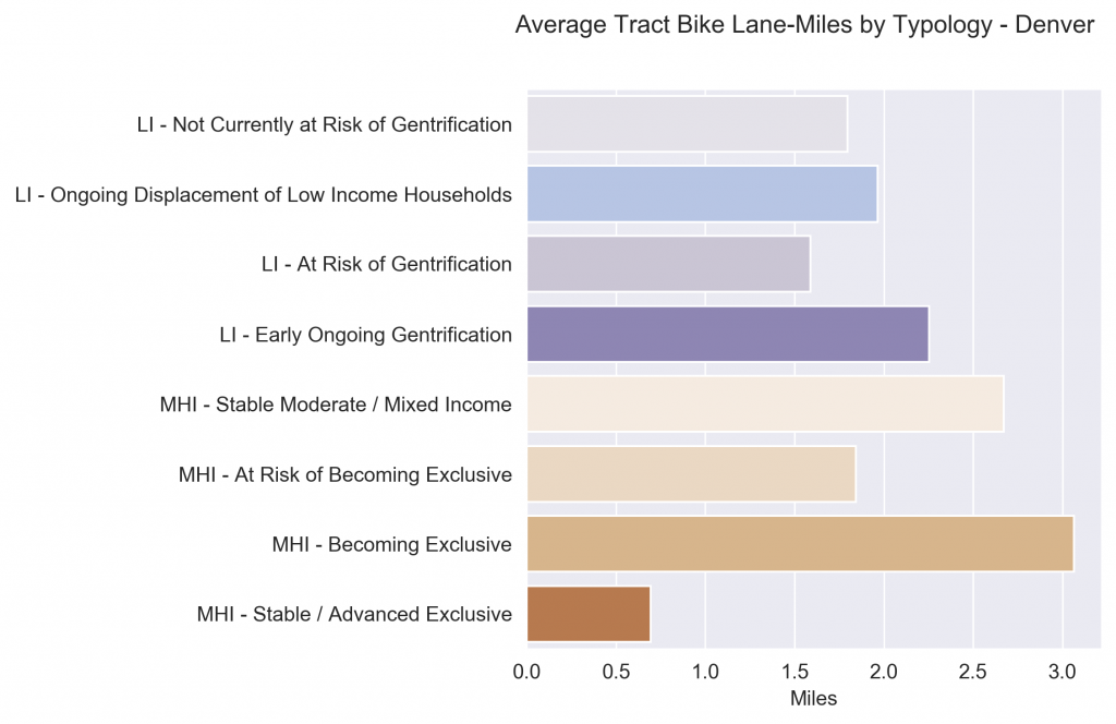
We are moving across to different regions of the United States to see if there is any correlation of the different patterns we have seen before with geographical region. Looking at the graph of Denver, it seems to show that Denver seems to resemble the trends of San Francisco more so than Chicago. In Denver, longer bike lane lengths seem to be associated with undergoing but not severe processes of exclusion. So that means the relationship between average bike lane length and severity of gentrification is more closely related to an inverse one.
Hmm, does there exist an East-West divide in the United States in terms of gentrification direction?
New York
To act upon our suspicions, let us travel to the “Big Apple”.
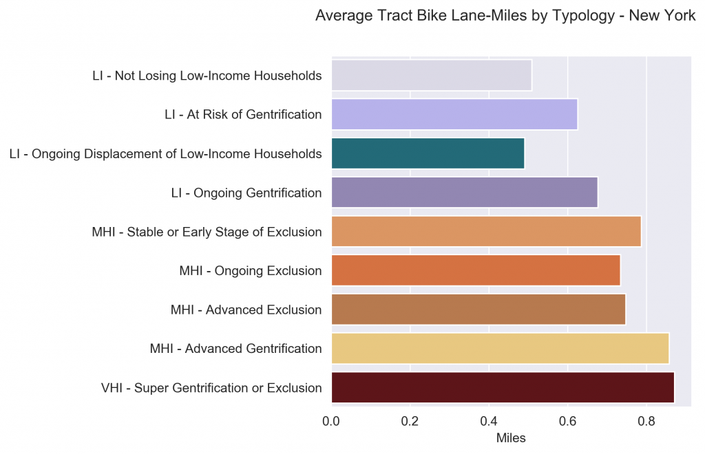
Here we come to New York, arguably the most famous city in the United States. The natural question becomes: Does New York City resemble more of San Francisco’s patterns or Chicago’s patterns? Well, clearly the data shows New York more resembles Chicago with an even more clear direction toward the correlation of more gentrification and longer bike lane lengths and away from the San Francisco model. A follow-up question would be “why is this the case”? What are factors in Chicago and New York that leads to this analytical result that we don’t reach in San Francisco? Once again, our analysis is exploratory in nature because of the limited capability of the data that we obtain at hand. However, those are very worthwhile questions for urban planners to explore in the future!
Conclusions
The data provided by the Urban Displacement Project and Professor Karen Chapple allowed us to do some preliminary exploratory analysis of urban dynamics that involve the interaction between processes like the varying degrees of exclusion, displacement, and gentrification and match them with manifestations on the ground — literally. We conducted similar analysis for four cities with bike data that UDP was conducted in: San Francisco, Chicago, Denver, and New York. These are all unique cities in their own right, bringing different sets of pre-existing conditions that is fascinating for urban planners to study. In our simple analysis above, we have identified and unvealed something we would like to call the “East-West Urban Divide”. This is a term describing the divergence in trends we see between the two western cities (San Francisco and Denver) and eastern cities (New York City, and Chicago). In San Francisco and Denver, more severe forms of exclusion is correlated with shorter bike lane lengths. On the other hand, in New York and Chicago, gentrification is more aligned with longer lengths of bike lanes. The trends are obvious enough to see on the graph but the underlying processes leading to the data visualizations are not so obvious. If possible, the remaining questions of “Why does this divide exist” and “How did this divide come about” would be very natural extensions to our simple analysis in this project.
If we were to describe our project in five words, those will be:
Length matters
Location, Location, Location
These will remain the morals of the story.
Thank you so much for following along with us on our data tour! Thank you CP101 course staff!
For each city, here is how we re-classified each bike lane. The San Francisco Bay Area data already provided a numerical class feature so we did not need to do make any adjustments. For New York, the process was a little more elaborate. There were two fields we considered: “tf_facility” and “ft_facility”. If both were of the same class, we used that class. In the case where one was filled and the other was empty, we used the filled field. In the case where both were filled, but were of different class, we picked the “lower” class, using the order 1, 4, 2, 3.
Chicago				Denver				New York
displayrou		Class	EXISTING_F		Class	tf_facility		Class
ACCESS PATH		1	Bike Lane		2	Bike-Friendly Parking	3
BIKE LANE		2	Buffered Bike Lane	4	Boardwalk		1
BUFFERED BIKE LANE	4	Neighborhood Bikeway	3	Buffered		4
NEIGHBORHOOD GREENWAY	3	Protected Bike Lane	4	Buffered Conventional	4
OFF-STREET TRAIL	-	Shared Roadway		3	Curbside		2
PROTECTED BIKE LANE	4	Shared Use Path		1	Dirt Trail		-
SHARED-LANE		3	Trail			-	Greenway		1
								Link			1
								Protected Path		4
								Sharrows		3
								Sidewalk		1
								Signed Route		3
								Standard		2
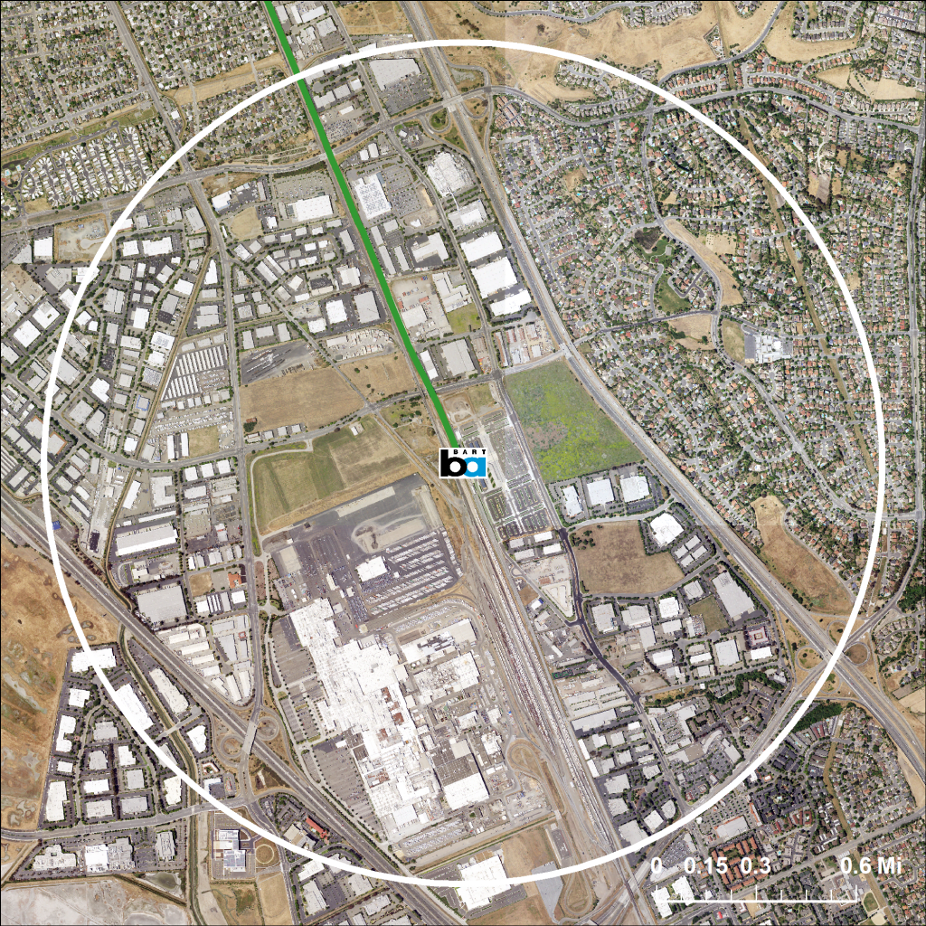
In this series of visualizations, we will be giving a close look at the BART stations in the Fremont Area and analyze some population characteristics of the local census tracts that will help us gauge the accessibility of different groups of people to the Fremont and Warm Springs BART stations, as well as the proposed Irvington Station, to be built between the two. More precisely, we would like to look at how the physical location of each station and access to the BART network vary for different groups of people through both a spatial (e.g. walkability) and a socioeconomic (e.g. wealth) perspective.
Visual 1: Station Location
Warm Springs BART Station
1 Mile Radius
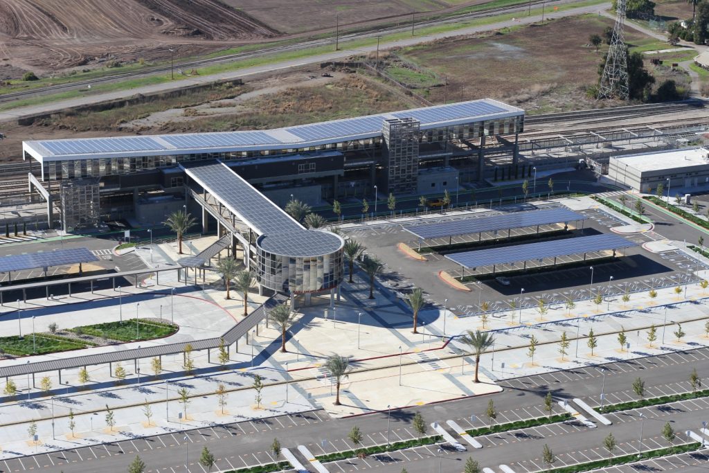
Included here is a photo of the new Warm Springs/South Fremont BART station, as well as a satellite image of the surrounding area. The station is located at the center of the image, with the white line drawn one mile away from the station, as the crow flies. Having opened to the public in March 2017, the Warm Springs station certainly looks sleek and modern, with glass tiling, and rooftop solar panels that capture more than enough energy to run the station. The official project web page claims “the Warm Springs / South Fremont Station is fully accessible to pedestrians and bicyclists,” and that “the site development is well integrated within the surrounding infrastructure, both existing and planned.”
However, both of the above images show that the immediate surrounding area is relatively empty—beyond parking lots are empty fields or industrial complexes. The only notable residential development located within a mile of the station is to the northeast, but it just so happens to be on the other side of a freeway. Thus, while the station itself may be completely accessible for pedestrians once they are there, getting there is a different story, which we will delve into in the next section.
Visual 2: Walkability
The above map shows an approximation of the time it would take for a “normal” pedestrian to walk from a given location to either the Fremont or Warm Springs BART station. The colored regions indicate all areas within one hour’s walk of a BART station, assuming a speed of 3 miles per hour. Click on the map to see a precise time for a specific location, or click and drag the “Walking Range” tab to see all the areas that fall within your own range of times.
In contrast with the circle on the satellite image in the first visual, this map gives a better indicator of spatial proximity, because it takes the actual road network into account—people do not walk in a straight line from their origin to their destination. From zooming in on the map, it is clear that hardly anybody lives within a ten minute walk to a station, and many residential areas, including the Mission San Jose and Niles neighborhoods are more than a half-hour walk away. The Irvington neighborhood, approximately one hour away from either station, appears to be the perfect spot to place another station to increase walkability. Finally, this map only considers the road network as a whole, without regards to the existence of sidewalks or pedestrian crossings. It may be the case that the shortest route to a station is not actually walkable, which would contract this map even more.
The point here is that BART stations in the Fremont area are not particularly accessible on foot. Residents wishing to take BART must drive to the station, and those without a car are left relying on public bus service. A big goal of increasing commuter public transit service is to reduce carbon emissions from driving, but if a potential rider has to get in his car to get to the station in the first place, some of that desired effect is counteracted and reduced.
Visual 3: Housing Prices
This map shows the median monthly gross rent within each census tract around the Fremont BART station. The darker the purple color, the higher the rents. Click on an individual tract to see specific values.
Our aim here was to see if there was any association between proximity to BART and housing values. Since many housing units in the tracts closest to the station are renter-occupied, we chose to look at monthly rent as opposed to the traditional home value. At first glance, there does not appear to be any obvious trend. However, notice that the tracts containing the station and those immediately to the south and east have higher rents than the tracts in the Centerville district to the west. Ignore the larger tracts to the east as they contain hardly any rental units, and have very large margins of error.
While we do not see a clear radial pattern, with intense purple very close to the station that gradually tapers off the farther away we get, there is no doubt that rents are higher in areas closer to the BART station. This correlation may not be completely attributable to BART—it could simply be the case that BART is located downtown along with lots of other amenities, and the existence of those amenities is what raises rent prices. Of course, the question remains over who can afford to have easy access to BART stations, and who can not.
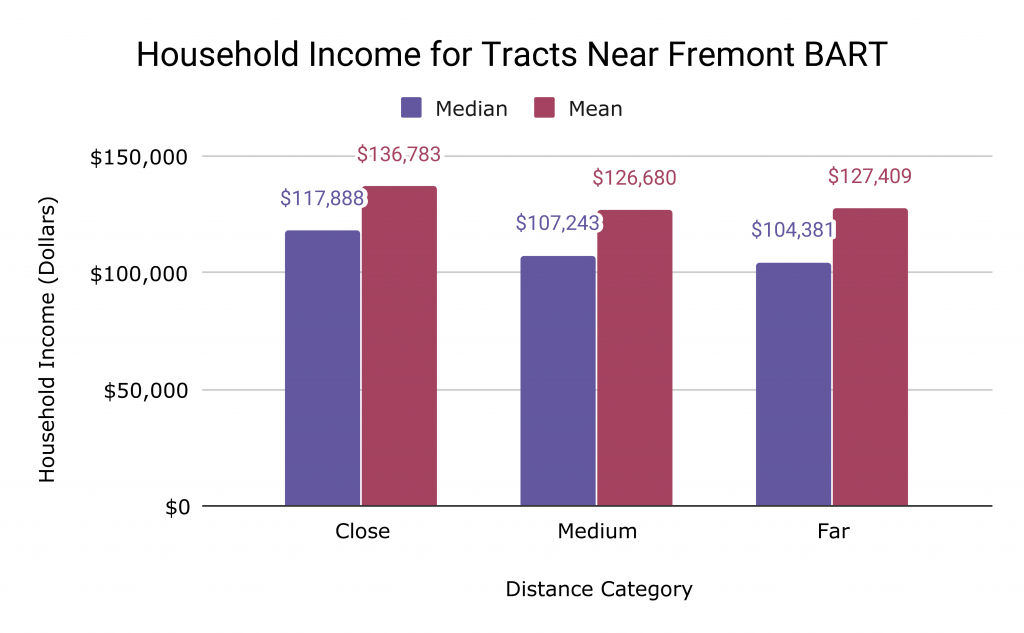
Visual 4: Indicators of Wealth
Source: American Community Survey 2013-17 Accessed through SocialExplorer, Tables A14006, A14008
We would like to look for some correlation between spatial proximity to the Fremont BART station and the level of wealth in a given area, this time attacking the problem in a slightly different way.
Our initial idea was that because rent prices are generally higher for census tracts closer to the station, the level of household income is likely also higher closer to the station. Through some exploratory data analysis, we see that there is a positive association between median household income and proximity to the station. The change in median household income as distance increases is not linear, with the decrease in household income much larger between “close” tracts and “medium” tracts (roughly 9.9%) as opposed to “medium” and “far” tracts (roughly 2.7%). To see which tracts fall into which category, click on the map in the third visual.
These insights suggests to us that the BART system in the Fremont area is much more accessible to higher income households. However, a tangential finding suggests that the relationship between distance and wealth diminishes the farther we get from the station.
Conclusion
The Fremont area is one of many examples of urban sprawl. Such areas were not developed with public transit in mind, but planners are doing their best to provide these regions with service given pre-existing conditions on the ground. One example of such a project is the extension of the BART system from its previous terminus at Fremont, to a few miles down near Warm Springs. Our brief analysis shows that BART in this area does not do much to curb the near-necessity of owning a car in the area, nor does it provide much access to those who may be lower-income. While this expansion may give wealthier suburbanites an easier, more environmentally-friendly way of traveling through the Bay Area, it fails to account for everybody.
U.S. Census Bureau. American Community Survey, 2017 American Community Survey 5-Year Estimates. Table A14006. Prepared by Social Explorer. (accessed Mar 20 2020).
U.S. Census Bureau. American Community Survey, 2017 American Community Survey 5-Year Estimates. Table A14008. Prepared by Social Explorer. (accessed Mar 20 2020).
U.S. Census Bureau. 2013-17 American Community Survey. Table B25064. Median Gross Rent. (accessed Mar 20 2020).
U.S. Geological Survey. 2016. National Map. (accessed Mar 20 2020).