by Rowan Pan and Isaac Schmidt – CP101
03/21/2020
Introduction
In this series of visualizations, we will be giving a close look at the BART stations in the Fremont Area and analyze some population characteristics of the local census tracts that will help us gauge the accessibility of different groups of people to the Fremont and Warm Springs BART stations, as well as the proposed Irvington Station, to be built between the two. More precisely, we would like to look at how the physical location of each station and access to the BART network vary for different groups of people through both a spatial (e.g. walkability) and a socioeconomic (e.g. wealth) perspective.
Visual 1: Station Location
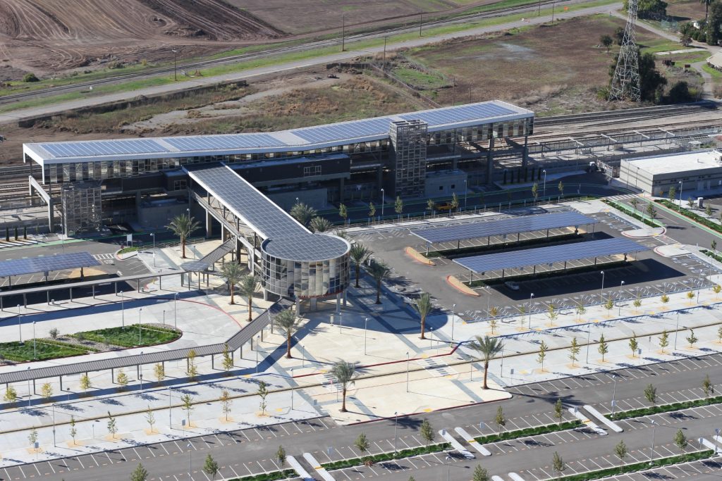
Warm Springs BART Station 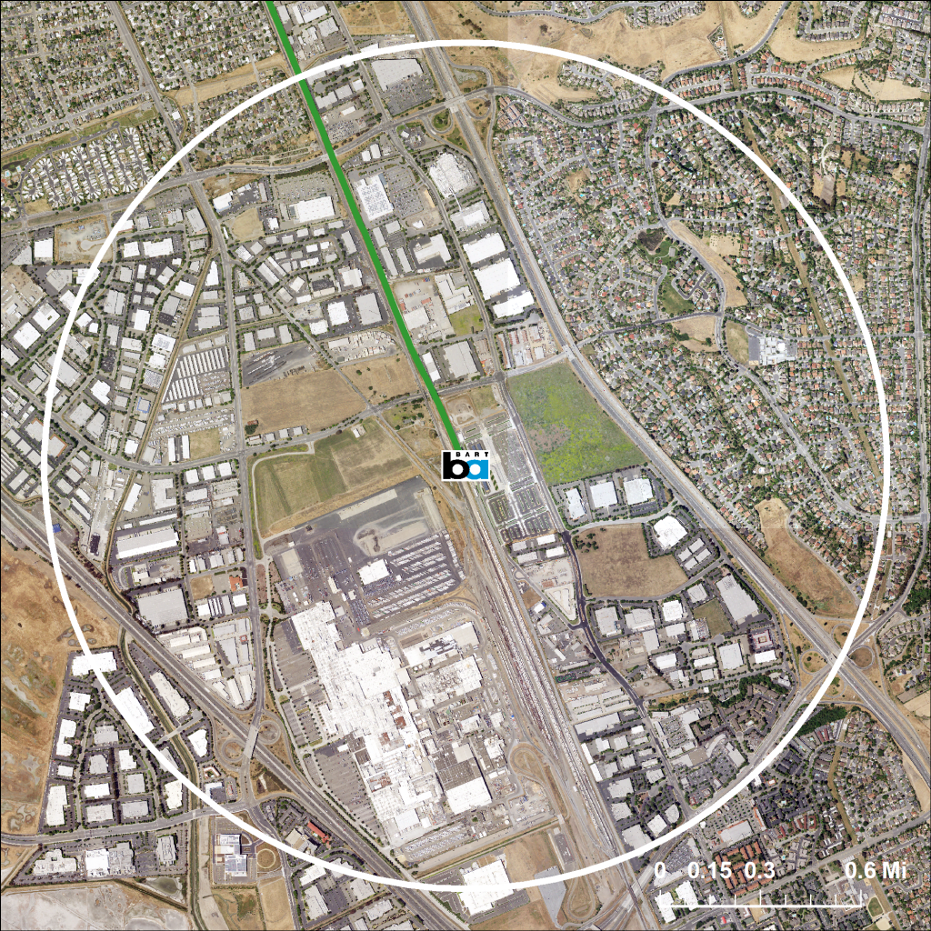
1 Mile Radius
Included here is a photo of the new Warm Springs/South Fremont BART station, as well as a satellite image of the surrounding area. The station is located at the center of the image, with the white line drawn one mile away from the station, as the crow flies. Having opened to the public in March 2017, the Warm Springs station certainly looks sleek and modern, with glass tiling, and rooftop solar panels that capture more than enough energy to run the station. The official project web page claims “the Warm Springs / South Fremont Station is fully accessible to pedestrians and bicyclists,” and that “the site development is well integrated within the surrounding infrastructure, both existing and planned.”
However, both of the above images show that the immediate surrounding area is relatively empty—beyond parking lots are empty fields or industrial complexes. The only notable residential development located within a mile of the station is to the northeast, but it just so happens to be on the other side of a freeway. Thus, while the station itself may be completely accessible for pedestrians once they are there, getting there is a different story, which we will delve into in the next section.
Visual 2: Walkability
The above map shows an approximation of the time it would take for a “normal” pedestrian to walk from a given location to either the Fremont or Warm Springs BART station. The colored regions indicate all areas within one hour’s walk of a BART station, assuming a speed of 3 miles per hour. Click on the map to see a precise time for a specific location, or click and drag the “Walking Range” tab to see all the areas that fall within your own range of times.
In contrast with the circle on the satellite image in the first visual, this map gives a better indicator of spatial proximity, because it takes the actual road network into account—people do not walk in a straight line from their origin to their destination. From zooming in on the map, it is clear that hardly anybody lives within a ten minute walk to a station, and many residential areas, including the Mission San Jose and Niles neighborhoods are more than a half-hour walk away. The Irvington neighborhood, approximately one hour away from either station, appears to be the perfect spot to place another station to increase walkability. Finally, this map only considers the road network as a whole, without regards to the existence of sidewalks or pedestrian crossings. It may be the case that the shortest route to a station is not actually walkable, which would contract this map even more.
The point here is that BART stations in the Fremont area are not particularly accessible on foot. Residents wishing to take BART must drive to the station, and those without a car are left relying on public bus service. A big goal of increasing commuter public transit service is to reduce carbon emissions from driving, but if a potential rider has to get in his car to get to the station in the first place, some of that desired effect is counteracted and reduced.
Visual 3: Housing Prices
This map shows the median monthly gross rent within each census tract around the Fremont BART station. The darker the purple color, the higher the rents. Click on an individual tract to see specific values.
Our aim here was to see if there was any association between proximity to BART and housing values. Since many housing units in the tracts closest to the station are renter-occupied, we chose to look at monthly rent as opposed to the traditional home value. At first glance, there does not appear to be any obvious trend. However, notice that the tracts containing the station and those immediately to the south and east have higher rents than the tracts in the Centerville district to the west. Ignore the larger tracts to the east as they contain hardly any rental units, and have very large margins of error.
While we do not see a clear radial pattern, with intense purple very close to the station that gradually tapers off the farther away we get, there is no doubt that rents are higher in areas closer to the BART station. This correlation may not be completely attributable to BART—it could simply be the case that BART is located downtown along with lots of other amenities, and the existence of those amenities is what raises rent prices. Of course, the question remains over who can afford to have easy access to BART stations, and who can not.
Visual 4: Indicators of Wealth
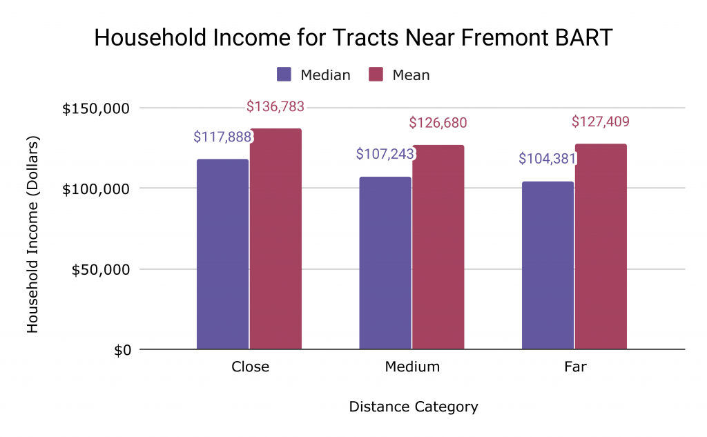
Accessed through SocialExplorer, Tables A14006, A14008
We would like to look for some correlation between spatial proximity to the Fremont BART station and the level of wealth in a given area, this time attacking the problem in a slightly different way.
Our initial idea was that because rent prices are generally higher for census tracts closer to the station, the level of household income is likely also higher closer to the station. Through some exploratory data analysis, we see that there is a positive association between median household income and proximity to the station. The change in median household income as distance increases is not linear, with the decrease in household income much larger between “close” tracts and “medium” tracts (roughly 9.9%) as opposed to “medium” and “far” tracts (roughly 2.7%). To see which tracts fall into which category, click on the map in the third visual.
These insights suggests to us that the BART system in the Fremont area is much more accessible to higher income households. However, a tangential finding suggests that the relationship between distance and wealth diminishes the farther we get from the station.
Conclusion
The Fremont area is one of many examples of urban sprawl. Such areas were not developed with public transit in mind, but planners are doing their best to provide these regions with service given pre-existing conditions on the ground. One example of such a project is the extension of the BART system from its previous terminus at Fremont, to a few miles down near Warm Springs. Our brief analysis shows that BART in this area does not do much to curb the near-necessity of owning a car in the area, nor does it provide much access to those who may be lower-income. While this expansion may give wealthier suburbanites an easier, more environmentally-friendly way of traveling through the Bay Area, it fails to account for everybody.
Sources
- Alameda County. Street Centerlines. <https://data.acgov.org/datasets/0fa4083923be419ebafc6de8cd2426b8_0>. (accessed March 8 2020).
- San Francisco Bay Area Rapid Transit District. Geospatial Data: Stations and Lines. <https://www.bart.gov/schedules/developers/geo>. (accessed Mar 8 2020).
- San Francisco Bay Area Rapid Transit District. Warm Springs Extension Project Overview. <https://www.bart.gov/about/projects/wsx>. (accessed Mar 20 2020).
- U.S. Census Bureau. American Community Survey, 2017 American Community Survey 5-Year Estimates. Table A14006. Prepared by Social Explorer. (accessed Mar 20 2020).
- U.S. Census Bureau. American Community Survey, 2017 American Community Survey 5-Year Estimates. Table A14008. Prepared by Social Explorer. (accessed Mar 20 2020).
- U.S. Census Bureau. 2013-17 American Community Survey. Table B25064. Median Gross Rent. (accessed Mar 20 2020).
- U.S. Geological Survey. 2016. National Map. (accessed Mar 20 2020).