Introduction
The 2007 – 2009 subprime mortgage market collapse, subsequent tsunami of foreclosures, and ensuing Great Recession is without a doubt one of the most significant, turbulent, and impactful periods in recent American history. This is a subject that has been written about and analyzed extensively, so it isn’t worthwhile to rehash all of the details here. What’s most important to note is the dramatic loss of wealth and the mass displacement or relocation of affected populations. Of course, these effects were not distributed evenly across the United States, both in terms of geography and demographics. Demographically, we now know that minority communities were targeted with predatory loans and experienced the sharpest loss of homeownership and wealth, followed by an uneven economic recovery that appears to have exacerbated the already widening racial wealth gap. Geographically, we know that some states and cities were hit significantly harder than others. California, after experiencing some of the fastest rising home prices in the nation in the years prior to the crash, had a foreclosure rate nearly twice the national average in 2007. These effects lingered years later, with a significant chunk of California mortgage holders remaining underwater as late as 2012.
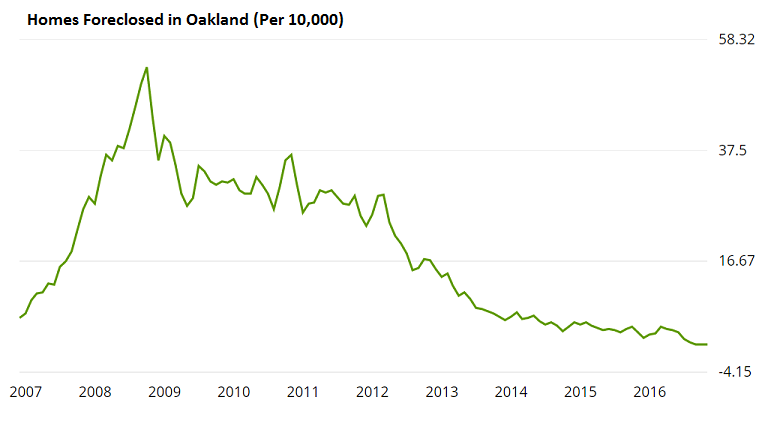
Oakland Foreclosure Graph From Zillow
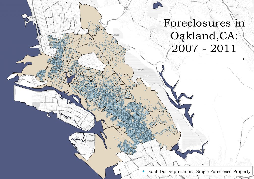
In Oakland, the crisis was especially acute, with stark demographic and geographic trends. Between 2007 and 2011, 1 in 7 Oakland mortgages entered default, with 1 in 14 eventually lost to foreclosure. As both the line graph and the previously linked report show, the rate of foreclosure rapidly rose and spiked between early 2007 and late 2008, leveling off but remaining relatively high for the three years that followed. As the map below illustrates, the vast majority of foreclosed properties were located in the East and West Oakland “flatlands,” diverse areas shaped in part by a legacy of racial and economic segregation.
This roughly 5-year span represents a key moment in the restructuring of Oakland’s neighborhoods and housing market. By comparing foreclosure data from this period against publicly available census data, I hope to shed light on some of the spatial and demographic processes related to this wave of foreclosures. Specially, I analyzed data from the 2010 and 2015 American Community Survey 5-Year estimates to answer two basic questions: 1). What indicators from the period during and prior to the market crash are most strongly correlated with the spatial concentration of foreclosures? and 2). What differences can be seen in terms of housing tenure in the years following the crisis? Finally, seeking to contextualize how the City responded to the crisis through its participation in the Neighborhood Stabilization Program, I took some preliminary steps towards analyzing the once-foreclosed properties that the city targeted for preservation. More on that later.
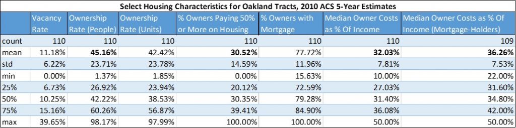
First, a brief discussion of methodology and limitations. 2010 ACS 5-Year estimates are chosen as the base year(s) for comparison and analysis for three simple reasons: 1) the 5-year range covers the heart of the foreclosure crisis and the years preceding it, 2) the data can be seamlessly compared with the newly released 2015 ACS 5-year data because it uses the same tract boundaries (no crosswalk necessary), and 3) the data are easily available through the census data API. With that being said, there are numerous issues with using 5-year estimates, namely that the covered period was incredibly volatile since it includes both the peak of the housing bubble and the depths of the recession. Another major caveat with using sample data is margin of error, which I ultimately decided to ignore for the sake of simplicity. Three Oakland tracts were removed due to small sample size, but other than that the results here do not control for error or outliers.
Foreclosure data covering January 2007 through October 2011 comes from Open Oakland Data (not to be confused with the City of Oakland’s Open Data Portal). While the above map shows each geolocated foreclosure as a single point, the data had to be transformed in order to illustrate and analyze their geographic concentration. The first, more basic method, involved performing spatial joins counting the number of foreclosures in each census tract polygon. Additionally, HdL parcel data, filtered for residential parcels only, were spatially joined and counted for each census tract. Two measures of foreclosure density are thus used: the number of foreclosures in a given census tract, and the number of foreclosures per residential parcel in a given census tract (foreclosures divided by residential parcels). The latter number better accounts for the residential population and size of a given tract, giving a more accurate representation of foreclosure concentration.
Predicting Foreclosures
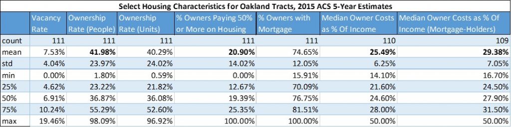
After looking at a range of ACS variables – including household mobility, vacancy, and tenure rates – I ultimately zeroed in on a variety of housing cost measures for owner households. Comparing ACS data between 2010 and 2015, it was apparent that there had been, by some measures, a significant shift in the amount of income owner-occupied households were spending on housing, especially for those holding a mortgage. Specifically, the “Median Selected Monthly Owner Costs as a Percentage of Household Income Over the Past 12 Months” variable and a derived proportion of owner households paying 50% or more of their income on owner were relatively high in the 2010 sample, declining significantly in the 2015 sample. The tables below show summary statistics for these and other select ACS variables and derived proportions for the two 5-year samples being compared, with the most striking differences in bold.
Analyzing the relationship between these housing cost variables and foreclosures was done both by running bivariate regressions and by mapping the two indicators. Bivariate regressions were performed between the “median selected monthly owner costs” variable and both measures of foreclosures by tract. In both cases, very high R-squared values were found, indicating that a high degree of the variability in foreclosure concentration is explained by the percentage of household income devoted to owner costs. Scatter plots with lines of best fit illustrate this relationship below.
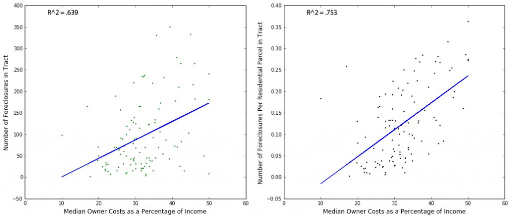
When mapping these two indicators, their close correlation is made more apparent. The map below shows how highly concentrated Oakland foreclosures were when measured as a percentage of residential parcels, as well as the prevalence of households spending upwards of 50% of their income on housing costs during this period. It should be noted that “50% or more” is the highest category for this variable, and given that the median value is provided, a significant number of Oakland families were likely spending significantly more than 50% of their income on mortgages and related expenses. While the model is obviously simple and imperfect, it appears that a high rate of very high cost-burdened homeowners is a strong indicator of vulnerability towards foreclosure.
Predicting the Impact of Foreclosures
Looking at the other half of the ACS sample, the 2015 5-year estimates, I hypothesized that tracts with high rates of foreclosure would also show the greatest decline in ownership rates. I was also interested in how this change in housing tenure might match up with the tracts targeted with Neighborhood Stabilization Program (NSP) funds. First, a quick explanation of what NSP looked like in Oakland. Oakland received a little over $8 million in the first round of the program’s funding, which was intended to help jurisdictions stem the tide of foreclosures and address issues of abandonment, blight, and loss of homeownership. The City eventually approved a plan to loan (and ultimately grant) around $5 million to the newly-formed Oakland Community Land Trust. This money would be used jump-start an effort to acquire and rehabilitate 200 vacant, foreclosed properties that would ultimately be sold to low-income Oakland residents at affordable prices. NSP attached a variety of restrictions on how and where these properties could be acquired, targeting the funding for hardest hit areas most likely to see a continued rise in foreclosures. In Oakland, the new community land trust initially identified, vetted, and attempted to purchase 189 properties. For a variety of reasons, including serious limitations baked into the program itself, Oak CLT was only able to purchase 17 properties.
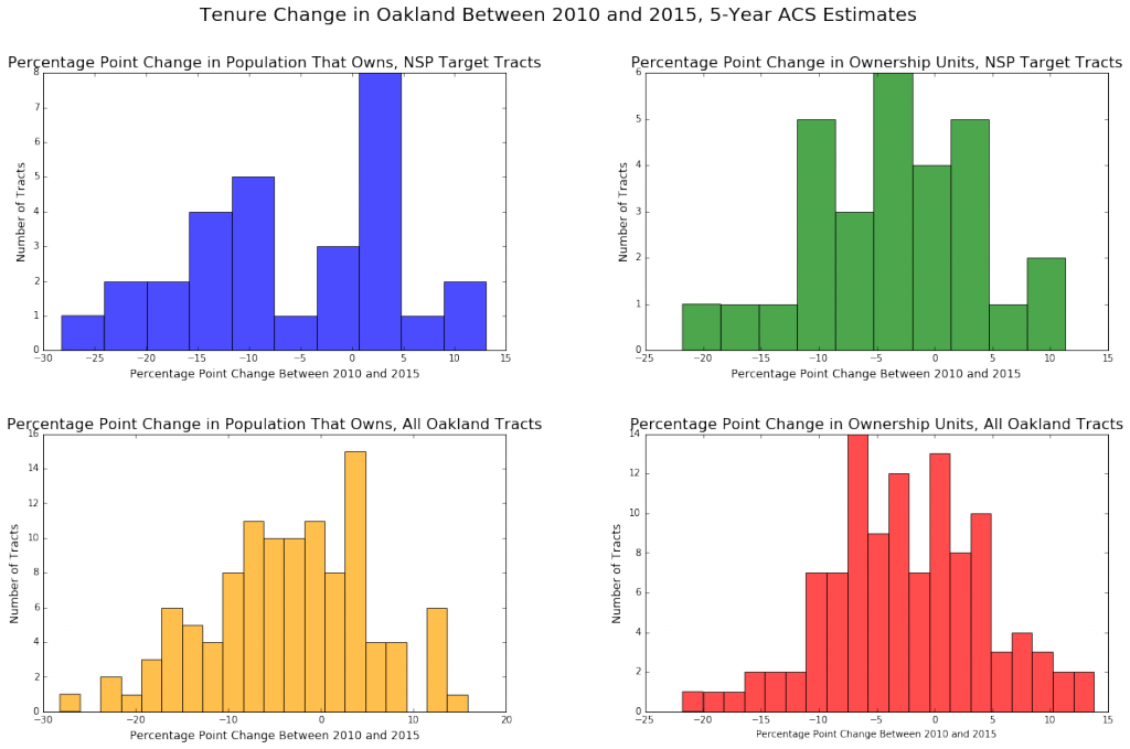
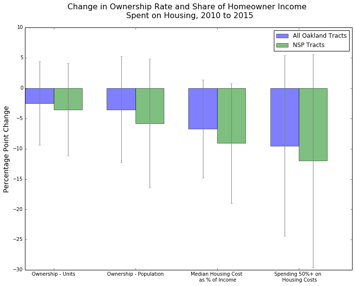
As the tables below show, there does appear to be a decline in homeownership – measured as both the proportion of owner-occupied units and the proportion of residents living in owner-occupied units – between the two periods. The decline, however, is less than expected, and given the margins of error associated with these estimates, likely not statistically significant in most tracts. Nevertheless, percentage point declines were more common than not, a trend that is more pronounced among the tracts where NSP targets were located.
Additionally, we can see a similar dynamic when looking at the change in the share of income that homeowners are spending on housing costs. Notably, Oakland tracts saw close to a 10 percentage point drop on average in the proportion of homeowners spending 50% of their income or more on housing costs. NSP census tracts saw an even steeper drop with a mean percentage point change just under 12. This could be for a number of reasons, ranging from stricter lending standards after the housing market collapse to depressed home values making ownership more affordable in the early part of the 5-year span covered by the 2015 ACS estimates.
When the change in ownership rate is regressed against the foreclosure concentration variables (i.e. when foreclosures per tract or foreclosures per parcel by tract is used as the independent variable), the correlation is quite weak. There are a number of reasons why this might be. Aside from the aforementioned issues with the ACS data (margins of error), the time intervals themselves might not be appropriate. Year-to-year data would give us a better idea of the trends involved, but unfortunately one-year ACS estimates are too noisy and aren’t available at the tract level.
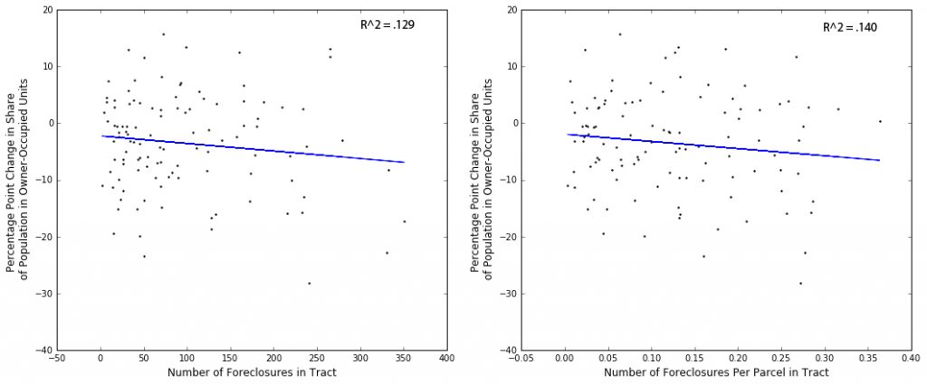
Ultimately, the changes in ownership rates, by both of my measures, are a lot less predictable, with gains in some hard-hit, high-poverty areas and losses in some of the more affluent tracts in the Oakland Hills. It’s entirely possible that this reflects real patterns – perhaps more affluent households are moving into flatland neighborhoods and buying up relatively cheap housing, while other more expensive neighborhoods are undergoing transitions to higher renter proportions due to skyrocketing home prices. With this level of analysis, it’s virtually impossible to tell what’s causing what. It is worth noting that despite some of the randomness, it does appear that NSP target areas (especially in East Oakland) have seen a steeper decline in ownership rates than Oakland on the whole, which may speak to the ongoing challenge of stabilizing housing in these areas as more households are forced to rent.
A Brief Note on NSP Target Properties
Finally, stepping away from the ACS data and focusing solely on the properties targeted with NSP funds, a couple of observations can be made. After merging these addresses to the City’s parcel records, a range of new property attributes can be analyzed, though as of right now it is unclear how many of these attributes have much analytical value. For example, compared to the properties that the Oak CLT was able to purchase, the rest of the NSP target properties are 10 years older on average. This might indicate something about the historic nature of the structures or the neighborhoods they’re located in (historic preservation designation was apparently a barrier to buying properties in West Oakland with NSP funding). More interestingly, however, a majority (99 of 171) of the properties that weren’t purchased by the land trust are classified as having “absentee” owners in the city’s parcel database. This means that the property’s physical address and mailing address do not match, which is a strong indicator of external ownership. While it can’t be said with absolute certainty, it would appear from this finding that most of the properties that the land trust was unable to purchase are now being used as rental units. Without knowing the tenure type of these homes prior to foreclosure, we can’t say that this is indicative of a transition from owner-occupied to renter-occupied housing. More research needs to be done to determine the significance of these findings.
You need to be a part of a contest for one of the highest quality sites on the web.
I most certainly will recommend this blog!
Why thank you!
hello sir can you give me love