
This page outlines the approach and methods in developing the Equal Transit tool. If you are a community group or advocacy organization that is interested in using the tool, please visit this page.
The Problem
Transit agencies are required to meet a number of external and internal social equity requirements, based on federal law and internal transit agency policies. When transit agencies propose changes to services, they must complete an equity analysis that examines whether they are adequately serving all members in their service areas. Based on external equity requirements, transit agencies must allocate resources equitably based on race and national origin (as stated in Title VI of the Civil Rights Act). Many transit agencies also set internal equity requirements, which often include allocation of transit service to lower income groups and to those without access to a personal vehicle.
Title VI of the Civil Rights Act of 1964
No person in the United States shall, on the ground of race, color, or national origin, be excluded from participation in, be denied the benefits of, or be subjected to discrimination under any program or activity receiving federal financial assistance.
Holding The Bay Area Metropolitan Transportation Commission Accountable
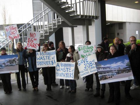
In 2005, a group of 278 minority bus riders and members of advocacy organizations filed a federal civil rights lawsuit against Metropolitan Transportation Commission (MTC) (1). The lawsuit was motivated by disparities in subsidies per bus ride (about $3 per trip) compared to those per rail transit ride (between $6 and $14) and the expansion of suburban rail service that tended to serve white and affluent riders while service declined for Oakland bus riders, who were considerably more likely to be low-income people of color (1).
A more recent example of MTC prioritizing directing funds toward a new rail project over improvements in bus service is the Oakland Airport Connector, a 3.2-mile, $500 million rail project built in 2014 (2). The project replaced a local bus route that provided service to two neighborhoods, in which 95% of the residents were people of color and 33% were low-income, with overhead rail that does not stop in either neighborhood (3). BART was found to have failed to complete an equity analysis for the Oakland Airport Connector project, mandatory under Civil Rights Act Title VI, and MTC was required to distribute $70 million to bus transit agencies throughout the Bay Area to address funding inequalities (3). Public transit investments that result in the deterioration of bus service have health implications, as bus service cuts can leave riders experiencing lower mental health outcomes, in part due to the increased likelihood of arriving late to work and facing lost wages (4).
The Equal Transit Tool
The Equal Transit tool can be used by community groups and advocates in California to determine whether transit agencies are meeting external and internal equity requirements when proposing changes to stop locations.
The tool compares existing and proposed stops by the following equity factors:
- Race
- National origin
- Income
- Vehicle Availability
- Access to low income jobs
How it’s Made and How it can be Used
The Equal Transit tool compares equity metrics at proposed transit stops to existing transit stops for transit agencies within California, using ASC and LEHD data. The tool requires community groups or advocates to have shapefiles with existing and proposed stops, and will provide these entities with data visualizations that can be easily accessible online or be included in reports.
The tool compares residential and job data in census tracts that are within transit stops’ rider catchment areas. The tool has two levels of analysis, basic and advanced. The basic analysis provides aggregate data in clear, easy to understand tables, plots and maps, and the advanced analysis provides more detailed, disaggregate analysis.
In the basic analysis level, community members or advocates provide the person running the python code with existing and proposed stop shapefiles with county FIPS codes. The person running the code will need to load the shapefiles into the python code, and adjust the transit catchment area settings (explained below), however other than this, the person does not need to make any additional changes to the code when running the basic analysis.
The advanced analysis level requires additional time and attention from the person running the code. The community members or advocates provide the person running the python code with existing and proposed stop shapefiles with county FIPS codes. The person running the code will need to load the shapefiles, adjust the transit catchment area settings (explained below), and make additional changes that are specific to the transit service area being analyzed (these sections of the code are marked with #ADVANCED ANALYSIS).
The tool’s transit catchment areas can be adjusted based on the type of transit in the buffer section of the python code. Based on literature, the catchment areas by type of transit is as follows:
- Local street transit (Bus) = 300 m
- Rapid street transit (Bus Rapid Transit) = 400 m
- Rapid transit (Light Rail Transit) = 800 m
- Regional transit (Commuter Rail) = 1900 m
BART Third Crossing Example
BART is proposing to develop a third crossing between Oakland and San Francisco, and has proposed a number of new stations that the new crossing may connect to. The Equal Transit tool has been used to analyze whether these new stations meet BART’s external and internal equity requirements, with regards to serving people of color, non-citizens, low-income individuals, and people without access to vehicles. The Basic Analysis provides an overview of the location of the proposed and existing stops, and aggregated information on demographics and low income jobs within the existing and proposed stop catchment areas.
Basic Analysis
Based on the basic analysis, BART’s proposed stations would serve residents and workers in service areas that better meet demographic equity requirements. Figure 1 shows the locations of the proposed stations (green) compared to the existing BART stations (blue). As seen in the figure 2, the proposed stations would serve a higher percentage of people of color, non-citizens, people without access to a vehicle, and those living below the poverty level. Figure 3 shows that there are higher percentages of low-income jobs (paying less than $40,000/yr) compared to total jobs at proposed stations compared to existing BART stations. However, figure 3 also shows that the proposed stations serve a higher proportion of high income jobs as well.
This basic analysis provides community groups with an overview of whether the proposed stations are meeting equity requirements, and serving under-represented communities better than existing stops. This analysis requires very little data cleaning or manipulation to produce data visualizations, and the data visualizations are made to be clear and easy to understand. Therefore, this level of analysis is relatively accessible to a variety of audiences.
figure 1
figure 2
figure 3
Dashboard
The dashboard is developed to present the basic analysis data visualizations with a url link that community groups can share online. Currently, the dashboard is still under development, (there is only an image of the map rather than an interactive html link because plot.ly dashboards do not allow html links to be embedded, and the platform is not compatible with folium maps). A version of the dashboard for BART’s proposed stations can be viewed here.
Advanced Analysis
The advanced analysis provides more detail about the types of populations specific existing and proposed stations serve. The advanced analysis also scores the proposed stations on whether they meet and exceed demographic proportions within the counties BART serves.
county demographics
Tables 1 and 2 show the descriptive statistics for the variables of interest in the counties BART operates in (Alameda, Contra Costa, San Francisco and San Mateo counties), these can be used when referencing to the existing and proposed stop analyses.
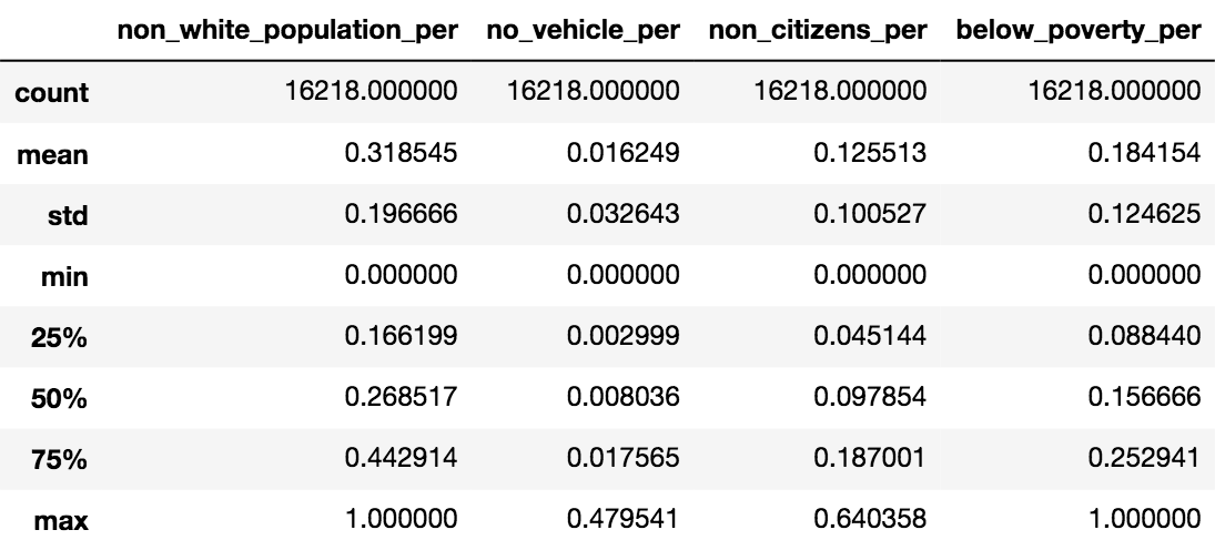
table 1
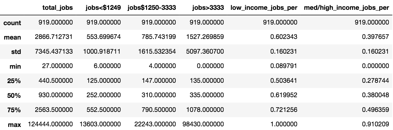 table 2 – note: low income jobs are jobs less than $3333/month, or ~$40,000/yr. Med/high income jobs are jobs making more than $3333/month.
People Of Color
Based on the advanced analysis, Van Ness is the proposed station that would serve the highest proportion of people of color (49%), while only 4% of those living within the Alameda station catchment area are people of color (figure 4). Figure 5 shows the distribution of the proportion of existing and proposed stations in serving people of color (marked with a k-distribution). This figure shows that a higher proportion of proposed stations would serve a higher percentage of people of color compared to existing stations.
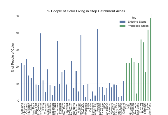
figure 4
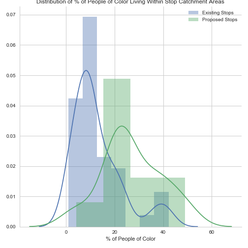
figure 5
non-citizens
The proposed station, Van Ness, would also serve the highest proportion of non-citizens (19%), while only 0.8% of those currently living within the Alameda station catchment area are not US citizens (figure 6). Figure 7 shows the distribution of the proportion of existing and proposed stations in serving non-citizens. This figure shows that only a slightly higher proportion of proposed stations would serve a higher percentage of non-citizens compared to existing stations.
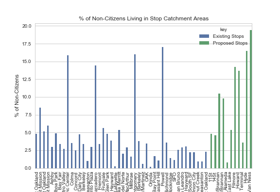
figure 6
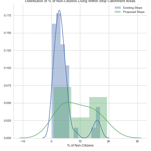
figure 7
Poverty
Similar to the people of color and non-citizen metrics, the proposed station, Van Ness, would also serve the highest proportion of people living below %100 of the poverty level (29%), while only 0.9% of those currently living within the Alameda station catchment area are below the federal poverty level (figure 8). Figure 9 shows the distribution of the proportion of existing and proposed stations in serving those living below the poverty level, showing that a higher proportion of proposed stations would serve a higher percentage of people living below the poverty level compared to existing stations.
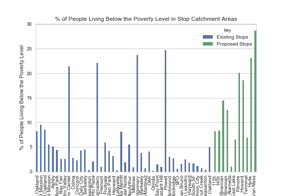 figure 8
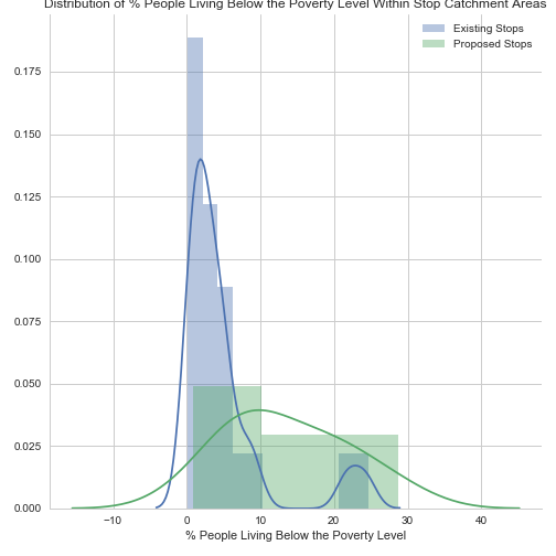 figure 9
No Vehicle
Proposed stations would also better serve those living without access to a vehicle better than existing stations. Similarly to the previously described equity variables, Van Ness would also serve the highest proportion of people without access to a vehicle (15%), while only 0.2% of those currently living within the Alameda station catchment area do not have access to a vehicle (figure 10). In figure 11, the distribution of the proportion of existing and proposed stations that serve populations without access to vehicles shows that a slightly higher proportion of proposed stations would serve a higher percentage of people without access to a vehicle compared to existing stations, however the proposed stations have a wider distribution of proportion of populations served compared to existing stops.
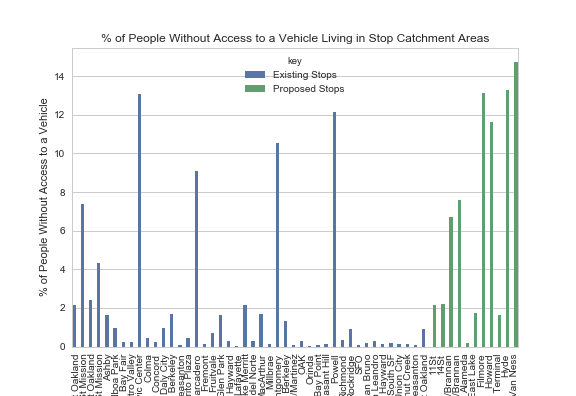
figure 10
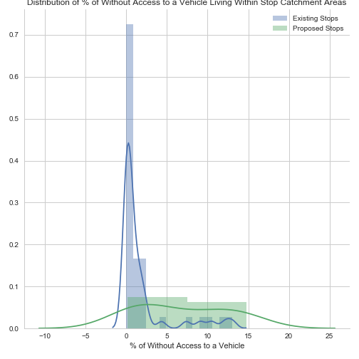
figure 11
Jobs
Based on LEHD data, the proposed stations would also provide access to higher proportions of low-income jobs compared to existing BART stations. Again, Van Ness would provide access the highest proportion of low-income jobs (34%), followed by the Filmore Stations, where 33% of jobs within the catchment area are low-income. In the Alameda stop catchment area, only 5% of jobs are low-income (figure 12). In figure 13, the distribution of existing and proposed stations that provide access to low-income jobs shows that a higher proportion of proposed stations would provide access to a higher percentage of low-income jobs compared to existing stations.
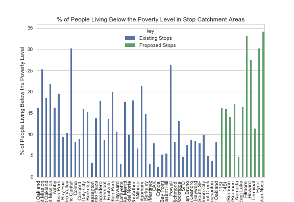
figure 12
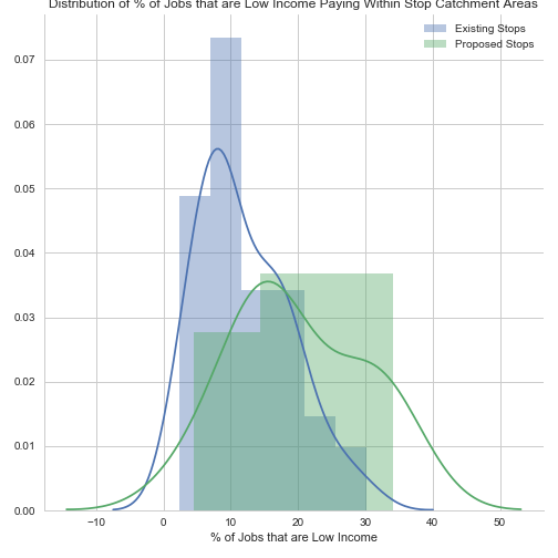
figure 13
Equity Scores
The equity scores compare the demographics the stations serve to average demographics in the counties BART serves. If the station serves a population that is at or greater than the average (mean) proportion of the population in the counties, the station is marked as ‘1’. For instance, the proposed Howard station serves a population that is 34% people of color, while the average proportion of people of color in the four counties that BART serves is 32%, therefore the station scores a ‘1’. If stations serve populations that are at or above county average proportions of populations who are people of color, non-citizens, below the poverty level and do not have access to vehicles, the proposed station receives a 1 in the total score.
Table 3 shows the equity scores the stations receive, and figure 15 shows the location of the stations that score in the total column. These proposed stations include Howard, Hyde and Van Ness. Based on these findings, it may be useful for the community groups to advocate for the selection of these stations in the development of the third crossing.
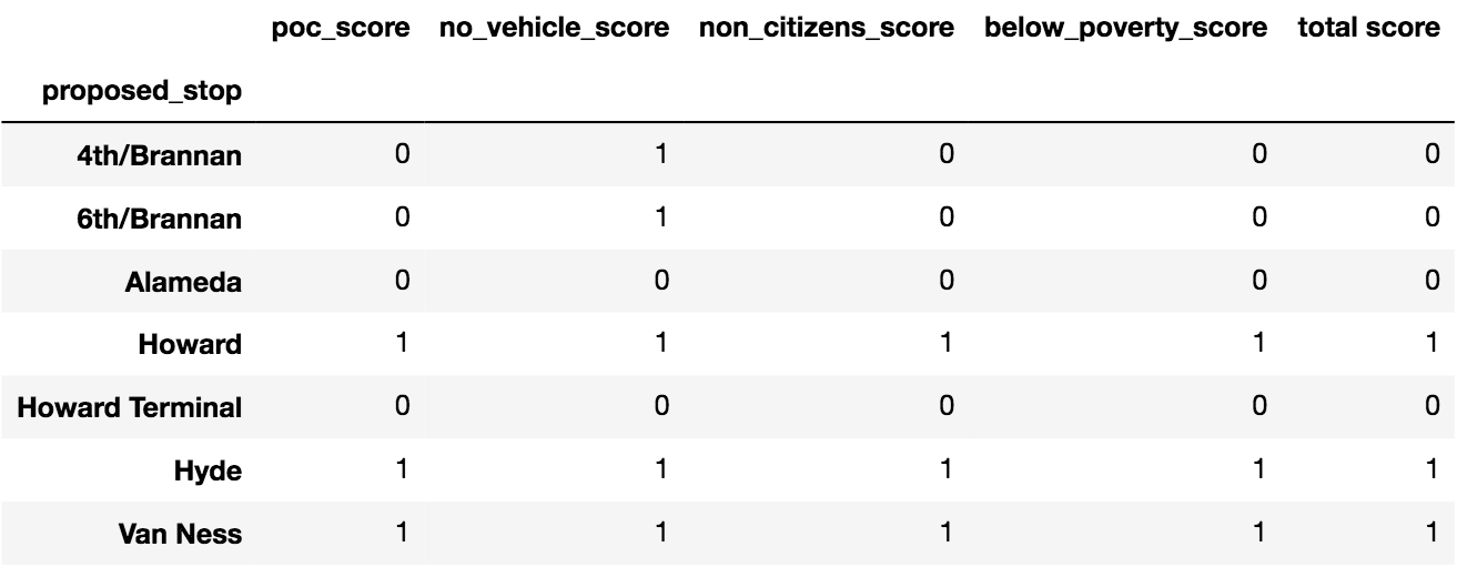
table 3
Figure 15
Limitations
The Equal Transit tool has a number of limitations. Firstly, the tool is not completely stand alone. The tool still needs to be run by someone who understands basic python, and some data cleaning and manipulation is still required. Secondly, in developing this tool, there was a trade off between geographic versatility and specificity of the tool, specifically when using in ACS data. The tool uses the ACS API, which allows up-to-date data to be used directly from the ACS data source. However, the API only provides census tract information for each state at the most granular level, therefore to allow the tool to be used in all of California, census tracts were used instead of census blocks. If the tool had focused on a specific area, local-level data could have also been used, however the tool would then have a narrower geographic applicability. In developing the tool, there was also a trade off between simplicity and comprehensiveness in the data visualizations. The tool could have created a variety of different types of maps and plots that would have provided a more comprehensive analysis of equity issues related to transit changes, however I chose to instead focus on developing simple visualizations that could clearly portray the data to an audience of mainly members of the public.
Citations
- Golub, A., R. A. Marcantonio, and T. W. Sanchez. Race, Space, and Struggles for Mobility: Transportation Impacts on African Americans in Oakland and the East Bay. Urban Geography, Vol. 34, No. 5, 2013, pp. 699–728. https://doi.org/10.1080/02723638.2013.778598.
- CDM Smith, and Corey, Canapary & Galanis Research. BART-to-Oakland International Airport Title VI Equity Analysis. 2014.
- Civil Rights Coalition Challenges Unfair Transit Project. Reimagine Radio. http://www.reimaginerpe.org/20years/marcantonio.
-
Alameda County Public Health Department. Getting on Board for Health – A Health Impact Assessment of Bus Funding and Access. Alameda County Public Health Department, 2013.