By: Nancy Stetson and Cassandra Bayer
Question: The Effect of Commute Times on Rental Prices
The term “housing crisis” has become commonplace amongst Bay Area residents. The influx of businesses into the region has driven up rental prices, squeezed the market’s available housing stock, and increased the population. Our initial hypothesis posited that the increased cost of living has driven people employed in city centers (i.e. San Francisco) to live in more suburban areas (i.e. Oakland) to find less costly housing.
Our questions investigate how the ease of commuting affects rental prices, whether any savings on rent are eroded by longer commutes, and if areas exist in the Bay Area that are both low-rent and low-commute.
Background: Trends Over Time
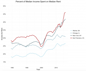
Between 1980 and 2010, the housing market (on a national scale) rose and fell. San Francisco stands out in the pack even when pitted against comparable cities. The graph below shows rental affordability, or the percent of the median income that would be spent on the median rent, in Atlanta, Chicago, New York City, and San Francisco. Highlighted in red, San Francisco has largely mirrored trends until 2010. After this period, the rate of growth for the index has shot up drastically in comparison to other cities. In recent years, San Francisco has leapt above NYC to become the most expensive place to live in the United States.
To understand where residents of the Bay Area are choosing to live, data must be disaggregated at a localized level. For example, as exhibited in the chart below, rents vary significantly across the Bay Area. Vallejo and San Francisco are only 31 miles apart, but Vallejo is far more affordable than San Francisco.
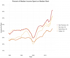
Our hypothesis is then that this rent disparity is created by high costs of commuting. If the commute from Vallejo to the economic center of the region is significant, then lower rents may still not be worth it, as the commuting costs erode rent savings.
Methodology
Our general plan for this project was to combine the cost of renting with the cost of commuting, so we could better explore the tradeoffs made by commuters in the Bay Area.
Data
We use three main sources of data. The first is a dataset of Craigslist postings collected by the Urban Analytics Lab in 2014 and were provided by Geoff Boeing. We combined these listings with commute data, using a simulated dataset of commute destinations from the Metropolitan Transportation Committee. To find commute times, we made requests from the Google Directions API.
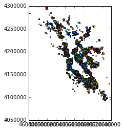
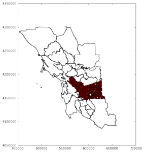
The MTC data used Traffic Analysis Zones (TAZ). TAZ are constructed by census block information; typically, they capture important information like the number of cars per household, income, and employment within each zone. In the Bay Area there are approximately 1,500 zones, they are aggregated into 34 “Super Districts.” Much of our analysis was centered around these zones. We found average commute times for each zone, and these commute times are based on commutes from zones to common super district destinations.
The following map displays geography of the MTC dataset.
The bulk of this project involved organizing and aggregating the commute destinations into a meaningful dataset and applying those findings to the rent data. There were two resulting datasets: one which had observations for each TAZ with average commutes and median rents, and another which had observations of rental listings that included the same information. The first dataset was used to map which areas are more or less expensive to live when both rent and commutes are taken into account. The second was used to regress commutes on rents to assess whether there is a cost of commuting that is revealed through the variation of rents in varying levels of accessibility to economic centers.
While we relied heavily on Python and Carto for this project, we used a blend of tools manipulate, visualize, and analyze the data.
|
Software |
Visuals | Data Cleaning |
Analytics |
| Python, version 2.7, Anaconda distribution |
X |
X |
X |
| Jupyter Notebooks | X | X | X |
| R, version 3.3.1 | X | ||
| Rstudio | X | X | X |
| Carto.com |
X |
Process
The central challenge for the project was finding commute times which accounted for traffic. We wanted to be sure to include traffic in our analysis, since it can be a significant barrier to transportation. For example, it is not uncommon for commute times across the Bay Bridge to double or triple during peak hours. In order to find commute times in the Bay Area, we used a Google API service which connects to Google’s map directions which predicts traffic at certain times and days.
The Google service allowed us to find the travel times for both driving and public transportation from pairs of locations. Our goal was to approximate the average commute time for a given Craigslist rental listing. To do this, we found where people were commuting to based on MTC data which recorded both their home transportation access zone and their destination zone. Due to the limits of the Google API, we aggregated destinations into their super districts, which are larger areas used by MTC to estimate commutes. For each home zone, we found times to the centroids(1) of super districts that were popular commute destination for each respective zone.
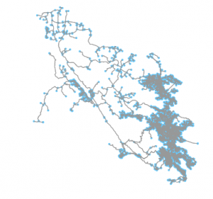
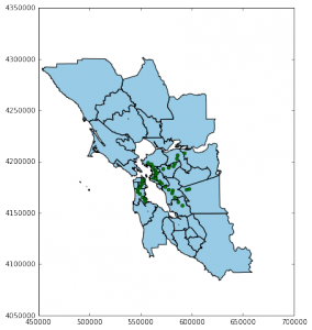
The following map illustrates the method we used to find average commute times. The map shows a single zone’s commute routes from West Berkeley to popular destinations. The color of the lines denotes the popularity of the route. Again, due to the limits of the Google API, we restricted our analysis to routes with at least 20 commuters in the simulated MTC data.
After we found the destinations of commuters, we used the Google API to find commute times for those respective start and end locations. To account for peak traffic, we set the time of arrival to 9 am on the Wednesday morning of December 14, 2016. The API has settings which allow you to control the mode of transportation, as well as the traffic model used for the driving directions. For each route we collected times using both the optimistic and pessimistic driving times, as well as the time a route would take on public transit. We took the average of the optimistic and pessimistic driving times to construct an overall driving(2) time.
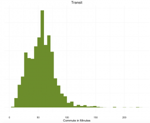
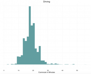
The distribution of average commutes, for both driving and transit, are shown below. The average driving commute is around 20 minutes, while the average transit commute is much higher, at about an hour.
To create an overall average commute time for each zone, we combined the driving and transit times by using a rough estimate of 25% transit and 75% driving, based on a PPIC survey of the Bay Area. Our analysis did not account for variance in the popularity of transit across the Bay Area, which is likely significant, but we felt our estimate was a reasonable simplification.
Finally, we wanted to be able to compare the cost of rent to the cost of commuting. To do that, we had to transform the time it takes to commute into the cost of that time. We decided to estimate the cost of commuting based on the time cost, assuming that for every hour that a person spends commuting is an hour where they could instead be doing productive work, and are therefore missing out on those earnings. Although there are other costs associated with commuting, including gas and car maintenance or public transit fares, the time cost would be immediately transferrable from zone to zone based on the estimated commute times. We based the cost of a person’s time on the median earnings of an individual in the Bay Area. We estimate a time cost of commuting of approximately $20 per additional one way minute per month.
We then visualized our findings in using Carto. We did further analysis to find the cost of commuting intrinsic in the geographic and price variation in rental listings.
Findings
Our initial findings were surprising to us: the most populated commute patterns were within one’s own home TAZ. This means that, on average, people are living closer to work than we initially hypothesized. Initially, we thought most commuters were commuting to downtown San Francisco, but the commute data made clear that the most common commutes were relatively short. However, it would be interesting to explore who is making the longest commutes, and how the length of commute is related to income levels (for example: do people commute far because they are unable to afford housing near economic centers, or do they commute long distances because they prefer the amenities in one area over the other, and can afford a car and the time it takes them to reach a well paid job?)
The pattern of shorter commutes can be seen in the first map below, which plots our constructed time cost of commuting across the Bay Area and shows that our initial hypothesis may not be entirely wrong, but misguided. Instead of there only one economic center with short commutes, there are multiple. While central San Francisco is certainly a popular destination, with surrounding areas that have easy access to jobs, other areas of the Bay offer the same benefit. UC Berkeley is one center, where most likely students live around the campus and their “commutes” consist of walking to class. North of the city, Santa Rosa’s center has low commute costs, with higher commute costs around the periphery of that city. Note: Zones without any commute routes with more than 20 people were removed.
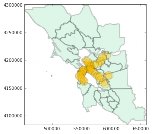
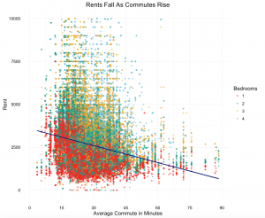
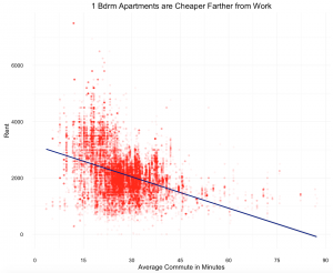
Wondering how these findings stacked up against rental price distribution, we plotted the roughly 100k rental listings we had. At first glance, it is easy to see that both prices and density of rental listings are denser in in San Francisco. Listings and their respective prices are fewer, and generally cheaper, further inland. A clear theme you can gather from the map is the geography of rents on the east versus west side of the Bay. While Marin, San Francisco and San Mateo counties appear largely unaffordable, rents in Alameda and Contra Costa counties are generally cheaper.
In order to combine our commute data and rental data, we plotted the median rent in each zone below. By flattening the rents, it is easier to see the cost difference between neighborhoods. This map further challenged our hypothesis: while lower rents may more common in the East Bay, the gradient of price wildly ranges depending on where the residence is. For example, ‘the flats’ near the bay in both Oakland and Berkeley are have significantly lower median rents than the hills of either city. Conversely, the map shows that there are relatively lower cost neighborhoods in San Francisco, although they are sparse.
To truly understand the interplay between rental price and commute time, we combined the two variables into an index. The index is between 0 to 100, wherein 100 represents the highest cost commute and rental listing in the dataset; other observations are placed in the index in relation to the highest. The area with the highest index juts into the bay from Marin, the lowest is a few block in Vallejo.
We find that there are small pockets of low rent, low commute neighborhoods, including areas of Vallejo and Oakland. There are also areas that appear affordable on the map that have relatively high commute times, particularly the region stretching from Martinez to Pittsburgh. These areas are deemed affordable by our index because commute costs, as we have estimated them, are lower overall than rent costs, and therefore weighted less heavily in our combined index.
Analysis
Although we created a per commute minute cost using the time cost to a median earner, we knew that the data we had should reveal the preferences of renters, showing their intrinsic value of commuting (see 538 analysis of commutes in NYC ). To back out this revealed cost of an additional minute of commute, we ran regressions of commute times on rent with a number of controls. Initially, we built separate models using just driving time as the independent variable on rent, just transit time as the independent variable on rent, and the combined commute variable as the independent variable on rent. However, we found that these models were quite weak and noisy. Therefore, we created the four models below.
The four models all include the following control variables:
- Number of Bedrooms
- Square Feet
- Whether the area is marked as a community of concern
- The number of commuters in each commute pattern
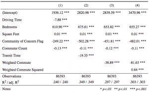
Only the fourth model includes a term for commute time squared, which shows the how the cost changes for each additional minute of commute.
We found that transportation had much more explanatory power than driving alone. For that reason, we use the combined variable for commute in model 3. The model leads us to believe that, for each additional minute of commute, rental prices fall by about $39. While model 4 is more difficult to interpret due to the quadratic, the coefficient on the squared term is positive, indicating that the farther you commute, each additional minute effectively decreases rent prices by less.
It was not surprising to see that the number of bedrooms significantly increased rental price; each additional bedrooms leads price to rise by about $650. However, it is worth noting that listings with more bedrooms are more commonly found outside the city center in less expensive areas, so the coefficient may be biased.
The community of concern tag was quite telling. An area is marked as a community of concern if it is largely minority, low-income, low English proficiency, elderly, zero vehicle households, disabled, rent-burdened, or single-parent (an area must meet four or more of these criteria). Rental prices drastically fall for areas that receive this flag, by roughly $450. And while the coefficient for commuter count may not be quite telling, it was a rough way to control for the population density.
While we know that the change is square feet is a significant predictor of rent, our initial results were weaker than expected. For every additional 1,000 square feet in a unit of housing, our initial regressions suggest that rent increases by only $10 per month. This seems far too low, yet it was stable. After looking more closely at the variable, we removed observations with square feet above the 99th percentile (approximately 3,000 square feet). The results below demonstrate a significant change in the square feet and bedroom coefficients (which are highly correlated), yet the commute coefficients are relatively stable.
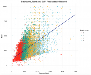
Once we subsetted the data to capture observations with more accurate square footage, we re-ran the models and found much different results. We can now see square feet explains a much larger share of rental price increase. When using the model that includes the weighted, combined commute variable, we see that rent shoots up by roughly $1,700 for every extra 1000 square feet; this figure is far more believable that what the previous model predicted– if even a bit high. However, notice that the coefficients on bedrooms are now negative. Presumably, there was some multi-collinearity between the variable for bedrooms and the variable for square feet. Moving forward, this problem would warrant further inspection. Despite the changes on bedroom and square feet, though, the coefficients capturing commute times stayed rather stable, which is promising for purposes of answering our project’s question.
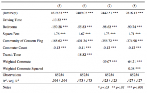
Overall, the commute cost appears to be higher than $20 per additional minute, which we estimated using median earnings. Our analysis suggests that renters value commute time at we $40 per one way minute per month. However, there are a number of limitations to our analysis, including a possibly biased dependent variable and omitted variables.
Limitations and Next Steps
Largely, this project was exploratory. We were curious to find what bearing, if any, commute times had on rental prices. To determine any causality, though, we would have to address limitations of our data and methodology.
The data that we used could be improved upon. The Craigslist data is from 2014; rental availability, prices, and density have likely changed since. Moreover, it may be biased: prices posted on Craigslist are at the behest of the poster– the price asked may not reflect the true value or the accepted price. Listings on Craigslist may also be rentals that have higher turnover than the average rental, marking the listings as systemically different. The data we relied upon for commuter patterns was simulated data, and warrants closer inspection. Also, commute times pulled from the Google Service are approximations and only reflective of one period of time (9am on a Wednesday morning).
Outside of the data, our methodology was geared towards understanding, at a glance, trends in the Bay Area. For example, we used median income for all nine counties of the Bay Area to calculate time costs; we would have to control to variation in income between zones to estimate true time costs. Relatedly, the index that accounted for commute and rental prices underestimates commutes according to the results of our regressions. While we estimated the time cost of commute to be around $20 per one way minute of commuting, our analysis shows that renters value commute time at nearly twice that. If the index was recreated with the results of the regression, areas with higher commutes would be shown as less affordable than in our map.
Finally, neither our index or our regressions takes into account other amenities associated with specific locations. While it is reasonable to assume that people prioritize rents and commutes during an apartment search, there are numerous other factors that determine residence. One that is notably absent from this analysis is school quality, which many families chose to prioritize over, or at least with, commute time or rent. Proximity to amenities or family, crime rates, or general environment also sway these decisions, and are more difficult to account for. By not including these other factors, we may be over- or underestimating the cost of commuting.
Lastly, there are important socioeconomic, ethical implications that our project does not capture. We found that the Bay Area does, in fact, have pockets of low-cost, low-rent areas. Yet, these areas are likely communities of concern. If median earners are continually pushed outside city centers, it will be at-risk communities who will be displaced.
An important next step to this work is to look at the populations most significantly impacted by these patterns. Moreover, more work should be done evaluating transportation options and further investigating how to create more affordable housing.
Footnotes:
(1) In order to make more realistic commute destinations, centroids are weighted by rental listings. The difference between geographic centroids and weighted centroids is negligible in the more urban areas of the bay, but creates much more realistic commuting destinations in less dense districts in places like Marin or San Mateo counties.
(2) The Google Directions API also has a traffic option called “bestguess” but comparing some commute times to the web version of Google Directions, it appeared that it underestimated traffic the farther into the future the request was for. We felt it was important to incorporate pessimistic models of traffic in our model.