Perception
Once sensory information arrives at the sensory projection area in the brain, the next step in cognition is forming a mental representation of the stimulus. This mental representation is what we call a percept. Although there are many different sensory modalities, most of what we know about perception is confined to visual and auditory perception -- that's where the research has been focused.
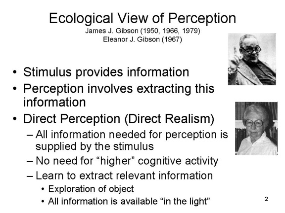
The Ecological View of Perception
 However, some theories of
perception deny or downplay the role of top-down, cognitive
processes in perception. According to the ecological view
of perception proposed by James J. Gibson, who often
collaborated with his wife, Eleanor Jack Gibson (they were
known as Jimmy and Jacky):
However, some theories of
perception deny or downplay the role of top-down, cognitive
processes in perception. According to the ecological view
of perception proposed by James J. Gibson, who often
collaborated with his wife, Eleanor Jack Gibson (they were
known as Jimmy and Jacky):
- All the information needed for perception is provided by the stimulus environment, broadly defined to include all the stimuli impinging on the organism at the moment.
- The perceptual apparatus has evolved in such a manner as to extract this information automatically, without any recourse to memory or thought.
- Because the perceptual apparatus has evolved in such a way as to enable us to perceive the world as it really is, there is no need for learning to occur (learning may be important for other aspects of behavior, but it is not important for perception).
- And because all the information we need to see the world the way it really is is provided by the stimulus environment, there is no need for the organism to consult its fund of world-knowledge stored in memory, or to engage in such "higher" mental processes as judgment, reasoning, or problem-solving.
The ecological view is a
radical view of perception, but in fact the principles of
direct realism can account for much of what we see. The
Gibsonian ecological view has been especially successful in
accounting for three basic aspects of perception:
- whether an object is stable or in motion;
- whether an object is close by or far away;
- whether an object is rigid or flexible.
The ecological view of perception is so named because it assumes that the stimulus environment (the ecology) provides enough information to enable us to perceive the world accurately, and there is no need to draw more information from "inside the head". It is also called direct perception because, in theory, the formation of the percept is not mediated by learning, inference, or other "higher" cognitive processes. And it is called direct realism because, again in theory, the mechanisms of perception have evolved in such a way as to permit us to perceive the world as it really is.
But there's a subtle trick in direct realism: the definition of "stimulus" must be broadened to include not just the distal stimulus object itself (the object of regard), but also other stimuli in the surrounding stimulus field, especially, the relationship between an object and its background. In addition to the stimulus and its context, important information for perception is also provided by the perceiver's body. All of this -- the distal stimulus, its environmental context, and the perceiver's own body -- are environmental sources of information for perception.
The Perception of Motion
How can we tell whether an object is in motion? Gibson argues that the perception of motion depends on the comparison between various sources of stimulus information.
Some information comes from the objects themselves.
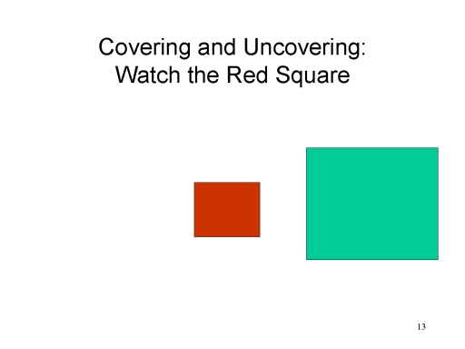 The successive covering
and uncovering of an object's background, or of one
object by another, is clear information that the object is
moving with respect to its background, or that one object is
moving with respect to another. If you watch the red
rectangle, you will see a green square successively cover and
uncover it. This is information that the square is moving
across the rectangle.
The successive covering
and uncovering of an object's background, or of one
object by another, is clear information that the object is
moving with respect to its background, or that one object is
moving with respect to another. If you watch the red
rectangle, you will see a green square successively cover and
uncover it. This is information that the square is moving
across the rectangle.
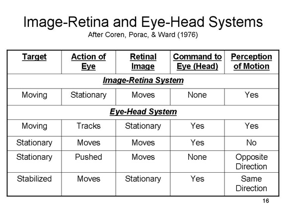
Other information relevant to motion is provided by the eyes and head.
Movement of the retinal image: As an object moves, the retinal image cast by that object moves across the retina. If you keep your eyes fixed on the cross, the image of the circle will move across the retina. This visual stimulation is information that the circle is moving.
Egomotion. But we do not always see motion when an image moves across the retina. If you fix your eyes on the cross, and then move your eyes or your head back and forth to the left and right, the retinal image of the cross also moves across the retina. The cross moves across the retina, but we do not see the cross move in the world. The visual system automatically corrects for kinesthetic information about egomotion, or self-produced movement, to tell us that it is our eyes that are moving, not the objects in the world. Moreover, we do not always see stability when an image stays fixed on the retina. If you fix your eyes on the cross, and then track the circle as it moves across the screen, your eyes and/or your head will move, in order to keep the image of the circle in the central field of vision; otherwise the image moves to the periphery. The cross stays fixed on the retina, but we see it move in the world. This egomotion is required to keep an image in a fixed position on the retina. Egomotion is another source of information for the perception of motion.
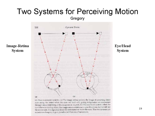 Thus, there are actually two different
systems for the perception of motion (as noted by Richard
Gregory, a British perception theorist):
Thus, there are actually two different
systems for the perception of motion (as noted by Richard
Gregory, a British perception theorist):
- The image-retina system takes information about the image of an object on the retina.
- The eye/head system takes information about movements of the eyes and head.
 Put in Gibsonian terms,
information about motion is provided by the discrepancy
between information provided by the two systems.
Put in Gibsonian terms,
information about motion is provided by the discrepancy
between information provided by the two systems.
- When the image moves across the retina, while the eyes and head remain still.
- When the image remains stationary on the retina, but they eyes and head move.
- When the image of one object on the retina remains stationary, but the image of another object moves across the retina.
- When the image moves across the retina at a different rate than the eyes and head are moving.
The effective stimulus for motion, then is the discrepancy between information provided by the image-retina and eye/head systems.
The Perception of Depth or Distance
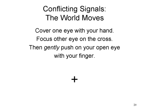 Sometimes the two sources of information
are in conflict. Cover one eye with your hand, and then focus
the other eye on the cross. Then gently push on your
open eye with your finger. The cross seems to move. This is
because the retinal image of the cross moves from one spot to
another, but there is no kinesthetic information about
egomotion to correct this apparent movement.
Sometimes the two sources of information
are in conflict. Cover one eye with your hand, and then focus
the other eye on the cross. Then gently push on your
open eye with your finger. The cross seems to move. This is
because the retinal image of the cross moves from one spot to
another, but there is no kinesthetic information about
egomotion to correct this apparent movement.
Similar processes can be seen in the perception of distance or depth.
Some cues to distance or depth are called binocular, because they depend on the fact that we have two eyes, and are not available to people who are blind in one eye.
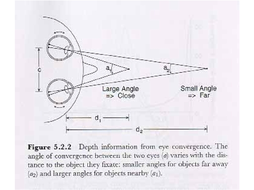 Convergence:
When fixating on an object, the two eyes turn toward each
other. From simple geometry, it is a fact that the angle of
convergence depends on the distance between the eyes and the
object:
Convergence:
When fixating on an object, the two eyes turn toward each
other. From simple geometry, it is a fact that the angle of
convergence depends on the distance between the eyes and the
object:
- at short distances, the angle of convergence is large;
- at long distances, the angle of convergence is small.
Note that the convergence principle works only up to 30-40 feet. After that distance, the eyes are essentially parallel, and convergence is no longer available as a cue to distance.
 Binocular (or Retinal)
Disparity: Because the two eyes are separated by a
space of 2-3 inches, they each provide somewhat different --
disparate -- images of an object.That is, each eye has a
slightly different perspective on the object.
Binocular (or Retinal)
Disparity: Because the two eyes are separated by a
space of 2-3 inches, they each provide somewhat different --
disparate -- images of an object.That is, each eye has a
slightly different perspective on the object.
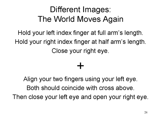 As a demonstration of
binocular disparity, hold out your left index finger at full
arm's length, and your right index finger at half arm's
length. Close your right eye, and align your two fingers using
only your left eye, so that both coincide with the cross. Then
close your left eye and open your right eye. The movement of
the cross shows that the left and right eyes have somewhat
different views.
As a demonstration of
binocular disparity, hold out your left index finger at full
arm's length, and your right index finger at half arm's
length. Close your right eye, and align your two fingers using
only your left eye, so that both coincide with the cross. Then
close your left eye and open your right eye. The movement of
the cross shows that the left and right eyes have somewhat
different views.
These 2-dimensional images are then fused by the brain to result in a three-dimensional percept, with information about depth as well as width and height.
 An
excellent demonstration of stereopsis is provided, naturally,
by stereograms (invented by Charles Wheatstone, an19th-century
physicist). These pairs of images differ slightly in lateral
displacement so that, when one image is presented to each eye,
the two images fuse into a vivid illusion of depth. Of
particular interest are the random-dot stereograms
invented by Bela Julesz, a 20th-century vision scientist
working at Bell Laboratories, which uses stereoscopic images
composed of thousands of randomly placed dots (hence the name)
to create images in depth.
An
excellent demonstration of stereopsis is provided, naturally,
by stereograms (invented by Charles Wheatstone, an19th-century
physicist). These pairs of images differ slightly in lateral
displacement so that, when one image is presented to each eye,
the two images fuse into a vivid illusion of depth. Of
particular interest are the random-dot stereograms
invented by Bela Julesz, a 20th-century vision scientist
working at Bell Laboratories, which uses stereoscopic images
composed of thousands of randomly placed dots (hence the name)
to create images in depth.
 Stereopsis is the
mechanism behind the production of 3-D movies and television,
where scenes are filmed by cameras with two lenses,
separated (like our eyes) by a few inches, so that each lens
captures a slightly different view of the scene. By means of
3-D glasses, each of these views is presented to a different
eye, and the visual system fuses the two 2-D images into a
single 3-D image.
Stereopsis is the
mechanism behind the production of 3-D movies and television,
where scenes are filmed by cameras with two lenses,
separated (like our eyes) by a few inches, so that each lens
captures a slightly different view of the scene. By means of
3-D glasses, each of these views is presented to a different
eye, and the visual system fuses the two 2-D images into a
single 3-D image.
Other cues to distance are monocular, in that they do not depend on the use of two eyes, and are available to organisms that are blind in one eye.
 Accommodation:
When the eyes focus on an object, the lens of the eye changes
shape:
Accommodation:
When the eyes focus on an object, the lens of the eye changes
shape:
- The lens bulges to focus on nearby objects.
- The lens flattens to focus on distant objects.
This flattening and bulging of the lens is accomplished by special muscles, which provide kinesthetic feedback to the visual system.
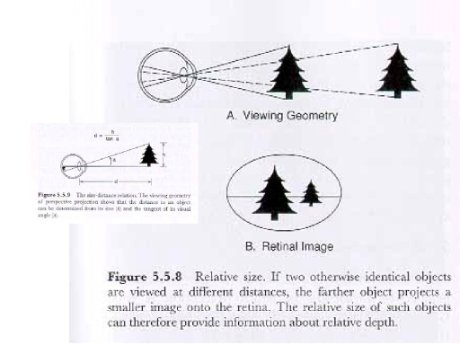 Relative
Size: The size of a retinal image depends on the
visual angle subtended by the object. According to the size-distance
rule:
Relative
Size: The size of a retinal image depends on the
visual angle subtended by the object. According to the size-distance
rule:
- If the distance from the observer to two objects is constant, the size of their retinal images will be a function of the size of the objects.
- If the size of two objects is constant, the size of their retinal images will be a function of their distance from the observer.
Thus, if two images are of
similar shape, but different relative size, there are two
possibilities:
- both are at the same distance from the observer, but one is smaller than the other;
- both are of the same size, but one is closer than the other.
 The solar
"Eclipse Across America" of August 21, 2017 dramatically
illustrates the size-distance rule. The distance from
the Sun to the Earth is about 92.96 million miles. The
distance from the Moon to the Earth is about 238,900 miles --
a ratio of 400:1. As it happens, the diameter of the Sun
is 864,000 miles, and the diameter of the Moon is 2,158 miles
-- also a ratio of 400:1. When the moon orbits between
the Sun and Earth, its disc completely covers that of the Sun,
causing a solar eclipse to occur. But just as important,
in the present context, the constant ratios mean that -- don't
look at the Sun without adequate eye protection!
-- the Sun and the Moon appear to be the same size.
(Photo by Celia
Talbot Tobin for The New York Times, 08/22/2017).
The solar
"Eclipse Across America" of August 21, 2017 dramatically
illustrates the size-distance rule. The distance from
the Sun to the Earth is about 92.96 million miles. The
distance from the Moon to the Earth is about 238,900 miles --
a ratio of 400:1. As it happens, the diameter of the Sun
is 864,000 miles, and the diameter of the Moon is 2,158 miles
-- also a ratio of 400:1. When the moon orbits between
the Sun and Earth, its disc completely covers that of the Sun,
causing a solar eclipse to occur. But just as important,
in the present context, the constant ratios mean that -- don't
look at the Sun without adequate eye protection!
-- the Sun and the Moon appear to be the same size.
(Photo by Celia
Talbot Tobin for The New York Times, 08/22/2017).
According to Gibson, the "choice" between these two possibilities is determined by other visual cues to distance provided the objects and their backgrounds.
 Superposition
(also known as Interposition). If one object
cuts off the observer's view of another object, the former is
closer to the observer than the latter.
Superposition
(also known as Interposition). If one object
cuts off the observer's view of another object, the former is
closer to the observer than the latter.
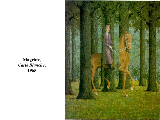
Although this "cue" seems obvious, it was used to great effect in "Carte Blanche" (1955), a painting by the Belgian (not exactly French) surrealist Rene Magritte.
Here's a riff on Magritte's painting: a photograph of a civil War re-enactment by Anderson Scott, from his book Whistling Dixie (2013).
Until the Renaissance, ancient and medieval artists relied on superposition to create the appearance of depth in their paintings.
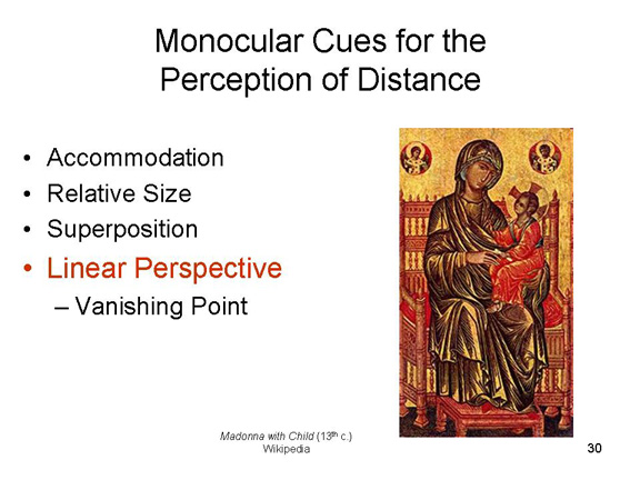
Linear Perspective:
Since the Renaissance, many painters have achieved a sense of
depth or distance in their two-dimensional canvases by making
use of perspective lines that converge toward a vanishing
point. Objects along these lines are foreshortened
proportionately. This cue is also known as spatial
recession.
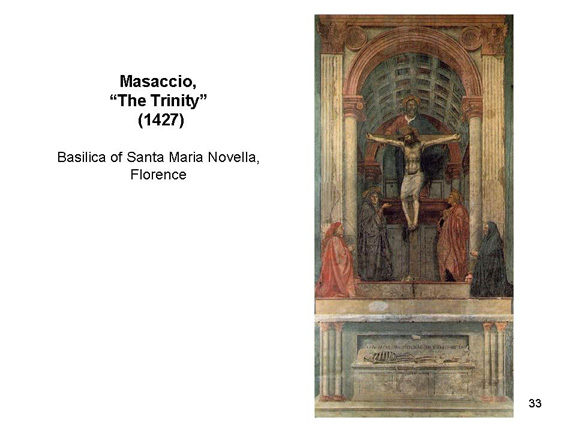
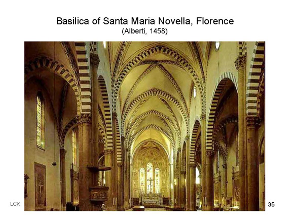
Here's an early example -- perhaps the very first painting to use linear perspective to create the illusion of depth: "The Trinity" by Masaccio (1425), in the Basilica of Santa Maria Novella, Florence. The principles of linear perspective were not codified until Leon Battista Alberti wrote his treatise De Pictura ("On Painting") in 1435. Thereafter, the principles were quickly adopted by other painters of the Renaissance.
A good example of the early use of linear perspective is Raphael's painting "The School of Athens" (1510-1511), which is in the "Rafael Rooms" in Vatican City.
Here's a rough analysis of the use of perspective in Raphael's painting. The tiles on the floor create perspective lines leading to the central figure. So do the columns near the ceiling. Individuals arrayed along the perspective lines are perceived as lying at different distances from the viewer. Enhancing the illusion of depth is relative size: individuals "near" the viewer are painted larger than those "farther away", in an application of the size-distance rule.
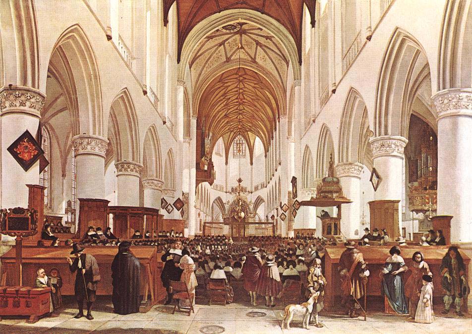
Here's an example from the Dutch "Golden Age","Interior of the Grote Kerk [the cathedral of St. Bavo] at Haarlem" (1673) by Gerrit Adriaensz. Berckheyde (yes, they allowed dogs in the church).
One last example: the Willow Path, the pedestrian entrance to Colgate University, where I went to college (photo by Mark DiOrio)
More Examples of Linear Perspective
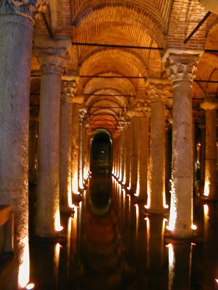
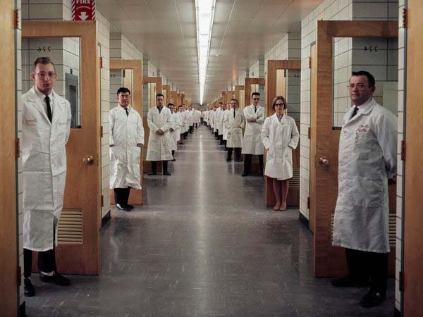
The Byzantine underground cistern in Istanbul, dating from the 6th century CE, is supported by 336 columns. The colonnade of the Buddhist temple of Bayon, in the Angkor Wat complex, Cambodia, dating from the 12th century CE (photo by Barry Brukoff). Here is a 1966 publicity photograph for Bell Laboratories, showing a corridor expressly designed to facilitate interactions between its scientists (Elliott Erwitt/Magnum Photos;New York Times 02/26/2012). If you think that this looks like a perfectly awful place to work, remember that these people, and others just like them, working in corridors like this, invented the transistor, the laser, the solar cell, the Unix operating system, the first communication satellites, the first cell phones, and fiber optics. See The Idea Factory: Bell Labs and the Great Age of American Innovation by John Gertner (2012).
Renaissance
architects sometimes employed illusory tricks of linear perspective to make their buildings seem bigger than they really are. On the left, the Duomo (cathedral) in Orvieto, Italy. Although we expect the columns along the nave to be in parallel, in fact they converge slightly as they approach the altar, thus exaggerating the length of the nave. At the Basilica of Santa Maria Novella, in Florence, the architect pulled out all the stops: not only do the columns along the nave converge slightly, but the floor rises slightly and the ceiling lowers slightly, to exaggerate the sense of distance even more.
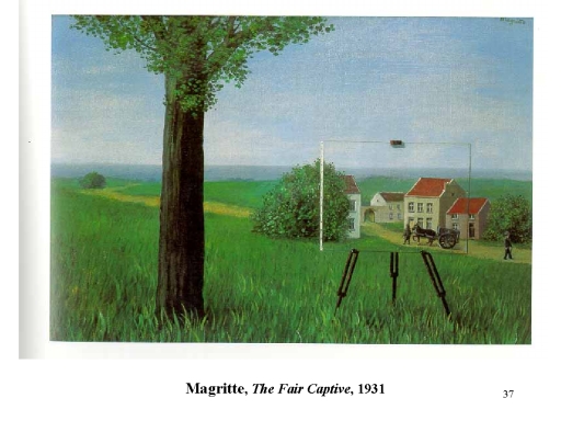
Magritte
also played on the Renaissance idea that the picture frame is like a window, and the painter should paint scenes as if they were being viewed through this opening.In "The Human Condition" (1933) and "The Fair Captive" (1931), Magritte paints the canvas in the scene being portrayed on the canvas.
Here's
a photographic riff on Magritte: an empty picture frame at a viewpoint looking toward Cadaques, Spain (New York Times, 12/15/2013). The city was a frequent subject of the surrealist painter Salvador Dali, who lived nearby -- as in his "Cadaques" (1923).
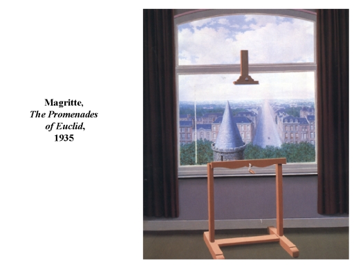
In "The Promenades of Euclid" (1935), the conical tower on the castle on the left is identical in size and shape to the boulevard on the right. The difference is that the tower cuts off our view of the apartment building (an application of superposition), while the boulevard proceeds along linear perspective lines to a vanishing point.
A similar ploy was used by Makoto Aida, a modern Japanese artist, in "Path Between Rice Fields", where the part in the girl's hair is continuous with the path between the fields. Superposition makes us see the girl as close by, while the converging lines of linear perspective makes us see the path receding into the distance (note that the path continues "forward", and is visible next to the girl's neck).
Here's a cover of the New Yorker by David Hockney that is a Magrittian riff on linear perspective. The receding palm trees give a clear impression of distance but note that the width of the road doesn't change.
Linear perspective is nicely illustrated by an untitled painting by Doug Argue, which may be viewed at the Weisman Art Museum at the University of Minnesota.


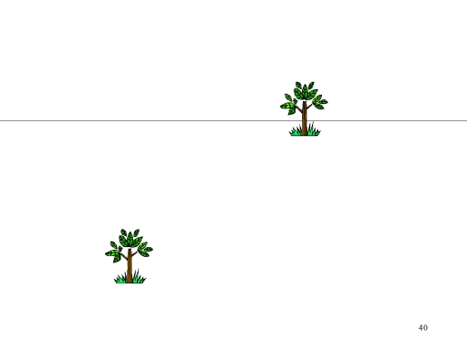 Elevation
 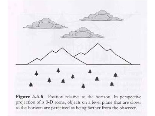 with respect to the Horizon:
Distant objects appear closer to the horizon. That this is not
just a matter of "up" versus "down", consider that the upper
trees appear further away than the lower ones, but the upper
clouds appear closer than the lower one.
with respect to the Horizon:
Distant objects appear closer to the horizon. That this is not
just a matter of "up" versus "down", consider that the upper
trees appear further away than the lower ones, but the upper
clouds appear closer than the lower one.
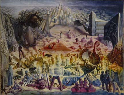
Another surrealist, the Russian-born American Paul (Pawel) Tchelitchew (1898-1957) combined linear perspective and elevation to striking effect in his masterpiece "Phenomena" (1938), the "Final Sketch" of which is shown here. Here there are three different sets of perspective lines. (1) In the foreground, with all the human figures (including Gertrude Stein, who owned the "Final Sketch", and her life-partner Alice B. Toklas, as well as assorted "freaks, monsters, and mutants", as if on a mesa. (2) In the upper left and right, a sort of city with street grid receding to the horizon. Note the blocky skyscraper on the right, which enhances the illusion of depth by means of superposition. That's Stein and Toklas sitting at the feet of the corresponding shrouded figure on the left. (3) In the upper center, a kind of mountain, also consisting of converging lines; but this time the lines converge above the horizon line, thus creating an illusion of height rather than depth.
Before the invention (discovery?) of linear perspective, artists sometimes used elevation as their principal cue to depth or distance. Consider "Paradise" (1445), a painting by the early-Renaissance Sienese artist Giovanni di Paulo (1398-1482), originally in Florence's Church of San Domenico, but now in the Uffizi Gallery. The painting depicts a number of angels and saints embracing each other in greeting, as if some of them had just arrived. Di Paolo packs a lot of people into a small space, and he uses elevation (and superposition) to convey the sense that some of these groupings are further away from the others. There's no use of linear perspective: note that the figures in toward the bottom of the painting, "nearest" the viewer, are the same height (if anything, a little smaller) than those toward the top, "farther away". Di Paolo knew about linear perspective, and he used it in some of his other paintings. But in this painting, he falls back on techniques more characteristic of Gothic art, to give his vision of Paradise an other-worldly feel (see "A Celebration Not of This Earth" by Benjamin Shull, Wall Street Journal, 02/29/2020).
It's a Bird! It's a Plane!
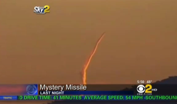 Elevation, as a distance cue, can lead
to interesting visual illusions. On November 9, 2010, local
TV stations, and then the national networks, reported on a
mysterious contrail that had been observed in the sky in the
Los Angeles area. Contrails are formed by condensation from
the exhaust of jet or rocket engines, and the fact that this
particular contrail seemed to arise out of the sea, headed
toward land, gave rise to the speculation that a missile had
been launched from a submarine off the coast, perhaps
accidentally. The Pentagon denied that there had been any
such launch -- but given the massive distrust of "guv-ment"
that infected the American citizenry, especially around the
time of the 2010 midterm elections, very few in the
"missile" crowd was persuaded. Still, a plausible
alternative theory was that this contrail was generated by a
jet flying east from Hawaii or Asia. The fact is that
whatever object was generating the contrail, it was moving
much too slowly to be a missile. We may never know what the
truth is, but it's easy to see how the illusion of
a missile launch could be generated by the elevation
principle. Note that the contrail appears to be rising from
the sea, but it is also rising from the horizon, and we know
that objects on the horizon appear to be distant from the
observer. Instead of a missile being launched from the sea
and gaining altitude, the control may very well be caused by
an airplane flying out of the horizon, toward the observer,
maintaining a constant altitude. The next time you're
outside on a sunny day, and you have a relatively clear shot
to the horizon, look for a jet contrail -- you'll see
exactly the same thing.
Elevation, as a distance cue, can lead
to interesting visual illusions. On November 9, 2010, local
TV stations, and then the national networks, reported on a
mysterious contrail that had been observed in the sky in the
Los Angeles area. Contrails are formed by condensation from
the exhaust of jet or rocket engines, and the fact that this
particular contrail seemed to arise out of the sea, headed
toward land, gave rise to the speculation that a missile had
been launched from a submarine off the coast, perhaps
accidentally. The Pentagon denied that there had been any
such launch -- but given the massive distrust of "guv-ment"
that infected the American citizenry, especially around the
time of the 2010 midterm elections, very few in the
"missile" crowd was persuaded. Still, a plausible
alternative theory was that this contrail was generated by a
jet flying east from Hawaii or Asia. The fact is that
whatever object was generating the contrail, it was moving
much too slowly to be a missile. We may never know what the
truth is, but it's easy to see how the illusion of
a missile launch could be generated by the elevation
principle. Note that the contrail appears to be rising from
the sea, but it is also rising from the horizon, and we know
that objects on the horizon appear to be distant from the
observer. Instead of a missile being launched from the sea
and gaining altitude, the control may very well be caused by
an airplane flying out of the horizon, toward the observer,
maintaining a constant altitude. The next time you're
outside on a sunny day, and you have a relatively clear shot
to the horizon, look for a jet contrail -- you'll see
exactly the same thing.
The "Mystery Missile" episode underscores a point that will be stressed later in these lectures - -that, contrary to Gibson, stimulation is inherently ambiguous, and any given pattern of proximal stimulation may be compatible with a number of different distal stimuli -- in this case, the same contrail could be generated by a submarine-launched missile, or a passenger plane carrying honeymooners home to their families. But we're not there yet!
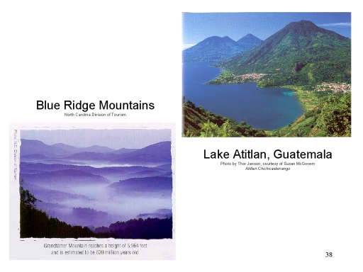 Aerial Perspective (also
called atmospheric perspective): Dust and
water particles in the air absorb and diffract light, with the
result that distant objects look both hazy and bluish. In the
photo of Lake Atitlan, it is clear that the mountains are
green, but the more distant ones are decidedly bluish. The
effect is exaggerated in the Blue Ridge Mountains, which look
blue not only because of aerial perspective, but because
spruce, pine, and fir trees emit a sap which dissolves in the
air and further enhances the effect.
Aerial Perspective (also
called atmospheric perspective): Dust and
water particles in the air absorb and diffract light, with the
result that distant objects look both hazy and bluish. In the
photo of Lake Atitlan, it is clear that the mountains are
green, but the more distant ones are decidedly bluish. The
effect is exaggerated in the Blue Ridge Mountains, which look
blue not only because of aerial perspective, but because
spruce, pine, and fir trees emit a sap which dissolves in the
air and further enhances the effect.
 You get the same effect in the Blue
Mountains in Australia -- although in this case the bluing is
caused by evaporated oil secreted by eucalyptus trees (photo
by Joe Wigdahl, from "Darwin's Forgotten World" by Tony
Perrottet, Smithsonian Magazine, 01/2015)..
You get the same effect in the Blue
Mountains in Australia -- although in this case the bluing is
caused by evaporated oil secreted by eucalyptus trees (photo
by Joe Wigdahl, from "Darwin's Forgotten World" by Tony
Perrottet, Smithsonian Magazine, 01/2015)..
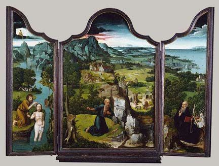
One
of the earliest uses of aerial (atmospheric) perspective is found in the Penitence of Saint Jerome (1518), a triptych by the Northern Renaissance painter Joachim Patinir. Patinir was one of the first Renaissance painters to specialize in landscapes, as opposed to portraits or paintings on historical or religious themes, and he was admired by Albrecht Durer. In fact, the first use of the term "landscape painter" comes from a remark by Durer about Patinir. Anyway, note that the distant portions of the landscape is given a bluish tinge, increasing the illusion of distance. Patinir's color scheme for spatial recession, beginning with browns for the near distance, green for the middle distance, and blue for the far distance, became a kind of "formula" for depicting distance in 16th-century landscapes.
In Magritte's painting, "The Glass Key" (1959), the bluish tinge helps give a sense of distance to the mountains in the background.


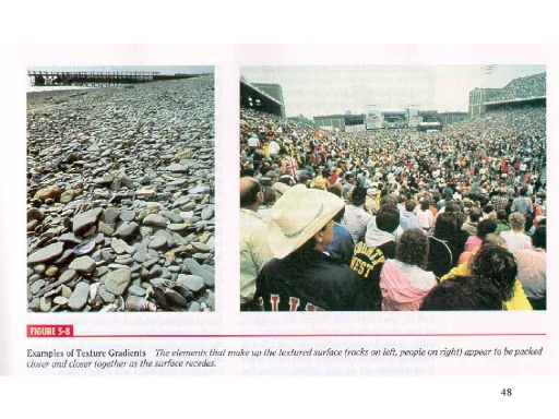 Texture
Gradients: In a variant on linear perspective,
continuous changes in the relative size and compactness of
objects also provide cues to distance. Distant points have
smaller elements, and their elements are more compact.
Texture
Gradients: In a variant on linear perspective,
continuous changes in the relative size and compactness of
objects also provide cues to distance. Distant points have
smaller elements, and their elements are more compact.
Here's an artistic example of texture gradient: La Luzerne, Saint-Denys (1884-1885) by Georges Seurat, the French post-impressionist painter (National Galleries of Scotland).
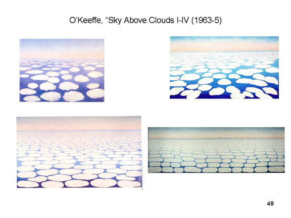
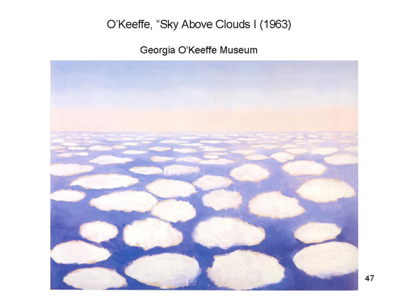
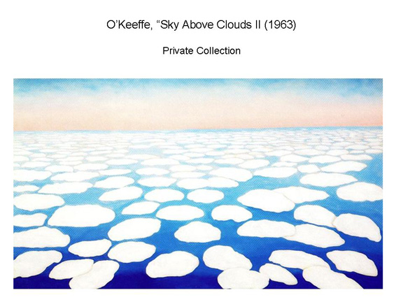
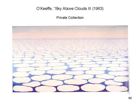
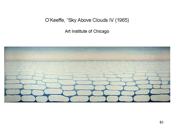
Georgia O'Keeffe used texture gradients to great effect in a series of paintings Sky Above Clouds I-IV (1963-1965), which was inspired by a view she had from an airplane.
 |
 |
 |
 |
And
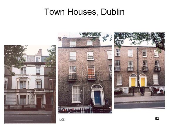
again, texture gradients have been used by architects to make their buildings seem taller than they really are. On the left are some Georgian-style townhouses in Dublin, where as you move up from the ground floor the windows become progressively shorter. Yes, the household help lived on the topmost floor, but that wasn't the reason that the windows are small: the windows are smaller to make the houses seem taller. The effect is also clear in this side view of the Duomo (cathedral) in Arezzo, Italy, where the rows of columns get shorter and shorter as they get higher and higher. In this case, the effect is magnified further by the fact that the side street is very narrow, so you're looking virtually straight up.
Here's another example of texture gradients in architecture: Cinderella's Castle at Magic Kingdom Park, part of the Walt Disney Resort in Orlando, Florida. It's the symbol of the park, like Sleeping Beauty's Castle in the original Disneyland. The designers wanted Cinderella's castle to be even taller, but their plans ran up against height restrictions imposed by a nearby airport. So, the castle was built with bricks that get progressively smaller and more compact as they go up, so that the castle looks taller than it actually is. (Thanks to Rhea Marie LaFleur for this one.)

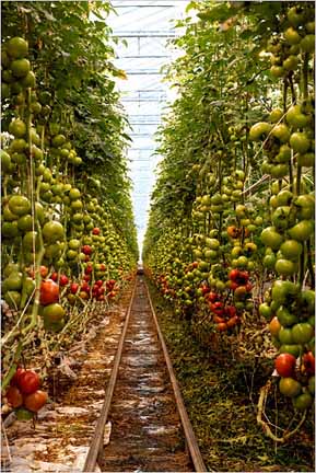 Here's an
example that combines texture gradients with linear
perspective. It's the interior of a greenhouse at Backyard
Farms, in Maine, as shot by Stacey Camp for the New York
Times (03/31/2010). You can see the converging lines
formed by the planters, and also by the tops of the vines. And
while the tomatoes (and the panes of glass in the roof)
nearest the viewer are clearly distinguishable, the ones
furthest away are not.
Here's an
example that combines texture gradients with linear
perspective. It's the interior of a greenhouse at Backyard
Farms, in Maine, as shot by Stacey Camp for the New York
Times (03/31/2010). You can see the converging lines
formed by the planters, and also by the tops of the vines. And
while the tomatoes (and the panes of glass in the roof)
nearest the viewer are clearly distinguishable, the ones
furthest away are not.
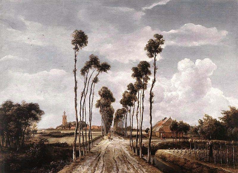 And here's
another example, from the "golden age" of Dutch painting:
Meindart Hobbema's Avenue at Middelharnis (1689;
National Gallery, London). It's a classic example of what art
historians call "deep central-perspective". Notice that the
trees have been trimmed all the way to the top. You can see
this clearly in the closest trees, but the more distant ones
all blend together, so that they don't look trimmed at all.
And here's
another example, from the "golden age" of Dutch painting:
Meindart Hobbema's Avenue at Middelharnis (1689;
National Gallery, London). It's a classic example of what art
historians call "deep central-perspective". Notice that the
trees have been trimmed all the way to the top. You can see
this clearly in the closest trees, but the more distant ones
all blend together, so that they don't look trimmed at all.
Shadowing: While the shadowed portions of objects are hidden from light, the illuminated portions of objects must be situated between light and shadow. Therefore, if we know the location of a light source, patterns of light and shadow in the visual field mark the relative distance of objects from the light, and therefore from the observer.
 The
The 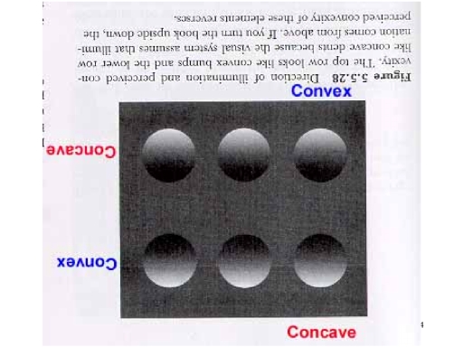 human visual
system evolved in an environment in which light from the sun
or the moon illuminates objects from above. Therefore, the top
row of circles looks like bumps in the surface, with their
centers closer to the observer, while the bottom row looks
like dents in the surface, with their centers relatively far
from the observer. If we flip the picture 180 degrees, the top
row now looks like bumps, and the bottom row now looks like
dents.
human visual
system evolved in an environment in which light from the sun
or the moon illuminates objects from above. Therefore, the top
row of circles looks like bumps in the surface, with their
centers closer to the observer, while the bottom row looks
like dents in the surface, with their centers relatively far
from the observer. If we flip the picture 180 degrees, the top
row now looks like bumps, and the bottom row now looks like
dents.
Shading doesn't just contribute to the perception of depth: it also contributes to the perception of form. The circles or discs in the example above don't look like circles. the look like bumps or indentations. V.S. Ramachandran (Nature, 1988; Scientific American, 8/1988) and his colleagues have been studying the principles which govern the perception of shape from shading (for an overview see "Out of the Shadows" by C. Chunharas and V.S. Ramachandran, Scientific American Mind, July-August/2016). Some of these principles are:
- All things being equal, the visual system "prefers" convexity: surfaces like this are more likely to be perceived as spheres than as cavities.
- We generally assume that there is only a single source of light.
- And we also assume that this light source is shining from above.
- Perceivers look for consistency among various cues.
These principles make evolutionary sense. After all, all creatures on earth evolved in an environment where there was a single source of light, either the sun or the moon, which was usually overhead.
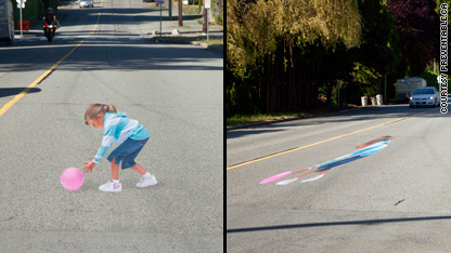
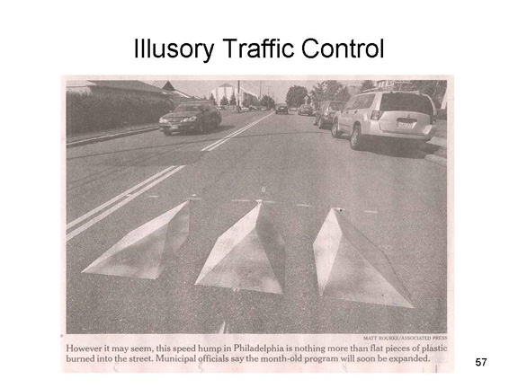 A
particularly interesting application of the principles of
depth perception to creating an illusion of depth is in "3-D"
or "virtual" speed bumps sometimes encountered in residential
areas to control traffic speed. Instead of the usual physical
speed bumps, these are flat pieces of plastic, embedded in the
street surface, whose visual appearance conveys the appearance
of a fairly nasty object sticking out of the street. They are
apparently quite effective -- at least until drivers catch on
to the trick! [See "To Slow Speeders, Philadelphia Tries
Make-Believe" by Sean D. Hamill,New York Times,
07/12/08.]
A
particularly interesting application of the principles of
depth perception to creating an illusion of depth is in "3-D"
or "virtual" speed bumps sometimes encountered in residential
areas to control traffic speed. Instead of the usual physical
speed bumps, these are flat pieces of plastic, embedded in the
street surface, whose visual appearance conveys the appearance
of a fairly nasty object sticking out of the street. They are
apparently quite effective -- at least until drivers catch on
to the trick! [See "To Slow Speeders, Philadelphia Tries
Make-Believe" by Sean D. Hamill,New York Times,
07/12/08.]
A similar tactic, deployed experimentally in Canada in 2010, employs an image of a child playing in the street (thanks to Alex Ren for spotting this).
Less practical, and more artistic, is "The Crevasse", a perspective painting created by Edgar Muller in Dun Laoghaire, Ireland (National Geographic, 06/2011).

 And finally, a
bit of viral hoax. In December 2015, someone in Brazil
actually painted, on the blank wall adjacent to a traffic
underpass, a fake tunnel of the sort that Road Runner used to
torment Wile E. Coyote in the famous series of Looney Tunes
cartoon shorts -- complete with an image of Road Runner
itself. Subsequently, someone posted the image on the
left to the internet (click on it to get the full treatment),
claiming that someone had actually crashed into the illusory
tunnel, after which the authorities painted it over.
It's a good story, and it's a wonderful visual illusion, but
the story is untrue. Yes, the fake tunnel was painted;
but no, no driver ever crashed into it (in fact, the red Fiat
automobile seen in the top image going through the underpass
is a different model from the damaged one depicted in the
lower left); and the image was painted over before any
accident could happen. The whole expose is detailed
here on the snopes.com website,. But it's still a
pretty convincing visual illusion, no? Here, for your
viewing pleasure, is a link to
a corresponding Road Runner cartoon posted to YouTube.
And finally, a
bit of viral hoax. In December 2015, someone in Brazil
actually painted, on the blank wall adjacent to a traffic
underpass, a fake tunnel of the sort that Road Runner used to
torment Wile E. Coyote in the famous series of Looney Tunes
cartoon shorts -- complete with an image of Road Runner
itself. Subsequently, someone posted the image on the
left to the internet (click on it to get the full treatment),
claiming that someone had actually crashed into the illusory
tunnel, after which the authorities painted it over.
It's a good story, and it's a wonderful visual illusion, but
the story is untrue. Yes, the fake tunnel was painted;
but no, no driver ever crashed into it (in fact, the red Fiat
automobile seen in the top image going through the underpass
is a different model from the damaged one depicted in the
lower left); and the image was painted over before any
accident could happen. The whole expose is detailed
here on the snopes.com website,. But it's still a
pretty convincing visual illusion, no? Here, for your
viewing pleasure, is a link to
a corresponding Road Runner cartoon posted to YouTube.
Speaking of motion, there are also motion cues to depth -- that is, dynamic cues to depth and distance that are produced by the observer's own movement through the environment.
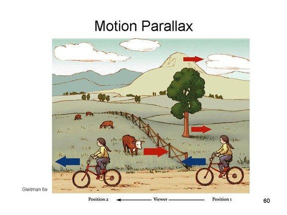 Motion parallax refers to the
differences in motion produced by objects at different
distances, relative to the viewpoint of a moving observer. As
the bicyclist moves from right to left, the world seems to
move backwards, from left to right. That much is obvious, but
it's actually more interesting than that. Assume that the
bicyclist fixates on the tree, in the middle distance. Objects
that are closer, like the cow, will appear to move in the
opposite direction, but objects that are farther away, like
the mountain, will do so more slowly, and may actually appear
to move in the same direction. Thus, the speed and direction
of apparent motion of objects created by a moving observer is
a cue to the distance of those objects from the observer
(astronomers use a similar principle to infer the distance of
stars).
Motion parallax refers to the
differences in motion produced by objects at different
distances, relative to the viewpoint of a moving observer. As
the bicyclist moves from right to left, the world seems to
move backwards, from left to right. That much is obvious, but
it's actually more interesting than that. Assume that the
bicyclist fixates on the tree, in the middle distance. Objects
that are closer, like the cow, will appear to move in the
opposite direction, but objects that are farther away, like
the mountain, will do so more slowly, and may actually appear
to move in the same direction. Thus, the speed and direction
of apparent motion of objects created by a moving observer is
a cue to the distance of those objects from the observer
(astronomers use a similar principle to infer the distance of
stars).
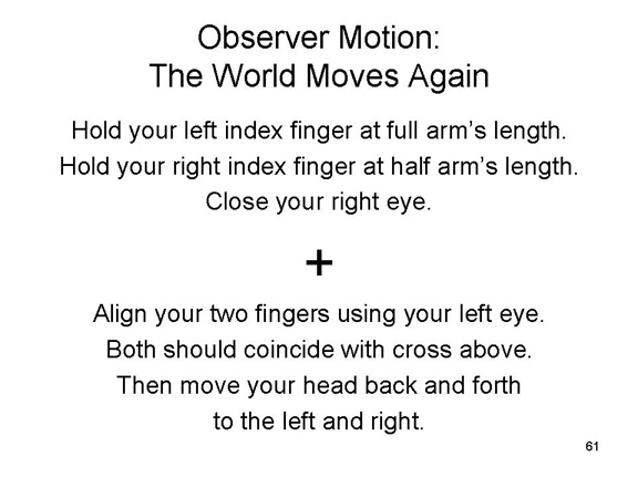
To simulate motion parallax, hold your two index fingers out in front of your nose, one at full arm's length, the other about halfway. Now close your right eye, much as you did in the demonstration of retinal disparity, and align your fingers with some object, such as this cross. Now keep your hands still, and slowly move your head to the right. When you do this, you'll see that both of your fingers appear to move in the opposite direction, with the closer finger moving leftward farther, and faster, than the more distant finger. Now repeat the action, but this time move your head to the left. This time, your fingers will appear to move to the right.
Here's one instance where the Renaissance attempt to replicate three-dimensional visual experience in two-dimensional paintings fails. Painters establish linear perspective from the perspective (sorry) of a single viewer standing stationary in front of a scene. But if you were viewing this scene in real life, and you walked back and forth, motion parallax would kick in: figures in the front of the painting would cover and uncover the figures immediately behind them. That doesn't happen with a painting: you see the same scene no matter how you situate yourself with respect to the presumed viewer's point of view. Still, it's a detail: How many people actually walk back and forth when looking at a painting?
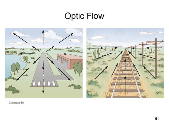 Optic flow
also refers to the movement of images across the retina as the
observer moves around the environment. If you're a pilot
landing an airplane, objects appear to diverge outwards from a
convergence point directly in front of you (this follows from
the principles of linear perspective). Objects that are close
by, like the near end of the runway, diverge very quickly,
compared to distant objects, like the far end of the runway.
If you're in the rear car of a train looking out the back
window, objects appear to converge inwards toward the
convergence point. And, again, nearby objects appear to go by
quickly, while faraway objects don't appear to move much at
all. So, in both cases, the relative velocity of images across
the retina is a cue to the relative distance of the objects.
Optic flow
also refers to the movement of images across the retina as the
observer moves around the environment. If you're a pilot
landing an airplane, objects appear to diverge outwards from a
convergence point directly in front of you (this follows from
the principles of linear perspective). Objects that are close
by, like the near end of the runway, diverge very quickly,
compared to distant objects, like the far end of the runway.
If you're in the rear car of a train looking out the back
window, objects appear to converge inwards toward the
convergence point. And, again, nearby objects appear to go by
quickly, while faraway objects don't appear to move much at
all. So, in both cases, the relative velocity of images across
the retina is a cue to the relative distance of the objects.
To simulate optic flow, just walk down a long hallway, and watch what happens to the doors, windows, or lockers that line the corridor. Now repeat the process, walking backward (but be careful not to trip or bump into anything!
And just to make an obvious point, you don't get optic flow when you walk toward, or away from, a painting either!
Many (but by no means all)
of the cues for depth and distance are summarized in the
following chart.
- Some cues are ocular i nature, in that distance information is provided by the muscles in the eyes.
- Other cues are optical in nature, in that distance information is provided by the light falling on the retina.
- Within each category, some cues are binocular in nature, requiring two eyes.
- Others are monocular, depending on only a single eye.
- Some optical cues are stereoscopic in nature, such as binocular disparity (which is obviously binocular!).
- Many of the monocular optical cues are pictorial in nature, in that they have been used by artists since the Renaissance to depict three dimensions in two-dimensional spaces such as a canvas (which is why you see so many paintings and buildings in this supplement).
- Other monocular optical cues, such as optic flow and motion parallax, depend on the object (or the observer) being in motion.
Organization of Depth Cues |
||
|
Cue Type |
Binocular |
Monocular |
|
Ocular |
Convergence |
Accommodation |
|
Optical |
Stereoscopic Binocular Disparity |
Pictorial Relative Size Linear Perspective Elevation Superposition Texture Gradients Aerial Perspective Shadowing
Motion Optic Flow Motion Parallax |
In summary, some of the
cues to depth are ocular in nature, reflecting
information coming from the muscles in the eye:
- accommodation is a monocular cue, requiring only one eye;
- convergence is a binocular cue, requiring two eyes.
Another binocular cue is stereoscopic
in nature, reflecting the fact that each eye receives a
slightly different image of the object of perception:
- The most prominent stereoscopic cue is binocular (or retinal) disparity; (there are other forms of disparity).
The remaining cues to
depth or distance are optical in nature, reflecting
the physics of vision and the geometries of distance. These
cues are sometimes called pictorial cues, because
they are the same sorts of cues that visual artists use to
give the illusion of depth to a painting on a two-dimensional
canvas:
- relative size, linear perspective, and the other pictorial cues are all monocular cues.
Trompe l'Oeil
Some artists have used the pictorial cues in a form of painting known as trompe l'oeil (French, meaning "fool the eye", pronounced trump-loy), in which images are painted on a flat surface in such a way as to give an illusion of depth -- not just a representation of a scene, but the actual perceptual experience of seeing objects in three dimensions.
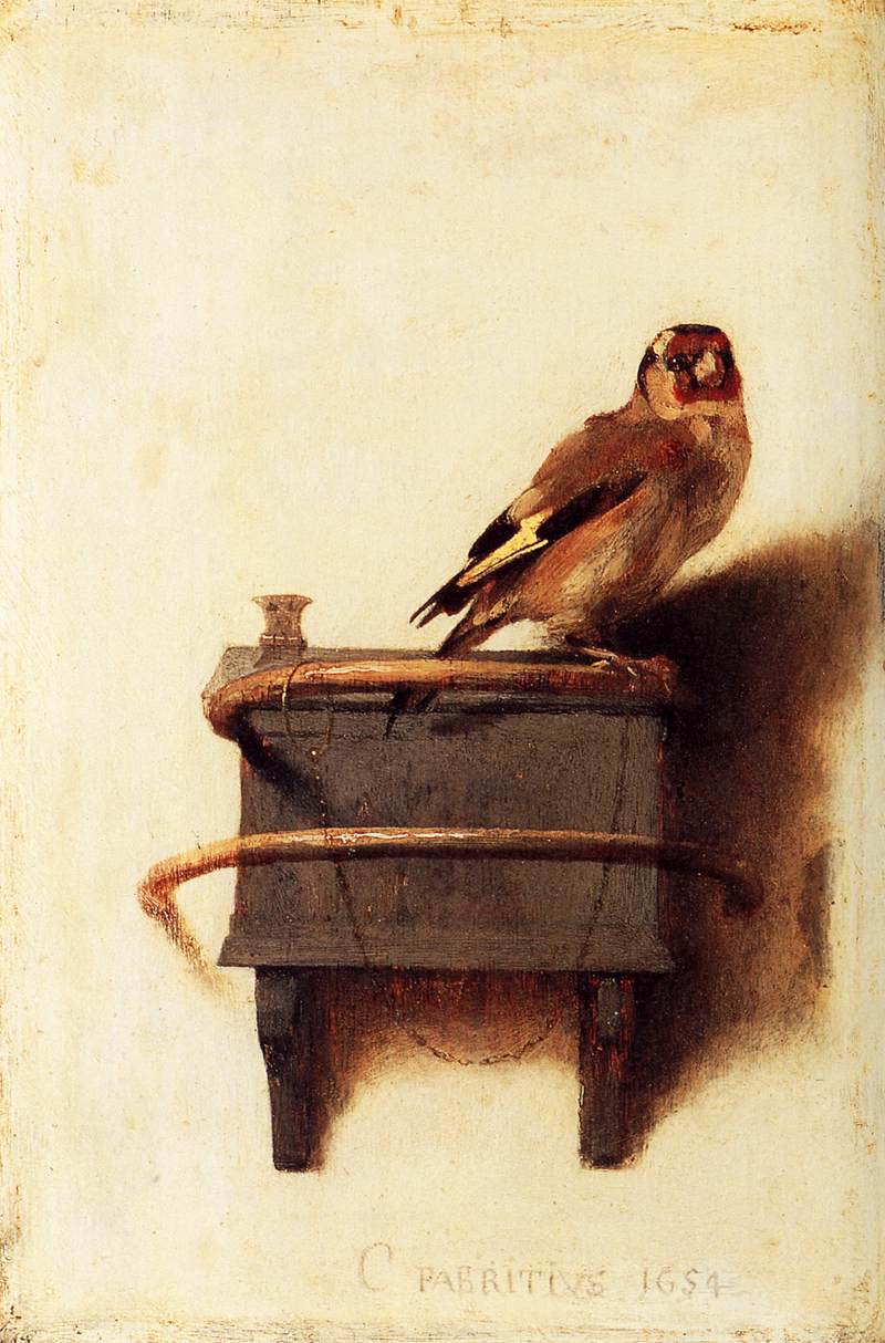 A famous
example is The Goldfinch (1654; in the
Mauritshaus, The Hague) by Carel Fabritius, an artist of the
"Golden Age" of Dutch painting. The painting is intended to
be hung high on a wall, with a light source to its left, so
that the painted shadow falls to the right. Most trompe-l'oeil
paintings were still lifes -- because, well, the illusion is
spoiled if there's something that's supposed to move! But in
this case Fabritius apparently figured that a pet bird would
perch somewhere for a long time. The painting was intended
to be hung unframed, so that its background would bled with
the texture as the wall of a 17th-century Dutch house.
(It's the inspiration for The Goldfinch (2013)
by Donna Tartt, which won the Pulitzer Price for fiction for
2014.
A famous
example is The Goldfinch (1654; in the
Mauritshaus, The Hague) by Carel Fabritius, an artist of the
"Golden Age" of Dutch painting. The painting is intended to
be hung high on a wall, with a light source to its left, so
that the painted shadow falls to the right. Most trompe-l'oeil
paintings were still lifes -- because, well, the illusion is
spoiled if there's something that's supposed to move! But in
this case Fabritius apparently figured that a pet bird would
perch somewhere for a long time. The painting was intended
to be hung unframed, so that its background would bled with
the texture as the wall of a 17th-century Dutch house.
(It's the inspiration for The Goldfinch (2013)
by Donna Tartt, which won the Pulitzer Price for fiction for
2014.
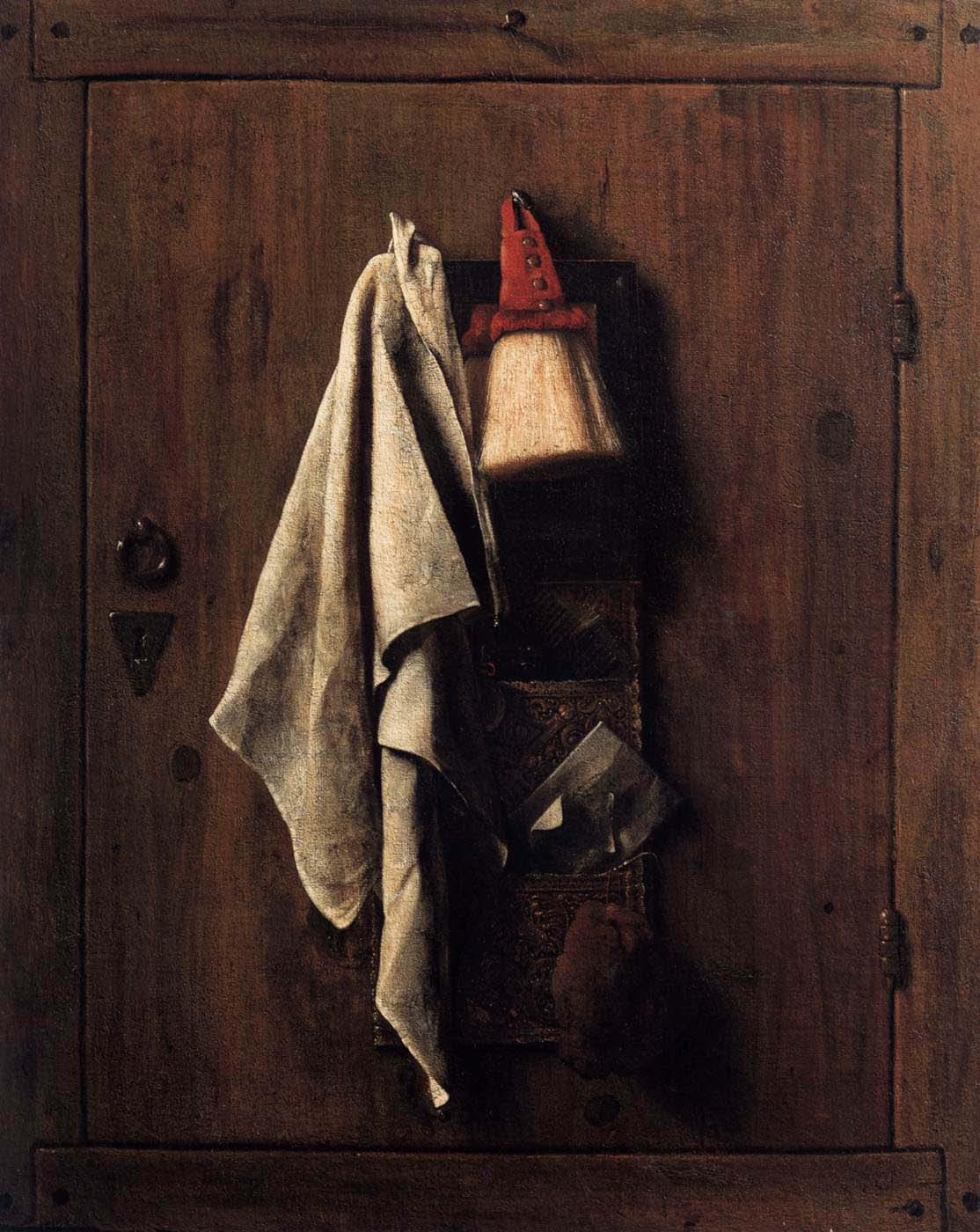 Another
 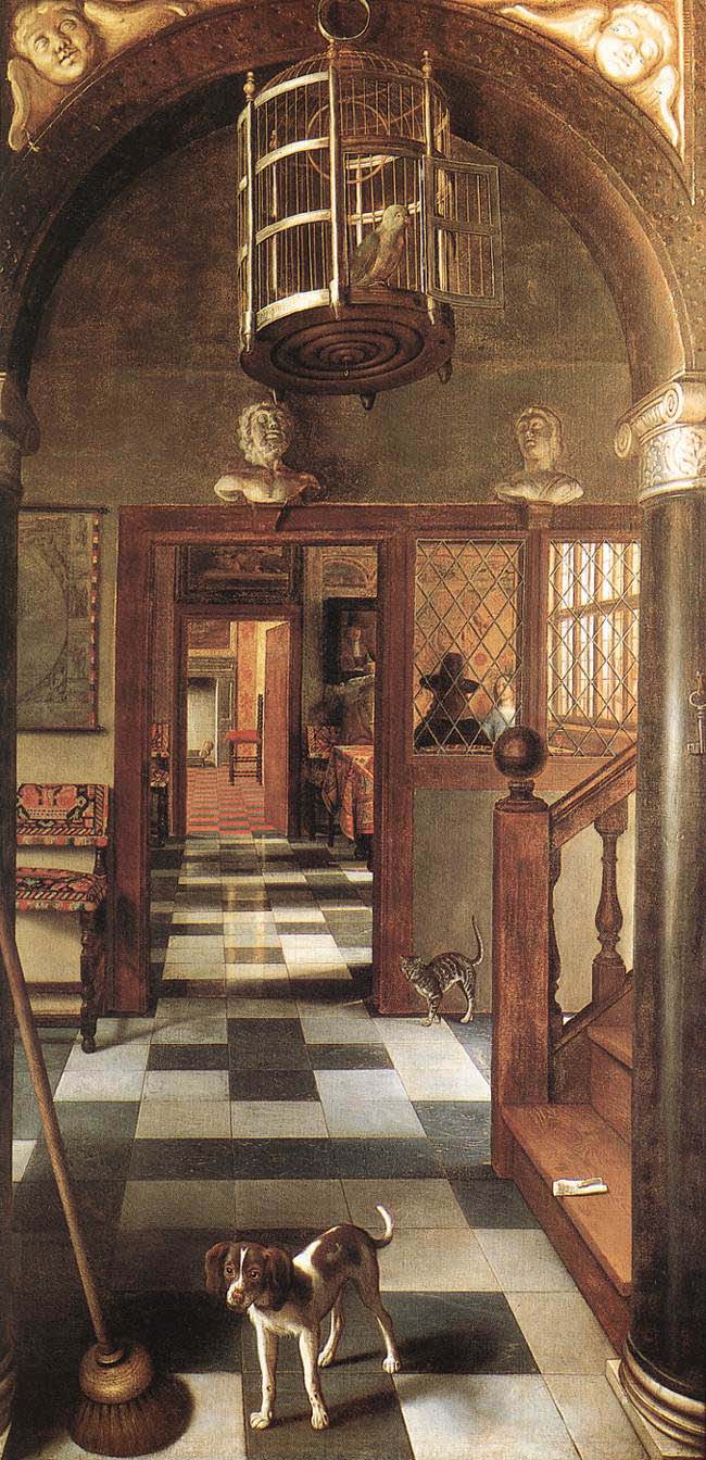 Dutch "golden age" painter of trompe
l'oeil was Samuel van Hoogstraten, whose Still
Life on a Cupboard Door (1655, in the Academy of Fine
Arts, Vienna) is shown here. Van Hoogstraten was famous for
painting life-size optical illusions showing a succession of
doorways, as in View of a Corridor (1662; National
Trust, Dyrham Park, England).. See how many pictorial cues
to depth you can identify. I'll show you another van
Hoogstraten painting later, when we discuss the Ames Room.'s
Dutch "golden age" painter of trompe
l'oeil was Samuel van Hoogstraten, whose Still
Life on a Cupboard Door (1655, in the Academy of Fine
Arts, Vienna) is shown here. Van Hoogstraten was famous for
painting life-size optical illusions showing a succession of
doorways, as in View of a Corridor (1662; National
Trust, Dyrham Park, England).. See how many pictorial cues
to depth you can identify. I'll show you another van
Hoogstraten painting later, when we discuss the Ames Room.'s
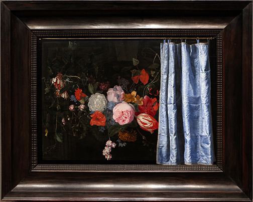 Here's
another one -- a 1658 collaboration between two Dutch
artists, Adriaen van der Spelt and Frans van Mieris the
Elder. The painting may have been inspired by the
story, recorded by Pliny the Elder, of two ancient (5th c.
BCE) Greek painters: Zeuxis, who painted grapes so
realistically that birds tried to eat them; and Parrhasius,
who painted a curtain so realistically that Zeuxis wanted to
see what was behind it. In any event, in 17th-century
Holland (and elsewhere), it was common to hang curtains in
front of paintings to protect them from smoke, dust, and
grime. In this case, van der Spelt painted the
flowers, and van Mieris painted the curtain. (I've
taken the story of Zeuxis and Parrhasius from "Feinting
Spells", a review by Susan Tallman of an exhibit at New
York's Metropolitan Museum of Art on "Cubism and the Trompe
l'Oeil Tradition", New York Review of Books,
01/19/2023. The van der Spelt-vanMieris collaboration,
on loan from the Art Institute of Chicago, opened the Met
exhibit.)
Here's
another one -- a 1658 collaboration between two Dutch
artists, Adriaen van der Spelt and Frans van Mieris the
Elder. The painting may have been inspired by the
story, recorded by Pliny the Elder, of two ancient (5th c.
BCE) Greek painters: Zeuxis, who painted grapes so
realistically that birds tried to eat them; and Parrhasius,
who painted a curtain so realistically that Zeuxis wanted to
see what was behind it. In any event, in 17th-century
Holland (and elsewhere), it was common to hang curtains in
front of paintings to protect them from smoke, dust, and
grime. In this case, van der Spelt painted the
flowers, and van Mieris painted the curtain. (I've
taken the story of Zeuxis and Parrhasius from "Feinting
Spells", a review by Susan Tallman of an exhibit at New
York's Metropolitan Museum of Art on "Cubism and the Trompe
l'Oeil Tradition", New York Review of Books,
01/19/2023. The van der Spelt-vanMieris collaboration,
on loan from the Art Institute of Chicago, opened the Met
exhibit.)
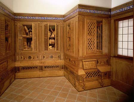 Here's yet another, done
with wood rather than paint: the "Gubbio Studiolo" of
Federico da Montefeltro, Duke of Urbino, created in the
1480s by the da Maiano Brothers, master woodworkers, for the
duke's residence in Gubbio, Italy, and now installed at the
Metropolitan Museum of Art in New York City. A studiolo
was a small, private study, fitted with shelves for books
and other objects, and intended to impress a visitor with
the owner's learning and culture. In this one, however,
there's a joke: the five surfaces you see are all perfectly
flat. The da Maiano brothers employed the then-new
techniques of visual perspective to fool the eye into seeing
real shelves with real books, partially open cupboard doors,
a chair with side table, and the like.
Here's yet another, done
with wood rather than paint: the "Gubbio Studiolo" of
Federico da Montefeltro, Duke of Urbino, created in the
1480s by the da Maiano Brothers, master woodworkers, for the
duke's residence in Gubbio, Italy, and now installed at the
Metropolitan Museum of Art in New York City. A studiolo
was a small, private study, fitted with shelves for books
and other objects, and intended to impress a visitor with
the owner's learning and culture. In this one, however,
there's a joke: the five surfaces you see are all perfectly
flat. The da Maiano brothers employed the then-new
techniques of visual perspective to fool the eye into seeing
real shelves with real books, partially open cupboard doors,
a chair with side table, and the like.
Beginning in the Renaissance, painters thought of the picture frame a a sort of "window" through which a scene was viewed -- a scene whose illusory realism was created by liner perspective and other pictorial cues (that's why they're called "pictorial"). But beginning in the late 19th century, with Impressionism and other forms of "modern" art, artists began to abandon these aspects of realism.
- The Impressionists themselves began painting pictures that resembled what the eye takes in "at a glance", rather than trying to faithfully represent what the scene actually is.
- The Cubists, like Picasso and Braque, painted pictures that simultaneously looked at a scene from multiple perspectives.
- And other Modernists painted pictures which abandoned
the window-like frame, breaking down the traditional
distinction between painting and sculpture. As
Gertrude Stein put it, writing about Picasso, "the framing
of life, the need that a picture exist in its frame,
remain in its frame was over", and "pictures commenced to
want to leave their frames".
For
a comprehensive survey of the use of perceptual principles in the visual arts, see Art and Illusionists (2015), by Nicholas Wade, a distinguished Scottish perception researcher. In 16 chapters covering everything from linear perspective to ambiguous figures,and from trompe l'oeil to surrealism, Wade shows how the principles of perception enable artists to create illusory three-dimensional worlds on flat surfaces. It's a worthy followup to Art and Illusion: A Study in the Psychology of Pictorial Presentation (1960), the classic treatise on the subject by E.H. Gombrich -- which, if you're really interested in this stuff, you should also read.
As research on motion and depth perception shows, in many cases all the information required for perception is supplied by the entire pattern of proximal stimulation available to the observer. Especially important is comparison between objects, and between objects and their backgrounds. Also relevant is information from the kinesthetic and vestibular senses, which permit a comparison between information processed by the distance senses and by the deep senses.
Perceiving Depth in Casablanca
From the Renaissance onward, visual artists have used the monocular optical cues to give the illusion of depth in their two-dimensional paintings. But the same cues have been employed in other circumstances as well.
Consider, for example, the last scene in the classic film Casablanca (1942, directed by Michael Curtiz), starring Humphrey Bogart (as American expatriate nightclub owner Rick Blaine) and Ingrid Bergman (as his former lover Ilse Lund, now married to Victor Laszlo, a leader of the anti-Nazi resistance, played by Paul Henreid), which takes place at the eponymous city's municipal airport. Due to wartime restrictions on access to airfields and the availability of aircraft, this scene could not be shot on location. Instead, it was shot on a sound-stage with a plywood mock-up of the airplane, using fog to obscure the artificiality of the whole thing.
In order to foster the illusion of distance, the mock-up was smaller than scale, and the ground crew was played by dwarfs -- actors of unusually small stature who were otherwise well-proportioned (probably some of the same "little people" who played the Munchkins in The Wizard of Oz). The same trick had been employed in an earlier stage version of the film, titled Everybody Goes to Rick's.
See Round Up the Usual Subjects: The
Making of Casablanca -- Bogart, Bergman, and World War II
by Aljean Harmatz.
Summary of the Ecological View of Perception
The theory of direct perception considers perception to be an innate mechanistic process, analogous to the S-R theory of learning or the psychophysical analysis of stimulus detection.
- All the information needed for perception is provided by the stimulus.
- With the proviso that the "stimulus" is defined broadly to include the entire pattern of proximal stimulation available to the perceiver, including information from the perceiver's own body as well as the external environment.
- The stimulus provides information for perception; the perceptual systems have evolved to extract this information. These mechanisms are part of the organism's innate biological endowment.
- Thus, perception requires little or no learning on the part of the organism, and little or no involvement of "higher" mental processes involved in judgment, memory, or inference based on prior experience. Perception is not mediated by cognition, which is why the ecological view is sometimes called direct perception.
- The information in the environment is sufficient to enable us to perceive the world the way it really is, which is why the ecological view is sometimes called direct realism.
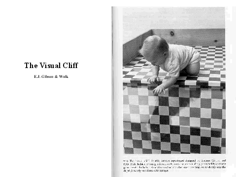 For
example, in a classic experiment by Eleanor J. Gibson and
Richard Walk, neonates were observed to avoid a visual cliff
on their first encounter with it. Noticing a visual cliff, and
avoiding falling from it, requires perception of distance.
Gibson and Walk argued that infants accomplish this
immediately, without benefit of learning, and without benefit
of judgment or inference. Their perceptual systems are built
to extract information about depth and distance from the
environment, and they do so automatically.
For
example, in a classic experiment by Eleanor J. Gibson and
Richard Walk, neonates were observed to avoid a visual cliff
on their first encounter with it. Noticing a visual cliff, and
avoiding falling from it, requires perception of distance.
Gibson and Walk argued that infants accomplish this
immediately, without benefit of learning, and without benefit
of judgment or inference. Their perceptual systems are built
to extract information about depth and distance from the
environment, and they do so automatically.
Is the Visual Cliff Really a Matter of Innate Depth Perception?
UCB's Prof. Joseph Campos has argued that Gibson and Walk erred in their conclusions from the "visual cliff" experiment. He noted that the infants were encouraged to crawl toward their mothers, who were situated on the other side of the cliff from the child. Campos argues that the infants avoided the cliff because they picked up on their mothers' facial and vocal expressions of anxiety, not because they innately perceived depth.
The Constructivist Approach to Perception
 The ecological view of perception is a
theory of veridical perception, and it specifies a set of
perceptual mechanisms that allow us to perceive objects as
they exist in the world by extracting the information they
make available to us. However, mechanisms of this sort cannot
be all that are involved, because sometimes we do not see the
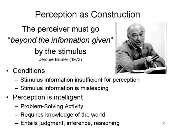
world as it really is. Moreover, as the pioneering American
cognitive psychologist Jerome Bruner noted, sometimes the
perceiver must go"beyond the information given" by
the stimulus.
The ecological view of perception is a
theory of veridical perception, and it specifies a set of
perceptual mechanisms that allow us to perceive objects as
they exist in the world by extracting the information they
make available to us. However, mechanisms of this sort cannot
be all that are involved, because sometimes we do not see the
world as it really is. Moreover, as the pioneering American
cognitive psychologist Jerome Bruner noted, sometimes the
perceiver must go"beyond the information given" by
the stimulus.
Link
to an interview with Jerome Bruner.
 Bruner's quote
exemplifies a long-running tradition in perception, known as
the constructivist view -- because it holds that
perception isn't given by the stimulus, but rather is actively
constructed by the perceiver.
Bruner's quote
exemplifies a long-running tradition in perception, known as
the constructivist view -- because it holds that
perception isn't given by the stimulus, but rather is actively
constructed by the perceiver.
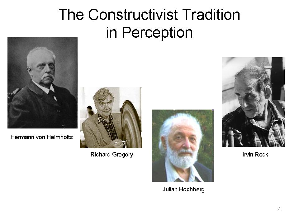
- In the 19th century, Hermann von Helmholtz argued that perception was mediated by unconscious inferences made by the perceiver.
- In the 20th century, Richard Gregory, a British psychologist, argued for the constructivist viewpoint in his book The Intelligent Eye.
- Julian Hochberg, an American psychologist, argued for the constructivist viewpoint in many articles collected in a volume entitled The Mind's Eye.
- Irvin Rock, another American psychologist (who spent the last years of his career at UC Berkeley), wrote a book on perception entitled Indirect Perception, directly countering the Gibsonian ecological viewpoint.
So sometimes the correct perception isn't conveyed by the stimulus. For example, the stimulus information provided by the sensory apparatus may be insufficient or misleading. Under these circumstances, the information from stimulation must be supplemented with conceptual information and other world-knowledge retrieved from memory. Under these circumstances, perception is not direct. Rather, it involves inference. Perception is intelligent, not mechanistic, in that it involves knowledge of the world, and requires active thinking and problem-solving on the part of the perceiver.
Gestalt Psychology
 This point was underscored in the 1920s
and 1930s by a group of perception theorists, including Kurt
Koffka, Wolfgang Kohler, and Max Wertheimer, known as the Gestalt
school of psychology. "Gestalt" is a German word that
roughly translates as "whole configuration", and the Gestalt
psychologists focused on the tendency of the mind to organize
individual stimuli into groups or sets -- in other words, to
fuse stimulus elements into a perceptual whole. Like the
functionalists, the Gestalt theorists were opposed to the
structuralists. From a Gestalt point of view, we cannot
analyze perceptual experience into its elementary
constituents, because the elements interact with each other in
such a way that
This point was underscored in the 1920s
and 1930s by a group of perception theorists, including Kurt
Koffka, Wolfgang Kohler, and Max Wertheimer, known as the Gestalt
school of psychology. "Gestalt" is a German word that
roughly translates as "whole configuration", and the Gestalt
psychologists focused on the tendency of the mind to organize
individual stimuli into groups or sets -- in other words, to
fuse stimulus elements into a perceptual whole. Like the
functionalists, the Gestalt theorists were opposed to the
structuralists. From a Gestalt point of view, we cannot
analyze perceptual experience into its elementary
constituents, because the elements interact with each other in
such a way that
"The whole is
something else than the sum of its parts"
(Koffka, 1935); sometimes rendered as the whole is greater than the some of its parts, but that's not what Koffka actually wrote, and he good-naturedly corrected people who said "greater").
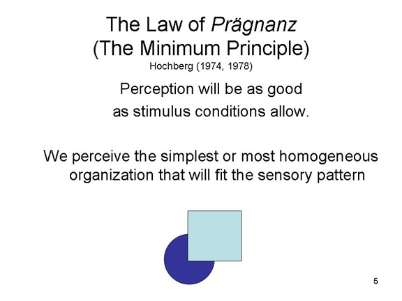 The
Gestalt principles can be summarized by the Law of
Pragnanz (German, roughly "good form"), which
states that
The
Gestalt principles can be summarized by the Law of
Pragnanz (German, roughly "good form"), which
states that
Perception will be as good as stimulus conditions allow.
More recently, the American perception psychologist Julian Hochberg (1974, 1978) modified the Law of Pragnanz with the minimum principle:
We perceive the simplest or most homogeneous organization that will fit the pattern of sensory stimulation.
Perception must account for the stimulus, but perception involves more than unpacking the stimulus array. The Law of Pragnanz and the minimum principle are not in the stimulus -- they are in the mind of the perceiver.
In their research, Wertheimer and other Gestalt psychologists identified a number of "laws" of perception which came to be known as the classical Gestalt principles of perception.
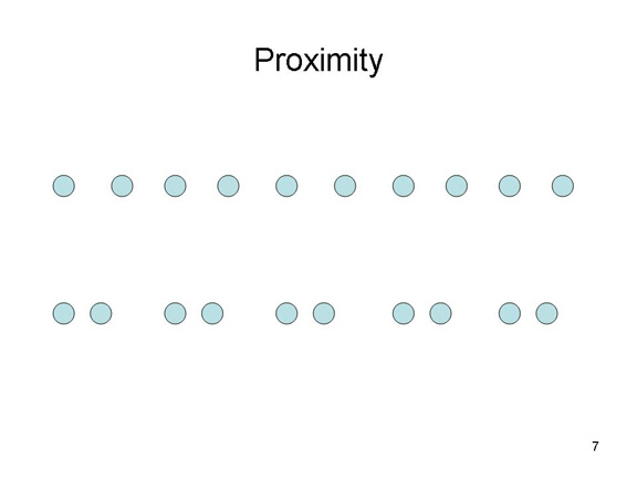 According to the
proximity principle, we group objects
together that are near each other. Thus, in the figure we tend
to see five pairs of dots instead of 10 dots.
According to the
proximity principle, we group objects
together that are near each other. Thus, in the figure we tend
to see five pairs of dots instead of 10 dots.
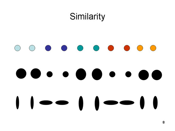 According to the
similarity principle, we tend to group
objects together based on similarity in appearance -- in
color, size, structure, and orientation.
According to the
similarity principle, we tend to group
objects together based on similarity in appearance -- in
color, size, structure, and orientation.
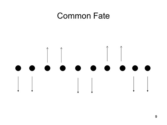 According to the principle of common
fate, we tend to group objects together based on
whether they move together in the environment.
According to the principle of common
fate, we tend to group objects together based on
whether they move together in the environment.
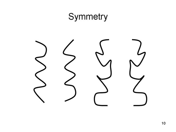 According to the symmetry
principle, we tend to group objects together that are mirror
images of each other.
According to the symmetry
principle, we tend to group objects together that are mirror
images of each other.
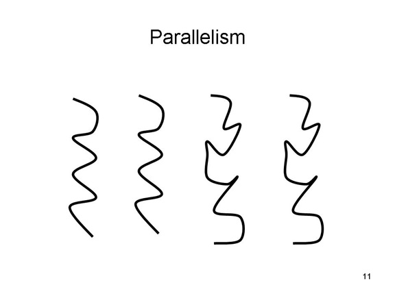 According to the
principle of parallelism, we tend to
perceive parallel lines as belonging together.
According to the
principle of parallelism, we tend to
perceive parallel lines as belonging together.
 According to the
closure principle, we tend to "fill in" the
missing parts of a stimulus. Thus, in the figure we tend to
see a closed circle rather than a circular arrangement of
dots.
According to the
closure principle, we tend to "fill in" the
missing parts of a stimulus. Thus, in the figure we tend to
see a closed circle rather than a circular arrangement of
dots.
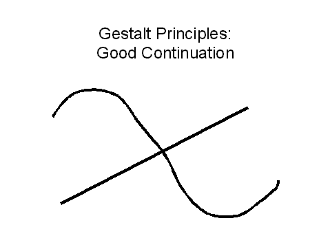 According to the principle of good
continuation, perception avoids abrupt shifts in
direction. Thus, in the figure we tend to see a curve crossed
by a straight line rather four lines, two curved and two
straight, that intersect at a point.
According to the principle of good
continuation, perception avoids abrupt shifts in
direction. Thus, in the figure we tend to see a curve crossed
by a straight line rather four lines, two curved and two
straight, that intersect at a point.
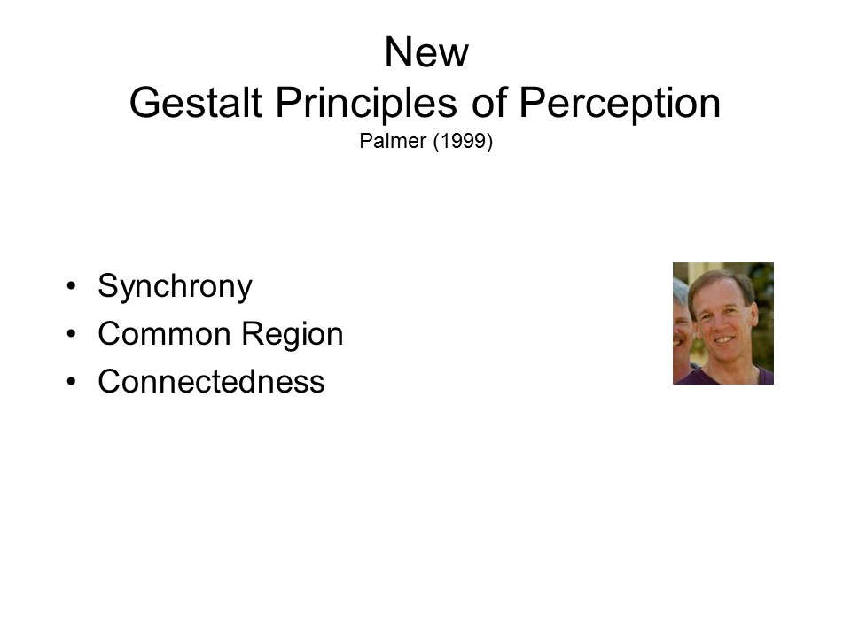 More
recently, cognitive psychologists such as Irvin Rock (working
first at Rutgers, then at Berkeley) and Steven Palmer (at
Berkeley) have discovered a number of new principles
supplementing the classical ones.
More
recently, cognitive psychologists such as Irvin Rock (working
first at Rutgers, then at Berkeley) and Steven Palmer (at
Berkeley) have discovered a number of new principles
supplementing the classical ones.
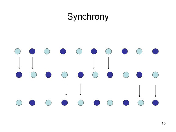 According to the
new principle of synchrony, object that move
together are perceived as belonging together.
According to the
new principle of synchrony, object that move
together are perceived as belonging together.
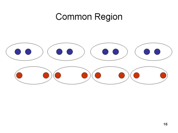 According
to the new principle of common region,
objects that share the same region of space are perceived as
belonging together.
According
to the new principle of common region,
objects that share the same region of space are perceived as
belonging together.
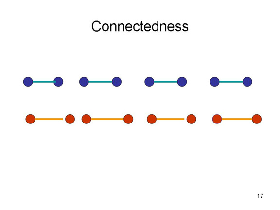 According
to the new principle of connectedness,objects
that are physically connected are perceived as belonging
together.
According
to the new principle of connectedness,objects
that are physically connected are perceived as belonging
together.
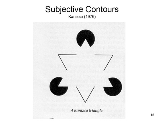 Many of the Gestalt principles come
together in the "Kanizsa figure" and similar illusions. Not
only do we see a triangle pointing downward instead of three
acute angles (an example of closure,
creating subjective contours which exist in perception
but not in the stimulus), but we also see another triangle,
pointing upward, created by the three "Pac-Men". The
triangle, of course, is not in the figure. It is created by
our visual system. There is nothing about the stimuli
themselves that requires these organizations. Many different
organizations of stimuli are possible, but according to the
Gestalt psychologists, the visual system, operating according
to Gestalt principles, creates (or prefers) one organization
over the others.
Many of the Gestalt principles come
together in the "Kanizsa figure" and similar illusions. Not
only do we see a triangle pointing downward instead of three
acute angles (an example of closure,
creating subjective contours which exist in perception
but not in the stimulus), but we also see another triangle,
pointing upward, created by the three "Pac-Men". The
triangle, of course, is not in the figure. It is created by
our visual system. There is nothing about the stimuli
themselves that requires these organizations. Many different
organizations of stimuli are possible, but according to the
Gestalt psychologists, the visual system, operating according
to Gestalt principles, creates (or prefers) one organization
over the others.
The Constellations and Gestalt
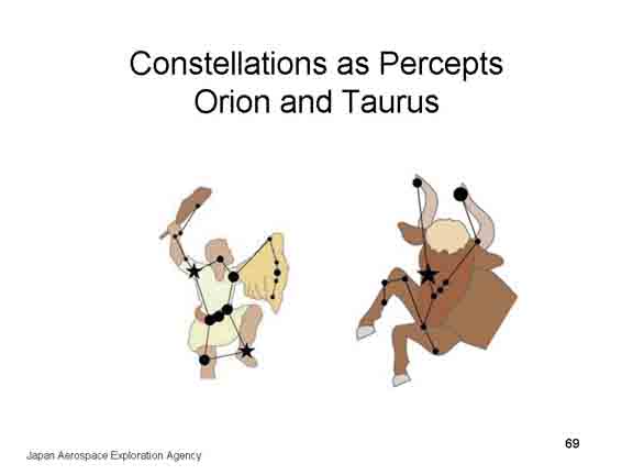 In
In
 some respects, the Gestalt principles
are illustrated by the stellar constellations, groups of
stars that seem to make up "pictures" in the sky. Every
culture identifies some constellations in the night sky,
though every culture has a somewhat different set, and
sometimes the same patterns receive different names in
different cultures. The most familiar of these, perhaps, are
the Big Dipper, Little Dipper, Orion, and the constellations
that make up the 12 signs of the zodiac. Many of these do,
indeed, look like the objects after which they are named.
And it is tempting to see in them such Gestalt principles of
grouping by proximity, good continuation, and good form.
some respects, the Gestalt principles
are illustrated by the stellar constellations, groups of
stars that seem to make up "pictures" in the sky. Every
culture identifies some constellations in the night sky,
though every culture has a somewhat different set, and
sometimes the same patterns receive different names in
different cultures. The most familiar of these, perhaps, are
the Big Dipper, Little Dipper, Orion, and the constellations
that make up the 12 signs of the zodiac. Many of these do,
indeed, look like the objects after which they are named.
And it is tempting to see in them such Gestalt principles of
grouping by proximity, good continuation, and good form.
The earliest reference to the constellations
is in the Phaenomena, written by Aratus, a Greek
poet, about 270 BCE -- though the poem makes clear that the
idea of the constellations had already been around for a
long time. The likeliest source are ancient Sumerians and
Babylonians, as early as the 7th century BCE (both
Mesopotamia and Greece lie north of the equator, which helps
explain why these civilizations did not identify any
constellations in the southern hemisphere). Another ancient
Greek document, Ptolemy's Almagest, from 150 CE,
lists 48 constellations. In 1922 the International
Astronomical Union produced an official list of 88
constellations covering the entire sky, both northern and
southern hemispheres. Because these constellations are
intended to include every visible star, they really
don't look like the objects after which they're named.
Rather, they serve as convenient ways to identify a region
of the night sky.
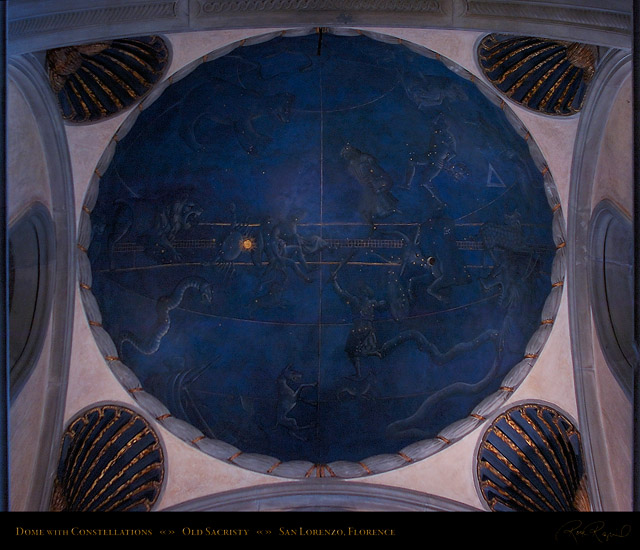 |
In the Church
of San Lorenzo, in Florence, a fresco in the
cupola above the high altar depicts the night sky
over the northern hemisphere (the church itself was
designed by Filippo Brunelleschi, who was also
responsible for the great dome of Florence
Cathedral). The painting was supervised by
Paolo dal Pozzo Toscanelli, a Florentine astronomer.
The scientific import is revealed by the extreme
precision with which the celestial bodies are
positioned. The position of the planets with respect
to the constellations represents the sky over
Florence at on July 4, 1442, which was the day that
the King of Naples entered Florence. |
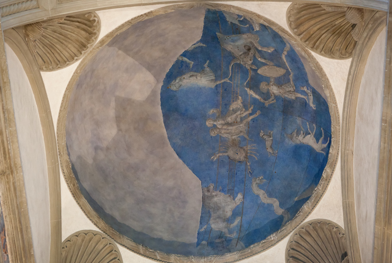 |
Another constellation fresco is found in the Pazzi Chapel in the Basilica of Santa Croce, also in Florence. |
Far from organizing patterns of the stars,
archaeoastronomer Bradley E. Schaefer suggests that the
constellations were projected onto the night sky
as a convenient way of mapping the cosmos for astrological
and other purposes (see "The Origin of the Greek
Constellations", Scientific American, 11/2006; also
).
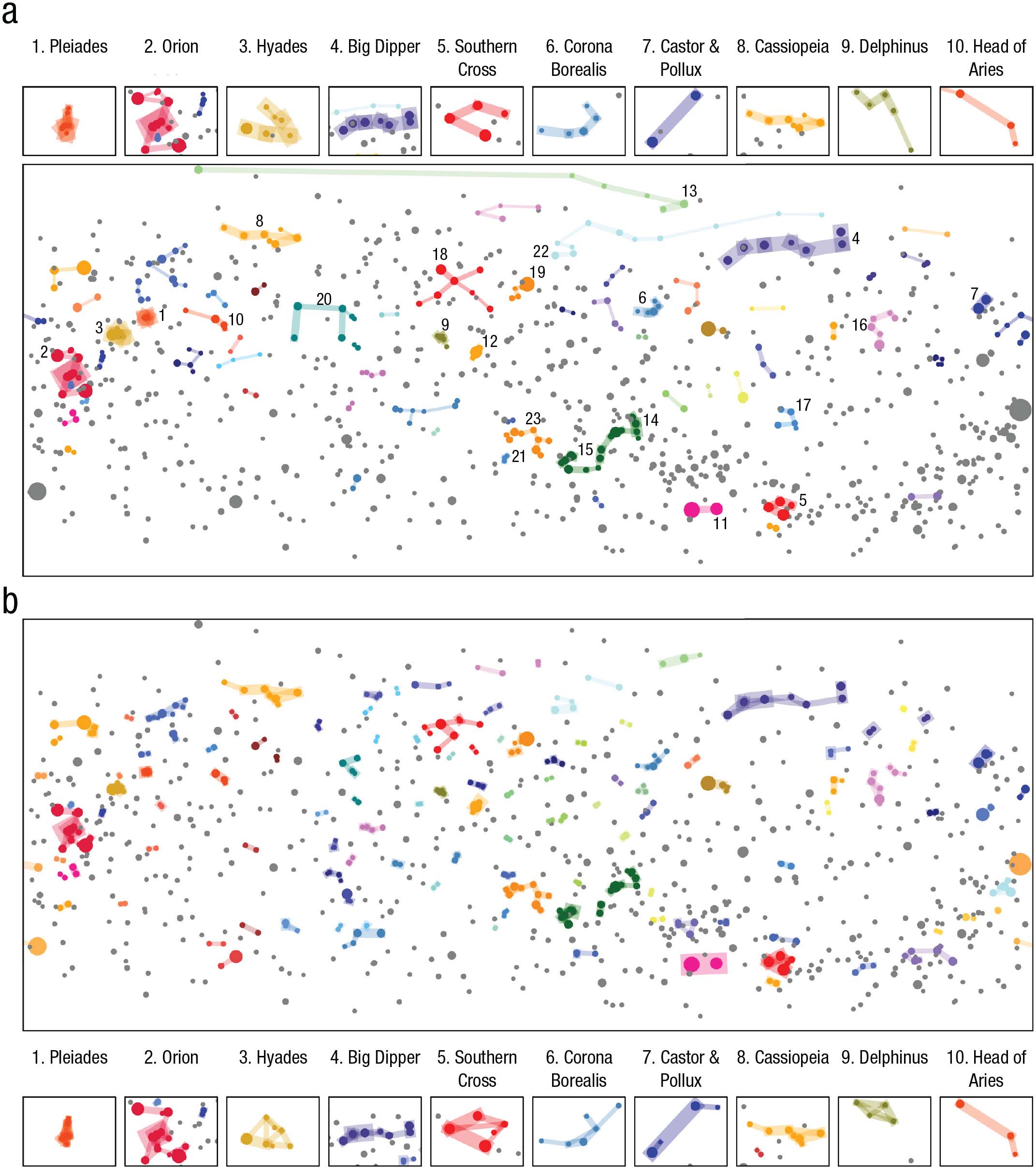 On
the other hand a group of Australian psychologists applied a
computational model of perceptual organization, mostly along
Gestalt lines, and discovered that the model identified many
of the most familiar constellations, suggesting that Gestalt
principles accounted for most of the cross-cultural
similarity in the perception of the night sky. In the
image to the right, the top panel (a) shows ten familiar
constellations against a representation of the night sky;
the bottom panel (b) shows the same sky map, with those same
10 constellations identified by the computer model.
(See Charles Kemp et al., "Perceptual Grouping Explains
Similarities in Constellations Across Cultures", Psychological
Science, 03/2022, from which the image is taken; see
also People and the Sky: Our Ancestors and the Cosmos
[2008] by Anthony F. Aveni).
On
the other hand a group of Australian psychologists applied a
computational model of perceptual organization, mostly along
Gestalt lines, and discovered that the model identified many
of the most familiar constellations, suggesting that Gestalt
principles accounted for most of the cross-cultural
similarity in the perception of the night sky. In the
image to the right, the top panel (a) shows ten familiar
constellations against a representation of the night sky;
the bottom panel (b) shows the same sky map, with those same
10 constellations identified by the computer model.
(See Charles Kemp et al., "Perceptual Grouping Explains
Similarities in Constellations Across Cultures", Psychological
Science, 03/2022, from which the image is taken; see
also People and the Sky: Our Ancestors and the Cosmos
[2008] by Anthony F. Aveni).
Feature Detection and Pattern Recognition
We usually think of sensation as the most elementary of mental processes. But even at the level of detection, "higher" mental processes of memory and thought are involved, as we seen in the theory of signal detection. We get further evidence of the role of higher mental processes After the sensory processes have done their work detecting stimuli in the environment and transforming their energies into neural impulses, perceptual processes take over to build an internal, mental representation of the stimulus field. It is at this point that we move from sensation to perception -- not just "Is there a stimulus?", and "How intense is it?"; but also "What is it?", "Where is it?", and "What is it doing?".
After a sensory impulse has reached the
cortical projection area (and perhaps even before that time,
in the sensory tract), the first stage in perception is
feature detection: analysis of the stimulus to extract
elementary features.This is followed by pattern
recognition, which allows the perceiver to identify some
combinations of elementary features as familiar and
meaningful, and others as novel or meaningless.
Feature Detection
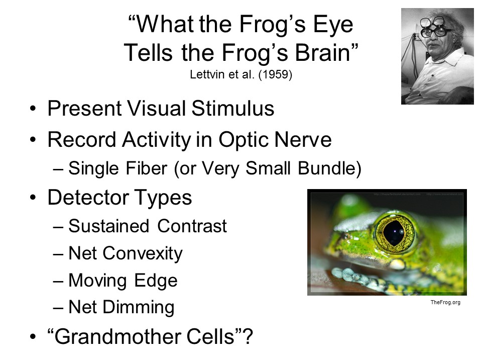 The
idea of feature detection followed by pattern recognition is
closely associated with computer models of cognition that
began to be developed in the 1950s and 1960s. But work
on the neurophysiology of the visual system was also
influential. In a classic experiment by Jerome Lettvin
and his colleagues, various visual stimuli were presented to a
frog while they recorded the activity of specific fibers in
the frog's optic nerve. They discovered that certain of
these fibers were responsive only when certain stimuli were
presented.
The
idea of feature detection followed by pattern recognition is
closely associated with computer models of cognition that
began to be developed in the 1950s and 1960s. But work
on the neurophysiology of the visual system was also
influential. In a classic experiment by Jerome Lettvin
and his colleagues, various visual stimuli were presented to a
frog while they recorded the activity of specific fibers in
the frog's optic nerve. They discovered that certain of
these fibers were responsive only when certain stimuli were
presented.
- For example, one set of fibers was responsive only to
the presentation of a sustained contrast -- an edge that
divided space into light and dark regions. Think of these
as shadow detectors.
- Other fibers became active only when the frog was
presented with a net convexity -- that is, a dark dot
presented against a light background, or a light dot
presented against a dark background. These fibers are now
commonly known as the bug detector for the
frog.
- There were other fibers that responded only when an edge
moved across the visual fiend, and still other fibers that
responded only when the illumination was reduced.
So it appeared that the frog's visual system is organized in such a way as to analyze its environment into elementary features -- edges, dots, moving edges, and changes in illumination. Extrapolating just a little bit, Lettvin jokingly suggested that in humans, we might have grandmother cells -- fibers in our visual system that responded only to the appearance of our grandmother.
 At roughly the same time,
David Hubel and Torsten Wiesel were doing similar experiments,
recording the activity of single cells in the visual cortex
(not the optic nerve) of cats. Again, the idea was to
present particular stimuli in the cat's visual field and then
record the activity of single neurons, or very small bundles
of neurons, in response to them. And, like Lettvin, they
found that there were certain cells in the visual cortex that
became active when the animal was presented with particular
stimuli:
At roughly the same time,
David Hubel and Torsten Wiesel were doing similar experiments,
recording the activity of single cells in the visual cortex
(not the optic nerve) of cats. Again, the idea was to
present particular stimuli in the cat's visual field and then
record the activity of single neurons, or very small bundles
of neurons, in response to them. And, like Lettvin, they
found that there were certain cells in the visual cortex that
became active when the animal was presented with particular
stimuli:
- to points of light against a dark background (or points of darkness against a light background),
- to edges (boundaries between light and dark regions), and
- to bars of light or darkness.
Within each stimulus category, individual cells were further differentiated by more specific qualities:
- angle of orientation (horizontal, vertical, etc.), for example, or
- stability or movement, or
- direction of movement.
- Some cells responded to vertical bars not horizontal
ones;
- others to stationary points but not moving ones;
- others to points moving to the right but not points
moving to the left.
- And so on.
Detailed study revealed
three basic kinds of feature-detecting cells.
- Simple cells respond to a particular stimulus appearing in a circumscribed area of the field (for example, a point of light in the upper-left quadrant). Thus, simple cells report location as well as feature.
- Complex cells respond to a particular stimulus (e.g., a point of light) appearing anywhere in the field; thus, they report only the presence of a feature, not its location.
- Hypercomplex cells respond to combinations of simple features, such as form corners, curves, and angles; they also respond to size. (More recent evidence suggests that "hypercomplex" cells are really a special class of simple cells.)
Analogous
feature-detectors have also been found in the auditory system.
For example, there are individual cells in the auditory nerve
that are maximally responsive to particular frequencies.
Similarly, individual cells have been found in the auditory
cortex of the monkey that respond to particular auditory
qualities:
- pure vs. complex tones,
- clicks, and noise;
- increases and decreases in pitch; and
- the onset vs. offset of sound.
For their work, Hubel and Wiesel shared
the Nobel Prize for Physiology or Medicine with Roger Sperry
for pioneering work on the physiology of the visual system.
Pattern Recognition
The next step in
perception is pattern recognition. Pattern recognition
processes take as their input the output from the feature
detectors. Thus, while the feature detectors analyze stimulus
input (the proximal stimulus) into a list of its constituent
features and the spatial relations among them, the pattern
recognizers synthesize a mental representation of the distal
stimulus.
- Feature detectors are innate: they are part of the genetic endowment of the organism, a product of the evolution of the species.
- By contrast, pattern recognition processes are acquired: they are shaped by the organism's sensory environment, as the organism learns to recognize stimulus patterns which have meaning.
Again, pattern recognition has been studied most extensively in the visual system. A good example is the orthography of written language. Remember that while spoken language is a product of biological evolution, written language is a cultural product. We have brains prewired for spoken language, but not for written language, which is why learning a written language can be so hard while learning a spoken language is so easy.
 Anyway, in principle all of the letters
in an written language can be decomposed into a small set of
features. In English, for example, all the letters are
composed of some combination of just 7 elementary features: 3
types of lines, vertical, horizontal, and oblique; two kinds
of angles, right and acute; and two kinds of curves,
continuous and discontinuous.
Anyway, in principle all of the letters
in an written language can be decomposed into a small set of
features. In English, for example, all the letters are
composed of some combination of just 7 elementary features: 3
types of lines, vertical, horizontal, and oblique; two kinds
of angles, right and acute; and two kinds of curves,
continuous and discontinuous.
For example, in English orthography the uppercase letter "A" is composed of one horizontal line, two oblique lines, and 3 acute angles:
A
By contrast, the letter "B" is composed of 1 vertical line, 3 horizontal lines, 4 right angles, and 2 discontinuous curves:
B
The letter O is composed of a single continuous curve:
O
And the letter "R" is composed of 1 vertical line, 1 oblique line, 2 horizontal lines, and one discontinuous curve:
R
We learn these patterns as we learn to read English. And we are not really conscious of these orthographic rules; nevertheless, they underlie our ability to read.
Other languages have different, unique orthographies.
 For
example, German has a letter, "SISSET", which stands for a
double-s, "ss". The letter looks like an English "B", but has
a little "tail" created by the fact that the lower
discontinuous curve isn't connected to the vertical line by a
horizontal line:.
For
example, German has a letter, "SISSET", which stands for a
double-s, "ss". The letter looks like an English "B", but has
a little "tail" created by the fact that the lower
discontinuous curve isn't connected to the vertical line by a
horizontal line:.
To look at the orthographies of other languages, check the "Alphabet Table" which comes with most good college dictionaries (usually found under "A" for "alphabet").
 In Greek:
- the letter "GAMMA" is composed of one horizontal and one vertical line;
- "PI" of one horizontal and two vertical lines;
- The letter "THETA" is composed of one continuous curve and one horizontal line;
- "PHI" is composed of one continuous curve and one vertical line;
- "PSI" (as in psy-chology) is composed of a discontinuous curve and a vertical line;
- And "OMEGA" is composed of a discontinuous curve and 2 horizontal lines.
Notice that the Greek letter "RHO" looks like the English letter "P", but has an entirely different pronunciation.
 In Russian:
- the letter "ZHE" is composed of two discontinuous curves (or perhaps two pairs of lines meeting at oblique angles), one horizontal line, and one vertical line;
- "TSE" is composed of 2 vertical lines, 1 horizontal line, and 1 oblique angle;
- "SHE" of 3 vertical lines and 1 horizontal line;
- "SHCHA" of 3 vertical lines, 1 horizontal line, and 1 oblique angle;
- "EE" is composed of 2 horizontal lines and one discontinuous curve;
- And "YA" of 1 vertical line, 1 acute angle, and 1 discontinuous curve.
Notice that the Russian letter "YA" looks like the English letter R, only backwards; but it's a vowel, not a consonant. Similarly, the Russian letter "ER" looks like both the Greek letter "RHO" and the English letter P.
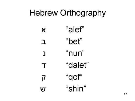 Hebrew
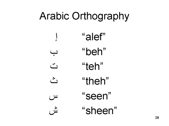 and
Arabic have entirely different orthographies
from any of these other languages.
and
Arabic have entirely different orthographies
from any of these other languages.
Chinese and Japanese employ ideographs instead of strings of letters to stand for words.
The letters of Greek, Russian, Hebrew, and Arabic are simply meaningless to someone who doesn't know the language -- "it's all Greek" to them. The orthographic rules must be mastered laboriously in order to read or write in the language; but once we become fluent readers and writers, they become unconscious and we can read or write them automatically.
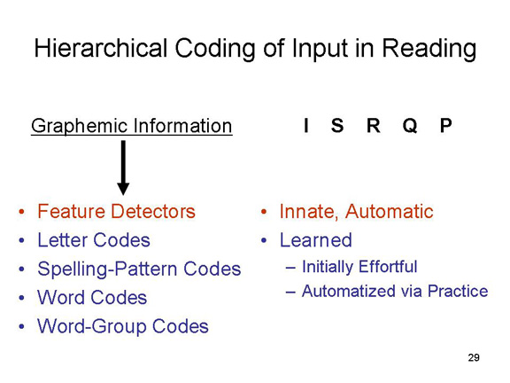 The process of pattern recognition in
reading continues beyond the stage of letter recognition.
Letters combine according to spelling-pattern codes (e.g., in
English, the letter Q is always followed by the
letter U), then into words, and then into word-group
codes (e.g., words like a,an, and the
are always followed by a noun). But in reading words, skilled
readers don't just piece individual words together -- rather,
they recognize words as wholes. When we learn to recognize
words in some language, we are engaging in pattern recognition
at a somewhat higher, more automatic, level.
The process of pattern recognition in
reading continues beyond the stage of letter recognition.
Letters combine according to spelling-pattern codes (e.g., in
English, the letter Q is always followed by the
letter U), then into words, and then into word-group
codes (e.g., words like a,an, and the
are always followed by a noun). But in reading words, skilled
readers don't just piece individual words together -- rather,
they recognize words as wholes. When we learn to recognize
words in some language, we are engaging in pattern recognition
at a somewhat higher, more automatic, level.
Analogous processes have been observed in the auditory case. A powerful example of auditory pattern recognition is found in the phonemes of spoken language. Phonemes are the smallest units of speech: all speech sounds are composed of a finite set of phonemes, which in turn are produced by certain articulatory features.
English phonology is composed of some 40 phonemes, which in turn represent various combinations of just 16 articulatory features. The speech-perception apparatus extracts these features and recognizes various combinations of these features as familiar.
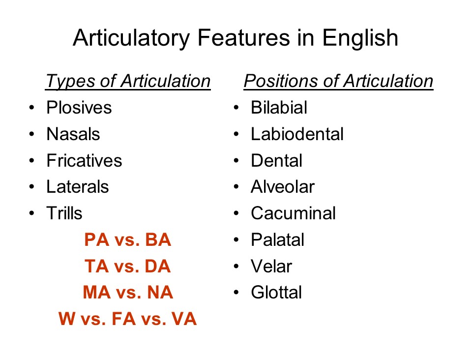 Again,
turn to your college dictionary, and find the section on
pronunciation. There you will find a list of about 40 vowels
and diphthongs (for example, the "e" in "silent" has the same
sound as the "o" in "connect"; the "c" in "race" has the same
sound as the "s" in "loose", etc. As English acquires new
words from other languages, its number of phonemes increases
progressively. But there are about 40 in the basic set of
English phonemes, and the others are phonemes from foreign
languages which have been imported into English.
Again,
turn to your college dictionary, and find the section on
pronunciation. There you will find a list of about 40 vowels
and diphthongs (for example, the "e" in "silent" has the same
sound as the "o" in "connect"; the "c" in "race" has the same
sound as the "s" in "loose", etc. As English acquires new
words from other languages, its number of phonemes increases
progressively. But there are about 40 in the basic set of
English phonemes, and the others are phonemes from foreign
languages which have been imported into English.
Each phoneme, in turn, represents a particular combination of articulatory features, or positions of the tongue, mouth, teeth, etc. when pronouncing them.
The English vowels are classified according to:
- the part of the tongue used in pronouncing the phoneme,
- front
- center
- back
- and the height of the tongue in the mouth
- high
- moderately high
- moderately low
- low.
With respect to the English
consonants:
- there are 5 types of articulation:
- plosives,
- nasals,
- fricatives,
- laterals, and
- trills.
- which are combined with 8 positions of articulation:
- bilabial,
- labiodental,
- dental,
- alveolar,
- cacuminal,
- palatal,
- velar, and
- glottal.
Don't bother trying to
memorize these terms. But pay attention to what goes on in
your mouth when you pronounce the following consonant-vowel
combinations:
- plosives like "PA" and "BA" are bilabial, involving both lips, while
- plosives like "TA" and "DA" are alveolar, where the tip of the tongue contacts the ridge of the gum;
- the nasal consonant "MA" is bilabial, while
- the nasal consonant "NA" is alveolar.
- the fricative "WA" is bilabial, while
- the fricatives "FA" and "VA" are labiodental, where the upper teeth contact the lower lip.
In some sense, when we perceive the
difference between consonants like the "M" in "MA" and the "N"
in "NA", what we are perceiving are the differences between
the articulatory movements produced by the speaker's vocal
apparatus.
Note to Linguistics Students
|
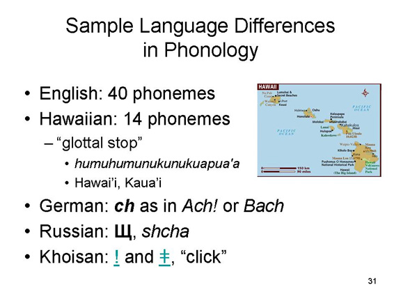 As with written orthography,
each language has a different spoken phonology. For example,
As with written orthography,
each language has a different spoken phonology. For example,
- Hawaiian has just 14 phonemes, which is one reason that Hawaiian words are so long.
- German has a phoneme, the ch sound in Ach!, that does not appear in English.
- Russian has another phoneme, transliterated as shch, that likewise does not appear in English.
- Chinese has two spoken forms,Mandarin and Cantonese, that differ in terms the rise and fall of pitch.
There are many other examples. Just as readers learn to recognize certain letters as meaningful, so speakers learn to recognize certain sounds. It's all pattern-recognition.
Just as written words are composed of multiple letters, so spoken words are typically composed of multiple phonemes. Just as we recognize patterns of letters as meaningful words in written language, so we recognize patterns of sounds as meaningful words in spoken language. Again, this is pattern recognition at a higher level.
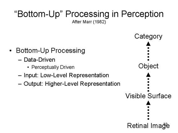 Feature detection
and pattern recognition exemplify what is known as bottom-up
processing in perception, also known as data-driven
or perceptually driven processing,
which take a low-level representation (like a letter) as input
and generate a higher-level representation (like a word) as
output. In a theory of visual perception offered by David
Marr, there are four such levels of processing: information
extracted from the retinal image is used to generate a
representation of the visible surface of a scene, which is
then used to identify the object, when is then used to
categorize the object.
Feature detection
and pattern recognition exemplify what is known as bottom-up
processing in perception, also known as data-driven
or perceptually driven processing,
which take a low-level representation (like a letter) as input
and generate a higher-level representation (like a word) as
output. In a theory of visual perception offered by David
Marr, there are four such levels of processing: information
extracted from the retinal image is used to generate a
representation of the visible surface of a scene, which is
then used to identify the object, when is then used to
categorize the object.
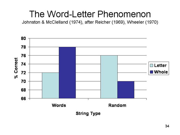 However,
from the constructivist point of view bottom-up processing
isn't all that's involved in perception. Consider the word-letter
phenomenon uncovered by (Johnston & McClelland,
1974). These investigators were intrigued by another
phenomenon, known as the word superiority effect,
in which subjects find it easier to distinguish between words
such as COIN and JOIN than they do between letters such as C
and J. This is, of course, counterintuitive, because in order
to recognize a word like COIN you've already got to recognize
the letter C. Johnston & McClelland asked their subjects
to detect the presence of a letter (e.g., C or J) in strings
of four letters. Some of these four-letter strings were actual
words (like COIN), whereas others were random strings (e.g.,
CPRD). Half the subjects were instructed to "try to see the
whole word", while the other half were told to "fixate" on a
particular letter position -- in fact, the precise position
where the target letter was going to appear. The results were
very striking. When the array consisted of actual words,
subjects performed better when they were instructed to see the
whole word than when they were informed in advance exactly
where the target letter was going to appear. The reverse
effect was obtained when subjects had to deal with random
letter strings. Put simply, it was easier for subjects to see
particular letters when they were presented in the context of
words. Somehow, the word influenced the perception of its
constituent letters.
However,
from the constructivist point of view bottom-up processing
isn't all that's involved in perception. Consider the word-letter
phenomenon uncovered by (Johnston & McClelland,
1974). These investigators were intrigued by another
phenomenon, known as the word superiority effect,
in which subjects find it easier to distinguish between words
such as COIN and JOIN than they do between letters such as C
and J. This is, of course, counterintuitive, because in order
to recognize a word like COIN you've already got to recognize
the letter C. Johnston & McClelland asked their subjects
to detect the presence of a letter (e.g., C or J) in strings
of four letters. Some of these four-letter strings were actual
words (like COIN), whereas others were random strings (e.g.,
CPRD). Half the subjects were instructed to "try to see the
whole word", while the other half were told to "fixate" on a
particular letter position -- in fact, the precise position
where the target letter was going to appear. The results were
very striking. When the array consisted of actual words,
subjects performed better when they were instructed to see the
whole word than when they were informed in advance exactly
where the target letter was going to appear. The reverse
effect was obtained when subjects had to deal with random
letter strings. Put simply, it was easier for subjects to see
particular letters when they were presented in the context of
words. Somehow, the word influenced the perception of its
constituent letters.
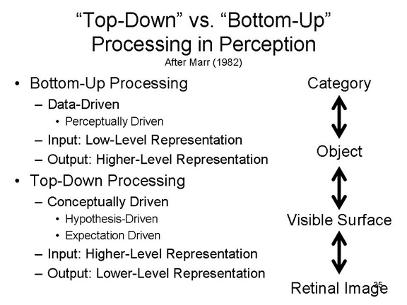 The implication is that, in addition to
"bottom-up" processing, there is also top-down processing
(also known as conceptually driven, hypothesis-driven,
or expectation-driven processing. "Top-down"
processes take input from a higher-level representation, such
as a word, and generate a lower-level representation, such as
a letter.
The implication is that, in addition to
"bottom-up" processing, there is also top-down processing
(also known as conceptually driven, hypothesis-driven,
or expectation-driven processing. "Top-down"
processes take input from a higher-level representation, such
as a word, and generate a lower-level representation, such as
a letter.
These spatial metaphors,
illustrate the constructivist principle that the final percept
is the product of two different sources of information, or the
interplay between two kinds of processes:
- "bottom-up" processes, involving sensory information coming from the periphery;
- input from the distal stimulus in the current environment, extracted from the proximal stimulus by feature-detector mechanisms;
- "top-down" processes, involving conceptual information coming from central structures.
- knowledge derived from previous experiences, and retrieved from memory, by which we recognize patterns of features as meaningful.
For this reason, Ulric Neisser has characterized perception as the point in the mind
where cognition and reality meet.
The Perceptual Constancies
The contribution of the perceiver is also revealed by the perceptual constancies.
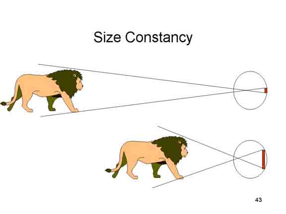 In
size constancy, the perceived size of an
object is does not change as its distance from the observer
changes. In some ways, this is surprising, because the
perceived size of an object is a function of the size of its
retinal image, and retinal size varies with the distance
between the observer and the object of regard. Therefore, as
an object moves closer its retinal image gets larger, and as
it moves away, its retinal image gets smaller. However, under
natural viewing conditions moving objects do not appear to
change in size.
In
size constancy, the perceived size of an
object is does not change as its distance from the observer
changes. In some ways, this is surprising, because the
perceived size of an object is a function of the size of its
retinal image, and retinal size varies with the distance
between the observer and the object of regard. Therefore, as
an object moves closer its retinal image gets larger, and as
it moves away, its retinal image gets smaller. However, under
natural viewing conditions moving objects do not appear to
change in size.
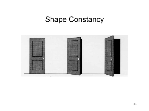 In shape
constancy, the perceived shape of an object is
invariant over changes in the shape of its retinal image. The
shape of a retinal image often changes when an object
undergoes a spatial transformation: when a door opens, its
retinal image changes from rectangular to trapezoidal to
(almost) linear. But again, under natural viewing conditions,
perceived shape remains invariant over spatial
transformations. We see the door opening and closing, but we
do not see it change shape.
In shape
constancy, the perceived shape of an object is
invariant over changes in the shape of its retinal image. The
shape of a retinal image often changes when an object
undergoes a spatial transformation: when a door opens, its
retinal image changes from rectangular to trapezoidal to
(almost) linear. But again, under natural viewing conditions,
perceived shape remains invariant over spatial
transformations. We see the door opening and closing, but we
do not see it change shape.
In the perceptual constancies, the pattern of proximal stimulation changes, but the perception of the distal stimulus remains constant. Therefore, perception is not entirely driven by the stimulus.
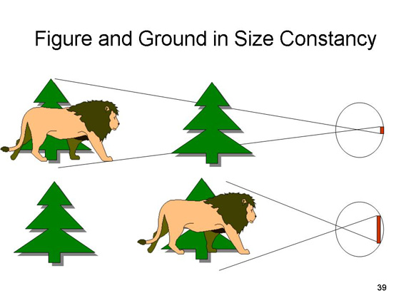 In many cases, perceptual
constancy reflects an automatic correction of the stimulus
input. When we survey the environment, we don't just perceive
the object of regard; we perceive it against its background,
and these background stimuli can provide distance cues. The
perceptual system then takes distance cues into account to
make inferences about size, speed, and shape,given
the perceived distance from the observer to the object.
In many cases, perceptual
constancy reflects an automatic correction of the stimulus
input. When we survey the environment, we don't just perceive
the object of regard; we perceive it against its background,
and these background stimuli can provide distance cues. The
perceptual system then takes distance cues into account to
make inferences about size, speed, and shape,given
the perceived distance from the observer to the object.
In some sense, then the perceptual constancies are not completely inconsistent with the ecological view: Gibson always insisted that it was the entire pattern of stimulation, including figure and ground, that provided the information needed for perception. Viewed against the background of trees and other features of the landscape, it is clear that the lion is coming closer, and not changing in size.
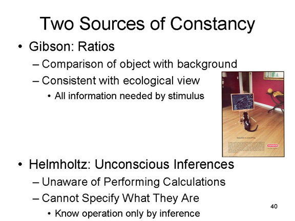 But even so, the visual system is using
information to make what Helmholtz called unconscious
inferences about the scene. The perceptual system
is performing certain calculations -- applying the
size-distance rule, for example. But we are not aware of
performing these calculations, and if we were asked we could
not specify what they are. Still, the perceptual constancies
indicate that we are making them nonetheless. These
calculations are part of the cognitive contribution to
perception. They indicate that not all the information for
perception is available in the stimulus array. Some of it has
to be calculated by the observer. These procedures, stored in
memory, represent part of the cognitive contribution to
perception.
But even so, the visual system is using
information to make what Helmholtz called unconscious
inferences about the scene. The perceptual system
is performing certain calculations -- applying the
size-distance rule, for example. But we are not aware of
performing these calculations, and if we were asked we could
not specify what they are. Still, the perceptual constancies
indicate that we are making them nonetheless. These
calculations are part of the cognitive contribution to
perception. They indicate that not all the information for
perception is available in the stimulus array. Some of it has
to be calculated by the observer. These procedures, stored in
memory, represent part of the cognitive contribution to
perception.
Reversible (Bistable, Ambiguous) Figures
The same point is made, in the opposite way, by the reversible (or ambiguous, or bistable) figures, which can be perceived in two or more quite different ways.
 In the Rubin
vase, the observer sees a white goblet or vase
against a black background. Look at if for a while, and see
what else you see: a pair of profiles in silhouette, against a
white background.
In the Rubin
vase, the observer sees a white goblet or vase
against a black background. Look at if for a while, and see
what else you see: a pair of profiles in silhouette, against a
white background.
A real-life variant on Rubin's figure is a porcelain vase commissioned for the Silver Jubilee (25th anniversary) of the coronation of England's Queen Elizabeth II in 1977. The vase has been cut in such a way as to display the profiles of the Queen on the right and Philip, the Prince consort, on the left.
Here's another one: the logo for No Kid Hungry, a charity in the United States. It looks like a half-eaten apple, but if you look a little more closely, you see the profiles of two children, a girl and a boy. It's a little easier to see of the profiles are outlined with a circle, as in the lower figure.
 In the Necker
cube, discovered in 1832 (by Louis Necker, a Swiss
crystallographer, who initially saw this effect in some
crystals he was examining under a microscope), one face (A or
B) initially appears closest to the observer; then, after a
while, the figure "flips" so that the other face (B or A) now
appears closest.
In the Necker
cube, discovered in 1832 (by Louis Necker, a Swiss
crystallographer, who initially saw this effect in some
crystals he was examining under a microscope), one face (A or
B) initially appears closest to the observer; then, after a
while, the figure "flips" so that the other face (B or A) now
appears closest.
Here's an example of a real-life Necker cube, on the roof of the Zig-Zag House" in Bombay Beach, California, on the shores of the Salton Sea. (Photo by Dick Lyon, sourced from the Bombay Beach article on Wikipedia).
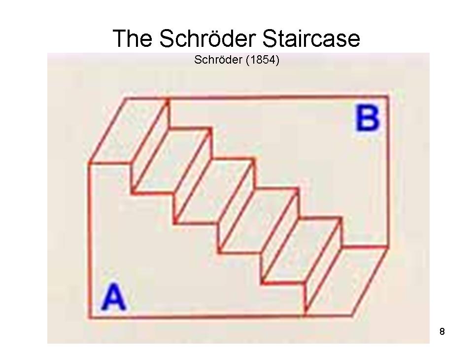 The
Schroeder Staircase (introduced in 1854) is a
variant on the Necker cube. After viewing for a while, the
stairway flips upside down, so that wall B now appears closer
to the viewer.
The
Schroeder Staircase (introduced in 1854) is a
variant on the Necker cube. After viewing for a while, the
stairway flips upside down, so that wall B now appears closer
to the viewer.
The
same effect was very popular in ancient Greece and Rome. On the right, a mosaic panel found in a house in Antioch, Greece, dating from the 2nd century BCE (from Gombrich, Art and Illusion, 1960). On the left, a floor from the "House of the Faun" in Pompeii, from before 79 CE (which is when Pompeii was destroyed by the eruption of Mount Vesuvius).
Here the same design is seen in the floor of the Basilica of San Giovanni Laterno (the Pope's home church in his role as Bishop of Rome) in Rome.
Here
it is in the Art Deco-inspired floor of an apartment building in New York City (photo from the New York Times, 10/11/2013). Imagine walking on that floor all the time! On the right is another example: the hallway of William James's house in Cambridge, Massachusetts, circa 1981. I can't vouch that the floor was there when James lived in it, but the residents at the time, William and Kay Estes -- both famous psychologists -- tried hard to preserve the original appearance of the house (photo from the Observer published by the Association for Psychological Science, 02/2015).
The
same "tumbling blocks" or "baby blocks" effect was also used by a Native American artist when painting the walls at the Mission San Xavier del Bac on the Tohono O'odham Indian Reservation in Tucson, Arizona, in the late 18th century. The walls can be seen on the sides of the interior image, on the right (photo by William Steen, New York Times 12/29/2013). According to a senior docent at the Mission, the decoration dates from the building of the church in the late 18th century, and that originally the Antioch blocks design was continued on the wooden floor. As disconcerting as it might be to walk on such a floor, as noted immediately above, he believes that the intent was to induce a feeling of disorientation in the worshipers, increasing their openness to the church's message.
This
painting of The Last Supper, on the wall of the Mission's nave (posted anonymously, so far as I can tell, on Flickr), gives some idea of what the Missions original floor might have looked like. On the right: another view down the nave, by Marty Straub and posted to the scenicusa.net website.
And it appears in this Midwestern Amish pieced quilt (c. 1940, quilt-maker unknown; private collection, photograph from the America Hurrah Archive, reprinted in the "Quilts 2004" calendar, Ziga Design).
The San Francisco artist Kristin Farr has made good use of the "tumbling blocks effect:
Here, a vinyl print of a painting used as a mural for wall on Market Street in San Francisco, near 7th street (it's temporary, as of August 2015).
Here, on a mural for the Urban Outfitters store in Honolulu.
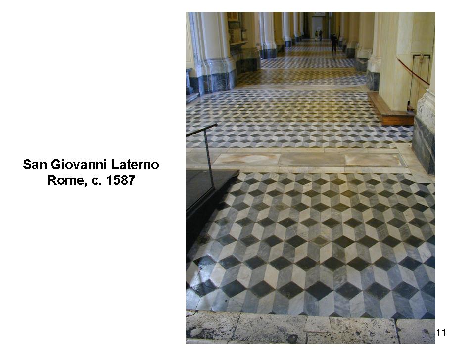
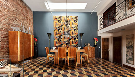
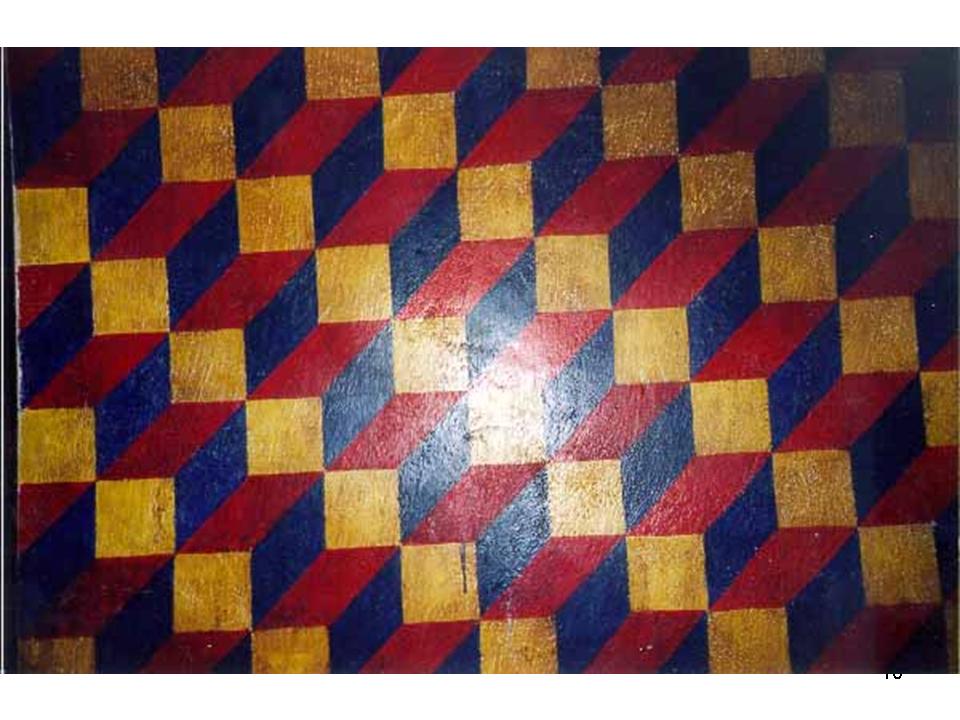
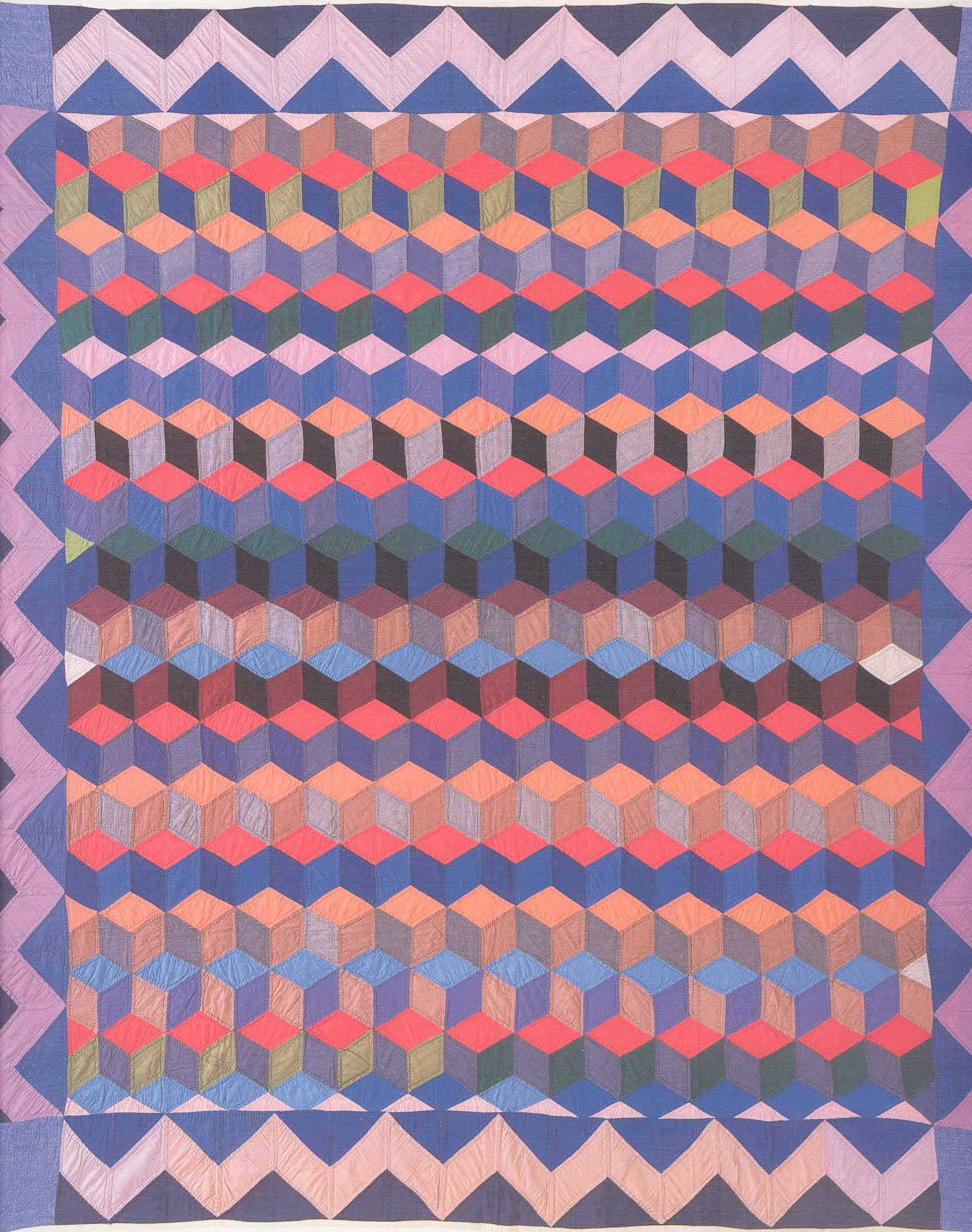
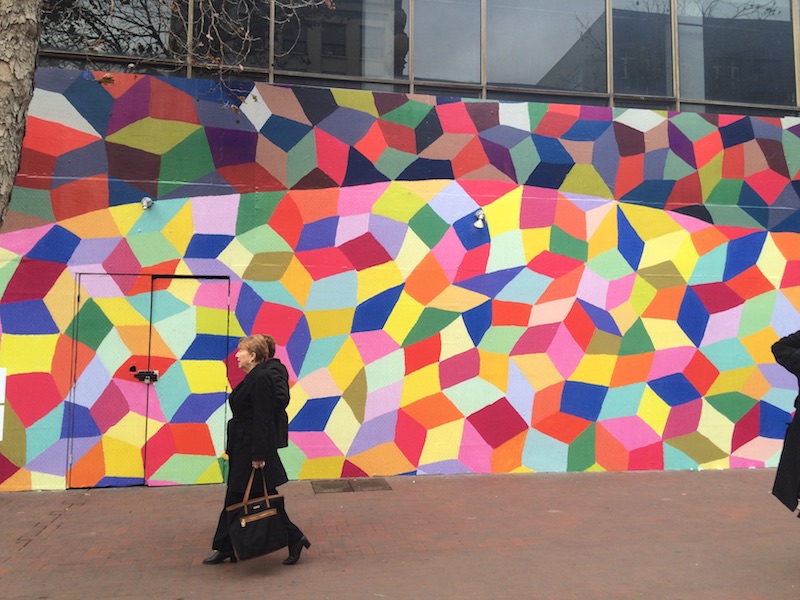
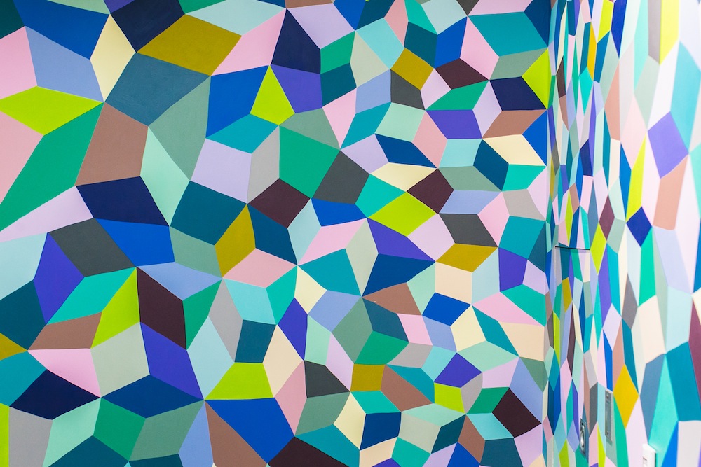
 In the Boring
figure, originally drawn by a cartoonist for the
British humor magazine Puck (1915) and brought to
the attention of psychologists by E.G. Boring (1930), you see
a young woman, looking demurely away from you. Look at it for
a while, and see what else you see. You also see an old
woman, looking down and scowling. The original caption
for this cartoon was "His Wife and His Mother-in-Law", and so
this is sometimes known as the "Wife/Mother-in-Law
Figure". As described by E.G. Boring (1930), the drawing
"shows in one figure the left profile of a young woman,
three-quarters from behind. the other figure is an old woman,
three-quarters from the front. The ear of the 'wife' is the
left eye of the 'mother-in-law'; the left eyelash of the
former is the right eyelash of the latter; the jaw of the
former is the nose of the latter; the neck-ribbon of the
former, the mouth of the latter".
In the Boring
figure, originally drawn by a cartoonist for the
British humor magazine Puck (1915) and brought to
the attention of psychologists by E.G. Boring (1930), you see
a young woman, looking demurely away from you. Look at it for
a while, and see what else you see. You also see an old
woman, looking down and scowling. The original caption
for this cartoon was "His Wife and His Mother-in-Law", and so
this is sometimes known as the "Wife/Mother-in-Law
Figure". As described by E.G. Boring (1930), the drawing
"shows in one figure the left profile of a young woman,
three-quarters from behind. the other figure is an old woman,
three-quarters from the front. The ear of the 'wife' is the
left eye of the 'mother-in-law'; the left eyelash of the
former is the right eyelash of the latter; the jaw of the
former is the nose of the latter; the neck-ribbon of the
former, the mouth of the latter".
Although
Boring attributed the cartoon to W.E. Hill (Puck, November 16, 1915, p. 11), versions of the figure had appeared as early as 1888 and 1890).
Botwinick (1981) devised a male version, entitled "Husband and Father-in-Law".
Fisher (1968) devised a 3-aspect version, "Mother, Father, and Daughter".
And Paul Noth, a cartoonist for the New Yorker, skillfully imagined what the wife in the Puck version looked like.
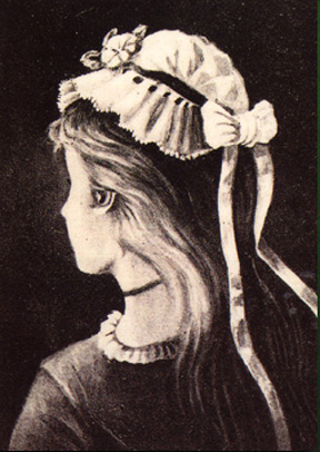

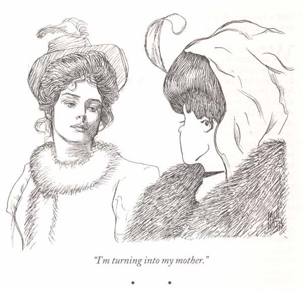
 In
the Jastrow figure devised by the American
psychologist Joseph Jastrow (1899, 1900), the figure can be
seen as a rabbit looking to the right. Or you can see it as a
duck.
In
the Jastrow figure devised by the American
psychologist Joseph Jastrow (1899, 1900), the figure can be
seen as a rabbit looking to the right. Or you can see it as a
duck.
 A
A
 cartoon
in the New Yorker by Paul Noth (07/03/2017) cleverly
combined Jastrow's duck-rabbit and Boring's
wife/mother-in-law. An earlier cartoon, from December
14, 2009, and January 4, 2010, also used the
duck-rabbit. For more on the duck-rabbit figure, see my
articles, "Joseph
Jastrow and His Duck -- or Is It a Rabbit?" and "Provenance
of the Chef-Dog Reversible Figure", both posted to my
website.
cartoon
in the New Yorker by Paul Noth (07/03/2017) cleverly
combined Jastrow's duck-rabbit and Boring's
wife/mother-in-law. An earlier cartoon, from December
14, 2009, and January 4, 2010, also used the
duck-rabbit. For more on the duck-rabbit figure, see my
articles, "Joseph
Jastrow and His Duck -- or Is It a Rabbit?" and "Provenance
of the Chef-Dog Reversible Figure", both posted to my
website.
 Similarly, this ulu,
or cutting tool, used by the indigenous Yupik people, and
discovered at the Nunalleq archeological site in Alaska.
The handle looks like a whale, with its head on the
right; and a seal, with its head on the left. (Image
from "Racing the Thaw" by A.R. Williams, National
Geographic, 04/2017.)
Similarly, this ulu,
or cutting tool, used by the indigenous Yupik people, and
discovered at the Nunalleq archeological site in Alaska.
The handle looks like a whale, with its head on the
right; and a seal, with its head on the left. (Image
from "Racing the Thaw" by A.R. Williams, National
Geographic, 04/2017.)
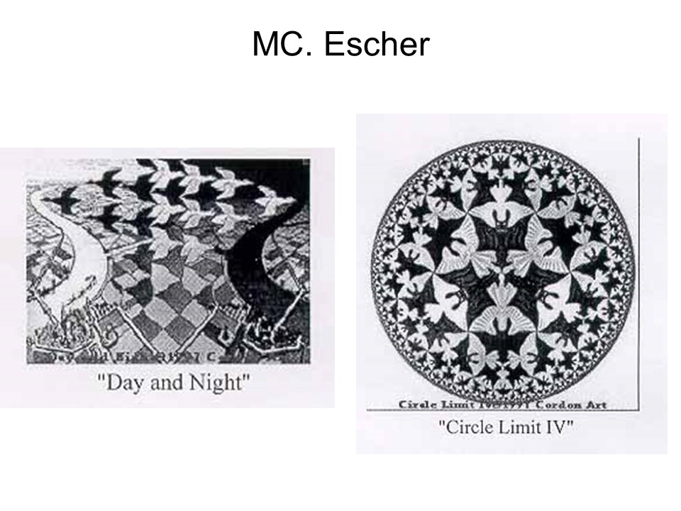 Reversible
figures are frequently employed as artistic devices, for
example by M.C. Escher, the Dutch painter, in many pictures.
In "Sky and Water I", we see fish against a background of
birds, and vice-versa.In "Circle Limit IV", the observer can
see either white angels against a black background or black
devil-like bats against a white background. For a recent
documentary, see "M.C. Escher: Journey to Infinity" (2021),
reviewed by Ben Kenigsberg ("Is It Art?", New York Times,
02/05/2021).
Reversible
figures are frequently employed as artistic devices, for
example by M.C. Escher, the Dutch painter, in many pictures.
In "Sky and Water I", we see fish against a background of
birds, and vice-versa.In "Circle Limit IV", the observer can
see either white angels against a black background or black
devil-like bats against a white background. For a recent
documentary, see "M.C. Escher: Journey to Infinity" (2021),
reviewed by Ben Kenigsberg ("Is It Art?", New York Times,
02/05/2021).
In
"Earth and Sky", the observer can see either white doves against a black background or black crows (?) against a white background. In "Earth and Sea, we can see either gulls or fish.
|
|
|
| In the 1970s, antinuclear activists used a version of "Earth and Sky" in a poster, representing atomic bombs and doves of peace. | And in response to the Gulf Oil Spill disaster, Bob Staake did this cover for the June 5, 2010 issue of The New Yorker: "After Escher: Gulf Sky and Water. |
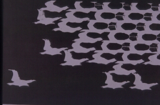

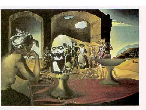 The
The 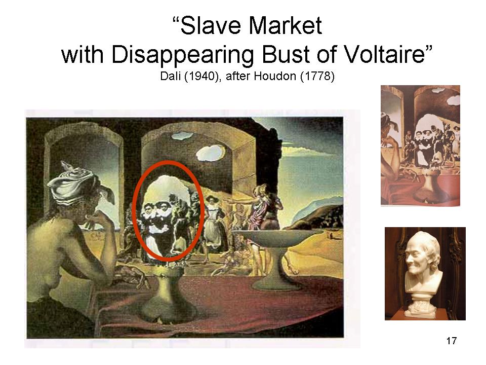 surrealist
Salvador Dali used reversibility to great effect in this
painting: ."Slave Market with Disappearing Bust of Voltaire"
(1940). The portrait of Voltaire is based on a bust of
the French philosopher by Houdon (1778).
surrealist
Salvador Dali used reversibility to great effect in this
painting: ."Slave Market with Disappearing Bust of Voltaire"
(1940). The portrait of Voltaire is based on a bust of
the French philosopher by Houdon (1778).
 In
In
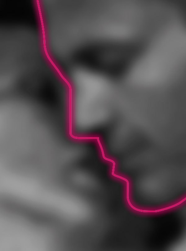 the
"Mask of Love" illusion, created by Gianni Sarcone and his
colleagues, a woman's face, surrounded by a Venetian-style
mask, can also be perceived as a man and a woman
kissing. This image won the 2011 "Visual Illusion of the
Year" contest sponsored by Scientific American -- even
though bistable figures aren't, technically, illusions.
the
"Mask of Love" illusion, created by Gianni Sarcone and his
colleagues, a woman's face, surrounded by a Venetian-style
mask, can also be perceived as a man and a woman
kissing. This image won the 2011 "Visual Illusion of the
Year" contest sponsored by Scientific American -- even
though bistable figures aren't, technically, illusions.
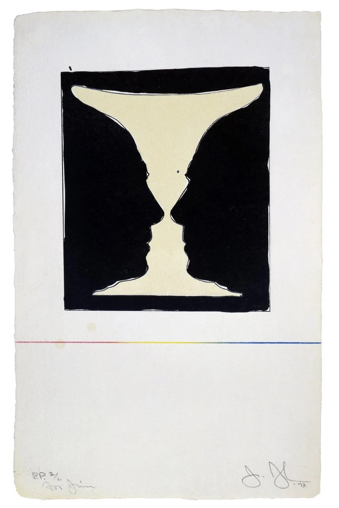 The
The  work
of the pioneering Pop artist Jasper Johns produced whole
series of works on themes of flags, targets, maps, and
numbers. Reversible figures are a frequent feature of
his work -- especially the Rubin vase, which appears all the
time in his work. In "Cup2Picasso" (1973), the silhouette is
of Pablo Picasso; in "Untitled" (2000), I'm pretty sure Johns
has co-opted, and distorted the souvenir vase from Queen
Elizabeth's Silver Jubilee, as described above.
work
of the pioneering Pop artist Jasper Johns produced whole
series of works on themes of flags, targets, maps, and
numbers. Reversible figures are a frequent feature of
his work -- especially the Rubin vase, which appears all the
time in his work. In "Cup2Picasso" (1973), the silhouette is
of Pablo Picasso; in "Untitled" (2000), I'm pretty sure Johns
has co-opted, and distorted the souvenir vase from Queen
Elizabeth's Silver Jubilee, as described above.
More
frequently, though, the Rubin vase is embedded in some larger work, as in "5 Postcards" (2011). Johns was also fond of the duck-rabbit, as in "Rabbit/Duck" (1990).
In all the reversible figures, the same stimulus can be perceived in at least two quite different ways, "depending on how you look at it". Just as in the perceptual constancies, perception remains constant despite transformations in the stimulus, so in the reversible figures perception varies even though the pattern of proximal stimulation remains constant. Either way, the observer is going beyond the information given in the stimulus. Perception is not driven exclusively by stimulation.
The Perceptual Illusions
According to the ecological view, the perceptual systems have evolved in such a way that we directly perceive the world as it really is. But in the perceptual illusions, we perceive things that aren't there.
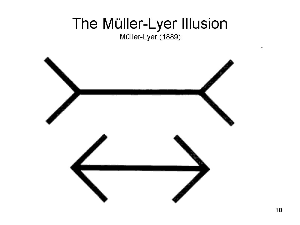 In
In
 the Muller-Lyer illusion,
created by Franz Muller-Lyer, a German psychiatrist (1889),
the line with the "feathers" looks longer than the line with
the "arrowheads", even though the two horizontal lines are
precisely the same length.
the Muller-Lyer illusion,
created by Franz Muller-Lyer, a German psychiatrist (1889),
the line with the "feathers" looks longer than the line with
the "arrowheads", even though the two horizontal lines are
precisely the same length.
The
illusion works whether the lines are horizontal or vertical.
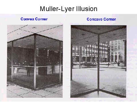
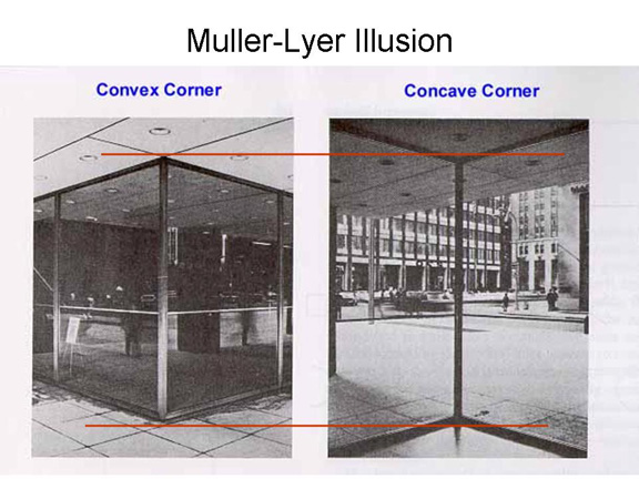
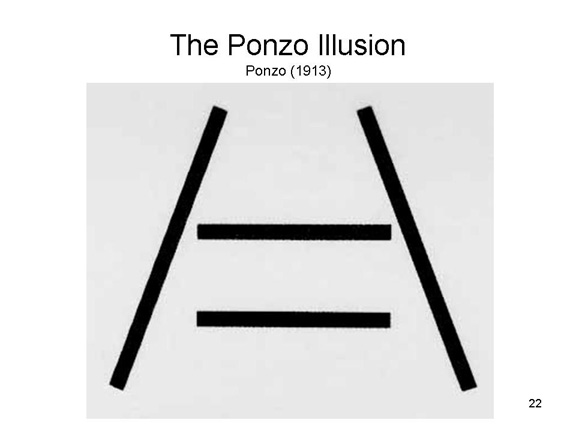 In
In 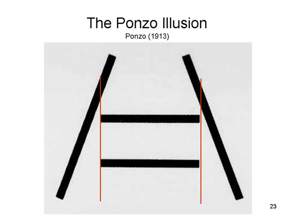 the Ponzo illusion,
created by Mario Ponzo, an Italian psychologist (1913), the
converging lines created by the "railroad tracks" make it seem
that the upper horizontal line is longer than the lower one.
The principle of the Ponzo illusion involves the same
unconscious inferences as in the Muller-Lyer illusion.
the Ponzo illusion,
created by Mario Ponzo, an Italian psychologist (1913), the
converging lines created by the "railroad tracks" make it seem
that the upper horizontal line is longer than the lower one.
The principle of the Ponzo illusion involves the same
unconscious inferences as in the Muller-Lyer illusion.
 Somewhat
 related
is the boomerang illusion popularized by Joseph
Jastrow (1892; he of the "duck-rabbit" figure described
above), based on earlier versions by Muller-Lyer (1889) and
Wilhelm Wundt. The lower "boomerang" appears larger,
although the two figures are identical in size. The
boomerang illusion is the basis for a popular magic trick,
described by Dr. Peter Prevos in The
Jastrow Illusion and Magic: A Treatise on the Boomerang
Illusion.
related
is the boomerang illusion popularized by Joseph
Jastrow (1892; he of the "duck-rabbit" figure described
above), based on earlier versions by Muller-Lyer (1889) and
Wilhelm Wundt. The lower "boomerang" appears larger,
although the two figures are identical in size. The
boomerang illusion is the basis for a popular magic trick,
described by Dr. Peter Prevos in The
Jastrow Illusion and Magic: A Treatise on the Boomerang
Illusion.
The Muller-Lyer and Ponzo
illusions illustrate the operation of Helmholtz's "unconscious
inferences" in perception -- this time, to create a false
perception.
- In the Muller-Lyer illusion, the feathers of the upper figure act like converging lines of perspective, creating the impression that the upper figure is farther away from the viewer than the lower figure.
- However, the two lines are actually equidistant from the viewer, they cast images of precisely the same length on the retina.
- Nevertheless, the visual system compensates for the depth cues
- Thus the inference:
- If the upper line is farther from me than the lower line; and
- If the image of the upper line is the same length as that of the lower line;
- Then, by virtue of the size-distance rule, the upper line must be longer than the lower line.
- Something similar goes on in the Ponzo illusion, where the "railroad tracks" act like converging lines of perspective, creating the impression that the upper line is farther away from the viewer than the lower line.
- However, the two lines are actually equidistant from the viewer, they cast images of precisely the same length on the retina.
- Nevertheless, the visual system compensates for the depth cues
- Again, the inference:
- If the upper line is farther from me than the lower line; and
- If the image of the upper line is the same length as that of the lower line;
- Then, by virtue of the size-distance rule, the upper line must be longer than the lower line.
Not all illusions capitalize on misleading depth cues. Sometimes the illusion is created by the influence of the surrounding context.
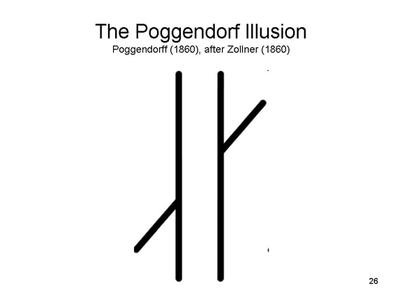 In
In
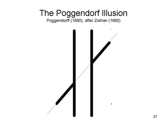 the Poggendorff illusion,
the top and bottom lines appear to be displaced, even though
they are actually connected. The illusion was introduced by
J.C. Poggendorff, a physicist (1860), based on observations by
J.C. Zollner, an astronomer who noticed the effect in a fabric
pattern.
the Poggendorff illusion,
the top and bottom lines appear to be displaced, even though
they are actually connected. The illusion was introduced by
J.C. Poggendorff, a physicist (1860), based on observations by
J.C. Zollner, an astronomer who noticed the effect in a fabric
pattern.
The Poggendorff illusion plays a role in the British flag, known as the Union Jack (because it combines the English Cross of St. George) with the Scottish Cross of St. Andrew and the Irish Cross of St. Patrick). When you look at the Union Jack, you think you see the diagonal red bars meeting at the center of the flag. They actually don't meet, but we see that they do because the Poggendorff illusion effectively compensates for the physical displacement. The effect is so strong that the British have to be deliberately instructed how to draw their own flag: most people draw it the way they see it, rather than the way it really is.
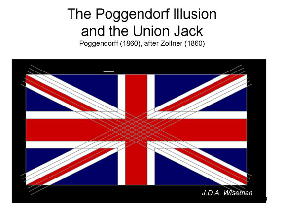
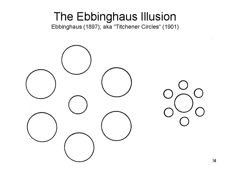 In
the Ebbinghaus illusion, the two circles are
the same diameter, but the one surrounded by small circles
seems larger than the one surrounded by large circles. The
figure was invented by Hermann von Ebbinghaus (1897) but
popularized by the pioneering American structuralist E.B.
Titchener (1901, so it is sometimes known as the Titchener
circles.
In
the Ebbinghaus illusion, the two circles are
the same diameter, but the one surrounded by small circles
seems larger than the one surrounded by large circles. The
figure was invented by Hermann von Ebbinghaus (1897) but
popularized by the pioneering American structuralist E.B.
Titchener (1901, so it is sometimes known as the Titchener
circles.
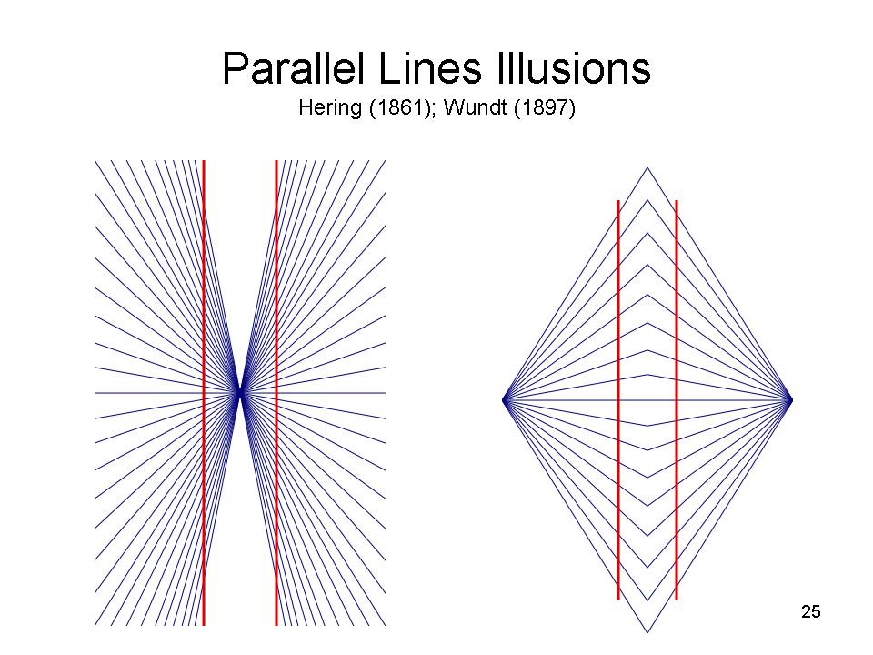 In
the Hering (1861) and Wundt
(1897) illusions, parallel lines actually
seem to be bent inward or outward.
In
the Hering (1861) and Wundt
(1897) illusions, parallel lines actually
seem to be bent inward or outward.
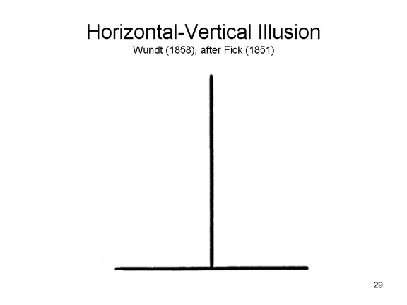 In the horizontal-vertical
illusion, the vertical line looks much longer than
the horizontal line, even though they are precisely the same
length.
In the horizontal-vertical
illusion, the vertical line looks much longer than
the horizontal line, even though they are precisely the same
length.
The horizontal-vertical illusion is used to good effect in the Gateway Arch by the architect Eero Saarinen (1947), in St. Louis, Missouri, located in a park on the banks of the Mississippi River (also known as the Gateway to the West). The Gateway Arch is based on the catenary arch -- the shape assumed by a suspended rope or a chain -- but in this case the base of the arch is precisely equal to its height -- but it doesn't look that way.
Donald J. Trump, 45th President of the United States, is famous -- some fashionistas say notorious -- for wearing his neckties long, so that they end below his belt. This is definitely a sartorial no-no -- the end of the necktie should fall right at the belt buckle. But why? It's not as if he doesn't know better, or nobody has advised him to dress differently. Trump revealed his secret to Chris Christie, the former New Jersey Governor who worked on his campaign prior to the 2016 election: tying your tie long as a slimming effect. Trump is, shall we say, wide of girth, and the horizontal-vertical illusion makes him seem taller, and less wide, than he actually is (his preference for very long overcoats may have the same rationale). For documentation, see Christie's 2019 memoir, Let Me Finish; image from Getty Images via Glamour magazine.
Visual illusions also play a role in many instances of "Op" and "Pop" Art. A very striking example is "Seven Sequences of the Movement of the Translational Motion of Red and Blue Segments" (1959), by the Argentine artist Julio Le Parc. Two bars come together in the middle panel to form the classic illusion, then retire to their corners, as it were. (For more on Le Parc, see "At 90, This Artist is Still Opening Doors of Perception" by Holland Cotter, reviewing an exhibition of Le Parc's work, "Julio Le Parc 1959" at the Met Breuer museum in New York City, New York Times, 01/25/2019.)
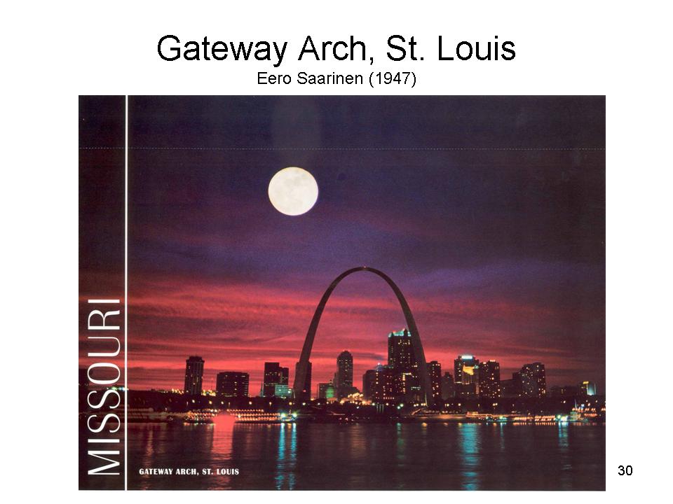
![]() In the Helmholtz illusion, a
square composed of horizontal stripes looks taller, and
thinner, than one composed of vertical stripes. I don't
see it myself, but many people do (and Helmholtz did!), never
mind that it seems to contradict the horizontal-vertical
illusion above.
In the Helmholtz illusion, a
square composed of horizontal stripes looks taller, and
thinner, than one composed of vertical stripes. I don't
see it myself, but many people do (and Helmholtz did!), never
mind that it seems to contradict the horizontal-vertical
illusion above.
When Helmholtz reported his discovery, in 1867, he made an offhand comment that women who wear horizontal stripes would look taller than those wearing vertical stripes. Of course, that's seems to run counter to the advice commonly given to both women and men, that horizontal stripes make people look fatter. Nevertheless, Thompson and Mikellidou (2011) put Helmholtz's idea to the test, with both 2- and 3-dimensional models, and found that, in fact, horizontal stripes made the figure look taller. Who knew?
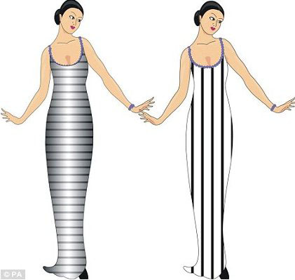
Other illusions are created by a misapplication of the principles of constancy, which also create an illusory sense of depth or distance.
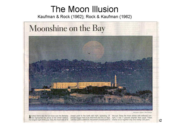 The
role of constancy, and the size-distance relation, is seen to
good effect in the Moon illusion, as
represented in this (altered) photograph of the moon rising
over the Berkeley hills, with Alcatraz Island in the
foreground. The illusion is that the moon looks larger when
viewed at the horizon than when viewed at its zenith, and it
is created by the misapplication of distance cues. By virtue
of elevation, objects near the horizon
appear farther away than objects that are far from the
horizon. Therefore, the moon on the horizon looks farther away
than the moon at zenith. But the retinal size of the two moons
remains constant. Therefore, the perceptual system "concludes"
that the moon at the horizon must be larger. This is an
unconscious inference, in Helmholtz's terms, but it is an
inference nonetheless.
The
role of constancy, and the size-distance relation, is seen to
good effect in the Moon illusion, as
represented in this (altered) photograph of the moon rising
over the Berkeley hills, with Alcatraz Island in the
foreground. The illusion is that the moon looks larger when
viewed at the horizon than when viewed at its zenith, and it
is created by the misapplication of distance cues. By virtue
of elevation, objects near the horizon
appear farther away than objects that are far from the
horizon. Therefore, the moon on the horizon looks farther away
than the moon at zenith. But the retinal size of the two moons
remains constant. Therefore, the perceptual system "concludes"
that the moon at the horizon must be larger. This is an
unconscious inference, in Helmholtz's terms, but it is an
inference nonetheless.
The Moon Illusion
The moon illusion is one of the most frequently encountered visual illusions in nature. Most other visual illusions are manufactured in some way, leading direct realists like Gibson to discount their performance.
Most of the photographs on this page representing the moon illusion were taken on or about the Winter Solstice, 1999, at the time of a "celestial confluence " in which the Moon was at perigee, the closest it comes to the Earth in its monthly cycle (and, on this occasion, the closest it came to the Earth all year), at the same time as the Earth was approaching perigee with respect to the Sun (this actually occurred on 01/03/00). This particular confluence, of lunar and solar perigees at the time of the Winter Solstice, occurs only once every 133 years, and thus aroused wide interest -- hence the many photographs. The confluence effectively increased both the size and the brightness of the moon somewhat, but these changes were invisible to the naked eye. The major result of the confluence was meteorological: extremely high tides raising the possibility of severe flooding.
Photographic Representations of the Moon Illusion |
||||||
| Moon over Wuhan, China, at the time of
the Mid-Autumn Moon Festival.
Photos by Zuma Press,West County Times, 10/01/06 |
 |
 |
 |
|||
| "Moon Rising: 12:29 a.m.", photography by Mark Jaremko, which appeared in the San Francisco Chronicle, 10/11/2009 |  |
|||||
| Here are two images of the "Harvest Moon" (i.e., the full moon nearest to the autumnal equinox), from "Wayne's ECO Time" blog. |  |
 |
||||
| Here's moonrise over the East Bay hills, viewed from Richmond's Marina Bay (from the Marina Bay Neighborhood Council website). |  |
|||||
| Here are a number of images taken on the occasion of the lunar eclipse that occurred on December 21, 2010 -- the first lunar eclipse to occur on the Winter Solstice in 372 years. In each case, the presence of depth cues makes the moon look larger than it would otherwise (images from the National Geographic website). |  |
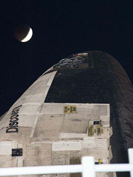 |
 |
|||
 |
 |
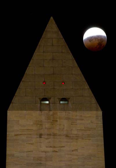 |
||||
| Here's an art photograph by Jean-Louis Monfraix, "Red Harvest Moon Rising Over Washington". Taken in 2001, it graced the cover of American Psychologist for July-August 2011 (Monfraix is married to Cynthia Belar, a prominent psychologist). | 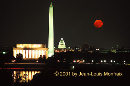 |
|||||
| There's a sun illusion, too, produced by the same principles, but you hardly ever get to see it -- because you're not supposed to look at the sun except with special protection. Here, the annular eclipse of the sun, May 20, 2012, photographed near Odessa, Texas (photo by Albert Cesare for the Odessa American/Associated Press). |  |
|||||
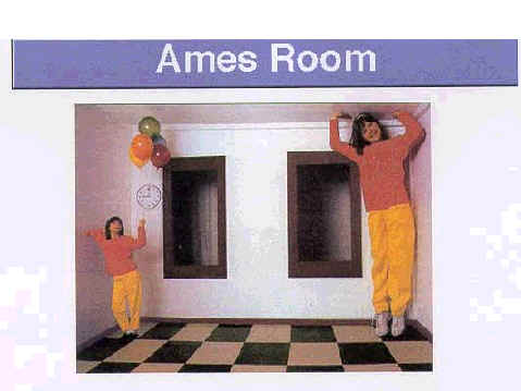 The mechanisms of
illusions are revealed dramatically in the Ames Room,
an example of which is sometimes on exhibit at the
Exploratorium in San Francisco (many of the Exploratorium's
exhibits are about visual perception and illusions). The
observer looks with one eye into the Ames Room, through a hole
in the wall. The two people appear to differ in height, but in
fact they are identical twins -- as close to identical in
height as two people are likely to get.
The mechanisms of
illusions are revealed dramatically in the Ames Room,
an example of which is sometimes on exhibit at the
Exploratorium in San Francisco (many of the Exploratorium's
exhibits are about visual perception and illusions). The
observer looks with one eye into the Ames Room, through a hole
in the wall. The two people appear to differ in height, but in
fact they are identical twins -- as close to identical in
height as two people are likely to get.
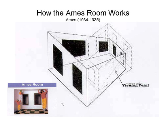 The illusion is created by certain
features of the room:
The illusion is created by certain
features of the room:
- The observer is actually looking from the side of the room, not the center, so he or she is not equidistant from the two side walls.
- The rear wall is angled sharply away from the observer, so it is not equidistant from the two girls.
- The ceiling is angled sharply away from the observer, so the ratio of the girls to the back wall is not invariant.
- The windows are subtly changed in shape, trapezoidal rather than rectangular, to reinforce the appearance of a standard room.
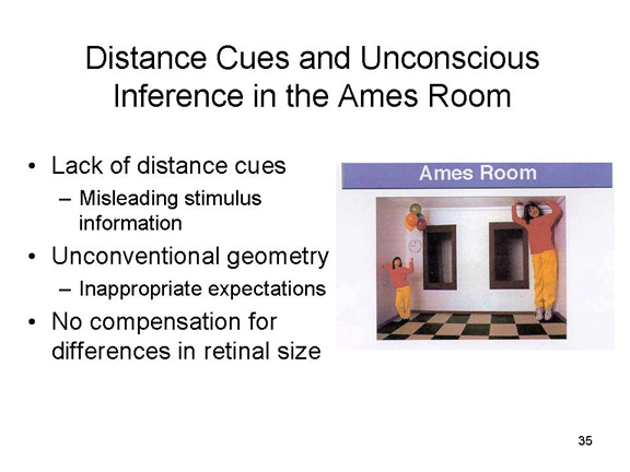 Thus, the room affords no
regular distance cues to the observer. Still, the perceiver,
based on prior experience with rooms, assumes that there are
equal distances and right angles. The observer thus infers
size directly from the retinal image. But because the
observer's assumptions are wrong, he or she makes incorrect
inferences about size. The Ames Room works because perception
is determined by the perceiver's knowledge and beliefs, not
just the physical stimulus.
Thus, the room affords no
regular distance cues to the observer. Still, the perceiver,
based on prior experience with rooms, assumes that there are
equal distances and right angles. The observer thus infers
size directly from the retinal image. But because the
observer's assumptions are wrong, he or she makes incorrect
inferences about size. The Ames Room works because perception
is determined by the perceiver's knowledge and beliefs, not
just the physical stimulus.
 Editorial cartoonist Tom Toles referenced
the Ames Room in this cartoon about the 2013 crisis over the
federal budget and debt ceiling (Washington Post,
10/16/2013).
Editorial cartoonist Tom Toles referenced
the Ames Room in this cartoon about the 2013 crisis over the
federal budget and debt ceiling (Washington Post,
10/16/2013).
 In the Ames Room,
visual cues were adjusted in such a way to make objects that
are the same size appear different. A similar illusion
can occur when there are no distance cues at all. Here's
the back story, courtesy of Charles Wheelan, a journalist and
author of Naked Statistics: Stripping the Dread from the
Data (2013), cited in the lectures
on Statistics) -- and also of Naked Economics: Undressing the Dismal
Science (2002)
and Naked Money: A Revealing Look at What It Is and Why It
Matters (2016). In 2016, Wheelan took his entire
family, including his wife and three teenagers, on a
9-month-long 'round-the-world trip, recounted in We Came,
We Saw, We Left: A Family Gap Year (2021; reviewed by
Amity Gaige in "Meet a Family Who Spent 9 Months Traveling the
Globe, Pre-Plague", New York Times Book Review,
02/07/2021, from which this image is taken). At one
point they found themselves in a bit of trackless, featureless
desert, and one of the Wheelan kids took this photo of the
rest of the family. In this instance, the effect results
from the lack of linear perspective (no tire tracks), no
superposition (the clouds on the horizon don't help), and,
especially, no texture gradients (the desert floor is sandy,
not rocky).
In the Ames Room,
visual cues were adjusted in such a way to make objects that
are the same size appear different. A similar illusion
can occur when there are no distance cues at all. Here's
the back story, courtesy of Charles Wheelan, a journalist and
author of Naked Statistics: Stripping the Dread from the
Data (2013), cited in the lectures
on Statistics) -- and also of Naked Economics: Undressing the Dismal
Science (2002)
and Naked Money: A Revealing Look at What It Is and Why It
Matters (2016). In 2016, Wheelan took his entire
family, including his wife and three teenagers, on a
9-month-long 'round-the-world trip, recounted in We Came,
We Saw, We Left: A Family Gap Year (2021; reviewed by
Amity Gaige in "Meet a Family Who Spent 9 Months Traveling the
Globe, Pre-Plague", New York Times Book Review,
02/07/2021, from which this image is taken). At one
point they found themselves in a bit of trackless, featureless
desert, and one of the Wheelan kids took this photo of the
rest of the family. In this instance, the effect results
from the lack of linear perspective (no tire tracks), no
superposition (the clouds on the horizon don't help), and,
especially, no texture gradients (the desert floor is sandy,
not rocky).
Apropos of nothing in particular: Commenting on his decision to inveigle his family into such a trip, Wheelan writes: "Experiences, rather than things, are what make us happy in the long run", because they become an "ingrained part of our identity".
Ames Room as Peepshow
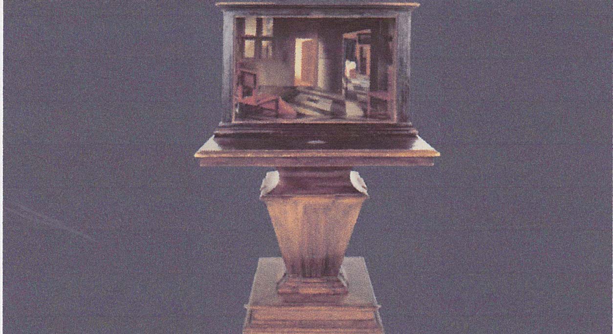 The
The 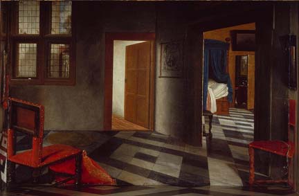 Ames Room was
foreshadowed by a type of art popular in the Dutch "golden
age" of painting known as a peepshow -- a
term that has somewhat different connotations now,
especially in The Netherlands, than it did then. Here's A
Peepshow with Views of the Interior of a Dutch House
(1655, in the National Gallery, London) by Samuel van
Hoogstraten (whom you read about before, in the context of
Dutch trompe l'oeil painting). The painting is
made on five inside surfaces of a box, which is left open on
one side, and then mounted on a stand. The open side is
covered with translucent paper, to allow light into the box,
which has two holes through with the viewer can peep inside.
Using the same techniques as Ames did some 300 years later,
van Hoogstraten has constructed a realistic illusion of a
room -- two rooms, actually, in all their depth.
Ames Room was
foreshadowed by a type of art popular in the Dutch "golden
age" of painting known as a peepshow -- a
term that has somewhat different connotations now,
especially in The Netherlands, than it did then. Here's A
Peepshow with Views of the Interior of a Dutch House
(1655, in the National Gallery, London) by Samuel van
Hoogstraten (whom you read about before, in the context of
Dutch trompe l'oeil painting). The painting is
made on five inside surfaces of a box, which is left open on
one side, and then mounted on a stand. The open side is
covered with translucent paper, to allow light into the box,
which has two holes through with the viewer can peep inside.
Using the same techniques as Ames did some 300 years later,
van Hoogstraten has constructed a realistic illusion of a
room -- two rooms, actually, in all their depth.
 Not
Not  all illusions are
produced by unconscious inferences. One interesting case
is the cafe wall illusion (Gregory, 1973) -- so named
because it was first noticed on the wall of a cafe in Bristol,
England (here's a picture of Prof. Richard Gregory beside that
very cafe wall). The lines are parallel, and horizontal
-- but they don't look it, partly due to the irradiation of
light from the black to the white bricks (the illusion is
diminished if the bricks are colored other than black and
white).
all illusions are
produced by unconscious inferences. One interesting case
is the cafe wall illusion (Gregory, 1973) -- so named
because it was first noticed on the wall of a cafe in Bristol,
England (here's a picture of Prof. Richard Gregory beside that
very cafe wall). The lines are parallel, and horizontal
-- but they don't look it, partly due to the irradiation of
light from the black to the white bricks (the illusion is
diminished if the bricks are colored other than black and
white).
As with many of the visual effects discussed in these lectures, the cafe wall illusion was put to striking use by architects --- in this case, the Port 1010 Building in Melbourne, Australia.

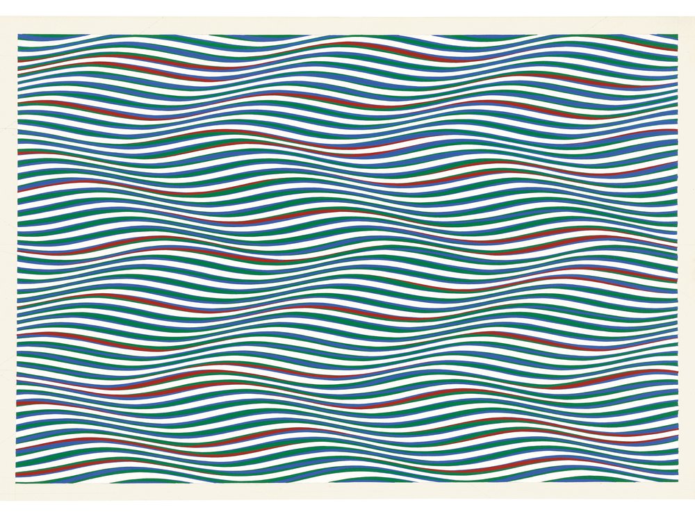 Visual illusions
played a large role in the "Op Art" movement that arose in the
1960s (the term itself was coined by Time magazine in
1964). Here, for example, is Red, Green, and Blue
Twisted Curves (1979) by the prominent British Op-Artist
Bridget Riley. That's just paint on a flat canvas,
turning into the perception of convex and convex shapes
reminiscent of some of the depth illusions discussed
earlier. But the effects are in the eye, and the mind,
not on the canvas. As Riley has noted, "the spectator
who looks at my work is part of the work itself" (quotation
and image from "Ahead of the Curve" by Amy Crawford, Smithsonian,
9/2022.
Visual illusions
played a large role in the "Op Art" movement that arose in the
1960s (the term itself was coined by Time magazine in
1964). Here, for example, is Red, Green, and Blue
Twisted Curves (1979) by the prominent British Op-Artist
Bridget Riley. That's just paint on a flat canvas,
turning into the perception of convex and convex shapes
reminiscent of some of the depth illusions discussed
earlier. But the effects are in the eye, and the mind,
not on the canvas. As Riley has noted, "the spectator
who looks at my work is part of the work itself" (quotation
and image from "Ahead of the Curve" by Amy Crawford, Smithsonian,
9/2022.
 "The Dress". Another
interesting illusion was "discovered" in February, 2015, when
a woman showed her son, and his fiancee, a photograph of the
dress she proposed to wear to their wedding. The couple
could not agree on the color of the dress: she saw it as white
and gold, while he saw it as blue and black. When the
image was posted to a social-networking website, it turned out
that there was wide disagreement about the color of the dress
-- revealing a new phenomenon of visual perception, previously
entirely unknown (Lafer-Sousa, Hermann, & Conway, Current
Biology, 2015). And also currently
unexplained. Actually, the dress is blue and
black. One possible explanation involves lighting: the
dress will actually change colors, depending on how it is
illuminated. But that can't be the entire explanation,
because many disagreements occurred between observers (like
the wedding couple) who viewed the dress under identical
viewing conditions. So another explanation involves
unconscious inferences: If observers assume that the dress is
illuminated by the blue sky, their visual system will
"subtract out" the blue in the dress, giving it the appearance
of white and gold; if observers assume that the dress is
illuminated by "yellow" sunlight, their visual systems will
"subtract" the gold, leaving the dress to appear blue and
black. Other hypotheses differ somewhat, but the bottom
line is that what we perceive isn't determined by the
stimulus. It's also determined by the context (in this
case, the lighting) in which the stimulus appears -- a
conclusion that is friendly to Gibson's ecological view.
But it's also determined by the expectations that we bring to
the act of perception -- a conclusion that supports the
constructivist point of view. For example, one study
found that about 50% of subjects who assumed that the
dress was photographed in artificial light perceived it as
white and gold; and about 80% of subjects who assumed
that it was photographed in shadow perceived it as black and
white. For more on the Dress Illusion, see "Unraveling
'the Dress'" by Stephen L. Macknik and Susana Martinez-Conde,
Scientific American Mind, 07-08/2015; their article,
"Colors Out of Space" (Scientific American Mind,
05-06/2011), provides additional technical information.
"The Dress". Another
interesting illusion was "discovered" in February, 2015, when
a woman showed her son, and his fiancee, a photograph of the
dress she proposed to wear to their wedding. The couple
could not agree on the color of the dress: she saw it as white
and gold, while he saw it as blue and black. When the
image was posted to a social-networking website, it turned out
that there was wide disagreement about the color of the dress
-- revealing a new phenomenon of visual perception, previously
entirely unknown (Lafer-Sousa, Hermann, & Conway, Current
Biology, 2015). And also currently
unexplained. Actually, the dress is blue and
black. One possible explanation involves lighting: the
dress will actually change colors, depending on how it is
illuminated. But that can't be the entire explanation,
because many disagreements occurred between observers (like
the wedding couple) who viewed the dress under identical
viewing conditions. So another explanation involves
unconscious inferences: If observers assume that the dress is
illuminated by the blue sky, their visual system will
"subtract out" the blue in the dress, giving it the appearance
of white and gold; if observers assume that the dress is
illuminated by "yellow" sunlight, their visual systems will
"subtract" the gold, leaving the dress to appear blue and
black. Other hypotheses differ somewhat, but the bottom
line is that what we perceive isn't determined by the
stimulus. It's also determined by the context (in this
case, the lighting) in which the stimulus appears -- a
conclusion that is friendly to Gibson's ecological view.
But it's also determined by the expectations that we bring to
the act of perception -- a conclusion that supports the
constructivist point of view. For example, one study
found that about 50% of subjects who assumed that the
dress was photographed in artificial light perceived it as
white and gold; and about 80% of subjects who assumed
that it was photographed in shadow perceived it as black and
white. For more on the Dress Illusion, see "Unraveling
'the Dress'" by Stephen L. Macknik and Susana Martinez-Conde,
Scientific American Mind, 07-08/2015; their article,
"Colors Out of Space" (Scientific American Mind,
05-06/2011), provides additional technical information.
The precise mechanisms of many visual illusions are more complicated than presented here, and some details remain controversial. What the illusions make clear, however, is that perception is not just the product of information provided by the proximal stimulus, and extracted by innate, "mindless" perceptual mechanisms. The perceiver's mental representation of the world is also shaped by "higher" mental processes involving knowledge, memory, expectations, judgment, and inference.
For more information on illusions, see:
- The Great Book of Optical Illusions by Al Sekel (or any of Sekel's earlier books, from which the Great Book is derived). The books have lots of illusions, in color, plus brief explanations, where available, of how they work.
- Mind Sights by Roger N. Shepard (1990). Shepard is a distinguished vision scientist who is also a talented artist (and musician). In this book, he employs principles of visual perception to construct a large number of 'Original visual illusions, ambiguities, and other anomalies" of visual perception.
- 187 Illusions: How They Twist Your Brain, published by Scientific American Mind, which publishes material on illusions in almost every issue. Every year, the magazine publishes an article, usually titled something like "10 Top Illusions" (e.g., 05-06/2011).
- And Champions of Illusion (2017) by Susana Martinez-Conde and Stephen Macknik, who founded the "Best Illusion of the Year" contest at Scientific American Mind.
- See also Sekel's website,Illusionworks, at http://www.illusionworks.com/ or http://www.psychologie.tu-dresden.de/i1/kaw/diverses%20Material/www.illusionworks.com/.
Auditory Perception
Most of our knowledge of
sensation and perception comes from studies of the visual
domain, and that is true for illusions as well. However, a
number of perceptual illusions have been identified in
audition -- many by Diana Deutsch, a professor at UC San
Diego.
- In one phenomenon, which Deutsch calls the octave illusion, the subject is presented over headphones with different tones in each ear, each separated by an octave (e.g., middle C and 3rd-space C on the treble clef). When the headphones are reversed, the high and low tones are now presented to the opposite ears, but the subject hears them in the same ears as before.
- In another, the tri-tone paradox, the listener hears a chord consisting of all the Cs that can be played on the piano (six of them), followed by all the F#s. Some subjects hear an ascending tone, others a descending tone.
Many of the illusions are very compelling, and deserve to be heard, which is why Deutsch has now produced two CD recordings of them with Philomel Records:Musical Illusions and Paradoxes (1995), and Phantom Words and Other Curiosities (2003).
There has now emerged a relatively large
literature on music perception.
Cultural Influences on Perception
The contributions of the perceiver to perception are also revealed by cultural influences on perception: people from different cultures may see very different things in the same stimulus.
 For example, this geological structure in
northwestern New Mexico, a volcanic vent millions of years old
on the Navajo Indian Reservation, is commonly known as
"Shiprock". That's the name the European settlers gave it in
the 1870s, and that's the name of the nearest town, the
largest in the Navajo Nation. Shiprock got its name because
the settlers thought it looked like a clipper ship. But of
course the Navajo had lived in the area long before the
settlers came, and they didn't know anything about clipper
ships. They named the mountain Tse'Bit'Ai, or "Rock
with Wings". The same geological formation gets two different
names, because it's perceived differently by people of two
different cultures. (Shiprock is a sacred site for the
Navajos. Click
here for additional views and information.)
For example, this geological structure in
northwestern New Mexico, a volcanic vent millions of years old
on the Navajo Indian Reservation, is commonly known as
"Shiprock". That's the name the European settlers gave it in
the 1870s, and that's the name of the nearest town, the
largest in the Navajo Nation. Shiprock got its name because
the settlers thought it looked like a clipper ship. But of
course the Navajo had lived in the area long before the
settlers came, and they didn't know anything about clipper
ships. They named the mountain Tse'Bit'Ai, or "Rock
with Wings". The same geological formation gets two different
names, because it's perceived differently by people of two
different cultures. (Shiprock is a sacred site for the
Navajos. Click
here for additional views and information.)
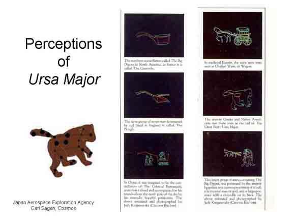 The
constellations in the night sky offer another example of
cultural differences in perception . The constellations, which
were developed by ancient cultures to aid navigation (and,
sometimes, astrology as well), are usually considered to
reflect organization by Gestalt principles such as good
continuation and closure. But even though the Gestalt
principles are universal, different cultures organized the
same pattern in different ways. So, what Europeans call The
Big Dipper (an important aid to finding Polaris, the North
Star), is seen differently in other countries (this example is
from the companion book to Carl Sagan's PBS television series,Cosmos):
The
constellations in the night sky offer another example of
cultural differences in perception . The constellations, which
were developed by ancient cultures to aid navigation (and,
sometimes, astrology as well), are usually considered to
reflect organization by Gestalt principles such as good
continuation and closure. But even though the Gestalt
principles are universal, different cultures organized the
same pattern in different ways. So, what Europeans call The
Big Dipper (an important aid to finding Polaris, the North
Star), is seen differently in other countries (this example is
from the companion book to Carl Sagan's PBS television series,Cosmos):
- In ancient Greece, and among some Native American tribes, it is The Great Bear.
- In England, it is The Plough.
- In China, The Celestial Bureaucrat.
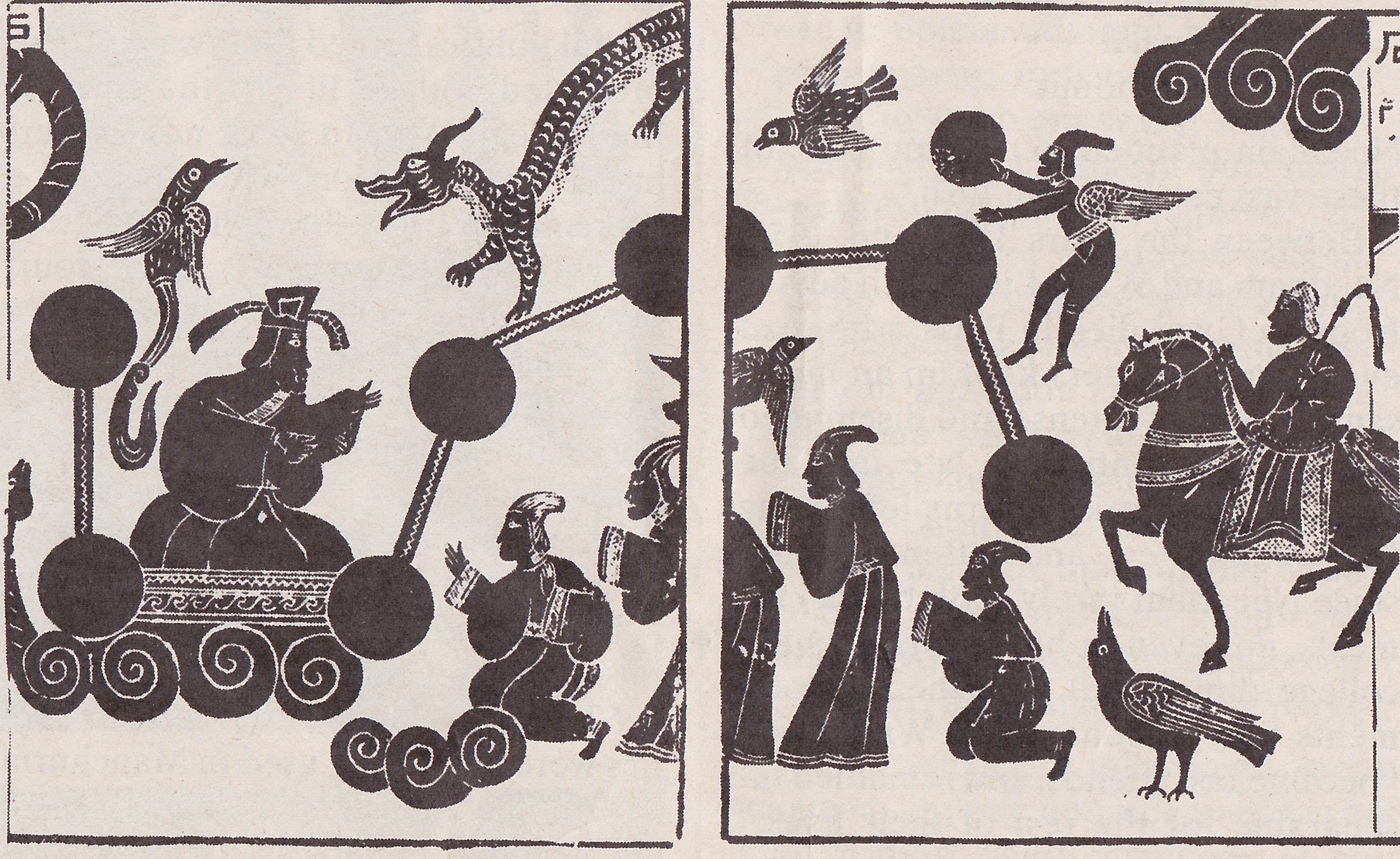 The graphic to the right is a
print of a relief in the Wu Liang tomb shrines, c. 147
CE, depicting the Big Dipper, or Ursa Major, as the
Celestial Bureaucrat, printed in Science and
Civilisation in China (1954ff) by Joseph Needham
(reprinted in "The Passions of Joseph Needham", by
Jonathan d. Spence, New York Review of Books,
08/14/2008).
The graphic to the right is a
print of a relief in the Wu Liang tomb shrines, c. 147
CE, depicting the Big Dipper, or Ursa Major, as the
Celestial Bureaucrat, printed in Science and
Civilisation in China (1954ff) by Joseph Needham
(reprinted in "The Passions of Joseph Needham", by
Jonathan d. Spence, New York Review of Books,
08/14/2008).- In medieval Europe, Charles' Wagon.
- In ancient Egypt, a complex depiction of a monster combining a bull, a man, and a hippopotamus, and a crocodile.
 Something similar can be seen in the
moon. You've heard of "The Man in the Moon", the image
of a face created by the seas and highlands on the moon's
surface. But other cultures perceive these same features
differently (Images taken from National Geographic).
Something similar can be seen in the
moon. You've heard of "The Man in the Moon", the image
of a face created by the seas and highlands on the moon's
surface. But other cultures perceive these same features
differently (Images taken from National Geographic).
- The "man in the Moon is common throughout Europe, and in the US -- but the "American" Man in the Moon is quite different from the European one!
- In East Asia, and Mesoamerica, people see a "Moon rabbit".
- In India, a pair of hand-prints.
- In Hawaii, people see a tree.
- In New Zealand, the Maori see a woman on the moon, but in a location quite different from either the European or the American "men".
In each case, the perceiver brings cultural knowledge to bear in making sense of the same stimulus pattern, thus "seeing" different things.
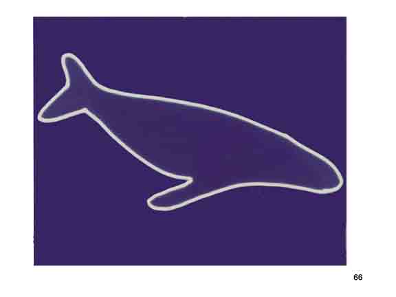 Here's another
example: In this figure most people see some sort of whale.
What else can you see? You can also see a kangaroo. I stumbled on
this figure when I was teaching at the University of Arizona,
and so this figure is known as the "Arizona Whale-Kangaroo.
Here's another
example: In this figure most people see some sort of whale.
What else can you see? You can also see a kangaroo. I stumbled on
this figure when I was teaching at the University of Arizona,
and so this figure is known as the "Arizona Whale-Kangaroo.
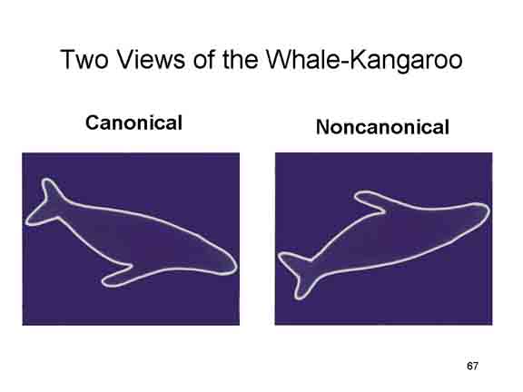 Given the alternate perception of this
figure, we simply couldn't resist comparing North American and
Australian college students. Sometimes the figure was
presented with the kangaroo in its "canonical" orientation,
with its feet and tail on the ground; in other conditions, the
figure was rotated so that the kangaroo was presented in a
"non-canonical" view.
Given the alternate perception of this
figure, we simply couldn't resist comparing North American and
Australian college students. Sometimes the figure was
presented with the kangaroo in its "canonical" orientation,
with its feet and tail on the ground; in other conditions, the
figure was rotated so that the kangaroo was presented in a
"non-canonical" view.
Of ![]() c
c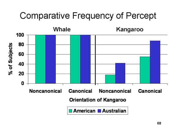 ourse,
the whale percept was rotated as well. Everyone everyone saw
the whale, regardless of whether they were American or
Australian. That makes sense, because both Australians and
Americans have had lots of experience seeing whales, and lots
of experience seeing whales in different orientations (like
swimming or breaching), as in the logo
of the Pacific Life Insurance Company. However,
Australians were more likely to see the kangaroo, and they
were more likely to see the kangaroo at odd, non-canonical
orientations (like with the "tail" pointing straight up or
down). Australians, more familiar with kangaroos than North
Americans (Skippy is, after all, their national symbol), are
more likely to see the kangaroo in this ambiguous figure.
ourse,
the whale percept was rotated as well. Everyone everyone saw
the whale, regardless of whether they were American or
Australian. That makes sense, because both Australians and
Americans have had lots of experience seeing whales, and lots
of experience seeing whales in different orientations (like
swimming or breaching), as in the logo
of the Pacific Life Insurance Company. However,
Australians were more likely to see the kangaroo, and they
were more likely to see the kangaroo at odd, non-canonical
orientations (like with the "tail" pointing straight up or
down). Australians, more familiar with kangaroos than North
Americans (Skippy is, after all, their national symbol), are
more likely to see the kangaroo in this ambiguous figure.
Perception as Problem-Solving
Sometimes, perceptual inference is unconscious, as Helmholtz noted. In other times, perceptual problem-solving requires active, conscious effort on the part of the perceiver. This fact is illustrated by the Gestalt figures, degraded line drawings and photographs of objects that are difficult to perceive, and identify, right away.
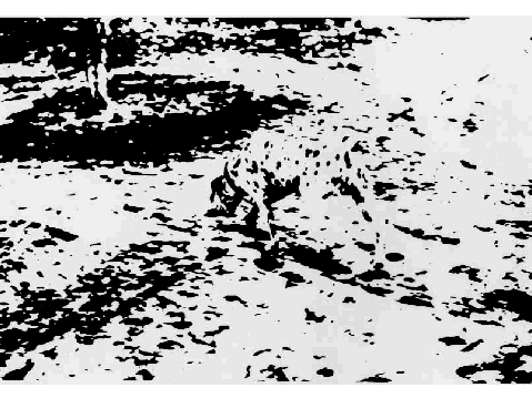 A famous
example is the photograph at the right. It shows a Dalmatian
dog, with its head pointing toward the upper left corner.
A famous
example is the photograph at the right. It shows a Dalmatian
dog, with its head pointing toward the upper left corner.
Here are some items from the Street Gestalt Completion Test, a psychological test intended to measure how good people are at achieving "closure" with Gestalt figures (there's a similar test devised by Mooney).
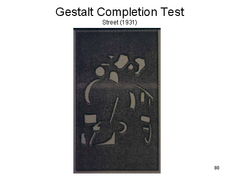 Here is a fairly familiar object,
provided you've been exposed to examples of the type in real
life. It's an old-fashioned steam locomotive.
Here is a fairly familiar object,
provided you've been exposed to examples of the type in real
life. It's an old-fashioned steam locomotive.
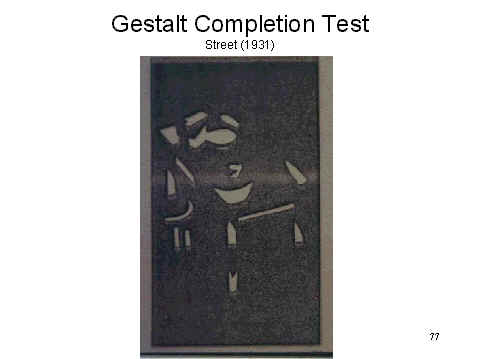 Here's
one that's more difficult. Note the several sets of parallel
vertical lines; the lines converging toward the top; it's a
table, with fruit and other objects on it.
Here's
one that's more difficult. Note the several sets of parallel
vertical lines; the lines converging toward the top; it's a
table, with fruit and other objects on it.
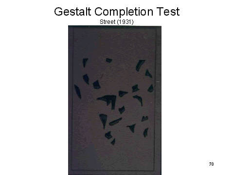 Here's one that's very difficult. Try to
figure out what it is.
Here's one that's very difficult. Try to
figure out what it is.
 Here's the same picture, only rotated 180o.
The figure is easier to see when it's in its proper
orientation; but it's still not all that easy: a
prancing horse, with a rider who's wearing a cape.
Here's the same picture, only rotated 180o.
The figure is easier to see when it's in its proper
orientation; but it's still not all that easy: a
prancing horse, with a rider who's wearing a cape.
The point of these figures is that it's work to figure out what they represent. The information provided by the stimulus is incomplete, vague, fragmentary, and ambiguous. You focus on a feature, and you say "What might that be?" "If that's what that is, then what must this be?". You're trying to make sense of the entire pattern of stimulation, and in doing so you bring all your cognitive resources -- knowledge, expectations, beliefs -- to bear on the problem of perceiving.
Canals on Mars: A Case of Perceptual Construction?
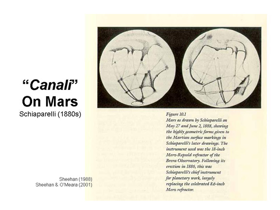 A famous example
of expectancy-determined perception are the "canals" on the
planet Mars, a "discovery" first announced by the Italian
astronomer Schiaparelli in 1887.
A famous example
of expectancy-determined perception are the "canals" on the
planet Mars, a "discovery" first announced by the Italian
astronomer Schiaparelli in 1887.
 Interestingly, Schiaparelli's
first drawings of Mars
Interestingly, Schiaparelli's
first drawings of Mars  didn't look like this. An
early map, from 1877, looks very much like a map of Mars
produced by another astronomer at about the same time.
didn't look like this. An
early map, from 1877, looks very much like a map of Mars
produced by another astronomer at about the same time.
 But in a somewhat later map,
from 1883, the Martian canals are fully in evidence. The
features are much more regular, more geometrical -- feeding
the speculation that Schiaparelli's canali were
artificial structures. By 1893, Schiaparelli held to the
full-formed belief that the canali were artificially
created by intelligent beings to move water from the Martian
poles to desert areas.
But in a somewhat later map,
from 1883, the Martian canals are fully in evidence. The
features are much more regular, more geometrical -- feeding
the speculation that Schiaparelli's canali were
artificial structures. By 1893, Schiaparelli held to the
full-formed belief that the canali were artificially
created by intelligent beings to move water from the Martian
poles to desert areas.
 Very
quickly, other astronomers began to see Schiaparelli's
"canals" too -- for example, Percival Lowell, an American
astronomer observing Mars from his private observatory at
Flagstaff, Arizona, in 1894.
Very
quickly, other astronomers began to see Schiaparelli's
"canals" too -- for example, Percival Lowell, an American
astronomer observing Mars from his private observatory at
Flagstaff, Arizona, in 1894.
Now, Percival Lowell (1955-1916) was no fool; nor were the professionals he worked with. He was independently wealthy: his brother, Abbot Lawrence Lowell, was president of Harvard University (Harvard's Lowell House is named after him), and it was his family (after whom Lowell, Massachusetts is named) that is referred to in the famous verse by John Collins Bossidy (1910):
And this is good old Boston,
The home of the bean and the cod,
Where the Lowells talk only to Cabots
And the Cabots talk only to God.
Lowell established the Flagstaff observatory in 1894, on what came to be known as "Mars Hill", specifically to observe Mars during a time when it was relatively close to Earth (I told you he was wealthy!).
- Lowell also directed a search for 'Planet X", whose existence he had predicted on the basis of eccentricities observed in the orbits of Uranus and Neptune. And, in fact, in 1930, more than a dozen years after Lowell died, one of his associates, Clyde Tombaugh, actually discovered Pluto.
- Another researcher at the Lowell Observatory, V.M. Sliphers, was the first (1912-1920) to observe the "red shift" in galaxies that gave rise to the theory of the expanding universe.
- A.E. Douglass, who located the site for the observatory and served as Lowell's assistant in its early years before moving to the Steward Observatory at the University of Arizona, discovered the relationship of climate to tree growth and invented the technology of dendrochronology, which uses tree rings to determining the age of trees.
The observatory still exists as a functioning enterprise, supported by grants and private philanthropy, and mostly devoted to planetary astronomy. You can visit it on your way to or from the Grand Canyon.
What Schiaparelli had originally termed canali, meaning "channels", which might well be natural formations on the surface, now became Lowell's "canals", implying deliberate construction by intelligent beings. Lowell also noted areas of green at the intersections of the canals, suggesting farm fields. It was just a small step to the idea that the canals were dug in desperation by water-starved beings to transport water from the Martian poles to agricultural areas near the equator -- the theme of Lowell's best-selling book,Mars.
 Unfortunately,
Mars doesn't look anything like any of these drawings, as
convincingly demonstrated by images derived from photographs
taken by the Mariner spacecraft. There is nothing on the
surface of Mars even remotely resembling canals.
Unfortunately,
Mars doesn't look anything like any of these drawings, as
convincingly demonstrated by images derived from photographs
taken by the Mariner spacecraft. There is nothing on the
surface of Mars even remotely resembling canals.
Actually,
there is, or at least there was, water on the Martian surface, but we didn't learn this until 2002, when photographs from NASA's Odyssey spacecraft sent back images of the south pole of Mars indicating that the soil there contained hydrogen, evidence of ice. Odyssey photographed some "channels", too, but they don't remotely resemble what Schiaparelli and Lowell thought they saw (Photographs from the NASA website, www.nasa.gov).
What happened? Even in the
19th century, telescopes were not very good. They had low
magnification, and they produced poor images. The largest
surface features on Mars were at about the limit of the
resolving power of the aided eye, so stimulus information was
very vague and fragmentary. To make this point clearer,
- The Panama Canal, linking the Atlantic and Pacific oceans across Central America (note to trivia mavens: the Pacific opening actually lies east of the Atlantic opening), is about 40 miles long, with channels In Lakes Miraflores and Gatun) up to 1,000 feet wide and locks about 110 feet wide.
- The Suez Canal, linking the Mediterranean and Red seas and separating Africa from Asia, is 101 miles long and at least 179 feet wide.
- The Erie Canal, linking the Great Lakes to the Hudson River in upstate New York, is about 363 miles long and about 70 feet wide.
- Closer to home, the California Aqueduct, running from the Sacramento River Delta to Southern California, is about 273 miles long and about 40 feet wide.
Lowell thought he was seeing structures of this magnitude. At the same time, he missed completely the biggest features of the Martian surface, such as Olympus Mons, a volcanic cone 370 miles wide and 14 miles high, and Valles Marineris, the "Grand Canyon of Mars", 2,000 miles long, 120 miles wide, and up to 6 miles deep. If Lowell couldn't see these features through his telescope, he could not possibly have seen canals.
In addition, it is not easy to distinguish features of the Martian surface from features (such as dust storms) in the Martian atmosphere. Moreover, due to rapid changes in atmospheric conditions on earth, even on Mars Hill near Flagstaff, Arizona, where the independently wealthy Lowell set up his own observatory (and where Clyde Tombaugh discovered the ninth planet, Pluto, in the 1930s), telescopic views of Mars were often less than optimal.
So even under the best of circumstances, 19th-century astronomers really only got very brief glimpses of the surface -- glimpses that left much to the imagination. The observers' percepts were biased by Gestalt principles of "good form" to smooth out irregularities and connect gaps. Even so, vague stimuli left much to the imagination -- so that even careful, scientifically trained observers saw what they wanted, or expected, to see.Schiaparelli and Lowell (especially Lowell) "connected the dots", creating continuous lines from discontinuous surface feature markings -- in much the same way that ancient sky-watchers saw patterns of stars making up the constellations.
What about Lowell's green farm fields?
They, too, were an illusion, but of a different sort. Mars is
called the "red planet", and indeed its surface is an
orange-red, due to a large amount of iron oxide n the soil
(the red planet Mars, and the blue star Rigel, in the
constellation Orion, are almost the only celestial objects
whose colors are visible to the naked eye). Through a
telescope, Mars looks very orange-red indeed, with spots of
gray-brown reflecting other the presence of other minerals --
and that's where the green fields come from. Remember negative
afterimages and the opponent-process theory of color vision?
When a neutral area is surrounded by a colored, the operation
of the opponent processes gives the neutral area an apparent
color opposite to that of the field. And the opposite of
orange-red is a kind of bluish green -- which is what Lowell
interpreted as agricultural area.
|
The story of the Martian "canals" is
discussed at length in The Planets and
Perception: Telescopic Views and Interpretations,
1609-1909 by W. Sheehan (1988), and Mars:
The Lure of the Red Planet by W. Sheehan &
S.J. O'Meara (2001).
For more on the first "Mars Craze" see The
Martians: The True Story of an Alien
Craze that Captured Turn-of-the-Century America
by David Baron (2025). A second Mars Craze,
arguably, was instigated by Orson Welles's 1938 radio
play based on H.G. Wells (no relation) 1898 novel, The
War of the Worlds.
For an update on the actual, contemporary, scientific
search for life on Mars, see "A Major Advance in the
Search for Life on Mars" by David W. Brown, (New
Yorker, 09/13/2025). |
Personality "Projection" as Constructive Perception
The fact that ambiguous stimuli leave much to the imagination, and require a substantial contribution from the perceiver, forms the basis for certain "projective" personality tests. These tests are not, in fact, particularly useful for personality assessment. But they remain very popular among clinicians, and this fact does not prevent us from using them to illustrate constructive aspects of perception.
 The
The
 Rorschach
technique, introduced by the Swiss psychologist
Hermann Rorschach in 1922, employs a set of 10 inkblots that
are symmetrical (because Rorschach folded the paper on which
he spilled his ink), but otherwise have no structure.
Therefore, the inkblots have no inherent meaning or
significance. Yet people often "see things" in them, analogous
to what we do when we see constellations in the night sky or
familiar shapes in clouds.
Rorschach
technique, introduced by the Swiss psychologist
Hermann Rorschach in 1922, employs a set of 10 inkblots that
are symmetrical (because Rorschach folded the paper on which
he spilled his ink), but otherwise have no structure.
Therefore, the inkblots have no inherent meaning or
significance. Yet people often "see things" in them, analogous
to what we do when we see constellations in the night sky or
familiar shapes in clouds.
- In the left-hand figure, one common percept is two bears
fighting, with blood. Another, focusing on the white
space, is a rocket ship taking off, or maybe a jet plane
viewed from above (or below).
- The right-hand figure is sometimes seen as an underwater scene, with crabs, and seahorses, and the like. A patient I tested once saw two English policeman ("bobbies") being chased by monsters, running toward the Eiffel tower. Another, focusing on the white space, saw a Japanese woman, dressed in a kimono, her hands folded in meditation.
I was trained to administer the
Rorschach in graduate school, and did so often when I was on
my clinical internship. One of my teachers, Julius Wishner,
was trained by Samuel Beck, who in turn was trained by
Rorschach himself, so I guess that makes me a third-generation
descendant. Wishner once described the Rorschach as
"psychology's most interesting test". Certainly it's more
interesting than an IQ test, and over the years a number of
researchers have attempted to construct useful systems for
scoring the Rorschach for purposes of personality assessment
and clinical diagnosis (which, by the way, was never
Rorschach's intention). By far the most popular of these
systems is the "Comprehensive System" for the Rorschach
promoted by the late John Exner. But despite its popularity
over the years, and the efforts of Exner and others to improve
its psychometric properties, the available research indicates
that, alas, it's not a very good test of personality. It
doesn't tell us anything that we couldn't find out through
alternative means that were both more valid and more
efficient.
I offer the Rorschach here only as an
example of the constructive point of view on perception. In
fact, Rorschach was inspired by the Gestalt psychologists, who
emphasized how perception gravitated toward "good form". He
proposed that a person's "perceptual style" could be inferred
from what he or she saw in the blots. Only later, did
psychologists begin interpreting test results in terms of the
perceiver's personality. The best evidence, however, is that
the Rorschach is not particularly useful for assessing
personality. Perhaps psychologists would have been better if
they had stuck to Rorschach's original idea!
- For a summary of this literature, written by clinical researchers who have been critical of the Rorschach, see Wood, J. M., Nezworski, M. T., Garb, H. N., & Lilienfeld, S. O. (Spring, 2006). The controversy over Exner's comprehensive system for the Rorschach: The critics speak. The Independent Practitioner (available on the web).
- Link to a critique posted in August 2009 by James Wood and his colleagues, to the listserv maintained by the Society for a Science of Clinical Psychology. Wood's critique is persuasive, to me, but the Rorschach still has its defenders.
- For example, in 2011 Prof. Gregory Meyer and his colleagues introduced a new scoring system for the Rorschach that, they claim, has improved validity over previous systems (including Exner's highly popular "Comprehensive System"). Link to a paper from Gregory Meyer's research group, proposing a new, improved approach to the Rorschach.
- For a nice history of the "Rorschach test", see The Inkblots: Hermann Rorschach, His Iconic Test, and the Power of Seeing (2017) by Damion Searls.
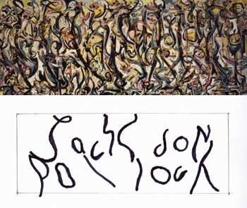 Still, the idea that we can "see things"
in ambiguous stimuli is familiar to anyone who has ever seen
animals in cloud formations. Here's an example of
projection from the history of art -- or, at least, a possible
example. Henry Adams, an art historian, has claimed that
Jackson Pollock embedded his name in his famous abstract
expressionist painting, Mural (1943). According
to Adams' hypothesis, Pollock began his painting by scrawling
his name across the canvas, and then applied paint in such a
way as to obscure it -- thus beginning with something
figurative and representational, his name, and ending with
something abstract -- his "signature" Abstract Expressionist
painting, so central to Pollack's reputation that its creation
was the centerpiece of the biopic, Pollack
(2000). (For more detail, see "Decoding Jackson Pollock"
by Henry Adams, Smithsonian, 11/2009.)
Still, the idea that we can "see things"
in ambiguous stimuli is familiar to anyone who has ever seen
animals in cloud formations. Here's an example of
projection from the history of art -- or, at least, a possible
example. Henry Adams, an art historian, has claimed that
Jackson Pollock embedded his name in his famous abstract
expressionist painting, Mural (1943). According
to Adams' hypothesis, Pollock began his painting by scrawling
his name across the canvas, and then applied paint in such a
way as to obscure it -- thus beginning with something
figurative and representational, his name, and ending with
something abstract -- his "signature" Abstract Expressionist
painting, so central to Pollack's reputation that its creation
was the centerpiece of the biopic, Pollack
(2000). (For more detail, see "Decoding Jackson Pollock"
by Henry Adams, Smithsonian, 11/2009.)
 The
The
 Thematic
Apperception Test, introduced by the American
psychologist Henry A. Murray in 1938, employs a set of
photographs and drawings that depict various scenes. The
subject is then instructed to make up a story about what is
going on in the picture, and what the characters are doing and
thinking. Despite the fact that each of the cards is a
"picture" of something, however, still they have enough
ambiguity that they are open to a wide variety of
interpretations.
Thematic
Apperception Test, introduced by the American
psychologist Henry A. Murray in 1938, employs a set of
photographs and drawings that depict various scenes. The
subject is then instructed to make up a story about what is
going on in the picture, and what the characters are doing and
thinking. Despite the fact that each of the cards is a
"picture" of something, however, still they have enough
ambiguity that they are open to a wide variety of
interpretations.
I used to administer the TAT, too, and when I was on the faculty at Harvard I taught a course with David McClelland, who probably did more than anyone else (except Henry Murray himself) to popularize the TAT. But while McClelland and his colleagues generated a great deal of interesting research using a variant on the TAT (which they sometimes called the "Picture-Story Exercise"), the original "clinical" version of the TAT never was given a standardized scoring system, which is absolutely essential for a valid personality test; nor did anyone collect norms from a representative sample of the population -- essential for interpreting test results. McClelland and his colleagues did create a standardized scoring system for some applications of the TAT method in their laboratory studies of the achievement motive and other aspects of personality, but a similar effort was never devoted to the clinical TAT.
Still, here are a couple of stories, written for the original clinical version of the TAT. What might these stories tell us about those who concocted them?
In the left-hand picture:
- This is the young Yehudi Menuhin, child prodigy of the violin, getting ready to play a recital at Carnegie Hall. He knows he's one of the world's greatest violin players, he's eagerly looking forward to strutting his stuff before the audience, and right now he's contemplating the piece he's about to play.
- This boy is being forced to take violin lessons by his parents, who think that the ability to play a musical instrument makes you smarter, and give him an advantage in the college admissions process. But he isn't interested in college, and he's definitely not interested in the violin. He isn't good at it, and he doesn't want to be good at it, and he hates classical music. He'd really rather be outside, playing a pickup game of soccer with his friends.
In the right-hand picture:
- This is Karl Wallenda, the patriarch of the Flying Wallendas, the famous troupe of circus acrobats. He's giving a command performance before the crowned heads of Europe. He's going to do his signature trick, the seven-person chair pyramid, with no net underneath. And he knows he's going to nail it.
- This is the Prisoner of Zenda. He's been confined in his cell for 20 years, and for all that time he's been fabricating a rope from pieces of cloth that he's managed to take from his bedding. This is the night: he's got an opportunity to escape, and he's started to work his way down the wall. But he's been spotted by the guards: they're waiting for him below, and they're waiting for him above. He's trapped.
Murray argued that what the person perceived in the pictures was indicative of his or her personality -- his or her motives, attitudes, interests, and concerns. This assumption is controversial, and if may very well not be correct. (In fact, Murray's original TAT is not a particularly good method for personality assessment, because no standardized scoring procedures or interpretive norms have ever been developed.) But, as with the Rorschach, the point remains that in any ambiguous stimulus, there will be differences in what is perceived -- inter-individual, depending on individual differences in expectations, beliefs, and the like; and intra-individual, depending on moment-to-moment changes in the individual's mental state. This is because the final percept is not determined solely by the features of the stimulus. It is also determined by the schema that the perceiver brings to the act of perception.
The Perceptual Cycle
In the final analysis,
perception is not just the product of information provided by
the stimulus environment, and extracted by evolved perceptual
mechanisms. Perception is problem-solving activity, in which
the perceiver has to make sense of information available from
diverse sources.
- Information from the proximal stimulus, including the entire sensory field, analyzed by "bottom-up" processing.
- Information derived from memory, including expectations, beliefs, and world knowledge, contributing to "top-down" processing.
The perceiver does extract information from the stimulus input, but the perceiver also employs inferential rules to make a judgment about the object -- the "best guess" about what the object is, where it is, and what it is doing. These guesses are usually very accurate: after all, we usually see the world as it really is. But this is not necessarily so. Conflicting information, incorrect assumptions, and using the wrong rules may lead the perceiver to make the wrong inference.
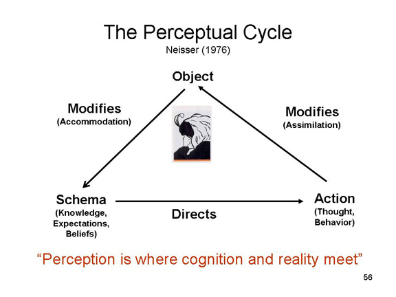 This
problem-solving, constructive approach to perception is
sometimes known as the perceptual cycle, a
term introduced by the pioneering American cognitive
psychologist Ulric Neisser in 1976.
This
problem-solving, constructive approach to perception is
sometimes known as the perceptual cycle, a
term introduced by the pioneering American cognitive
psychologist Ulric Neisser in 1976.
The observer's task is to perceive the stimulus in the environment, but the observer never enters into any perceptual encounter "cold". Instead, he or she carries into the situation a pre-existing mental representation of the world. Neisser calls this representation a schema. The schema includes generalized representation of knowledge about objects, events, and the relations between them, as well as specific expectations about what will be met.
The distal stimulus provides information which is picked up by the sensory systems when the proximal stimulus is transduced by the sensory receptors into neural impulses transmitted to the central nervous system. This pattern of proximal stimulation is decoded by perceptual processes such as feature detection and pattern recognition.
If the stimulus information fits readily into the active schema, the object is immediately categorized, and is not processed further in the absence of active attention.
If there is a mismatch between the stimulus and the schema, recognition of the discrepancy initiates further cognitive activity. The perceiver may pay fuller attention to the object, providing a closer examination of available features. Or the perceiver may manipulate the object to reveal new features. Or the perceiver may engage in perceptual inference -- making judgments based on what is already known from information provided by the stimulus and knowledge retrieved from memory.
These two phases in interaction between the stimulus and schema may be described in terms borrowed from the Swiss developmental psychologist Jean Piaget:
- Assimilation: transforming the percept until it fits the schema.
- Accommodation: transforming the schema until it can incorporate the percept.
In perception, inferential
procedures lead to a perceptual hypothesis,
which is then tested, much like a scientist would test a
hypothesis, by obtaining further information.
- This cycle of perceptual hypothesis-testing is continued until a satisfactory percept is formed -- a percept that accounts, as well as possible, for stimulus information. Usually, at this point the object has been identified and categorized as similar to other objects the person has encountered in the past.
- The cycle begins anew when the perceiver encounters new, surprising input -- a new mismatch between what we perceive and what we expect.
When the stimulus is rich in information, and well structured, perception doesn't require much thought. It proceeds in a relatively automatic fashion.
But when the stimulus is vague,
fragmentary, and not well organized -- when stimulus
information can support many possible percepts -- perception
requires correspondingly more mental activity. The perceiver
must actively search for new information, fill in missing
pieces through inference, and put the pieces together -- much
like we would put together a jigsaw puzzle.
Predictive Coding
 A contemporary
variation on Neisser's perceptual cycle -- and, for that
matter, Helmholtz's original constructivist theory has been
offered by Anil Seth ("Our Inner Universes", Scientific
American, 08/2019), a cognitive neuroscientist at the
University of Sussex who co-directs the Sackler Center for
Consciousness Science there (the Sackler center is likely the
inspiration for the research center depicted in David Lodge's
academic satire Thinks..., and discussed in my
lecture, in my "Consciousness"
course, on "Consciousness
in the Arts and Humanities"). Seth begins by
noting that different people see reality differently -- as
illustrated, for example, by perceptual anomalies such as the
Dress Illusion discussed earlier in
these lectures. He writes: "The story usually told about
illusions is that they exploit quirks in the circuitry of
perception, so that what we perceive deviates from what is
there. Implicit in this story, however, is the
assumption that a properly functioning perceptual system will
render to our consciousness things precisely as they
are. The deeper truth is that perception is never a
direct window onto an objective reality. All our
perceptions are active constructions, brain-based best guesses
at the nature of a world that is forever obscured behind
a sensory veil.... Visual illusions are fleeting
glimpses into this deeper truth.... The reality we
experience -- the way things seem -- is not a direct
reflection of what is actually out there. It is a clever
construction by the brain. And if my brain is different
from your brain, my reality may be different from yours,
too."
A contemporary
variation on Neisser's perceptual cycle -- and, for that
matter, Helmholtz's original constructivist theory has been
offered by Anil Seth ("Our Inner Universes", Scientific
American, 08/2019), a cognitive neuroscientist at the
University of Sussex who co-directs the Sackler Center for
Consciousness Science there (the Sackler center is likely the
inspiration for the research center depicted in David Lodge's
academic satire Thinks..., and discussed in my
lecture, in my "Consciousness"
course, on "Consciousness
in the Arts and Humanities"). Seth begins by
noting that different people see reality differently -- as
illustrated, for example, by perceptual anomalies such as the
Dress Illusion discussed earlier in
these lectures. He writes: "The story usually told about
illusions is that they exploit quirks in the circuitry of
perception, so that what we perceive deviates from what is
there. Implicit in this story, however, is the
assumption that a properly functioning perceptual system will
render to our consciousness things precisely as they
are. The deeper truth is that perception is never a
direct window onto an objective reality. All our
perceptions are active constructions, brain-based best guesses
at the nature of a world that is forever obscured behind
a sensory veil.... Visual illusions are fleeting
glimpses into this deeper truth.... The reality we
experience -- the way things seem -- is not a direct
reflection of what is actually out there. It is a clever
construction by the brain. And if my brain is different
from your brain, my reality may be different from yours,
too."
Seth contrasts his version of
constructivism with what he calls the "classical model" of
"bottom-up" processing, in which perceptual contents are
conveyed by signals that flow from the sensory surfaces
toward the brain. The role of "top-down" processing is
merely to add context or detail to what is perceived.
The heavy lifting is all done the sensory signals
themselves. In an alternative view, which Seth calls predictive
coding or predictive processing. In this
theory, "the brain" engages in problem-solving activity,
attempting to determine what is going on in the external world
(or, for that matter, in the internal world of the
body). It does this by making "best guesses" about the
causes of sensory inputs, and then updating these hypotheses
by comparing its predictions with actual sensory signals, and
adjusting its predictions to minimize sensory-prediction
errors. In this case, most of the work of perception is
performed by the central prediction machine of the brain, and
sensory signals serve only to calibrate the process.
Seth writes, "Rather than being a passive registration of an
external objective reality, perception emerges as a process of
active construction -- a controlled hallucination, as it has
come to be known".
Two comments here.
- What Seth calls the "classical model" is hardly the
classical model. A good argument can be made that
Helmholtz's constructivism is the classical view, as it
dominated the study of perception from the mid-19th century
up until the time that Gibson's ecological optics came along
to shake things up. It's Gibson's revisionist view
that emphasizes bottom-up processing, with his assertion
that all the information needed for perception is provided
by the stimulus (broadly defined).
- Seth is a cognitive neuroscientist, and so he argues that
the brain is a "prediction machine", and it's the
brain that compares predictions with sensory signals,
updates predictions, etc. But talk of "the brain"
doing things, and "every brain is different, so we all
perceive a different reality" (I'm paraphrasing here) really
adds nothing to the argument. All psychologists agree
that the brain is the biological substrate of mental life,
and that "mind is what the brain does". But unless
someone identifies the particular module or system or
circuit in the brain that actually does the comparison, or
the updating, or whatever, all this neuroscientific talk is
just window-dressing. To be fair, Seth does cite a
brain-imaging study suggesting that activation in the
superior temporal sulcus. But even so, we could talk
about "the perceptual system", or "perception", or "the
mind" doing these things, and nothing would be lost.
Constructive Alternativism
In this way, perceptual activity represents a sort of compromise. The perceiver can't perceive just anything. Perception is constrained by the features of the stimulus. But, within limits, there are lots of possibilities for perceptual construction -- a situation called constructive alternativism by the American psychologist George Kelly. You can't just see anything: What you see is constrained by stimulus input. But when stimulus information is vague and fragmentary, perception is largely determined by expectations and beliefs. To some extent, you can choose what you see.
The Bottom Line in Perception
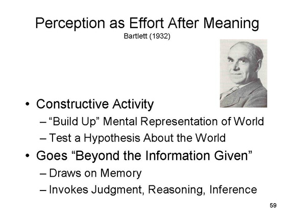 Sometimes,
the information "in the light" is all we need to perceive the
world accurately. However, stimulation is often insufficient
or ambiguous, so that the perceiver must engage in what the
British psychologist Frederick C. Bartlett called "effort
after meaning" -- his version of Bruner's later phrase, going
"beyond the information given" by the stimulus. Perception
draws on knowledge, expectations, and beliefs; it relies on
inferences, whether conscious or unconscious; and it it
involves problem-solving and hypothesis-testing activity, as
the perceiver figures out what objects, where, doing
what, could possibly be giving rise to the available pattern
of proximal stimulation.
Sometimes,
the information "in the light" is all we need to perceive the
world accurately. However, stimulation is often insufficient
or ambiguous, so that the perceiver must engage in what the
British psychologist Frederick C. Bartlett called "effort
after meaning" -- his version of Bruner's later phrase, going
"beyond the information given" by the stimulus. Perception
draws on knowledge, expectations, and beliefs; it relies on
inferences, whether conscious or unconscious; and it it
involves problem-solving and hypothesis-testing activity, as
the perceiver figures out what objects, where, doing
what, could possibly be giving rise to the available pattern
of proximal stimulation.
In the final analysis, perception is
not like looking at a picture. It is like painting a
picture anew each time, based on fragmentary materials.
For Further Information on (Mostly Visual) Perception: |
|
 |
 |
This page last modified 01/27/2026.