Beyond Impressions:
Descriptive and Inferential Statistics
Ernest Rutherford, who made that nasty remark about physics and stamp collecting, also said that "If your experiment needs statistics, you ought to have done a better experiment". But he was wrong about that, just as he was wrong about reductionism. Even physicists use statistics -- most recently in their search for the Higgs boson (also known as "the God particle", which gives mass to matter). The Higgs was first observed in a set of experiments completed in December 2011, but official announcement of its existence had to wait until July 4, 2012, so that they could double the number of observations (to about 800 trillion!), and achieve a confidence level of "five sigma". You'll find out what this means later in this Supplement.
Scientists of all stripes, including physicists and psychologists, use statistics to help determine which observations to take seriously, and which explanations are correct.
"Lies, damn lies, and statistics" -- that's a quote attributed by Mark Twain to Benjamin Disraeli, the 19th-century British prime minister. And it's true that scientists and policymakers are often able to massage statistics to "prove" things that aren't really true. But if you understand just a little statistics, you won't be fooled quite so often. That minimal understanding is the goal of this lecture. If you continue on in Psychology, you'll almost certainly take a whole formal course in methods and statistics, at the end of which you'll understand more!
Scales of Measurement
Quantification, or assigning numbers to observations, is the core of the scientific method. Quantification generates the numerical data that can be analyzed by various statistical techniques. The process of assigning numbers to observations is called scaling.
As late as the end of the 18th century, it was widely believed, thanks mostly to the philosopher Immanuel Kant) that psychology could not be a science because science depends on measurement, and the mind could not be measured. On the other hand, Alfred W. Crosby (in The Measure of Reality: Quantification and Western Society, 1250-1600, 1997) points out that as early as the 14th century Richard Swineshead (just imagine the grief he got in junior high school) and a group of scholars (known as the Schoolmen) at Oxford's Merton College were considering ways in which they might measure "moral" qualities such as certitude, virtue, and grace, as well as physical qualities such as size, motion, and heat. What accounts for the change? Kant, like most other philosophers of his time, was influenced by the argument of Rene Descartes, a 17th-century French philosopher, that mind and body were composed of different substances -- body was composed of a material substance, but mind (or, if you will, soul) was immaterial. Because material substances took up space, they could be measured. Because mind did not take up space, it could not be measured.
Nevertheless, less than half a century after Kant made his pronouncement, Ernst Weber and Gustav Fechner asked their subjects to assign numbers to the intensity of their sensory experiences, and discovered the first psychophysical laws. Shortly thereafter, Franciscus Donders showed how reaction times could measure the speed of mental processes. People realized that they could measure the mind after all, and scientific psychology was off and running.
But what kind of measurement is mental measurement? Robert Crease (in World in the Balance: The Historic Quest for an Absolute System of Measurement, 2011), distinguishes between two quite different types of measurement:
- In ontic measurement, we are measuring the physical properties of things that exist in the world. Measuring the length of a bolt of cloth with a yardstick, or weighing yourself on a bathroom scale, are good examples. There are absolute, universal standards for ontic measurements. For example, a meter is equal to 1/10,000,000 of the distance from the Earth's equator to the North Pole, and kilogram is equal to the mas of 1 liter of water.
- In ontological measurement, we try to measure properties or qualities that do not exist in quite the same way as length and weight do, because they are in some sense invisible. This is where Kant got hung up. Intelligence, or neuroticism, or loudness are hypothetical constructs, "invisible" entities which we invoke to describe or explain something that we can see. Hypothetical constructs exist in physics and chemistry, too. But they are abundant in psychology. And precisely because they are "hypothetical", many of the controversies in psychology revolve around how different investigators define their constructs. We'll see this most clearly when we come to research and theory on the most salient psychological construct of them all -- intelligence.
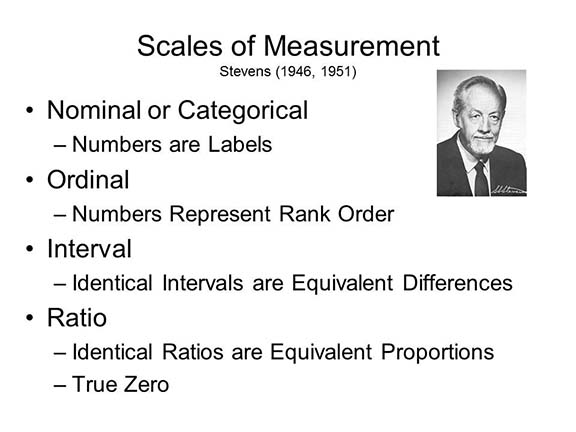 In a classic paper, S.S. Stevens, the
great 20th-century psychophysicist, identified four
different kinds of measurement scales used in psychology.
In a classic paper, S.S. Stevens, the
great 20th-century psychophysicist, identified four
different kinds of measurement scales used in psychology.
Nominal (or categorical) scales simply use numbers to label categories. For example, if we wish to classify our subjects according to sex, we might use 0 = female and 1 = male (this is the preference of most male researchers; female researchers have other ideas). But it doesn't matter what the numbers are. We could just as easily let 5 = male and 586 = female, because we don't do anything with these numbers except use them as convenient labels.
Ordinal scales use numbers to express relative magnitude. If we ask you to rank political candidates in terms of preference, where 1 = least preferred and 10 = most preferred, a candidate ranked #8 is preferred more than a candidate ranked #6, who is preferred more than a candidate ranked #4. However, there is no implication that #8 is preferred twice as much as #4, or four times as much as #2. All we can say is that one candidate is preferred more (or less) than another. Rank orderings are transitive: if #8 is preferred to #4, and #4 is preferred to #2, then #8 is preferred to #2.
In interval scales, equal differences between scores can be treated as actually equal. Time is a common interval scale in psychological research: 9 seconds is 5 seconds longer than 4 seconds, and 8 seconds is 5 seconds longer than 3 seconds, and the two 5-second differences are equivalent to each other. Interval scales are important because they permit scores to be added and subtracted from each other.
In ratio scales, there is an absolute zero-point against which all other scores can be compared -- which means that scores can be multiplied and divided as well as added and subtracted. Only with ratio scales can we truly say that one score is twice as large, or half as large, as another. Time is on a ratio scale as well as an interval scale -- 8 seconds is twice as long as 4 seconds.While interval scales permit addition and subtraction, ratio scales permit multiplication and division.
Most psychological data is on nominal, ordinal,
or interval scales. For technical reasons that need not
detain us here, ratio scales are pretty rare in psychology.
But this fact does not prevent investigators from speaking
of their data, informally, as if it were on a ratio scale,
and analyzing it accordingly.
"Data Is" or "Data Are"?
In the paragraph just above I wrote that "data is", whereas if you read the psychological literature you will often find psychologists writing "data are". Technically, the word data is the plural of the word datum, but Latin plurals often become English singulars --agenda is another example. The fact is that scientists rarely work with a single datum, or individual piece of information, but rather with a body of data. Accordingly, I generally use data as a mass noun that takes a singular verb, rather than as a count noun that takes the plural.
Alternatively,data can be viewed as a sort of collective noun, like team. In this case, it also takes the singular.
Usage differs across writers, however, and even individual
writers can be inconsistent. This is just one example of
how English is constantly evolving.
For an engaging (and somewhat left-leaning) history of data, see How Data Happened: A History from the Age of Reason to the Age of Algorithms (2023) by Chris Wiggins (an applied mathematician) and Matthew L. Jones (a historian), reviewed by Ben Tarnoff in "Ones and Zeros" (The Nation, 10/30-11/06/2023). The general theme of the book is "How Everything Became Data" -- including people.
"Subjects" or "Participants"?
Another tricky language issue crops up when we refer to the individuals who provide the data analyzed in psychological experiments. In psychophysics, such individuals are typically referred to as "observers"; in survey research, they are often referred to as "informants". But traditionally, they are referred to as "subjects", a term which includes both humans, such as college students, and animals, such as rats and pigeons. However, beginning with in its 4th edition, the Publication Manual of the American Psychological Association -- a widely adopted guide to scientific writing similar to The Chicago Manual of Style in the humanities -- advised authors to "replace the impersonal term subjects with a more descriptive term" like participants (p. 49). Since then, references to research "participants" have proliferated in the literature -- a trend that even drew the notice of the New York Times (The Subject Is... Subjects" by Benedict Carey, 06/05/05).
The Times quoted Gary VandenBos, executive director of publications and communications for the APA, as saying that "'Subjects' implies that these are people who are having things done to them, whereas 'participants' implies that they gave consent". This, of course, is incorrect. Such individuals might be called "objects", but never "subjects"; the term "subject" implies activity, not passivity (think about the subject-object distinction in English grammar).
More important, perhaps, the "participant" rule blithely
ignores the simple fact that there are many "participants"
in psychological experiments, each with their own special
designated role during the social interaction known as
"taking part in an experiment":
- There are the subjects who provide the empirical data collected in an experiment, and
- the experimenters who conduct the experiment itself;
- there are the confederates (Schachter and Singer called them "stooges", which definitely has an unsavory ring to it!) who help create and maintain deception in certain kinds of experiments;
- there are laboratory technicians who operate special equipment (as in brain-imaging studies), and
- perhaps other research assistants as well, such as data coders, who have active contact with the subject, the experimenter, or both.
All these people "participate" in the experiment. To call subjects mere "participants" not only denies recognition of their unique contribution to research, but it also denies proper recognition to the other participants as well.
Only one category of participants provides the data collected in an experiment: the subjects, and that's what "they" should be called whether they are human or nonhuman.
Descriptive Statistics
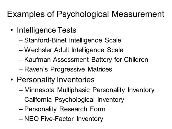 Probably the most familiar
examples of psychological measurement come in the form of
various psychological tests, such as intelligence tests
(e.g., the Stanford-Binet Intelligence Scale or the Wechsler
Adult Intelligence Scale) and personality questionnaires
(e.g., the Minnesota Multiphasic Personality Inventory or
the California Psychological Inventory). The construction of
these scales is discussed in more detail in the lectures on
Thought and Language
and Personality and Social
Interaction.
Probably the most familiar
examples of psychological measurement come in the form of
various psychological tests, such as intelligence tests
(e.g., the Stanford-Binet Intelligence Scale or the Wechsler
Adult Intelligence Scale) and personality questionnaires
(e.g., the Minnesota Multiphasic Personality Inventory or
the California Psychological Inventory). The construction of
these scales is discussed in more detail in the lectures on
Thought and Language
and Personality and Social
Interaction.
For now, let's assume that a subject has completed one of these personality questionnaires, known as the NEO-Five Factor Inventory, which has scales for measuring extraversion, neuroticism, and three other personality traits (we'll talk about the Big Five factors of personality later). Scores on each of these scales can range from a low of 0 to a high of 48.
Now let's imagine that our subject has scored 20 on both of these tests. What does that mean? Does that mean that the person is as neurotic as he or she is extraverted? We don't really know, because before we can interpret a person's test scores, we have to have information about the distribution of scores on the two tests. Before we can interpret an individual's score, we have to now something about how people in general perform on the test. And that's where statistics come in.
In fact, there are two broad kinds of
statistics: descriptive statistics and inferential
statistics.
Descriptive statistics, as their name implies, help us to describe the data in general terms. And they come in two forms:
- Measures of central tendency, such as the mean, the median, and the mode;
- Measures of variability, such as the variance, the standard deviation, and the standard error of the mean.
We can use descriptive statistics to indicate how people in general perform on some task.
Then there are inferential statistics, which allow us to make inferences about whether any differences we observe between different groups of people, or different conditions of an experiment, are actually big enough,significant enough, to take seriously. the kinds of measures we have for this include:
- the t-test and the analysis of variance;
- the correlation coefficient and multiple regression.
These will be discussed later.
As far as central tendency goes, there are basically three different measures that we use.
- The most popular of these is the mean, or arithmetical average, abbreviated M, which is computed simply by adding up the individual scores and dividing by the number of observations.
- The median is that point which divides the distribution exactly in half: below the median there are 50% of the observations, and 50% of the observations are above the median. We can determine the median simply by rank-ordering the observations and finding the point that divides the distributions in half.
- The mode is simply the most frequent observation. If two different points share the highest frequency, we call the distribution bimodal.
Next, we need to have some way of characterizing the variability of the observations, the variability in the data, or the dispersion of observations around the center. The commonest statistics for this purpose are known as:
- the standard deviation (abbreviated SD);
- the variance, which is simply the square of the SD;
- the standard error of the mean.
For an exam, you should know how to determine the mean, median, and mode of a set of observations. I almost always ask this question on an exam, and it's just a matter of simple arithmetic. But you do not need to know how to calculate measures of variability like the standard deviation and the standard error. Conceptually, however, the standard deviation has to do with the difference between observed scores and the mean. If most of the observations in a distribution huddle close to the mean, the variability will be low. If many observations lie far from the mean, the variability will be high.
The standard deviation, then, is the measure of the dispersion of individual scores around our sample mean. But what if we took repeated samples from the same population. Each time we'd get a slightly different mean and a slightly different standard deviation, because each sample would be slightly different from the others. They wouldn't be identical. The standard error is essentially a measure of the variability among the means of repeated samples drawn from the same population. You can think of ti as the standard deviation of the means calculated from repeated samples, analogous to the standard deviation of the mean calculated from a single sample.
Most psychological measurements follow what is known as the normal (or Gausian) distribution. If you plot the frequency with which various scores occur, you obtain a more-or-less bell-shaped curve that is more-or-less symmetrical around the mean, and in which the men, the median, and the mode are very similar. In a normal distribution, most scores fall very close to the mean, and the further you get from the mean, the fewer scores there are. If you have a perfectly normal distribution, the mean, the median, and the mode are identical, but we really don't see that too much in nature.
The normal distribution follows from what is known as the central limit theorem in probability theory. That's all you have to know about this unless you take a course in probability and statistics. And, for this course, you don't even have to know that! But I have to say it.
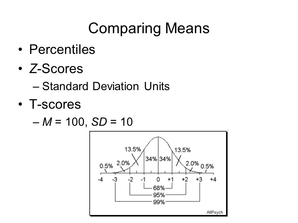
One of the interesting features of a normal distribution is that the scatter or dispersion of scores around the mean follows a characteristic pattern known as The Rule of 68, 95, and 99. What this means is that in a large sample:
- approximately 68% of the observations will fall within 1 standard deviation of the mean;
- approximately 95 % will fall within 2 standard deviations;
- and approximately 99% of the observations will fall within 3 standard deviations (actually, 99.7%, but who's counting?).
10,00 Dice Rolls...
A nice visualization of probability and the normal distribution in action comes from Kirkman Amyx, a Bay Area artist whose work, as described on his website, "explores the use of photography as a data visualization tool which can allow for seeing patterns, structure, and meaning through image repetition. These conceptually based projects which utilize a hint of science, data analysis, and the measurement of time, are ultimately visual inquiries and explorations of phenomena."
 Consider his
digital painting, "10,000 Dice Rolls CMV", Amyx
writes: "This visual exploration is investigating
the dichotomy between chance and predictably, the theory
of probability, and the law of large numbers. Over a
period of 10 hours 10,000 dice were rolled, and each
outcome photographed in the location of the fall. Digital
compilations and a 6 minute video were made of the 10,000
files to show how a random but repeated event can quickly
produce a predictable pattern. Here you can see that most
of the rolls fell in the center of the space, with very
few along the outer edges. If you measured the distance
between the center of the space and the location where
each dice roll fell, and then calculated the mean and
standard deviation, you would find that roughly 68% of the
rolls would fall within 1 standard deviation of the center
of the space, 95% would fall within 2 SDs, and
99% within 3 SDs. ("CMV" stands for "Cyan,
Magenta, Violet", the three colors in which the dice rolls
were printed.)
Consider his
digital painting, "10,000 Dice Rolls CMV", Amyx
writes: "This visual exploration is investigating
the dichotomy between chance and predictably, the theory
of probability, and the law of large numbers. Over a
period of 10 hours 10,000 dice were rolled, and each
outcome photographed in the location of the fall. Digital
compilations and a 6 minute video were made of the 10,000
files to show how a random but repeated event can quickly
produce a predictable pattern. Here you can see that most
of the rolls fell in the center of the space, with very
few along the outer edges. If you measured the distance
between the center of the space and the location where
each dice roll fell, and then calculated the mean and
standard deviation, you would find that roughly 68% of the
rolls would fall within 1 standard deviation of the center
of the space, 95% would fall within 2 SDs, and
99% within 3 SDs. ("CMV" stands for "Cyan,
Magenta, Violet", the three colors in which the dice rolls
were printed.)
...and
9,519 Characters
 A
three-dimensional example of this type is "We Choose the
Moon", an artwork by Eli Blasko, a Tucson-based artist who
works in various media (the artwork, made in 2020, was
displayed in the 2023 Biennial Exhibition at the Tucson
Museum of Art). In order to make the piece, Blasko
took the transcript of a 1962 speech by President John F.
Kennedy) announcing the Apollo moonshot program ("We
choose to go to the moon in this decade and do the other
things, not because they are easy, but because they are
hard..."), cut out each individual letter, and then
dropped all 9,519 cutouts onto a piece of paper. The
resulting mound has a peak at the center, and then spreads
out pretty symmetrically until there are only single
characters at the very circumference. If you took a
cross-section of the mound, it would look a lot like the
normal curve. If you drew concentric rings, you'd
find that about 68% of the cutouts fell within 1 SD
of the center, 95% within 2 SD, and 99% within 3 SD.
Here are some other views of Blasko's artwork (all images
from Blasko's website).
A
three-dimensional example of this type is "We Choose the
Moon", an artwork by Eli Blasko, a Tucson-based artist who
works in various media (the artwork, made in 2020, was
displayed in the 2023 Biennial Exhibition at the Tucson
Museum of Art). In order to make the piece, Blasko
took the transcript of a 1962 speech by President John F.
Kennedy) announcing the Apollo moonshot program ("We
choose to go to the moon in this decade and do the other
things, not because they are easy, but because they are
hard..."), cut out each individual letter, and then
dropped all 9,519 cutouts onto a piece of paper. The
resulting mound has a peak at the center, and then spreads
out pretty symmetrically until there are only single
characters at the very circumference. If you took a
cross-section of the mound, it would look a lot like the
normal curve. If you drew concentric rings, you'd
find that about 68% of the cutouts fell within 1 SD
of the center, 95% within 2 SD, and 99% within 3 SD.
Here are some other views of Blasko's artwork (all images
from Blasko's website).
 |
 |
 |
 It's important
to remember that means are only estimates of population
values, given the observations in a sample. If we measured
the entire population we wouldn't have to estimate the mean:
we'd know exactly what it is. But in describing sample
distributions we define a confidence interval
of 2 standard deviations around the mean. So given the mean
score, and a reasonably normal distribution of scores, we
can be 95% confident that the true mean lies somewhere
between 2 standard deviations below and 2 standard
deviations above the mean. Put another way, there is only a
5% chance that the true mean lies outside those limits: p < .05
again!
It's important
to remember that means are only estimates of population
values, given the observations in a sample. If we measured
the entire population we wouldn't have to estimate the mean:
we'd know exactly what it is. But in describing sample
distributions we define a confidence interval
of 2 standard deviations around the mean. So given the mean
score, and a reasonably normal distribution of scores, we
can be 95% confident that the true mean lies somewhere
between 2 standard deviations below and 2 standard
deviations above the mean. Put another way, there is only a
5% chance that the true mean lies outside those limits: p < .05
again!
People whose scores fall outside the confidence interval are sometimes called "outliers", who may differ from the rest of the sample in some way. So that gives us a second rule -- what you might call "The Rule of 2": if there are a lot of subjects with scores more than 2 standard deviations away from the mean, this is unlikely to have occurred merely by chance. If you watch the television news, you'll see that confidence intervals are also reported for other kinds of statistics. So, for example, when a newscaster reports the results of a survey or a political poll, he or she may report that 57% of people prefer one candidate over another, with a confidence interval of 3 percentage points. In that case, we can be 95% certain that the true preference is somewhere between 54% and 60%. The calculation is a little bit different, but the logic of confidence intervals is the same.
An interesting example occurred in an official report of the US Bureau of Labor Statistics for May 2012 (announced in June). Reflecting the slow recovery from the Great Recession that began with the financial crisis of 2008, unemployment was estimated at 8.2% (up a little from the months before); it was also estimated that 69,000 new jobs had been created -- not a great number either. But the margin of error around the job-creation estimate was 100,000. This means that as many as 169,000 jobs might have been created that month -- but also that we might have lost as many as 31,000 jobs! Sure enough, the July report revised the May figure upward to 77,000 new jobs, and the August report revised it still further, to 87,000 new jobs.
Here's another one, of even greater importance. In the case of Atkins v. Virginia (2002), the US Supreme Court held that it was unconstitutional to execute a mentally retarded prisoner, on the grounds that it was cruel and inhuman. However, it left vague the criteria for identifying someone as mentally retarded. After that decision was handed down, Freddie Hall, convicted in Florida for a brutal murder, appealed his death sentence on the grounds that he was mentally retarded (Hall didn't seek an insanity defense: he only wished to prevent his execution for the crime). As we'll discuss later in the lectures on Psychopathology, the conventional diagnosis of mental retardation requires evidence of deficits in both intellectual and adaptive functioning, with both deficits manifest before age 18. As discussed later in the lecture on Thought and Language, the conventional criterion for intellectual disability is an IQ of 70 or less. Given the way that IQ tests are scored, this would put the person at least two standard deviations below the population mean, and most states employ something like that criterion. Hall, unfortunately for him, scored slightly above 70 when he was tested, and Florida law employed a strict cutoff IQ of 70, allowing for no "wiggle-room" (it also uses IQ as the sole criterion for mental retardation). In Hall vs. Florida (2014), Hall's lawyers argued that such a cutoff was too strict, and didn't take into account measurement error. That is to say, while he might have scored 71 or 73 (or, on one occasion, 80) when he was tested, the measurement error of the test was such that there was some chance that his true score was below 70. Put another way, the confidence interval around his scores was such that it was possible that his true score was 70 or below. In a 5-4 decision, the Court agreed, mandating that Florida (and other states that also have a "bright line" IQ cutoff) must take account of both the measurement error of IQ tests and other evidence of maladaptive functioning in determining whether a condemned prisoner is mentally retarded.
In industry, a popular quality-control standard, pioneered by the Motorola Corporation, is known as six sigma. In statistics, the standard deviation is often denoted by the Greek letter sigma, and the six-sigma rule aims to establish product specifications that would limit manufacturing defects to the lower tail of the normal distribution, more than 6 standard deviations ("six sigma") below the mean. Thinking about the "Rule of 68, 95, and 99", and remembering that 32% of observations will fall outside the 1SD limit, half above and half below, that means that a "one sigma" rule would permit 16% manufacturing defects (((100-68)/2 = 16) which is pretty shoddy work); a rule of "two sigma" would permit defects in 2.5% of products ((100-95)/2), and a rule of "three sigma" would permit defects in 0.5% of products((100-99)/2). Most statistical tables stop at 3 SDs, but if you carry the calculation out, in practice the "six sigma" rule sets a limit of 3.4 defects per million, or 0.0000034%). Now,that's quality!
Scrubbing the Test
In New York State, students are required to pass "Regents Examinations" in five areas -- math, science, English, and two in history or some other social science -- in order to graduate from high school. The exams are set by the state Board of Regents (hence the name), and consist of both multiple-choice and open-ended questions. In order to pass a Regents' Exam, the student must get a score of 65 out of 100 (a previous threshold of 55 was deemed too low). Up until 2011, State policy permitted re-scoring tests that were close to the threshold for passing, in order to prevent students from being failed simply because of a grading error. The exams are used both to evaluate student competence in the areas tested, and in the preparation of "report cards" for schools and principals.
I was educated in New York State, and, at least at that time, the Regents Exams were things of beauty. They covered the entire curriculum (algebra and , trigonometry, biology and chemistry, world and US history, Latin and German, etc.; I believe they even had them in music and art). To be sure, they were high-stakes tests. You could not get a "Regents" diploma, making you eligible for college admission, if you did not pass them. If you passed the "Regents" you passed the course, regardless of whether you actually took it (many students took at least one required "Regents" exam in summer school, in order to make room in their schedules for electives). And if you failed the test you failed the course, no matter how well you did throughout the academic year on "local" exams. But nobody complained about "teaching to the test", because everybody -- teachers, principals, students, and parents alike -- understood that the tests fairly represented the curriculum that was supposed to be taught. They had what psychometricians call content validity. (The same principle of content validity underlies the construction of exams in this course.)
![]() However,
in February 2011, a study by the New York Times
found an anomaly in the distribution of scores on five
representative Regents Exams. For the most part, the
distribution of scores resembled the normal bell-shaped
curve -- except that more students scored exactly
65, and fewer students received scores of 61-64, than
would be expected by chance. Apparently, well-meaning
reviewers were "scrubbing the test", mostly when
evaluating the open-ended essay questions, in order to
give failing students just enough extra points to pass
(or, perhaps they were cheating, in order to make their
schools look better than they were.In May of that year,
the New York State Department of Education issued new
regulations policy forbidding re-scoring the exams -- both
the essay and multiple-choice sections.
However,
in February 2011, a study by the New York Times
found an anomaly in the distribution of scores on five
representative Regents Exams. For the most part, the
distribution of scores resembled the normal bell-shaped
curve -- except that more students scored exactly
65, and fewer students received scores of 61-64, than
would be expected by chance. Apparently, well-meaning
reviewers were "scrubbing the test", mostly when
evaluating the open-ended essay questions, in order to
give failing students just enough extra points to pass
(or, perhaps they were cheating, in order to make their
schools look better than they were.In May of that year,
the New York State Department of Education issued new
regulations policy forbidding re-scoring the exams -- both
the essay and multiple-choice sections.
Links to articles by Sharon Otterman in the New York Times describing the study (02/19/2011) and its consequences for New York State education policy (05/2/2011), from which the graphic was taken.
Comparing Scores
 The
The 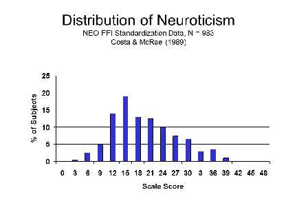 normal distribution offers
us a way of comparing scores on two tests that are scaled
differently. Imagine that we have tests of extraversion and
neuroticism from the NEO-Five Factor Inventory, whose scores
can range from 0-48. A subject scores 20 on the both scales.
Does that mean that the person is as neurotic as s/he is
extraverted? There are several ways to approach this
question. Both require that we have information about the
distribution of scores on the two tests, based on a
representative sample of the population. This information
was provided by the authors of the NEO-FFI, based on the
results of a standardization sample consisting of almost 500
college-age men and almost 500 college-age women. The
distributions of test scores would look something like
these.
normal distribution offers
us a way of comparing scores on two tests that are scaled
differently. Imagine that we have tests of extraversion and
neuroticism from the NEO-Five Factor Inventory, whose scores
can range from 0-48. A subject scores 20 on the both scales.
Does that mean that the person is as neurotic as s/he is
extraverted? There are several ways to approach this
question. Both require that we have information about the
distribution of scores on the two tests, based on a
representative sample of the population. This information
was provided by the authors of the NEO-FFI, based on the
results of a standardization sample consisting of almost 500
college-age men and almost 500 college-age women. The
distributions of test scores would look something like
these.
 Here's a side-by-side comparison,
showing the mean, median, and mode of each distribution, and
locating our hypothetical subject who scores 20 on both
scales. Note that the distribution of extraversion is pretty
symmetrical, while the distribution of neuroticism is
asymmetrical. This asymmetry, when it occurs, is called skewness.
In this case, neuroticism shows a marked positive skew
(also called rightward skew), meaning that there
are relatively few high scores in the distribution.
Here's a side-by-side comparison,
showing the mean, median, and mode of each distribution, and
locating our hypothetical subject who scores 20 on both
scales. Note that the distribution of extraversion is pretty
symmetrical, while the distribution of neuroticism is
asymmetrical. This asymmetry, when it occurs, is called skewness.
In this case, neuroticism shows a marked positive skew
(also called rightward skew), meaning that there
are relatively few high scores in the distribution.
Understand the concept of skewness, but don't get hung up on keeping the different directions straight-- positive vs. negative, left vs. right. I mix them up myself, and would never ask you to distinguish between positive and negative skewness on an exam. In unimodal distributions:
- In positive skewness, the mean is higher than the median.
- In negative skewness, the mean is lower than the median.
 In
In  fact, we have a number of different
ways of putting these two scores on a comparable basis.
fact, we have a number of different
ways of putting these two scores on a comparable basis.
- First, we can calculate the subject's scores in terms of percentiles. We order the scores, from lowest to highest, and we determine what percentage of the sample have scores below 20. As it happens, a score of 20 is below the median (50th percentile) for extraversion, but above the median for neuroticism.
- More precisely, a score of 20 on the NEO-FFI Neuroticism scale corresponds to a percentile score of 69;
- and a score
of 20 on the NEO-FFI Extraversion scale corresponds to
a percentile score of 12.
So, we can say that the subject is not very extraverted, but he's somewhat neurotic. More to the point, it seems that he's more neurotic than extraverted.
- Another way to do this is to calculate Z-scores, representing the distance of the subject's scores from the sample mean.
- The NEO-FFI norms show that mean score on the Neuroticism scale is 19.07, with a standard deviation of approximately 7.46 (aggregating data from males and females). So, the subject's Z-score for neuroticism is +0.12.
- The mean
score on the Extraversion scale is 27.69, with a
standard deviation of approximately 5.83. So, the
subject's Z-score for extraversion is -1.32.
So, once again we can say that the subject is more neurotic than he is extraverted.
- A variant on the Z-score is he T-score (where the "T" stands for "True"). This is simply a transformation of the Z=score to a conventional mean of 50 and a standard deviation of 10 == much like IQ scores are transformed to a conventional mean of 100 and a standard deviation of 15. T-scores are often used in the interpretation of personality inventories such as the MMPI, CPI, and various versions of the NEO-PI.
- A score of 20 on the NEO-FFI Neuroticism sub-scale corresponds to a T-score of approximately 52 (averaging across males and females).
- A score of
20 on the NEO-FFI Extraversion sub-scale corresponds
to a T-score of approximately 39..
Again, our subject is more neurotic than average, less extraverted than average, and more neurotic than extraverted.
Now let's see how descriptive and inferential statistics work out in practice.
Testing a Hypothesis
Sometimes it would seem that you wouldn't need statistics to draw inferences -- they seem self-evident. They pass what researchers jokingly call the traumatic interocular test -- meaning that the effect hits you right between the eyes.
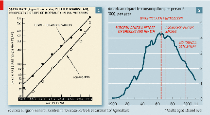 Consider this famous graph from the
1964 Surgeon General's report on "Smoking and Health".
This shows the death rate plotted against age for US service
veterans. The two lines are virtually straight,
showing that the likelihood of dying increases as one gets
older -- big surprise. But the death rate for smokers
at any age is consistently higher than that for non-smokers
-- which would seem to support the Surgeon General's
conclusion that, on average, smokers die younger than
nonsmokers. But is that difference really significant,
or could it be due merely to chance? And how big is
the difference, really? The answers are "yes" and
"big", but the cigarette manufacturers resisted the Surgeon
General's conclusions (and continue to resist them to this
day!). So before we can convince someone that
cigarettes really do harm every system in the body (the
conclusion of the most recent Surgeon General's report,
issued in 2014 on the 50th anniversary of the first one), we
need to perform some additional statistical analyses.
Consider this famous graph from the
1964 Surgeon General's report on "Smoking and Health".
This shows the death rate plotted against age for US service
veterans. The two lines are virtually straight,
showing that the likelihood of dying increases as one gets
older -- big surprise. But the death rate for smokers
at any age is consistently higher than that for non-smokers
-- which would seem to support the Surgeon General's
conclusion that, on average, smokers die younger than
nonsmokers. But is that difference really significant,
or could it be due merely to chance? And how big is
the difference, really? The answers are "yes" and
"big", but the cigarette manufacturers resisted the Surgeon
General's conclusions (and continue to resist them to this
day!). So before we can convince someone that
cigarettes really do harm every system in the body (the
conclusion of the most recent Surgeon General's report,
issued in 2014 on the 50th anniversary of the first one), we
need to perform some additional statistical analyses.
The other graph plots US cigarette consumption per person from 1900 to 2011. Cigarette use increases steadily, but then seems to take a sharp turn downward when the Surgeon General issued his report. But did it really? And how quickly did smoking behavior begin to change? That there's been a change is self-evident, but how much of the change was caused by the report itself, compared to the introduction of warning labels, or the banning of cigarette advertisements on radio and TV. to figure these things out, again, we need additional statistical analyses.
That's what inferential statistics do: enable us not just to describe a pattern of data, but to test specific hypotheses about difference, association, and cause and effect.
The Sternberg Experiment
 Consider
a simple but classic psychological experiment by Saul
Sternberg, based on the assumption that mental processes
take time -- in fact, Sternberg's experiment, which deserves
its "classic" status, represented a modern revival of
reaction-time paradigm initiated by Franciscus Donders in
the 19th century.
Consider
a simple but classic psychological experiment by Saul
Sternberg, based on the assumption that mental processes
take time -- in fact, Sternberg's experiment, which deserves
its "classic" status, represented a modern revival of
reaction-time paradigm initiated by Franciscus Donders in
the 19th century.
In Sternberg's experiment, a subject is shown a set of 1 to 7 letters, say C--H--F--M--P--W, that comprise the study set. After memorizing the study set, he or she is presented with a probe item, say --T--, and must decide whether the probe is in the study set. Answering the question, then, requires the subject to search memory and match the probe with the items in the study set. There are two basic hypotheses about this process. One is that memory search is serial, meaning that the subject compares the probe item to each item in the study set, one at a time. The other is that search is parallel, meaning that the probe is compared to all study set items simultaneously.
How to distinguish between the two hypotheses? Given the assumption that mental processes take time, it should take longer to inspect the items in a study set one at a time, than it does to inspect them simultaneously. Or, put another way, if memory search is serial, search time should increase with the size of the study set; if memory search is parallel, it should not.
Search time may be estimated by response latency -- the time it takes the subject to make the correct response, once the probe has been presented. So, in the experiment, Sternberg asked his subjects to memorize a study set; then he presented a probe, and recorded how long it took the subjects to say "Yes" or "No". (Subjects hardly ever make errors in this kind of task.) His two hypotheses were: (1) that response latency would vary as a function of the size of the memory set (under the hypothesis of serial search, more comparisons would take more time); and (2) response latencies for "Yes" responses would be, on average, shorter than for "No" responses (because subjects terminate search as soon as they discover a match for the probe, and only search all the way to the end of the list when the probe is at the very end, or not in the study set at all.
So in the Sternberg-type experiment, a group of subjects, selected at random, are all run through the same procedure. From one trial to another, the size of the study set might be varied from 1, 3, 5, and 7 items; and on half the trials the correct answer is "Yes", indicating that the probe item was somewhere in the study set, while on the other half of the trials the correct answer is "No", meaning that the probe was missing. These two variables, set size and correct response, which are manipulated (or controlled) by the experimenter, are known as the independent variables in the experiment. The point of the study is to determine the effects of these variables on response latency, the experimental outcome measured by the experimenter, and which is known as the dependent variable. In properly designed, well-controlled experiments, changes in the dependent variable are assumed caused by changes in the independent variable.
 As it happens, Sternberg found that
response latency varied as a function of the size of the
memory set. It took subjects about 400 milliseconds to
search a set consisting of just one item, about 500
milliseconds to search a set of 3 items, about 600
milliseconds to search a set of 5 items, and about 700
milliseconds to search a set of 7 items.
As it happens, Sternberg found that
response latency varied as a function of the size of the
memory set. It took subjects about 400 milliseconds to
search a set consisting of just one item, about 500
milliseconds to search a set of 3 items, about 600
milliseconds to search a set of 5 items, and about 700
milliseconds to search a set of 7 items.
The Sternberg task has been of great interest to psychologists, because it seems to offer us a view of the mind in operation: we can see how long various mental processes take. Apparently, we search memory one item at a time, in series, and it takes about 50 milliseconds to search each item in the memory set.
Now suppose we were interested in the question of whether age slows down the process of memory search. We know that the elderly have more trouble remembering things than do young adults, and it is a reasonable to suspect that this is because aging slows down the memory search process. Based on the theory that aging slows down mental processes, we derive the hypothesis that older subjects will be slower on the Sternberg task than younger subjects. If we test this hypothesis, and it proves to be correct, that supports the theory. If the hypothesis proves to be incorrect, then it's back to the drawing board.
In order to test the hypothesis, and determine whether our theory is supportable, we recruit two groups of 10 adults, one young and the other elderly, and run them on a version of the Sternberg memory-search task. Of course, any differences observed between young and old subjects might be due to a host of variables besides age per se. Accordingly, we select our subjects carefully so that the two groups are matched as closely as possible in terms of IQ, years of education, socioeconomic status, and physical health.
Note that in this experiment we are not comparing every young person in the world to every old person. That might be nice, but it is simply not possible to do so. Instead, we draw a small sample from the entire population of young people, and another sample from the population of elderly. Of course, it is important that our samples be representative of the populations from which they are drawn -- that is, that the people included in the samples possess the general characteristics of the population as a whole.
Note, too, that age, the independent variable in our little experiment, is not exactly manipulated by the experimenter. We can't take 20 people and randomly assign 10 of the to be young, and the other 10 old -- any more than, if we were interested in gender differences, we could randomly assign some subjects to be male and others to be female! Instead, we have to be satisfied with sampling our subjects based on the pre-existing variable of age. Because we rely on pre-existing group differences, which we treat as if they resulted from an experimental manipulation, our little experiment is, technically, a quasi-experiment. But the logic of experimental inference is the same.
Whether we're randomly assigning subjects to conditions, or selecting subjects based on some pre-existing variable, it is important to eliminate potentially confounding variables. For example, if young people are generally healthier than old people, group differences in physical infirmity might account for differences in reaction time. In some experiments, this problem is solved by means of random assignment: subjects are assigned by chance alone to one experimental group or another. In this way, the experimenter hopes to spread potentially confounding variables evenly between the groups. This might be the case if we wanted to investigate the effects of drugs (such as alcohol) on memory search. We would select a sample of college students, divide them into two groups, have one group take alcohol and the other take a placebo (the independent variable), and test response latency (the dependent variable). Most such experiments shows that alcohol slows response latencies, which is why if you drink you shouldn't drive.
- An experiment that has separate groups of subjects assigned to experimental and control conditions uses a between-subjects design.
- If all subjects are run under both experimental and control conditions, this is called a within-subjects design.
Obviously, people cannot be assigned randomly to groups differing on age, any more than they can be randomly assigned to gender. Accordingly, we employ a stratified sample design in which subjects are divided into levels according to the independent variable -- in this case, age. In order to eliminate the effects of potentially confounding variables, however, we make sure that the subjects are matched on every other variable that could possibly have an effect on the dependent variable.
We conduct a simple version of Sternberg's experiment, involving only a single set size, five items, and observe the following results (mean response latencies calculated for each subject over several trials, measured in milliseconds). Remember, this is fabricated data, for purposes of illustration only.
|
Group |
Pairs of Subjects |
|||||||||
|
1 |
2 |
3 |
4 |
5 |
6 |
7 |
8 |
9 |
10 |
|
|
Young |
635 |
725 |
630 |
675 |
625 |
640 |
660 |
635 |
645 |
650 |
|
Elderly |
740 |
695 |
730 |
725 |
750 |
745 |
710 |
760 |
735 |
725 |
The reaction times look different, by about 100 milliseconds, according to the Traumatic Interocular Test, but how can we be sure that this difference is something to be taken seriously? Notice that not every subject within each age group performed in precisely the same manner: there are individual differences in performance on the Sternberg task.
- "Individual differences" is another way of referring to between-subject or within-group variance. In particular, some of the elderly subjects performed better than some of the young subjects.
- There is also within-subject variance, reflecting the fact that individual subjects don't perform precisely the same way on each trial.) What is the "true value" of response latency for old and young subjects? You don't see the within-subject variance in this table, because it presents only individual subjects' mean scores. But of course, over trials each subject showed some variability around his or her mean, and that is within-subject variance.
- Within-subject
variance also occurs in within-subject
designs,
where the same subjects
are exposed to all conditions
of the experiment. Of course,
we can't do that in this experiment.
Furthermore, notice that one of the young subjects showed a slower reaction time than one of the old subjects. Given the differences in performance within each group, is it possible that the differences we observe between the two groups are due merely to chance factors, and that if we drew another sample of old and young subjects the difference would disappear, or even reverse? In order to check the reliability of experimental outcomes, psychologists employ statistical tests.
A Digression on Probability
 What does it mean to say that an
observation -- such as the difference between two groups --
might be due to chance factors? What it means is that the
difference might not be significant, because it might well
occur simply by chance, and that if we conducted the
experiment again, we might get quite different observations,
and a different difference between the two groups -- again,
just by chance" by the roll of the dice, as it were.
What does it mean to say that an
observation -- such as the difference between two groups --
might be due to chance factors? What it means is that the
difference might not be significant, because it might well
occur simply by chance, and that if we conducted the
experiment again, we might get quite different observations,
and a different difference between the two groups -- again,
just by chance" by the roll of the dice, as it were.
In fact, probability theory has its origins in analyses of games of chance -- dice, cards, and the like -- by Gerolamo Cardano in the 16th century, and -- more famously -- Pierre de Fermat (he of Fermat's Last Theorem fame) and Blaise Pascal (he of Pascal's Conjecture fame) in the 17th century.
 Consider
an event that can have a fixed number of outcomes -- like
the roll of a die or a draw from a deck of cards.
Consider
an event that can have a fixed number of outcomes -- like
the roll of a die or a draw from a deck of cards.
- In the case of the die, which has six sides, the probability of any face falling up is 1/6 (assuming that the die isn't "loaded"). So, the likelihood of a singe roll of a die resulting in a "3" is 1/6.
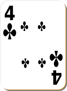
- In the case of the cards, of which there are 52 in a standard deck, the probability of any particular card being drawn is 1/52 (assuming that the deck isn't "stacked"). So, the likelihood of drawing the 4 of Clubs is 1/52.
The probability of an event A can be calculated
as follows:
p(A) = The number of ways in which A can occur / The total number of possible outcomes.
- Thus, from a single roll of a single die, the probability of rolling a 4 is 1/6, because only one face of the die has 4 pips.
The probability that either one or another event will occur is the sum of their individual probabilities.
- Thus, the probability of rolling an even number is 3/6, or 1/2, because there are 3 different faces that contain an even number of pips -- 2, 4, or 6. The probability of each of these outcomes is 1/6, so the probability of any one of these occurring is 1/6 + 1/6 + 1/6 = 3/6 = 1/2.
The probability that both one and another event will occur is the product of their individual probabilities.
- Thus, the probability of rolling an even number on two successive rolls of a die is 9/36 or 1/4, because the probability of rolling an even number on the first time is 3/6, and the probability of rolling an even number the second time is also 3/6.
These calculations refer to independent probabilities, where the probability of one even does not depend on the probability of another. But sometimes probabilities are not independent.
- As noted earlier, the probability of drawing the 4 of Clubs from a deck of cards is 1/52.
But what if you now draw a second card?
- If you replace the first-drawn card in the deck, and reshuffle, the probability of drawing the 4 of Clubs on the second remains 1/52. This is called sampling with replacement.
- But if you do not replace the first-drawn card -- what is called sampling without replacement -- the probability of drawing the 4 of Clubs changes, depending on the first card you drew.
- If the first-drawn card was, in fact, the 4 of Clubs, then -- obviously -- the probability of drawing the 4 of Clubs on the second attempt goes to 0.
- If the first-drawn card was not the 4 of Clubs, then the probability of drawing the 4 of Clubs on the second attempt increases slightly to 1/51.
The law of large numbers states that, the more often you repeat a trial, the more likely it is that the outcomes will reflect chance operations.
- The average
value of a single roll of a die is (1+2+3+4+5+6) =
3.5.
- If you toss a single die 3 times, and get a 6 each time, the average value of the rolls will be (3x6)/3 = 6.
- But if you toss that same die 300 times, the average value will revert to something closer to 3.5.
Dying in a Terrorist Attack
When you're asked what the probability is of one event or another occurring, the answer is the sum of their individual probabilities.
When you're asked what the probability of one event and another occurring, the answer is the product of their individual probabilities
 The
American performance artist Laurie Anderson has parlayed
this into a joke. Paraphrasing her routine:
The
American performance artist Laurie Anderson has parlayed
this into a joke. Paraphrasing her routine:
Question: What's the best way to prevent yourself from being killed by a terrorist bomber on an airplane?
Answer:
Carry a bomb onto the plane. The odds of there being one
bomb-carrying passenger on a plane are small, but the odds
of there being two bombs are even smaller!
In fact, the statistician Nate Silver has estimated the probability of dying on an airplane as a result of a terrorist attack as 1 in 25 million ("Crunching the Risk Numbers", Wall Street Journal, 01/08/2011). So if you follow Anderson's logic, the chance of there being two terrorist bombers is 1 in 525 trillion!
Descriptive Statistics
 Returning to our
experiment, first we need to have some way of characterizing
the typical performance of young and old subjects on the
Sternberg task. Here, there are three basic statistics that
measure the central tendency of a set of
observations:
Returning to our
experiment, first we need to have some way of characterizing
the typical performance of young and old subjects on the
Sternberg task. Here, there are three basic statistics that
measure the central tendency of a set of
observations:
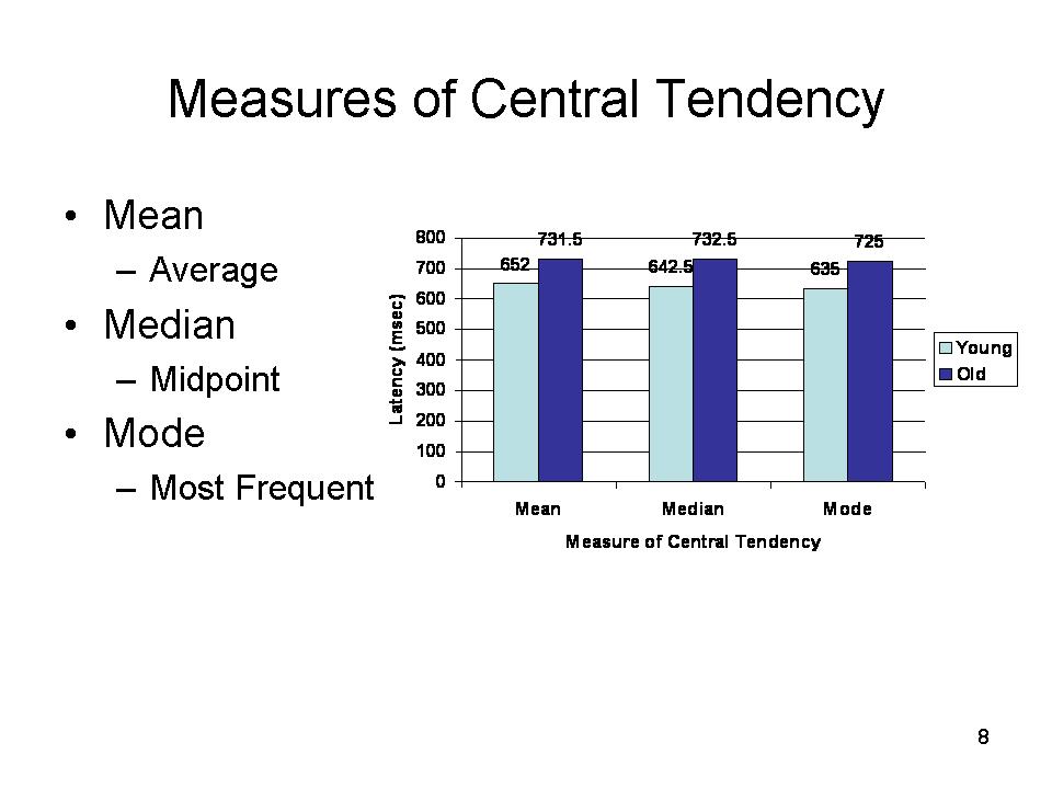
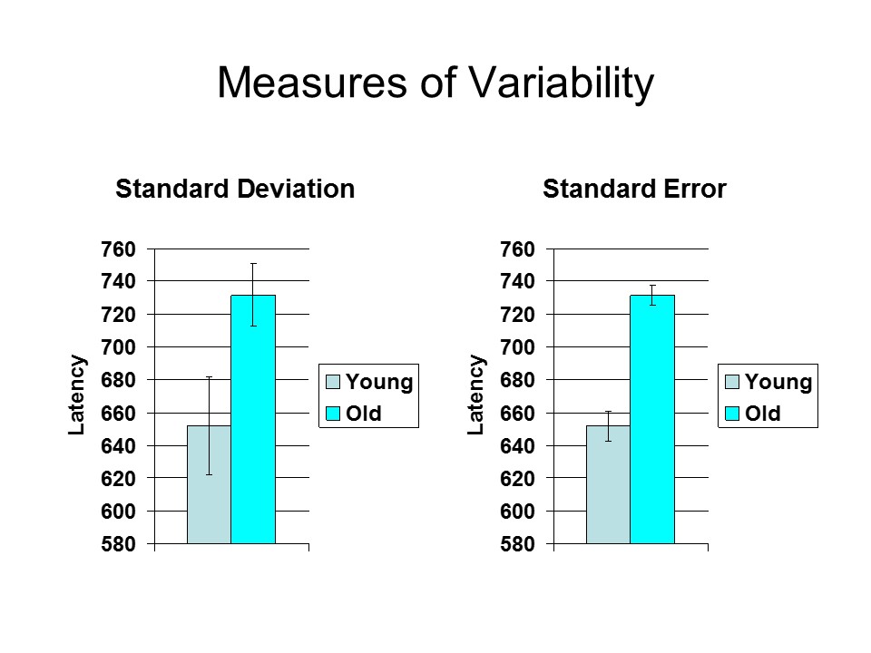
- The mean (M) is the arithmetical average, computed by adding up the numbers and dividing by the number of observations. In this case, the mean response latency for the young subjects is 652 milliseconds (6520/10), while M for the old is approximately 732 milliseconds (7315/10).
- The median is the value below which 50% of the observations are found. It is determined simply by rank-ordering the observations, and finding the point that divides the distribution in half. For the young subjects, the median is 642.5 milliseconds, halfway between 640 and 645; for the old, it is 732.5, halfway between 730 and 735.
- The mode is simply the most frequent observation. For the young subjects, the mode is 635 milliseconds, for the old it is 725.
Notice that, in this case, the mean, median, and mode for each group are similar in value. This is not always so. But in a normal distribution, these three estimates of central tendency will be exactly equal.
 Second, we need to have some way of
characterizing the dispersion of
observations around the center, or variability.
The commonest statistics for this purpose are the variance
and the standard deviation (SD).
Second, we need to have some way of
characterizing the dispersion of
observations around the center, or variability.
The commonest statistics for this purpose are the variance
and the standard deviation (SD).
- In the case of the young subjects, the SD is approximately 30 milliseconds.
- For the old subjects the SD is approximately 19 milliseconds.
The standard deviation is a measure of the dispersion of individual values around the sample mean. But what if we took repeated samples from the same populations of young and old subjects? Each time, we'd get a slightly different mean (and standard deviation), because each sample would be slightly different from the others. The standard error of the mean (SEM) is, essentially, a measure of the variance of means of repeated samples drawn from a population.
- For the old subjects, SEM is approximately 6.
- For the young
subjects, SEM is approximately 9.
Confidence Intervals
 Applying the Rule of 68, 95, and 99, we
can infer that approximately 68% of the observations will
fall within 1 standard deviation of the mean; approximately
95% of the scores will fall within 2 standard deviations;
and approximately 99% of observations will fall within 3
standard deviations.
Applying the Rule of 68, 95, and 99, we
can infer that approximately 68% of the observations will
fall within 1 standard deviation of the mean; approximately
95% of the scores will fall within 2 standard deviations;
and approximately 99% of observations will fall within 3
standard deviations.
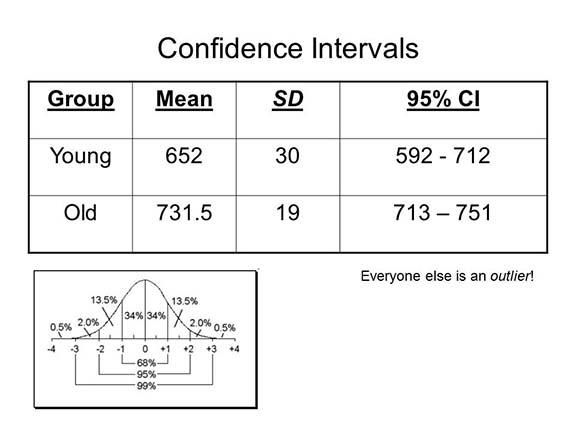
- Thus, in a large sample of young people, we would expect that 68% of subjects would show response latencies between 622 and 682 milliseconds (652 plus or minus 30), and 95% would show latencies between 592 and 712 milliseconds (632 plus or minus 60).
- Similarly, in a large sample of old people, we would expect that 68% of the subjects would show response latencies between 713 and 751 milliseconds, 95% between 694 and 770 milliseconds.
Put another way, in terms of confidence intervals, Remember that means are only estimates of population values, given the observations in a sample (if we measured the entire population, we wouldn't have to estimate the mean -- we'd know what it is!). In describing sample distributions, we define a confidence interval as 2 standard deviations around the mean. Given the results of our experiment:
- We can be 95% confident that the true mean response latency for the entire population of young subjects is somewhere between 592 and 712 milliseconds.
- And we can be 95% confident that the true mean for the entire population of elderly subjects is somewhere between 713 and 751 milliseconds.
Note that in this instance the confidence intervals do not overlap. This is our first clue that the response latencies for young and old subjects really are different.
The normal distribution permits us to determine the extent to which something might occur by chance. Thus, for the young subjects, a response latency of 725 milliseconds falls more than 2 standard deviations away from the mean. We expect such subjects to be observed less than 5% of the time, by chance: half of these, 2.5%, will fall more than 2 standard deviations below the mean, while the remaining half will fall more than 2 standard deviations above the mean.
- In fact, there was such a subject in our sample of 10 young subjects. Perhaps this was just a random happenstance. Or perhaps this individual is a true outlier who was texting his girlfriend during the experiment!
- The same thing goes for that elderly subject whose mean reaction time was 695 milliseconds. Maybe this was a random occurrence, or maybe this is a person who, in terms of mental speed, has aged really successfully!
Inferential Statistics
 The normal
distribution also permits us to determine the significance
of the difference between groups. One statistic commonly
used for this purpose is the t test(sometimes
called "Student's t", after the pseudonymous
author, now known to be W.S. Gossett (1876-1937), who first
published the test), which indicates how likely it is that
difference between two groups occurred by chance alone. You
do not have to know how to calculate a t test. Conceptually,
however, the t test compares the difference
between two group means compared to the standard deviations
around those means.
The normal
distribution also permits us to determine the significance
of the difference between groups. One statistic commonly
used for this purpose is the t test(sometimes
called "Student's t", after the pseudonymous
author, now known to be W.S. Gossett (1876-1937), who first
published the test), which indicates how likely it is that
difference between two groups occurred by chance alone. You
do not have to know how to calculate a t test. Conceptually,
however, the t test compares the difference
between two group means compared to the standard deviations
around those means.
The t test is an inferential statistic: it goes beyond mere description, and allows the investigator to make inferences, or judgments, about the magnitude of a difference, or some other relationship, between two groups or variables. There are several varieties of the t test, all based on the same logic of comparing the difference between two means to their standard error(s).
 As a general rule of thumb, if two
group means differ from each other by more than 2 standard
deviations, we consider that this is rather unlikely to have
occurred simply by chance. This heuristic is known as the
rule of two standard deviations.
As a general rule of thumb, if two
group means differ from each other by more than 2 standard
deviations, we consider that this is rather unlikely to have
occurred simply by chance. This heuristic is known as the
rule of two standard deviations.
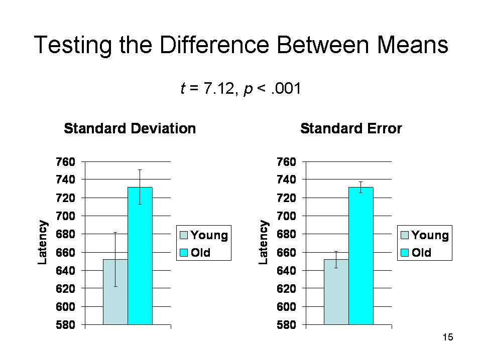
- In the case of our young and old subjects, note that the mean of the young subjects, 652, is more than 4 standard deviations away from the mean, 732, of the old subjects (732 - 652 = 80, 80/19 = 4.21).
- Similarly, the mean of the old subjects is more than 2 standard deviations away from the mean of the young subjects (80/30 = 2.67). Thus, these two means are so far away from each other that we consider it rather unlikely that the difference is due to chance.
But that's really conservative. A more appropriate indicator is the distance between the means in terms of standard errors.
- The mean value for the old subjects is almost nine standard errors away from the mean of the young subjects (80/9 = 8.89).
- And the mean value for the young subjects is more than 13 standard errors away from the mean of the old subjects (80/6 =13.3).
In fact, in this case, t = 7.12, p < .001, suggesting that a difference this large would occur far less than once in a thousand by chance alone).
The probability attached to any value of t depends on the number of subjects: the more subjects there are, the lower a t is needed to achieve statistical significance.
We can conclude, therefore, that the young probably do have shorter response latencies than the elderly, meaning -- if Sternberg was right that his task measured memory search -- that memory search is, on average, faster for young people than for old.
Note, however, that we can never be absolutely
certain that a difference is real. After all, there
is that one chance out of a thousand. As a rule,
psychologists accept as statistically significant
a finding that would occur by chance in only 5 out of 100
cases -- the "p < .05" that you will see so
often in research reports. But this is just a convenient
standard. In Statistical Methods for Research Workers
(1925), a groundbreaking text on statistics, Ronald Fisher,
the "father" of modern statistics, proposed p<.05,
writing that "It is convenient to take this point as a limit
in judging whether a deviation ought to be significant or not".
To "p<" or Not To "p<"
Because precise p values are hard to calculate
by hand, traditionally investigators estimated them from
published tables. Thus, in the older literature, you will
see p-values reported merely as "less" than .05
(5 chances out of 100), .01 (1/100), .005 (5/1000), and
.001 (1/1000). More recently, the advent of high-speed
computers has made it possible for investigators -- by
which I mean their computers -- to calculate exact
probabilities very easily. Hence, in the newer literature,
you will often see p-values reported as ".0136"
or some-such. In my view, this makes a fetish out of p-values,
and so I prefer to use the older conventions of
statistical significance: < .05, < .01, < .005,
and < .001 (anything less than .001, in my view, is
just gilding the lily).
Types of Errors
To repeat: there is always some probability that a result will occur simply by chance. Statistical significance is always expressed in terms of probabilities, meaning that there is always some probability of making a mistake. In general, we count two different types of errors:
- Type I error refers to the probability of accepting a difference as significant when in fact it is due to chance. In this case, we might conclude that the young and the old differ in search speed, when in fact they do not. This happens when we adopt a criterion for statistical significance that is too liberal (e.g., 10 or 20 times out of 100). Another term for Type I error is false positive.
- Type II error refers to the probability of rejecting a difference as nonsignificant when in fact it is true. In this case, we might conclude that the young and the old do not differ in response latency, when in fact they do. This happens when we adopt a criterion that is too strict (e.g., 1 in 10,000 or 1 in 1,000,000). Another term for Type II error is false negative.
Note that the two types of errors compensate for each other: if you increase the probability of a Type I error, you decrease the likelihood of a Type II error, and vice-versa. The trick is to find an acceptable middle ground.
Note also that it is easy to confuse Type I and Type II errors. Your instructor gets them confused all the time. For that reason, you will never be asked to define Type I and Type II errors as such on a test. However, you will be held responsible for the concepts that these terms represent: False positives and false negatives.
Of course, there is no way to eliminate the
likelihood of error entirely. However, we can increase our
confidence in our experimental results if we perform a replication
of the experiment, and get the same results. Replications
come in two kinds: exact, in which we repeat the original
procedures slightly, or conceptual, in which we vary details
of the procedure. For example, we might have slightly
different criteria for classifying subjects as young or old,
or we might test them with different set sizes. Whether the
replication is exact or conceptual, if our hypothesis is
correct we ought to get a difference between young and old
subjects.
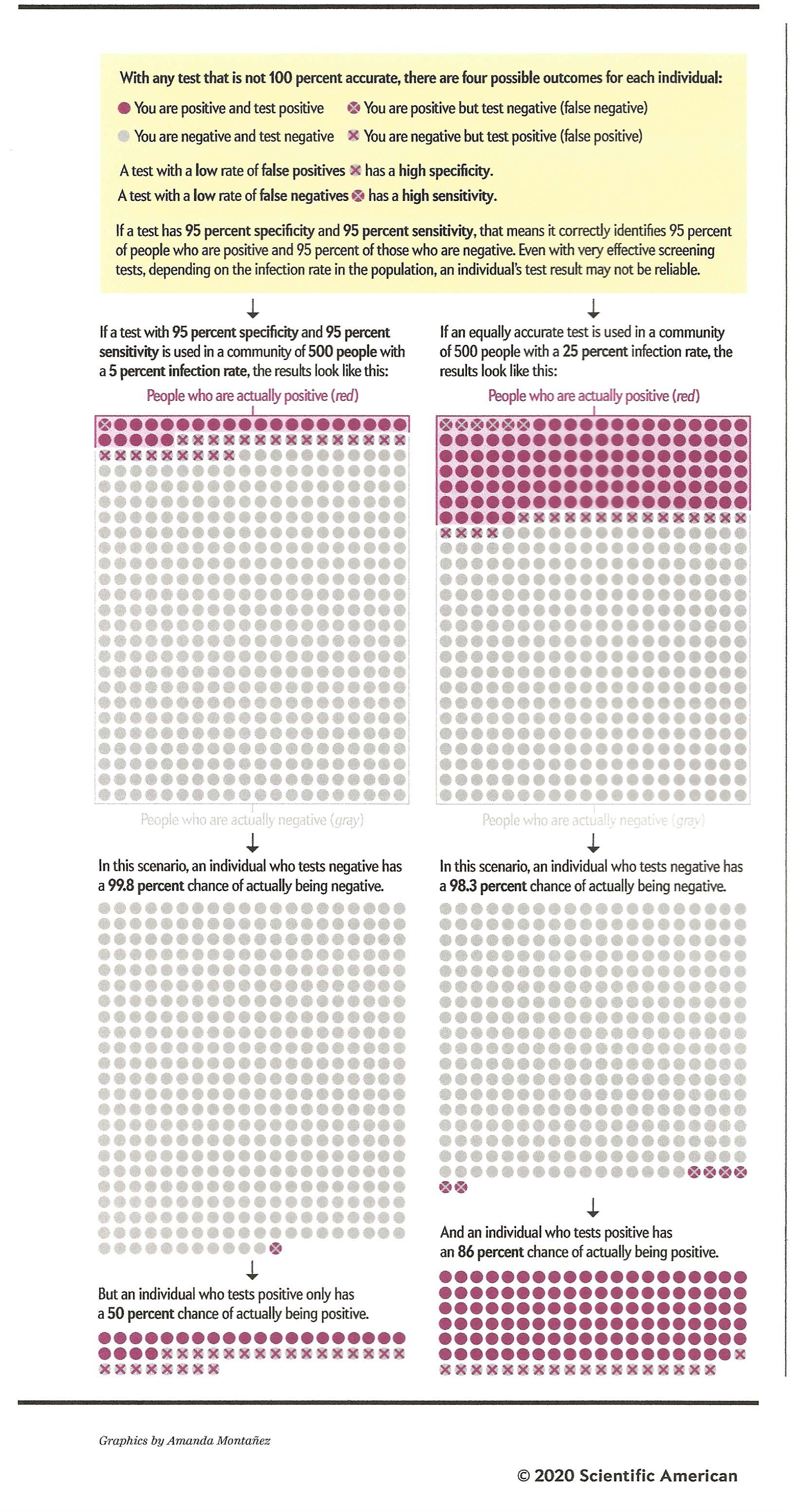
Sensitivity and Specificity in Medical TestsSetting aside the problems of experimental design and statistical inference, the issue of false positives and false negatives comes up all the time in the context of medical testing. Suppose that you're testing for a particular medical condition: a mammogram to detect breast cancer, or occult (hidden) blood in feces that might indicate colorectal cancer -- or, since I'm writing this in July 2020, a test to detect the coronavirus that caused the Covid-19 pandemic. These tests are screening devices, and positive results usually call for further testing to confirm a diagnosis.
There are two standards for the reliability of a medical test:
The "gold
standard" for medical testing is 95% sensitivity and
95% specificity. That is, it will correctly
identify 95% of those who have the disease as well
95% of those who do not have the disease
(Note: there's that "p<.05" again!).
As of July 2020, many of the available tests for
Covid-19 appear not to meet this standard,
generating lots of false-positive and false-negative
results. But -- and
here's the rub -- even if a test did have 95%
sensitivity and specificity, it still might make a
lot of errors, depending on the baserate of
the disease in question. To make a long story
short, those 95% figures really only apply when the
baserate for the disease in question is 50% -- that
is, when half the population actually has the
disease (which, to put it gently, is hardly ever the
case). To see how
this works, consider the following graph, taken from
"False Positive Alarm", an article by Sarah Lewin
Frasier in Scientific American (July 2020 --
an issue focused on the Covid-19 pandemic).
Now
consider the right-hand panels, which show the
outcomes of the same test, 95% sensitivity and 95%
specificity, for a disease whose infection rate in
the population is 25%. In a random sample of
500 people, that means that 125 will have the
disease, and 375 will be healthy. At 95%
sensitivity, the test will correctly identify 119
individuals as positive (95% of 125), and miss only
6; and at 95% specificity, it will correctly
identify 356 people as disease free (95% of 375),
and incorrectly identify only 19 as having the
disease. That means that, of all 138
individuals who received positive test results, 119
(86%) were diagnosed correctly as having the
disease, and only 19 (14%) were diagnosed
incorrectly as being disease-free. That's a much
better ratio. Not shown
in the Scientific American graphic is the
case were the infection rate is 50%. You can
work out the arithmetic for yourself, but under
these circumstances, the test will miss only 12
individuals with the disease (5%), and incorrectly
diagnose only 12 healthy people (another 5%). Of course
for most diseases, the infection rate is going to be
closer to 1% than 50% or even 25%. By way of
comparison, the lifetime prevalence rate for breast
cancer in women is about 12%; for colon cancer,
about 4%. For Covid-19, as of July 2020 about
9% of diagnostic tests were positive for the
coronavirus; but, at that time most people being
tested already show symptoms of coronavirus
infection, such as fever, dry cough, or shortness of
breath; so the actual prevalence rate is probably
lower than that. A little more than 1% of the
population had tested positive for the coronavirus;
but again; this figure was not based on a random
sample and most positive cases were
asymptomatic. Still, under such circumstances,
where the baseline prevalence rate in the population
is closer to 1% than 50%, the probability of getting
a false positive test result is pretty high -- which
is why it's important that the sensitivity and
specificity of a test be as high as possible.
Unfortunately, for Covid-19, we so many different
tests are being used that we don't really know much
about their sensitivity and specificity; nor, if we
get a test, do we have much control over whether we
get one that is highly reliable.
Of course,
a lot depends on the costs associated with making
the two kinds of mistakes. We may be willing
to tolerate a high rate of false positives, if the
test has a low rate of false negatives. We'll
take up this matter again, in the lectures on
"Sensation", when we discuss signal-detection
theory, which takes account of both the
expectations and motivations of the judge using a
test. The same
arithmetic applies to the evaluation of a treatment
for a disease. In this case, the cure rate is
analogous to sensitivity (how many cases does the
treatment actually cure), while the rate of negative
side effects is analogous to specificity (in how
many cases does the treatment do more harm than
good). And, to
return to psychology for just a moment, the same
arithmetic applies to the diagnosis of mental
illnesses. On many college campuses and
elsewhere, it's common to ask students to fill out
questionnaires to screen for illness such as
depression or risk of suicide. Again, these
are just screeners, and it's important to know how
they stand with respect to sensitivity and
specificity. |
Correlation
 Another way of addressing the same
question is to calculate the correlation
coefficient (r), also known as
"Pearson's product-moment correlation coefficient". The
correlation coefficient is a measure of the direction and
strength of the relationship between two variables. If a
correlation is positive that means that
the two variables increase (go up) and decrease (go down)
together: high values on one variable are associated with
high values on the other. If a correlation is negative,
as one variable increases in magnitude the other one
decreases, and vice-versa. The strength of a correlation
varies from 0 (zero) to 1. If the correlation is 0, then
there is no relationship between the two variables. If the
correlation is 1, then there is a perfect correspondence
(positive or negative) between the two variables). If the
correlation is in between, then there is some relationship,
but it is not perfect.
Another way of addressing the same
question is to calculate the correlation
coefficient (r), also known as
"Pearson's product-moment correlation coefficient". The
correlation coefficient is a measure of the direction and
strength of the relationship between two variables. If a
correlation is positive that means that
the two variables increase (go up) and decrease (go down)
together: high values on one variable are associated with
high values on the other. If a correlation is negative,
as one variable increases in magnitude the other one
decreases, and vice-versa. The strength of a correlation
varies from 0 (zero) to 1. If the correlation is 0, then
there is no relationship between the two variables. If the
correlation is 1, then there is a perfect correspondence
(positive or negative) between the two variables). If the
correlation is in between, then there is some relationship,
but it is not perfect.
Another way of thinking about the correlation coefficient is that it expresses the degree to which we can predict the value of one variable, if we know the value of another variable. If the correlation between Variable X and Variable Y is 1.00, we can predict Y from X with certainty. If the correlation is 0, we cannot predict it at all. If the correlation is between 0 and 1, we can predict with some degree of confidence -- the higher the correlation, the higher the certainty. Such analyses are known as regression analyses, which generate regression equations in which the correlation coefficient plays an important role. In correlational research, the independent variable is usually called the predictor variable; the dependent variable is called the criterion variable.
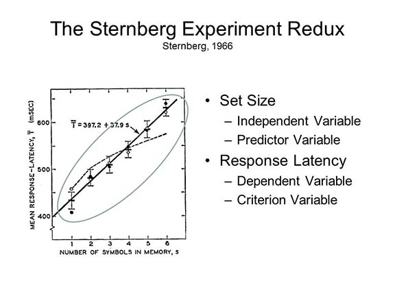 In fact, Sternberg himself employed
regression analysis in his experiment. In the figure shown
earlier, reaction time (the dependent variable) is regressed
on set size (the independent variable). The resulting
regression equation indicates that each item in the search
set adds about 30 milliseconds to search time
In fact, Sternberg himself employed
regression analysis in his experiment. In the figure shown
earlier, reaction time (the dependent variable) is regressed
on set size (the independent variable). The resulting
regression equation indicates that each item in the search
set adds about 30 milliseconds to search time
Now, if we are right in our hypothesis that search speed is slower in elderly subjects, then we expect a positive correlation between response latency and age: the older the subject is, the longer (i.e., slower) the response latency. You do not have to know how to calculate a correlation coefficient. Conceptually, though, some idea of the correlation coefficient can be gleaned by considering the scatterplot that is formed by pitting one variable against another.
Suppose, instead of classifying our subjects as young and old, we knew their actual ages.Remember, again, that this is fabricated data, for purposes of illustration only.
|
Subject |
1 |
2 |
3 |
4 |
5 |
6 |
7 |
8 |
9 |
10 |
|
Age |
18 |
24 |
19 |
30 |
17 |
23 |
27 |
21 |
24 |
22 |
|
Latency |
635 |
725 |
630 |
675 |
625 |
640 |
660 |
635 |
645 |
650 |
|
Subject |
11 |
12 |
13 |
14 |
15 |
16 |
17 |
18 |
19 |
20 |
|
Age |
75 |
63 |
71 |
77 |
68 |
64 |
67 |
82 |
76 |
72 |
|
Latency |
740 |
695 |
730 |
725 |
750 |
745 |
710 |
760 |
735 |
725 |
As an exercise, you might wish to plot these variables against each other on a piece of graph paper. Make age the x-axis (horizontal), and response latency the y-axis (vertical).
In a scatterplot, the correlation can be
estimated by the shape formed by the points. If the
correlation is +1.00, the points form a perfectly straight
line marching from the lower left to the upper right.
- If the correlation is -1.00, they form a straight line going from upper left to lower right.
- In a correlation of 0 (zero), an envelope drawn around the points forms something resembling a circle or a square.
- If the correlation is nonzero, the envelope forms an oblong, football-like shape. The narrower the oblong, the higher the correlation; and the orientation of the oblong (lower left to upper right or upper left to lower right) indicates the direction of the correlation, positive or negative.
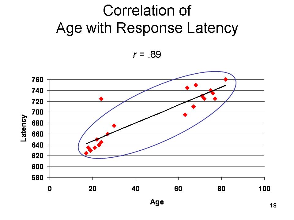 In the case of
the data given in the table above, the correlation r
= .89. But again, how do we know whether this might not have
occurred, just by chance. Again, there is a method for
evaluating the statistical significance of a correlation
coefficient -- just as there is for evaluating the outcome
of a t test. As it happens, in this case the
likelihood of obtaining such a correlation by chance, in
just 20 cases, is well under 1 in 1,000. (Interestingly,
this is the same estimate that our t-test gave us.
In fact, the two types of statistical tests are
mathematically equivalent.) So, according to established
conventions, we consider that the correlation is
statistically significant: it is very unlikely to have
occurred by chance alone. This is especially the case if we
draw another sample, and get a correlation of the same (or
similar) magnitude the second time.
In the case of
the data given in the table above, the correlation r
= .89. But again, how do we know whether this might not have
occurred, just by chance. Again, there is a method for
evaluating the statistical significance of a correlation
coefficient -- just as there is for evaluating the outcome
of a t test. As it happens, in this case the
likelihood of obtaining such a correlation by chance, in
just 20 cases, is well under 1 in 1,000. (Interestingly,
this is the same estimate that our t-test gave us.
In fact, the two types of statistical tests are
mathematically equivalent.) So, according to established
conventions, we consider that the correlation is
statistically significant: it is very unlikely to have
occurred by chance alone. This is especially the case if we
draw another sample, and get a correlation of the same (or
similar) magnitude the second time.
As with the t-test, the probability attached to any value of r depends on the number of subjects: the more subjects there are, the lower an r is needed to achieve statistical significance.
Even if two variables are highly correlated,
that does not mean that one causes the other. In the case of
age and response latency, it is pretty likely that something
about the aging process causes response latency to increase.
But think about other possible correlations.
- Measured intelligence (IQ) is positively correlated with socioeconomic status, but that doesn't necessarily mean that intelligence causes wealth. (I hasten to note that this correlation is relatively modest: there are a lot of smart poor people, and a lot of stupid rich ones.) It might be that rich people have more educational advantages than poor people: in this case, wealth causes intelligence. Alternatively, both wealth and intelligence might be caused by some third variable.
- Research also shows that there is a positive correlation between there's a positive correlation between marijuana use and schizophrenia, which has led some medical and legal authorities to argue that, in fact, heavy marijuana use causes schizophrenia. But it's also possible that people who are at risk for schizophrenia are also inclined to smoke marijuana frequently; if enough of these individuals actually experience an episode of schizophrenia, eventually, this will also produce the correlation.
There are ways of using correlational data to tease out causal relationships, in a technique known as structural equation modeling, but as a rule causation can only be established by a formal experiment involving random assignment of subjects to experimental and control groups, holding all other variables constant. In this case, and this case only, we may be certain whether changes in the independent variable cause changes in the dependent variable to occur.
- In the case of marijuana and schizophrenia, for example, a recent large scale study by Power et al. (Lancet, 2014) examined marijuana use in a large sample of subjects who had no psychiatric history. Extent of marijuana use was correlated with the presence of certain genetic markers of risk for schizophrenia.They also performed a twin study. Identical twins, neither of whom had ever smoked marijuana, had a relatively low density of these genetic markers, known as a polygenetic-risk score; if one twin smoked but not the other, their score was average; but if both twins smoked marijuana, their score was relatively high. Taken together, these findings strongly suggest that a predisposition to schizophrenia is one of the causes of heavy marijuana use, not the other way around.
Adding a Third Dimension
 Plotting the relationship between two
variables is nice, but sometimes it's useful to see how this
relationship varies in terms of a third variable, such as
time. This isn't easy in the usual two-dimensional
graph, though it can be done. A lovely example is this
graph, concocted by Alicia Parlapiano of the New York
Times, which plots the relationship between the US
unemployment rate and the inflation rate year by year.
It looks like a mess, but if you view it interactively, you
can see the trends it depicts more clearly. For an
interactive version, see "Janet
Yellen, on the Economy's Twists and Turns", New York
Times (10/10/2013).
Plotting the relationship between two
variables is nice, but sometimes it's useful to see how this
relationship varies in terms of a third variable, such as
time. This isn't easy in the usual two-dimensional
graph, though it can be done. A lovely example is this
graph, concocted by Alicia Parlapiano of the New York
Times, which plots the relationship between the US
unemployment rate and the inflation rate year by year.
It looks like a mess, but if you view it interactively, you
can see the trends it depicts more clearly. For an
interactive version, see "Janet
Yellen, on the Economy's Twists and Turns", New York
Times (10/10/2013).
Adding Levels of Complexity
So far, we have been concerned only with testing the relationship between two variables: age and response latency. In the t test, age is a categorical variable, young or old. In the correlation coefficient, age is a continuous variable, varying from 17 to 82. Response latency is a continuous variable in either case. But what if we want to perform a more complex experiment, involving a number of different independent variables.
The Analysis of Variance
Fortunately, there are variants of the t test for use when an experiment has more than two groups. Collectively, these procedures are known as the analysis of variance, or ANOVA..
Let's assume that we want to complicate the
issue by adding gender -- whether the subjects are male or
female -- to our set of independent variables. Now, there's
no a priori reason to expect a gender difference
in response latency. However, it's well known that, on
average, women show less age-related cognitive impairment
than men, so we might expect a gender difference to emerge
in the elderly group, if not in the young group. So, we now
have three different effects to test for: two main
effects, and an interaction.
The basic framework for the multifactorial (i.e., taking
account of two or more factors simultaneously) was provided
by UCB's Richard Cruthchfield in a paper co-authored with
his mentor, E.C. Tolman (Psych. Review, 1940).
- The main effect of age: whether, on average, young and old subjects differ in response latency.
- The main effect of gender: whether, on average, men and women differ in response latency.
- The age-by-gender interaction: whether the age difference in response latency differs between men and women -- or, conversely, whether any gender difference is altered when age is taken into account.
To do this experiment properly, we'd need a lot more than 20 subjects -- if there were only 5 subjects per cell (our original 20 divided up into 4 groups), we wouldn't have enough statistical power (a term explained below) to test our new hypotheses So now let's imagine that we expanded our sample to 100 subjects: 25 young men, 25 young women, 25 elderly men, and 25 elderly women. For the purposes of this illustration, we may simply create in 80 more subjects just like our first 20 (remember, this is fabricated data!), half male and half female.
 And when
you do that, here's what the (fabricated) results might look
like. The actual ANOVA involves the statistic F
(again, you don't have to know how F is calculated
for this course). As with t,r, and any
other statistic, the significance of F depends on
how many subjects are in the experiment.
And when
you do that, here's what the (fabricated) results might look
like. The actual ANOVA involves the statistic F
(again, you don't have to know how F is calculated
for this course). As with t,r, and any
other statistic, the significance of F depends on
how many subjects are in the experiment.
- There is, as we would expect from the earlier t-test, a big main effect of age, F = 338.96, p < .001.
- Interestingly, there is also a significant main effect of gender, F = 18.36, p < .001, such that women have somewhat faster response latencies than men.
- Most interestingly, there was a significant age-by-gender interaction, F = 5.91, p < .05, such that the difference between men and women was greater for the elderly subjects than it was for the young subjects. Or, but another way, in this case age magnifies the effect of gender. In interactions, one independent variable modifies the effect of another independent variable.
In principle, you can expand ANOVA infinitely, investigating any number of main effects and their interactions -- so long as you have enough subjects to fill the cells of the various designs. You can also do an ANOVA when there are only two groups of subjects, as in our original t-test example. In fact, for the two-group case,t =
As with the t-test, here are also several varieties of ANOVA:
- In between-groups designs, each level of an independent variable is represented by a different group of subjects. In our example, there are four different groups of subjects representing the various combinations of age and gender.
- In within-subjects designs, every subject in the experiment is exposed to each level of the independent variable. For, example, in the original Sternberg (1966) experiment, every subject searched every size of memory set. As a rule, within-subjects designs are more powerful than between-subjects designs.
- There are also mixed designs, in which some independent variables are between-groups variables, and others are within-groups variables. In our specimen experiment, we could easily have exposed each of the subjects to multiple set sizes. In that case, age and gender would be between-groups variables, and set size would be a within-subjects variable.
Many, if not most, between-groups ANOVAs involve random assignment of subjects to conditions. For example, we could have a between-groups version of the original Sternberg experiment, in which different groups of subjects were randomly assigned to different set sizes. But sometimes the variables don't permit random assignment. For example, you can't randomly assign subjects to age, and you can't randomly assign subjects to gender! In these cases, we employ a variant of ANOVA known as the stratified sample design, in which different groups represent different levels of some pre-existing variable -- like age or gender. Or we could perform an analogous experiment with subjects of different educational levels, or different socioeconomic status. Even though subjects are not randomly assigned to conditions, the logic of ANOVA still holds.
Multiple Regression
And there are also variants on the correlation coefficient in which we can test the associations among multiple variables -- these are collectively known as multiple regression. In a multiple regression analysis, two or more predictor variables are correlated with a single criterion variable, and the corresponding statistic is known as R.
In our earlier example, the correlation coefficient r represents the regression of response latency on age. In multiple regression,R represents the association between multiple variables -- in this case, age and gender -- taken together. In this case,R = .92 -- which is slightly bigger than r = .89, suggesting that adding gender to age gives us a little more accurate prediction of response latency.
Multiple regression can also allow us to
compare the strength of the multiple predictors, employing a
statistic known as the standardized regression
coefficient, or beta. In our
contrived example,
- beta = .89 for age, and
- beta = .18 for gender.
Both are statistically significant, but age is obviously the more powerful predictor.
Multiple regression allows us to enter interactions (like age by gender) into the equation, as well, but that is a complicated procedure that takes us well beyond where we want to be in this elementary introduction.
Which to choose? The fact of the matter is, everything you can do with a t-test and ANOVA you can also do with the correlation coefficient and multiple regression, so the choice is to some extent arbitrary. Each choice has its advantages and disadvantages, and in the final analysis the choice will be determined largely by the nature of the variables under consideration -- discrete or continuous, experimentally manipulated or pre-existing individual differences.
Some Special Topics
That's the basics of statistical analysis -- in
fact, in some respects it's more than the basics. But there
are some additional issues that will come up from time to
time in this course, and the following material is presented
for anyone who wants a little additional background.
Sampling
Sampling is absolutely critical for research to have any validity. If the sample employed in a study is not representative of the population at large, then the results of the study cannot be generalized to the population at large -- thus vitiating the whole point of doing the research in the first place.
For example, an extremely large proportion of psychological research is done with college students serving as subjects - -frequently to fulfill a requirement of their introductory psychology course. And it's been claimed that "college sophomores" are unrepresentative of the population as a whole, and thus that a large proportion of psychological research is -- not to put too fine a point on it -- worthless. But this point can be overstated, too. There's actually little reason to think that college students' minds work differently than other adults' minds. Researchers have to be careful when generalizing from one gender to another, perhaps, or from young people to old people, or from one culture to another. But research involving college sophomores shouldn't be dismissed outright. It's really an empirical question whether research generalizes from sample to population. Frankly, most of the time the resemblance is close enough.
 But
there are some instances
where sampling really does
matter. A famous
case is the 1936
presidential election in
the United States, where
a straw poll conducted
by the Literary Digest
predicted that the
Republican Alf Landon
would defeat the
incumbent Democrat Franklin
Delano
Roosevelt in a
landslide. The
LD's polling
had been correct in
all four of the
previous
presidential
elections. But
its sample was
biased in favor of
people
who read
magazines like
the Literary
Digest, or
owned
automobiles, or
had telephones
-- a sample that
was unrepresentative
of the population
at large during
the Great
Depression.
Roosevelt won, of
course, and went
on to win
re-election in
1940 and 1944 as
well. George
Gallup, however,
then an
up-and-coming
young pollster
armed with a PhD
in applied
psychology from
the University
of Iowa,
employed a
variant on sampling,
and
correctly
predicted the
result.
But
there are some instances
where sampling really does
matter. A famous
case is the 1936
presidential election in
the United States, where
a straw poll conducted
by the Literary Digest
predicted that the
Republican Alf Landon
would defeat the
incumbent Democrat Franklin
Delano
Roosevelt in a
landslide. The
LD's polling
had been correct in
all four of the
previous
presidential
elections. But
its sample was
biased in favor of
people
who read
magazines like
the Literary
Digest, or
owned
automobiles, or
had telephones
-- a sample that
was unrepresentative
of the population
at large during
the Great
Depression.
Roosevelt won, of
course, and went
on to win
re-election in
1940 and 1944 as
well. George
Gallup, however,
then an
up-and-coming
young pollster
armed with a PhD
in applied
psychology from
the University
of Iowa,
employed a
variant on sampling,
and
correctly
predicted the
result.
- Something
similar happened
in the 1948
general
election, when
the Chicago
Tribune,
relying on
pre-election
surveys --
including a
Gallup poll!
-- to
meet a
printer's
deadline
before the
close of the
election
polls, published
with
a front-page
headline that
got the
election
results
completely
wrong.
What went
wrong with
Gallup's
poll?
His variant on
stratified
sampling was
inappropriate
to the
situation: a
truly
stratified
sample, or
better yet a
truly random
sample,
presumably
would have
been better.
- The
day of the
2012 election,
Mitt Romney's
pollsters
predicted that
he would win
the election
-- and
even after exit
polling showed
that Barack
Obama had won
re-election,
Karl Rove, the
"architect" of
the election
and
re-election of
George
W. Bush ("Bush
43"),
refused to accept
the results
when they were
announced on
Fox News.
Over
the succeeding
years,
public-opinion
pollsters
have honed
public-opinion
polling to a
fine
science.
But problems
can crop up
when the population
changes.
Much opinion
polling, for
example, is
done via
telephone,
using numbers
randomly
sampled from a
telephone
directory.
But
increasingly,
households
have unlisted
telephone numbers.
Pollsters
responded to
this by
creating
computer programs
that would
generate
telephone
numbers
randomly.
And
increasingly,
households use
answering
machines to
screen calls,
and simply
don't answer
when a
polling
organization
calls.
And besides,
increasing
numbers of
people do not
have
landlines,
relying on
cellphones
instead - -and
there are no
directories
for cell
phones.
In response,
pollsters have
refined their
random-telephone-number-generating
programs.
But many
cellphone
users simply
don't answer
when they see
who's calling.
Internet
polling is
just as bad,
or
worse.
You see the
problem.
And it's not
trivial.
When
public-opinion
polling began,
in the 1920s,
the response
rate was
typically over
90%; now it is
typically
below 10%.
For an excellent overview of the problems of public-opinion polling, and attempts to solve them, see "Politics and the New Machine" by Jill Lepore, New Yorker, 11/16/2015.
Sampling, Masks, Covid-19, and Presidential Politics
A
more subtle
issue
concerning
sampling was
revealed in
the 2020
presidential
campaign, held
during the
worldwide
Covid-19
pandemic.
The Centers
for Disease
Control and
other medical
authorities
had
recommended
that people
wear cloth
face asks to
prevent
inadvertent
transmission
of the virus
through the
air.
Former
Vice-President
Joseph Biden,
then the
Democratic
Candidate,
religiously
wore a mask;
the incumbent
President
Donald Trump,
the Republican
candidate,
generally
refused to do
so -- even
after he
himself
contracted the
virus.
In an
interview on
the Fox
Business
Channel on
10/15, Trump
cited a CDC
report
(09/10/20)
study of 314
people who had
been tested
for the virus
after
experiencing
Covid-19
symptoms
(about half
actually
tested
positive).
The subjects
were
interviewed
over the phone
about their
social
activities
during the two
weeks prior to
their
testing.
The CDC
reported that
85% of those
who had tested
positive
reported
wearing masks
always or
often,
compared to
89% of those
who tested
negative -- a
very small
difference.
However,
Trump got the
finding
backwards.
He claimed
that "85% of
the people
wearing masks
catch it [the
virus]."
This was not
just a slip of
the tongue,
because Trump
repeated the
claim later
that day in a
"town hall"
aired on
NBC. And
it's a big
error, because
it suggests
that wearing
masks actually
increases the
chance of
infection.
The CDC
immediately
issued a tweet
on Twitter
attempting to
correct the
information,
and the lead
author of the
study argued
that the
finding was
actually "mask
neutral", and
that the study
wasn't
designed to
test the
effects of
masks. Never
mind that the
whole purpose
of masks is
not to prevent
people from
catching the
virus.
It's to
prevent people
from shedding
the virus onto
other
people.
As the slogan
goes, "My mask
protects you,
your mask
protects me". The
most important
finding of the
study,
according to
the CDC, was
that those
individuals
who tested
positive for
the virus had
been more
likely to have
eaten in a
restaurant in
the two weeks
prior to their
test.
You can't eat
with a mask
on. So
even if the
subjects
reported
truthfully
that they
""always or
often" wore a
mask, they
certainly
weren't doing
so when they
were in the
congested
confines of a
restaurant,
and that
increased
their risk for
exposure. But
there's a more
subtle problem
with this
study, and it
affects lots
of other
studies of
this type, in
lots of
domains other
than Covid-19. Consider
the basic
public-health
question: Does
Factor A
increase (or
decrease) an
individual's
risk for
contracting
Disease
X? The
disease could
be lung
cancer, and
the putative
cause
smoking.
Or it could be
some form of
mental
illness, and
the risk
factor could
be childhood
sexual
abuse.
Or, for that
matter, the
"disease"
could be the
likelihood of
committing a
crime, and the
background
"cause" could
be low
socioeconomic
status How
could we
design a study
to test the
hypothesis
that A causes
(or increases
the risk for)
X? The
easiest way to
do such a
study is to
take a group
of people who
have Disease
X, and
determine
whether Factor
A is in their
history.
That's what
was done in
the CDC
study:
half the
sample of
interviewees
had the virus,
half of them
didn't, and
all them were
queried about
their social
activities.
This strategy
is called the
case-control
method
because you've
got a case in
hand, and you
find a control
for it.
The method is
also called conditioning
on the
consequent,
because the
sample was
divided into
two groups
depending on
whether they
had the
disease.
This is "easy"
because you've
already got
the subjects,
and you
already know
how things
turned out for
them.
It's also very
cheap to
conduct the
study. Another
way to do such
a study is to
take a group
of people who
have Factor A
in their
history, and
find out
whether they
contract
Disease
X. This
strategy is
called conditioning
on the
antecedent,
because the
two groups
differ on
whether they
have the
putative cause
in their
background.
This is much
harder to do,
especially in
the case of
relatively
rare diseases,
because you
have to start
with an
enormous
sample of
subjects, and
then follow
them to see
what happens
to them.
It's also very
expensive. The
problem is
that
conditioning
on the
consequent
always and
necessarily
magnifies the
relationship
between the
antecedent
variable and
the consequent
variable.
I say "always
and
necessarily"
because the
problem has
nothing to do
with the
disease in
question.
It's in the
math. To
get an idea of
how this is
so, consider
the following
example drawn
from the work
of Robyn
Dawes, a
prominent
decision
researcher who
first pointed
this out (Am
J. Psych.
1994, Fig
1). For
those who want
it, that paper
contains a
formal
mathematical
proof. Let's
imagine that a
researcher
wants to test
the hypothesis
that a
particular
gene is a risk
factor for
schizophrenia.
She then draws
a sample of
100 patients
with
schizophrenia,
and 100
controls and
tests for the
presence of
the
gene.
The resulting
2x2
contingency
table looks
like Table A:
80% of the
schizophrenic
patients had
the gene, but
only 30% of
the nonpatient
controls.
That's a
pretty strong
relationship,
amounting to a
phi
coefficient (a
variant on the
correlation
coefficient)
of .50.
But
that doesn't
take account
of the baserate
for
schizophrenia
in the
population.
Assume, for
purposes of
the example,
that the
baserate is
10% (it's
actually much
lower than
that, but 10%
makes the math
easier).
When you take
account of the
baserate, you
get a somewhat
different
view, depicted
in Table B:
10% of the
population has
schizophrenia,
but only 80%
of these, or
8% of the
population as
a whole, also
has the
gene.
There's still
a significant
relationship,
but now it's
considerably
weaker,
amounting to phi
= .31.
This is what
we'd expect to
find in a
truly random
sample of the
population --
which, of
course, is the
right way to
do a study
like this.
OK, but now what happens if we condition on the antecedent? That is, we found a bunch of people who had the gene, and another bunch of people who didn't, and then determined whether they had schizophrenia. The resulting 2x2 table would look like Table C: Of the 100 people who have the gene, 23% will also have schizophrenia; and of the 100 people who don't have the gene, only 3% will also have schizophrenia. The resulting phi = .30 -- pretty much what we got with the random sample.
The bottom line here is that when the consequent (e.g., the illness) is relatively rare (p < .50), the case-control method, which entails conditioning on the consequent, will always overestimate the relationship between antecedent and consequent. That's the price you pay for being able to do a study inexpensively. The other bottom line is: wear your mask! Your mask protects me, and my mask protects you. |
Factor Analysis
Factor analysis is a type of multivariate analysis based on the correlation coefficient (r), a statistic which expresses the direction and degree and of relationship between two variables. As discussed above, correlations can vary from -1.00 (high scores one variable are associated with low scores on another variable), through 0.00 (no relationship between variables), to +1.00 (a perfect relationship between the variables, with high scores on one associated with high scores on the other).
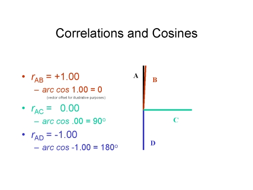 A
correlation may also be expressed graphically as the cosine
of the angle formed by two vectors representing the
variables under consideration. For example:
A
correlation may also be expressed graphically as the cosine
of the angle formed by two vectors representing the
variables under consideration. For example:
- Two perfectly correlated variables (r = +1.00), A and B, appear as vectors separated by an angle of 0 degrees (cos 0o = 1.00); for purposes of illustration, I've separated these two variables by a very small angle.
- Two uncorrelated variables (r = 0.00), A and C, appear as vectors separated by 90 degrees (cos 90o = 0.00).
- Two negatively correlated variables (r = -1.00), A and D, appear as vectors separated by 180 degrees (cos 180o = -1.00).
Now imagine a matrix containing the correlations between 100 different variables -- or, worse yet, a figure representing these correlations graphically. This would amount to 4950 correlations or vectors -- clearly too many even hope to grasp. Factor analysis reduces such a matrix to manageable size by summarizing groups of highly correlated variables as a single factor. There are as many factors as there are distinct groups of related variables.
 Consider
the simple case of four variables which are all highly
intercorrelated, with rs ranging from .70 to .99
(which are really very high indeed). In this case, a single
vector, running right through the middle -- the factor --
summarizes all of them quite adequately. Notice that the
vector representing the factor (location approximate)
minimizes the average angular distance between it and each
of the vectors representing the four original variables. We
can take this new summary vector, which is highly correlated
(rs > .90) with each of the original variables,
as a kind of proxy for the original set of four.
Consider
the simple case of four variables which are all highly
intercorrelated, with rs ranging from .70 to .99
(which are really very high indeed). In this case, a single
vector, running right through the middle -- the factor --
summarizes all of them quite adequately. Notice that the
vector representing the factor (location approximate)
minimizes the average angular distance between it and each
of the vectors representing the four original variables. We
can take this new summary vector, which is highly correlated
(rs > .90) with each of the original variables,
as a kind of proxy for the original set of four.
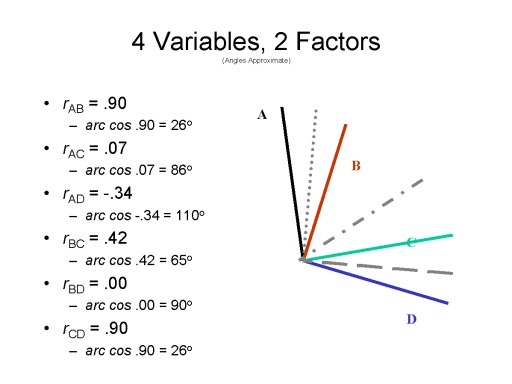 Now
consider the case where two variables are highly
intercorrelated, as are two other variables, but the members
of one pair are essentially uncorrelated with the members of
the other pair. A single factor will run through these four
vectors, but it doesn't really represent the actual pattern
of relationships very well: the angular distances between
the vector representing the factor and the vectors
representing the are just too great. In this case, two
factors give a better summary of these relationships -- as
indicated by the relatively small angular distances between
each of the factor and their corresponding two variables.
Note that the two new vectors are uncorrelated with each
other (cos 90o = 0.00).
Now
consider the case where two variables are highly
intercorrelated, as are two other variables, but the members
of one pair are essentially uncorrelated with the members of
the other pair. A single factor will run through these four
vectors, but it doesn't really represent the actual pattern
of relationships very well: the angular distances between
the vector representing the factor and the vectors
representing the are just too great. In this case, two
factors give a better summary of these relationships -- as
indicated by the relatively small angular distances between
each of the factor and their corresponding two variables.
Note that the two new vectors are uncorrelated with each
other (cos 90o = 0.00).
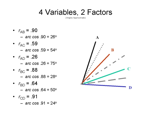 Finally,
consider a slightly different arrangement of these four
variables. Here there are two pairs of variables that are
each highly intercorrelated, but in this case there are also
some substantial intercorrelations between the members of
the respective pairs as well. In this case, the correlations
may be summarized either by a single vector or by two
vectors. In the latter case, note that the two vectors are
themselves somewhat correlated (cos 75o = 0.26).
Finally,
consider a slightly different arrangement of these four
variables. Here there are two pairs of variables that are
each highly intercorrelated, but in this case there are also
some substantial intercorrelations between the members of
the respective pairs as well. In this case, the correlations
may be summarized either by a single vector or by two
vectors. In the latter case, note that the two vectors are
themselves somewhat correlated (cos 75o = 0.26).
Generally speaking, there are three forms of factor analysis, and the choice among them is dictated largely by the nature of the inter-item correlations, as well as by personal taste.
- Where all the items are highly intercorrelated, the investigator may wish to summarize them all with a single general factor. This is the origin of Spearman's g, or factor of "general intelligence".
- Where some items are uncorrelated with others, or when many of the intercorrelations are relatively low, the investigator may wish to extract multiple factors. In the latter case, the factors may be orthogonal or oblique.
- If orthogonal, the factors are constrained so that they are uncorrelated with each other. This is the method underlying Guilford's "structure of intellect" model of intelligence.
- If oblique, the factors are allowed to correlate with each other. This is the method underlying Thurstone's "primary mental abilities" model of intelligence: each primary mental ability is represented by a separate "primary" factor.
- If oblique factors are permitted, of course, the process can be continued by constructing higher-order or superordinate factors which summarize the relations between primary or subordinate factors. In Thurstone's model of intelligence Spearman's g emerges as a secondary factor summarizing the relations among the primary factors.
Factor analysis is the basic technique employed in studies of the structure of intelligence, as discussed in the lectures on Thought and Language. And it is also the means by which the Big Five personality traits, discussed in the lectures on Personality and Social Interaction, were discovered.
Non-Parametric Tests
The t-test and the correlation coefficient are known as parametric tests, because they make certain assumptions about the underlying parameters (characteristics) of the variable distributions. For example, strictly speaking, they require that variables be (more or less) normally distributed, and they require that measurement be on a ratio (or at least an interval) scale. In fact, these restrictions can be violated, to some extent, with impunity. But when all you have is data on a nominal or ordinal scale, you really shouldn't use parametric statistics to describe data and make inferences from it. Fortunately, we have available a set of non-parametric or "distribution-free" statistics to use in this case. They aren't nearly as powerful as parametric statistics, but they're pretty good in a pinch.
One of the most popular nonparametric statistics is known as the chi-square test (abbreviated X2), which categorizes each data point in terms of a two-dimensional table. For example, we can divide the response latencies in our "age" experiment at the median (this is known as a median split), classifying each data point as (relatively) short or long. When we count how many short and long response latencies are in each group, we get a 2x2 table that looks like this:
|
Group |
Response Latency |
|
| Short | Long | |
| Young | 9 | 1 |
| Old | 1 | 9 |
Chi-square tests can have more than 4 cells; and they can also be in more than two dimensions.
Basically, the chi-square test assesses the difference between the observed frequencies in each cell, and those that would be expected by chance. If there were no difference between young and old subjects, then we would expect 5 observations in each cell. You don't have to know how to calculate the chi-square test, but in fact X2 = 12.8, which is significant at the level of p < .001 (a nice consistency here, huh?).
There is also a nonparametric version of the t test, known as the Mann-Whitney U Test. Basically, the U test arranges the scores from each subject from lowest to highest. If there is no difference between the groups, we would expect the scores of the young and old subjects to be completely interspersed. In fact, the two groups' scores are arrayed as follows:
| 625 | 630 | 635 | 635 | 640 | 645 | 650 | 660 | 675 | 695 | 710 | 725 | 725 | 725 | 730 | 735 | 740 | 745 | 750 | 760 |
| Y | Y | Y | Y | Y | Y | Y | Y | Y | E | E | Y | E | E | E | E | E | E | E | E |
The Mann-Whitney test yields U = 10.0, p < .001.
Finally, there is a nonparametric version of the correlation coefficient, known as Spearman's rank-order correlation coefficient, or rho. Basically,rho ranks subjects from lowest to highest on each of the variables, and then assesses the extent to which the ranks are the same. For this data set, the rank-order correlation between age and response latency is rho = .88,p < .001.
Power, Meta-Analysis, and Effect Size
Strictly as a matter of mathematics, statistical significance varies with the number of observations: with only 10 subjects, a correlation of r = .70 has a greater than 5% chance of occurring just by chance; but with 20 subjects, a correlation as low as r = .45 is significant at the p < .05 level. With hundreds of subjects -- a situation that is quite common in correlational research -- even very low correlations can be statistically significant -- that is, unlikely to occur solely by chance. Put another way, the bigger the sample, the more power a study has to detect significant associations among variables.
Because of low sample size, sometimes a single study does not have enough power to detect an effect that is really there. There may even be several studies, all with effects in the same direction (e.g., slower response latencies in the elderly), but none of these effects significant. In the past, all we could do was to tabulate a kind of "box score" listing how many studies had significant vs. nonsignificant results, how many had nonsignificant results in the same direction, and the like. More recently, however, statisticians have developed a number of meta-analysis techniques for combining the results of a number of different studies to determine the overall result in quantitative terms. The result is "one big study" -- not merely an analysis, but an analysis (which is what meta-analysis means), that has more power to detect weak effects if they are really there.
But meta-analysis is not just a trick to massage weak data into statistically significant results. Properly used, it is a powerful quantitative method for generalizing from the results of many independent studies, and for determining what factors are associated with large vs. small effects.
Even low correlations, when statistically significant, can be informative both theoretically and in terms of public policy. The actual correlation between smoking and lung cancer is very low, but with millions of subjects, stopping smoking (or better yet, not starting at all) can substantially reduce one's risk for the disease.
But when even very low correlations can be statistically significant, we sometimes need some other standard to tell us how strong an association really is -- a standard of effect size. There are many different measures of effect size, but one that has proved very popular is Cohen's d, which can be computed from the values of t and r (the beauty of d is that it allows meta-analysts to compare both experimental and correlational studies on the same metric).
But d is just another number: What does it mean? There are no hard and fast standards for interpreting effect sizes, but a "rule of thumb" proposed by Jacob Cohen (1988) has been highly influential:
|
Range of d' |
Interpretation |
| .00 - .10 | An effect of this size is trivial -- or,
perhaps less pejoratively, "very small". |
| .11 - .35 | An effect size of d = 0.2 (corresponding to an r of about .10 is "small"; there is about 85% overlap in the distributions of the two groups. |
| .36 - .65 | An effect size of d = 0.5 (corresponding to an r of about .24 is "medium"; the two distributions are spread more apart, with about 67% overlap. |
| .66 - 1.00 | An effect size of d = 0.8 (corresponding to an r of about .37 is "large"; the two distributions are spread even further apart, with only about 50% overlap. |
| > 1.00 | An effect size greater than 1.00 would be called "very large" by any standard. Social scientists would kill for effects this large. |
In fact, the correlations obtained in most psychological research -- most research anywhere in the social sciences -- are rarely large. For example, Walter Mischel (1968) pointed out that the typical correlation between scores on a personality test and actual behavior is less than .30 (he dubbed this the personality coefficient). A meta-analysis by Hemphill (American Psychologist, 2003) estimated that about two-thirds of correlation coefficients in research on personality assessment and psychotherapy are less than .30. Another meta-analysis by Richard et al. (2003) found that roughly 30% of social-psychological studies reported effect sizes of d = 20 or less; about 50%,d = .40 or less; and about 75%,d = 60 or less.
Bayes's Theorem
All experiments -- indeed, arguably, all problem-solving, begins with some provisional hypothesis about the world:If X is true, then Y is true. If aging results in cognitive slowing, then search time in the Sternberg task should increase as a function of age. If this child is autistic, then he'll be withdrawn and silent. If she likes me, she'll say "yes" when I ask her for a date. It's all hypothesis testing.
Ordinarily, we test our hypotheses by
evaluating the evidence as it comes in, confirming our
hypotheses or revising (or abandoning) them accordingly. But
hypothesis-testing is not quite that simple. Thomas Bayes, a
18th-century English clergyman (Presbyterian, not Anglican),
had the insight that we can't just evaluate the hypothesis
given the strength of the evidence; we also have to evaluate
the evidence given the strength of the hypothesis!
Bayes was a clergyman, but he was a clergyman with a liberal-arts education that included a healthy dose of mathematics. He came up with his eponymous Theorem in the course of calculating the probability of the existence of God, given the evidence found in Creation.
Adopting Bayes's Theorem helps prevent us from accepting outrageous hypotheses as true, given highly unlikely evidence. For example, if someone tells you that precognition is possible, and then demonstrates that he can predict the toss of a coin with accuracy levels above what you'd expect by chance, you might conclude that precognition is indeed possible, and this guy has it. But if you take into account the sheer implausibility of the hypothesis that we can predict the future, the evidence is much less convincing.
According to Bayes's Theorem, proper hypothesis-testing proceeds along a number of steps:
First, we establish the prior probability that the hypothesis is true.
Then we recalculate this probability based on the available evidence, yielding a posterior probability.
Bayes's Theorem states that the posterior probability that a hypothesis is true is given by the prior probability, multiplied by the conditional probability of the evidence, given the hypothesis, divided by the probability of the new evidence.
Put in somewhat simplified mathematical terms,
p(H | E) = (p(E | H) *p(H)) / (p(E).
Here's a simple example, taken from the mathematician John Allen Poulous:
- You have three coins, two of which are fair, and one of which is biased with two heads.
- You pick one coin at random.
- Thus, the prior probability of picking the biased coin,p(H, is 1/3.
- And the prior probability of picking a fair coin,p(not H) = 2/3.
- You flip the coin three times, and each time it lands heads-up.
- The probability that this would occur with a fair coin (not H) is 1/2 * 1/2 * 1/2 or 1/8.
- The probability that this would occur with the biased coin (H) is a perfect 1.0.
- Plugging the resulting probabilities into Bayes' Theorem, the posterior probability that you have picked the biased coin now rises to 4/5.
In Bayesian inference, a researcher starts out
with an initial belief about the state of the world, and then updates
that belief by collecting empirical
data. The empirical data then
becomes the basis for an updated belief, which in turn
serves as the initial belief for further research. In
the real world, of course, the prior probabilities are not
always so obvious, and even advocates of Bayesian procedures
debate the criteria to be used in determining one's "initial beliefs".
To be honest, it seems to me that the "initial belief" usually
takes the form of the null hypothesis -- which it's
null-hypothesis significance testing that is precisely
what the Bayesians
are trying to get away from. There's really no
getting away from it.
Still, a number of theorists are now arguing
that Bayes's Theorem offers a more solid procedure for
testing hypotheses, much less susceptible to the kinds of
problems that arise with traditional hypothesis-testing.
We'll encounter Bayes's Theorem again later, in the lectures
on Thinking.
For a thorough, engaging treatment of Bayes's theorem, see The Theory That Would Not Die: How Bayes' Rule Cracked the Enigma Code, Hunted Down Russian Submarines, and Emerged Triumphant from Two Centuries of Controversy by Sharon Bertsch McGrayne (2011). The example came from Poulous's review of this book in the New York Times Book Review ("In All Probability", 08/07/2011).
Notice how McGrayne (and many others) spells the possessive of Bayes's name: ending just in an apostrophe ('), not an apostrophe-s ('s). I've made this mistake myself, and if you look hard enough on my website you might find an instance or two of "Bayes'". In English, we write possessives by adding the suffix -s to the end of a word. But in English poetry, it's common to write the possessive of words that end in -s by simply adding the apostrophe. That's usually in order to make it the line of poetry scan better (when John Keats wrote "On First Looking into Chapman's Homer", he had "Cortez" discovering the Pacific Ocean, not the historically accurate "Balboa", because he only had two syllables to work with). But, as I'll note in the lectures on Language, language evolves and possessives like Jesus' are so common that eventually we'll settle on Bayes' as well.
See also a series of tutorials by C.R. Gallistel of Rutgers University, published in the Observer, the house-organ of the Association for Psychological Science:
- Probability and Likelihood (September, 2015).
- The Prior (October, 2015).
- The Prior in Probabilistic Inference (November, 2015).
The New Statistics
Showing that "p <
.05" is, really, only the first step in testing an empirical
hypothesis. Recently there has been increasing criticism
of that is known as "null hypothesis significance testing",
where the researcher only determines whether a difference, or
a correlation, is bigger than what we would expect by
chance. Meta-analysis and Bayesian inference are steps
toward a more rigorous statistical analysis of data, and these
days researchers are encouraged -- actually, required -- to
specify confidence intervals around their results, and
estimate the actual size of effects. These topics have
all been discussed here, but the reader should know that it's
not really enough to report that "p < .05"
anymore.
In 2016, the American Statistical
Association cautioned researchers on over-reliance on p-values
in their first-ever position paper on statistical
practices. In its "Statement
on p Values: Context, Process, and Purpose", the
ASA proffered the following guidelines to be considered when
interpreting p-values (quoted, with my comments in
[brackets]):
- A p value can indicate how incompatible data are with a specified statistical model. [In standard Null-Hypothesis Significance Testing (NHST), the "specified statistical model is the null hypothesis that the difference or correlation observed has occurred merely by chance. But it's possible to test outcomes against alternative models, as well, and psychologists do this more and more these days.]
- A p value does not measure the probability that the studied hypothesis is true or the probability that the data were produced by random chance alone. [This is technically true, even though it's easiest to think of p-values as the probability that a result occurred by chance.
- Scientific conclusions and business or policy decisions should not be based only on whether a p value passes a specific threshold. [Also true, technically. Still in actual practice, p,.05 is pretty much the threshold for taking a result seriously.
- Proper inference requires full reporting and transparency. [Absolutely true. In studies involving many statistical comparisons, such as public-health data or other instances of Big Data, some apparently "significant" relationships will occur merely by chance. Think about it: if you do 100 comparisons, 5 of them will be "significant" at p<.05 just by chance alone. That's why it's important that significant findings, especially unexpected ones, should be replicated to reduce the likelihood that they are spurious. And why it's good to predict outcomes in advance, or to be able to explain unexpected outcomes on the basis of some established theoretical principle.]
- A p value, or statistical significance, does not measure the size of an effect or the importance of a result. [Again, absolutely true. With a large enough N, even trivial differences or correlations can be "statistically significant".]
- By itself, a p value does not provide a good
measure of evidence regarding a model or hypothesis.
[Again, absolutely true. Ideally, a statistically
significant p value should be accompanied by a
non-trivial effect size -- though it has to be said that
some "small" effects are immensely significant, as in public
health (e.g., the link between smoking and lung cancer).]
Still, it has to be said,
that "p < .05" is the single most important
criterion for determining the empirical validity of any
claim. If the probability attached to a result is more
than 5/100, there's not a lot of point in paying attention to
it -- unless a meta-analysis of accumulated "nonsignificant"
results actually crosses into the territory of "p <
.05".
Here's an example of the difference between traditional "null hypothesis statistical testing and Bayesian inference, excerpted from "Science's Inference Problem: When Data Doesn't Mean What We Think It Does", a review of several books on data analysis (New York Times Book Review, 02/18/2018).For an overview, see "The New Statistics: Estimation and Research Integrity", an online tutorial by Prof. Geoff Cumming of LaTrobe University in Australia. See also his article, "The New Statistics: Why and How" (Psychological Science, 2014). Also "A Significant Problem" by Lydia Denworth (Scientific American 10/2019).
Over the past few years, many scientific researchers, especially those working in psychology and biomedicine, have become concerned about the reproducibility of results in their field. Again and again, findings deemed “statistically significant” and published in reputable journals have not held up when the experiments were conducted anew. Critics have pointed to many possible causes, including the unconscious manipulation of data, a reluctance to publish negative results and a standard of statistical significance that is too easy to meet.
In their book TEN GREAT IDEAS ABOUT CHANCE..., a historical and philosophical tour of major insights in the development of probability theory, the mathematician Persi Diaconis and the philosopher Brian Skyrms emphasize another possible cause of the so-called replication crisis: the tendency, even among “working scientists,” to equate probability with frequency. Frequency is a measure of how often a certain event occurs; it concerns facts about the empirical world. Probability is a measure of rational degree of belief; it concerns how strongly we should expect a certain event to occur. Linking frequency and probability is hardly an error. (Indeed, the notion that in large enough numbers frequencies can approximate probabilities is Diaconis and Skyrms’s fourth “great idea” about chance.) But failing to distinguish the two concepts when testing hypotheses, they warn, “can have pernicious effects.”
Consider statistical significance, a standard scientists often use to judge the worth of their findings. The goal of an experiment is to make an inductive inference: to determine how confident you should be in a hypothesis, given the data. You suspect a coin is weighted (the hypothesis), so you flip it five times and it comes up heads each time (the data); what is the likelihood that your hypothesis is correct? A notable feature of the methodology of statistical significance is that it does not directly pose this question. To determine statistical significance, you ask something more roundabout: What is the probability of getting the same data as a result of random “noise”? That is, what are the odds of getting five heads in a row assuming the coin is not weighted? If that figure is small enough — less than 5 percent is a commonly used threshold — your finding is judged statistically significant. Since the chance of flipping five heads in a row with a fair coin is only about 3 percent, you have cleared the bar.
Note from JFK: Tests of statistical significance come in two forms, "one-tailed" and "two-tailed". In a two-tailed test, the investigator predicts that there will be a significant difference, but does not predict the direction of the difference. So, in the coin-tossing example, we could test the hypothesis that the coin is weighted, and this would be true if it turned up five heads or five tails. That is (pardon the pun) a two-tailed test. Or, we could test the hypothesis that the coin is weighted towards heads. This would be a one-tailed test, and it's only passed if the coin turns up five heads.
But what have you found? Diaconis and Skyrms caution that if you are not careful, you can fall prey to a kind of bait-and-switch. You may think you are learning the probability of your hypothesis (the claim that the coin is weighted), given the frequency of heads. But in fact you are learning the probability of the frequency of heads, given the so-called null hypothesis (the assumption there is nothing amiss with the coin). The former is the inductive inference you were looking to make; the latter is a deductive inference that, while helpful in indicating how improbable your data are, does not directly address your hypothesis. Flipping five heads in a row gives some evidence the coin is weighted, but it hardly amounts to a discovery that it is. Because too many scientists rely on the “mechanical” use of this technique, Diaconis and Skyrms argue, they fail to appreciate what they have — and have not — found, thereby fostering the publication of weak results.
A researcher seeking instruction in the sophisticated use of such techniques may want to consult OBSERVATION AND EXPERIMENT: An Introduction to Causal Inference (Harvard University, $35), by the statistician Paul R. Rosenbaum. The methodology of statistical significance, along with that of randomized experimentation, was developed by the statistician R. A. Fisher in the 1920s and ’30s. Fisher was aware that statistical significance was not a measure of the likelihood that, say, a certain drug was effective, given the data. He knew it revealed the likelihood of the data, assuming the null hypothesis that there was no treatment effect from the drug. But as Rosenbaum’s book demonstrates, this was by no means an admission of inadequacy. Fisher’s aim was to show, through proper experimental design and analysis, how the investigation of the null hypothesis speaks “directly and plainly” to a question we want to answer: Namely, is there good evidence that the drug had any treatment effect? That many researchers are careless with this technique is not the fault of the methodology.Diaconis and Skyrms declare themselves to be “thorough Bayesians,” unwavering followers of the 18th-century thinker Thomas Bayes, who laid down the basic mathematics for the coveted “inverse” inference — straight from the data to the degree of confidence in your hypothesis. (This is Diaconis and Skyrms’s sixth “great idea” about chance.) Bayesian statistics purports to show how to rationally update your beliefs over time, in the face of new evidence. It does so by mathematically unifying three factors: your initial confidence in your hypothesis (“I’m pretty sure this coin is weighted”); your confidence in the accuracy of the data, given your hypothesis (“I’d fully expect to see a weighted coin come up heads five times in a row”); and your confidence in the accuracy of the data, setting aside your hypothesis (“I’d be quite surprised, but not shocked, to see a fair coin come up heads five times in a row”). In this way, Diaconis and Skyrms argue, the Bayesian approach reckons with the “totality of evidence,” and thus offers researchers valuable guidance as they address the replication crisis.
Big Data
Traditionally, psychological research has relatively small-scale studies. A typical experimental design might have 20-30 subjects per condition, while a typical correlational study might have 200-300. But the advent of the internet, and especially social media, has made it possible to conduct studies with huge numbers of subjects and observations -- thousands, tens of thousands, millions. This is accomplished either by conducting the study over the Internet, or by using the vast computational power now available to researchers to analyze huge data sets, in an enterprise called data mining. Probably the most famous example of data mining is the program of the National Security Agency (NSA), revealed by Edward Snowden in 2013, to collect "metadata" on every telephone call, email exchange, or web search conducted by anyone, anywhere in the world. More benign examples are encountered when you order a video on Netflix, only to have Netflix tell you what other videos you might enjoy. Google and Facebook, to name two prominent examples, keep enormous databases recording every page you've "liked" and every photo you've tagged, every keyword you've searched on, and every ad you've clicked on. All of this goes under the heading of "big data".
The seeds of the Big Data movement were laid in an article by Chris Anderson, editor of Wired magazine, entitled "The End of Theory" (2008). Anderson wrote that we were now living in
a world where massive amounts of data and applied mathematics replace every other tool that might be brought to bear. Out with every theory of human behavior, from linguistics to sociology. Forget taxonomy, ontology, and psychology. Who knows why people do what they do? The point is, they do it, and we can track and measure it with unprecedented fidelity. With enough data, the numbers speak for themselves.
The movement is probably best represented by Big Data: A Revolution That Will Transform How We Live, Work, and Think by Kenneth Cukier and Vikktor Mayer-Schonberger, who write that "society will need to shed some of its obsession for causality in exchange for simple correlations: not knowing why, but only what".
The "Dark Side" of Big Data is detailed in two other books, reviewed by Sue Halpern in "They Have, Right Now, Another You" (New York Review of Books, 12/22/2016).
- Weapons of Math Destruction: How Big Data Increases Inequality and Threatens Democracy by Cathy O'Neil (2016).
- Virtual
competition: The Promise and Perils of the
Algorithm-Driven Society by Ariel
Ezrachi & Maurice Stucke.
There is no question that Big Data will be a
goldmine for certain kinds of social scientists, marketing
professionals, and spies. some studies will be
possible that would never have been possible before.
However, the virtues of Big Data shouldn't be
overstated. After all (and both Anderson and Cukier
and Mayer-Schonberger admit this), the essence of Big Data
is correlational. We might discover, for example, that
two social indices move together; or that people who like
Forbidden Planet also like The Martian Chronicles; or that
the use of first-person pronouns has increased greatly since
World War II; or, for that matter, that a couple of guys
living in Los Angeles spend an awful lot of time talking to
people in Iran.
At the
same time, it's
worth remembering the Literary Digest fiasco of
1936. Your sample size can be huge, but if your
sample is unrepresentative, you're going to get misleading
results.
For an overview of Big Data at UC Berkeley, see "Riding the iBomb: Life in the Age of Exploding Information" by Pat Joseph, California, Winter 2013.
But algorithms
are only as good as the data that's input to them ("Garbage
In, Garbage Out"
as the computer programmers say). And
correlation doesn't necessarily mean causation. And
really, isn't that what we want to know as social scientists
-- why something happened, or why two things co together (or
don't)? We can't just set aside questions of
causality. As students of psychology, we want to know
how the mind works, and why people do what they do. To
answer these sorts of questions, we need the kind of
carefully controlled research that can only be done in
controlled laboratory or field settings.
The Experimenting Society
In "Reforms as Experiments", his 1969
presidential address to the American Psychological
Association, Donald
T. Campbell, a
prominent statistician and social psychologist, called for the
application of the experimental method, including
rigorous statistical analyses, to matters of public
policy. In his view, matters of public policy
should not be determined by ideologies of Democrats and
Republicans, left and right, but rather by evidence
of what actually works to achieve certain agreed-upon
policy objectives -- for
example, how to reduce traffic fatalities, or changes
in policing policies. Campbell's point was that while
an idea might sound good, and someone might argue plausibly that such-and-such
a policy might work, this is really an
empirical question. Accordingly, he
called for an experimenting society
which would put reforms to rigorous
empirical test.
Campbell
himself doubted that society would tolerate a truly
experimental approach to policy -- in which, for
example, children might be randomly assigned to
segregated or integrated schools to determine the
effect of segregation on academic outcomes.
But he did advocate the development of quasi-experimental
designs which, by use of sophisticated
statistical
techniques, would allow policy makers to
test hypotheses and determine
cause and effect.
More
recently, however, the idea of
randomized social experiments has
gained popularity -- partly
inspired by the success of randomized
clinical trials in medicine, in
which one group of patients gets a
a new treatment, while another
group gets the current
standard of care, or even a
placebo. In an editorial
"In Praise of Human
Guinea Pigs", The
Economist,
a highly influential weekly news magazine,called for the use
of randomized controlled trials in various policy
domains -- education, drug policy, criminal justice,
prison reform, and the like ((12/12/2015).
And, in fact, the
Obama Administration has been engaged in just such a
project. The White House Office of Information
and Regulatory
Affairs conducts rigorous cost-benefit analyses
to determine whether various public policies and regulations
actually accomplish their intended goals in a
cost-effective manner. From 2009 to 2012, this agency was
headed by Cass Sunstein, a legal scholar who has
argued that policymakers should employ
psychological principles to encourage citizens
to do things that are in their best interests -- for
example, saving adequately for
retirement.
For more on the application of randomized clinical trials in psychology and psychotherapy, see the lectures on "Psychopathology and Psychotherapy".
Clinical vs. Statistical Prediction
Statistics can tell us which research results to
pay attention to, and which to ignore. But they can
also be an aid in decision-making. How well will a
student do in school? A worker at a job? What is
the likelihood that someone will suffer an episode of mental
illness? Or recover from one?
 In a famous study, Paul Meehl (1954)
demonstrated that statistical predictions -- based, for
example, on the correlation coefficient -- were generally
superior to impressionistic human judgments.
In a famous study, Paul Meehl (1954)
demonstrated that statistical predictions -- based, for
example, on the correlation coefficient -- were generally
superior to impressionistic human judgments.
- In his 1954 paper, Meehl reviewed 20 studies that compared "clinical" (i.e., intuitive or impressionistic) and "statistical" (i.e., actuarial) predictions.
- Statistical predictions were more accurate than clinical predictions in 11 of the 20 studies.
- Clinical and statistical predictions were equivalent in 8 studies.
- Clinical prediction seemed superior in only one study, and that one study was later found to have serious methodological problems.
- In a 1965
paper, Meehl reviewed 51 additional studies.
- Statistical prediction was better in 33 studies.
- 17 studies yielded a tie.
- And again, only one study found clinical prediction superior to statistical prediction (Lindzey, 1965) -- but this study, too, was subsequently found to have methodological problems (Goldberg, 19968).
- About
the same time, Sawyer (1966)
reviewed the same body of
literature, and came to the same
conclusions.
- Further, Sawyer made an important distinction between two different aspects of the clinical-statistical controversy.
- There are clinical and statistical methods of data collection, such as interviews and questionnaires.
- And there are clinical and statistical method of data combination, such as intuition and multiple regression.
- In Sawyer's analysis, statistical methods were superior to clinical methods in both respects.
- In his 1954 and 1965 studies, Meehl employed a "box score" method of reviewing the data -- listing studies in three columns representing those whose outcomes significantly favored statistical prediction, those (virtually nonexistent) which significantly favored clinical prediction, and those that resulted in a tie (see also Dawes, Faust, & Meehl, 1989; Grove & Meehl, 1996). But quantitative meta-analysis gives us a more definitive picture of the trends across many studies.
- Grove et al. (2000) reported just such a quantitative meta-analysis of the whole available literature, taking into account the strength of effects, as well as their direction.
- While in the previous "box score" analysis a majority of studies showed that clinical and statistical methods came out about even, the overall trend now clearly favored statistical prediction.
- An additional plurality of studies yielded a tie.
- A small minority of studies favored clinical prediction.
- In the latest meta-analysis, Aegisdottir et al. confirmed this pattern.
So Meehl's findings, which had been anticipated
by Theodore Sarbin (1943), have been confirmed by every
analysis performed since then.
When it comes to predicting future events, nothing beats the power of actuarial statistics. Nothing.
Here's a provocative real-world example: parole decisions and the problem of recidivism -- that is, the probability that a prisoner, once released, while commit another crime. Convicted criminals may be paroled before serving their entire sentence, provided that they show that they are no longer a threat to society. These judgments have traditionally been made by a parole board, which looks at the trial record, the behavior of the prisoner while incarcerated, and an interview with the applicant. Parole is a very weighty decision. False positives -- granting parole to a prisoner who will go right out and resume a life of crime -- has obvious implications for society. And so do false negatives -- denying parole to a prisoner who would keep to the straight and narrow is unjust, puts the cost of unnecessary imprisonment on society, and seemingly contradicts one major goal of imprisonment, which is rehabilitation (not just punishment). So it's important that these decisions be as valid as possible. Richard Berk, a criminologist at the University of Pennsylvania School of Law, assembled a massive data set on some 30,000 probationers and parolees in the Philadelphia area, and developed a statistical model to predict whether an individual would be charged with homicide or attempted homicide within two years of their release. In cross-validation on another 30,000 cases, Berk's algorithm predicted outcome correctly in 88% of the cases. Of course, murder is rare: "only" 322 of the convicts in the original sample attempted or committed murder, so if Berk had just predicted that nobody would do so, he would have been right 98.92% of the time; but then again, 322 people might have been killed. So the algorithm likely prevented some deaths, by identifying those candidates for parole who were most likely to try to kill someone. At the same time, some of the variables that went into Berk's algorithm are problematic. One of the best individual predictors was the candidate's Zip Code -- parolees from some parts of Philadelphia were much more likely to attempt or commit murder than were parolees from another. And it seems unfair, something close to stereotyping, to base a judgment on where a parolee lives; n this sense, Berk's algorithm seems to build in, or at least play to, group stereotypes. Any kind of judgment involves a trade-off. The undoubted advantage of algorithms like Berks's is that they're not just valid, in that they successfully predict outcomes (albeit with some error), but they also applied reliably -- evenly across the board.
Berks is not alone in combining Big Data with statistical or actuarial prediction, but he has been very vigorous in extending his method to other domains, such as sentencing, the inspection of dangerous workplaces, auditing and collection by the Internal Revenue Service, the identification of potentially toxic chemicals by the Environmental Protection Agency, and regulation by the Food and Drug Administration and the Securities and Exchange Commission, and other agencies. And his work is having an impact. In response to the parole study described above, Philadelphia's Department of Adult Parole and Probation reorganized its policies and procedures, so that parole and probation officers could devote relatively less effort to "low risk" parolees, leaving more time to devote to those of relatively high risk for reoffending.
Still, it has to be repeated that an algorithm is only as good as the data it's derived from. As they say, in computer science, GOGI: "Garbage in, garbage out". They might also say "Bias in, bias out". Consider, again, the problem of predicting recidivism. What we want to know is if someone will commit a crime. But we never have that information. What we know is whether someone's been arrested, or convicted. Arrest or conviction are proxies for criminality. But if Blacks are more likely to be arrested than whites who commit the same crimes (which they are, especially for drug-related offenses), and if Blacks are more likely to be convicted than whites who are tried for the same crimes (ditto), then racial bias is built into the algorithm.
For a good discussion of what we count and how we count it, in the context of decision algorithms and Big Data, see "What Really Counts" by Hannah Fry, New Yorker, 03/29/2021).
For another, see "Sentenced by Algorithm" by Jed S. Rakoff, an essay review of When Machines Can be Judge, Jury, and Executioner: Justice in the Age of Artificial Intelligence by Katherine B. Forrest (New York Review of Books, 07/10/2021). Forrest, was a formal Federal judge, is particularly concerned with the use of statistical algorithms to predict the probability that an convicted person will re-offend after release from prison -- a prediction that plays a major role in determining convicts' initial sentences, and whether and when they will be paroled. In principle, Forrest advocates the use of AI-derived algorithms for this purpose, but she worries about bias built into the system. Moreover, modern AI differs radically from the kinds of algorithms that Meehl and others advocated. In Meehl's time, the algorithm was represented by a multiple-regression equation, in which the weights attached to various predictor variables (essentially, their correlation with the criterion) are visible to everyone and open to criticism. But that is not the case with modern machine learning, based on neural networks, in which the computer is, essentially, a "black box" whose processes are, essentially, invisible. Neural networks take inputs (like demographic data) and adjust their internal processes to produce outputs (like predictions of recidivism). But again, GOGI: if the inputs are biased, the predictions will be inaccurate. And indeed, Forrest reports that a commonly used program for predicting recidivism, known as COMPAS (Correctional Offender Management Profiling for Alternative Sanctions) has an error rate of 30-40%, mostly in the form of false positives: predicting that people will re-offend when in fact they do not; and they are particularly bad at predicting re-offending by Black defendants. Moreover, the particular algorithm used by COMPAS is a proprietary secret, which means that defendants cannot check it for bias. The situation is bad enough when a traditional multiple-regression equation is essentially a trade secret; it's much, much worse in the case of machine learning, when the algorithm is unknowable in principle.
Big Data and statistical prediction promise to play a increasing role in public policy. This will not be without controversy, and warrants serious discussion. But it's going to happen -- and, with proper respect for democratic processes, it probably should.
 For an excellent account of how
statistical analysis can outperform intuitive or theory- (or
ideology-) based predictions, see The Signal and the Noise:
Why so Many Predictions Fail -- But Some Don't (2012) by
Nate Silver. Silver wrote the "Five Thirty-Eight" column in
the New York Times (that's the number of Representatives and
Senators in Congress, plus the President), and is famous for
using statistical analyses to predict the performance of
baseball players and the outcomes of elections. He's also
critical of common misuses of statistics by politicians,
judges, and other policy-makers.
For an excellent account of how
statistical analysis can outperform intuitive or theory- (or
ideology-) based predictions, see The Signal and the Noise:
Why so Many Predictions Fail -- But Some Don't (2012) by
Nate Silver. Silver wrote the "Five Thirty-Eight" column in
the New York Times (that's the number of Representatives and
Senators in Congress, plus the President), and is famous for
using statistical analyses to predict the performance of
baseball players and the outcomes of elections. He's also
critical of common misuses of statistics by politicians,
judges, and other policy-makers.
For example, in 2013 the US Supreme Court heard arguments about a provision of the Voting Rights Act that requires certain areas with a history of racial discrimination (mostly, though not exclusively, the Jim Crow South) obtain approval from the Justice Department before changing their voting laws. Several affected districts sued, claiming that there was no longer any racial discrimination in voter registration and behavior. during oral argument, Chief Justice Roberts noted that Mississippi, one of the states affected by the legislation, has the best ratio of Black to White voter turnout (roughly 1.11:1), while Massachusetts, which is not covered, has the worst (roughly 0.65:1). The implication was that, whatever differences might have been in the past, they don't hold in the present. In his column, Silver pointed out two errors in Judge Roberts's reasoning.
- First, he pointed out that the relevant question is not whether Mississippi and Massachusetts differ in minority voter participation, but whether voters in Mississippi and Massachusetts are representative of their respective populations. Silver calculated the ratio of Black to White voter participation for all states covered by the Act as 1.09:1, compared to 1.12:1 in non-covered states -- not a statistically significant difference.
- Second, the ratios may be equivalent now, but this equivalence was created precisely by the Voter Registration Act. Had the covered states been allowed to continue in their old "Jim Crow" ways, their ratios would likely have stayed very low, signifying low Black voter participation.
So, maybe Massachusetts has some work to do, but any conclusions about the effectiveness of, and the need for, the protections afforded by the Voting Rights Act need to be based on appropriate statistical analyses, not individual data-points "cherry picked" to make a point (see "A Justice's Use of Statistics, Viewed Skeptically", 03/08/2013).
 If
If  more
proof were needed, consider the case of the 2002 Oakland
Athletics baseball team, as documented in Moneyball: The
Art of Winning an Unfair Game by Michael Lewis
(2003), and dramatized in the film of the same name starring
Brad Pitt (2011). Traditionally, recruitment was based
on the subjective judgements of scouts, coaches, and
managers, as well as traditional statistics such as batting
average and runs batted in. In order to compensate for
the relatively poor financial situation of the As', Billy
Beane, the general manager of the team, decided to pick
players based on more sophisticated statistical analyses
known as sabermetrics introduced by Bill James and
the Society for American Baseball Research (SABR).
Sabermetrics showed, for example, that on-base percentage
(as opposed to batting average) and slugging percentage
(total bases / at-bats) were better measures of offensive
success. Selecting players based on these more valid
statistical measures permitted Beane to field an excellent
team at greatly reduced cost, making the As competitive
against richer teams. They didn't win the World
Series, but using this system they did go to the American
League playoffs in 2002 and 2003.
more
proof were needed, consider the case of the 2002 Oakland
Athletics baseball team, as documented in Moneyball: The
Art of Winning an Unfair Game by Michael Lewis
(2003), and dramatized in the film of the same name starring
Brad Pitt (2011). Traditionally, recruitment was based
on the subjective judgements of scouts, coaches, and
managers, as well as traditional statistics such as batting
average and runs batted in. In order to compensate for
the relatively poor financial situation of the As', Billy
Beane, the general manager of the team, decided to pick
players based on more sophisticated statistical analyses
known as sabermetrics introduced by Bill James and
the Society for American Baseball Research (SABR).
Sabermetrics showed, for example, that on-base percentage
(as opposed to batting average) and slugging percentage
(total bases / at-bats) were better measures of offensive
success. Selecting players based on these more valid
statistical measures permitted Beane to field an excellent
team at greatly reduced cost, making the As competitive
against richer teams. They didn't win the World
Series, but using this system they did go to the American
League playoffs in 2002 and 2003.
Since
then, every major-league baseball team has adopted
sabermetrics, as
documented by Christopher Phillips in Scouting and
Scoring: What We Know About Baseball (2019).
Reviewing the book in the New Yorker ("Twist and Scout",
04/08/2019), Louis Menand puts the contest between
expert "clinical" judgment and statistical judgment:
The “scouting” in Phillips’s title refers to the traditional baseball scout. He’s the guy who sizes up the young prospect playing high-school or college ball, gets to know him away from the diamond, and draws on many years of experience hanging out with professional ballplayers to decide what the chances are that this one will make it to the bigs—and therefore what his price point should be for the club that signs him.
The “scorer” is what’s known in baseball as a sabermetrician. (And they don’t call it scoring; they call it “data capture.”) He’s the guy who punches numbers into a laptop to calculate a player’s score in multivariable categories like WAR (wins above replacement), FIP (fielding independent pitching), WHIP (walks plus hits per inning pitched), WOBA (weighted on-base average), and O.P.S. (on-base percentage plus slugging). Quantifying a player’s production in this way allows him to be compared numerically with other available players and assigned a dollar value....
The scout thinks that you have to see a player to know if he has what it takes; the scorer thinks that observation is a distraction, that all you need are the stats. The scout judges: he wants to know what a person is like. The scorer measures: he adds up what a person has done. Both methods, scouting and scoring, propose themselves as a sound basis for making a bet, which is what major-league baseball clubs are doing when they sign a prospect. Which method is more trustworthy?
The question is worth contemplating, because we’re confronted with it fairly regularly in life. Which applicant do we admit to our college? Which comrade do we invite to join our revolutionary cell? Whom do we hire to clean up our yard or do our taxes? Do we go with our intuition (“He just looks like an accountant”)? Or are we more comfortable with a number (“She gets four and a half stars on Yelp”)?
Referring to Moneyball, Menand
complains that "Lewis's book has a lot of examples where
scouts got it wrong but scorers got it right, so it's
regrettable that Phillips doesn't provide much in the way of
examples where the reverse is true". But that may be
because the reverse is hardly ever true: statistical
prediction reliably beats clinical prediction -- in baseball
and everything else.
Or, perhaps closer to home, consider investments in the stock market. Lots of people think they can make a killing by picking stocks, but in fact the best overall performance is provided by "index" funds that simply invest in a representative sample of stocks (something to think about once you're out in the world, saving for retirement or your own children's college education. Again, a simple algorithms beats "expert" judgment and intuition. As cases in point:
- In 2008, Warren
Buffet, the billionaire who made his own billions
through ingenious stock picks, made a bet
with a prominent money-management firm that an index
fund that invests in the Standard & Poors list of
500 stocks (e.g., the Vanguard 500 Index Fund Admiral
Shares), basically buying a basket of each of the
500 securities, would do better than five
actively managed funds over a period of 10 years
(remember, this was toward the end of the Financial
Crisis of 2007-2008, and right smack-dab in the
middle of the Great Recession of
2007-2009. As of May 2016, with two years to
go, Buffett was winning handily ("Why Buffett's
Million-dollar Bet Against Hedge Funds was a Slam
Dunk" by Roger Lowenstein, Fortune
Magazine, 05/11/2016) The Vanguard fund
was up more than 65%, while a group of hedge funds selected
by Protege was up only about 22%. Part of
the reason has to do with the fees charged by
hedge funds, which are much greater (typically 2%
up front plus 20% of the profits -- the
"carried interest" that played such a role in
the 2016 Presidential campaign) than
those charged by passively managed index funds
(typically about 0.05% per year), which
just buy a basket of stocks and let it sit
there). But Buffett's success (so far) also
reflects the basic truth that statistical
prediction beats clinical prediction every
time. Setting aside the matter of fees,
Buffett's basket grew at a rate of 6.5% a year,
while Protege's increased by only 5% (which, if
you do the math, shows you just how big a bite
those active-management fees can take out of
your investments).
- Most private colleges and universities have their endowments managed by professional managers -- who, like hedge funds, buy and sell stocks and bonds on their behalf. Some of the biggest institutions, like Harvard, Yale, and many retirement systems (until recently, when it got smart, the California Public Employees Retirement System) actually hire professional hedge-fund managers, who charge enormous fees for their services. And they, too, tend to underperform -- sometimes so badly that they rack up losses for the institutions in question ("How Colleges Lost Billions to Hedge Funds in 2016" by Charlie Eaton, Chronicle of Higher Education, 03/03/2017). According to Eaton, colleges and universities spent about $2.5 billion in hedge-fund fees in 2015 -- about 60¢/$1 in returns (I told you those management fees were high!). But while the Dow Jones Industrial Average gained more than 13% in 2016 (think of that as a kind of index fund), college and university endowments scored losses of almost 2%. Harvard alone lost $2 billion of an endowment of about $37 billion. Instead of hiring people to actively manage their endowments, some schools are now simply buying index funds.
- In 2017, BlackRock, a large investment manager, formally began to shift from actively managed funds, to index funds and other "algorithmic" methods of picking stocks for investment. At the same time, it began reducing the number of managers who actively pick stocks for various investment funds. Score another victory for statistical over "clinical" prediction! (See "At BlackRock, Machines Are Rising Over Managers to Pick Stocks" by Landon Thomas, New York Times, 03/29/2017.)
- Fidelity,
another large and reputable firm that
manages many individual and group
retirement funds, also has begun to shift
from active to passive management (see
"Alive and Kicking" by "Schumpeter" (a pen
name), Economist
06/24/2017).
- Still, Fidelity actively promotes actively managed funds, and in 2019 issued a report claiming that they had better outcomes than index funds. However, the study was criticized for data-selection policies that bias the results in favor of actively managed funds (see "Fidelity Index-Fund Bashing Misses the Mark" by Jason Zweig, Wall Street Journal, 04/13/2019). In addition, much of the gains by actively managed funds are lost due to the higher fees charged for them. Most important, the Fidelity study was based on short-term gains -- over a period of just one year. Even the best stock-pickers don't do consistently well. As Zweig points out in the WSJ article, "only 7% of the funds in the highest quartile of active US stock funds in September 2015 were still among the top 25% just three years later.... Over five years, fewer than 1.5% managed to stay among the top 25%". This doesn't happen with index funds, which by definition go up and down with the market -- and historically, the market always goes up.
Predicting the 2024 Presidential Election
The year 2024 was dubbed "the year
of elections", because national elections were held
in so many different countries, including the United
Kingdom, Russia, and India as well as the US. The
outcomes of the Russian and Indian elections were
pretty easy to predict, because of the structural
dominance of one person (Russia's Vladimir Putin) or
party (Narendra Modi and his BJP) its
competitors. But Britain's election was not
foretold, and the American electoral contest,
between Donald Trump (the 45th President of the
United States, who defeated Hillary Clinton in
2016), and Kamala Harris (Vice-President under Joe
Biden, the 46th President, who defeated Trump in
2020), was especially close, providing an interest
test of various prediction models. Statistical prediction of an
American presidential election is not a matter of
averaging polls, or anything so simple. This
is because the outcome of the election is not
determined by the number of votes each candidate
receives. It is determined by the "vote" of
the Electoral College, which consists of a number of
electors equivalent to the number of Representatives
and Senators each state sends to the United States
Congress. But while each state's number of
congressional representatives is determined by
population, each state also gets two senator,
regardless of populaton. The result is an
imbalance favoring rural states, which tend to be
conservative, over larger states, which tend to be
liberal. So, for example, California, a
liberal "blue" state with 54 electors, has only
about 94% of the electors that it would have, were
electors distributed in line with the population;
South Dakota, a conservative "red" state with 3
electors, has 199% of the electors it should have,
based only on population. The situation is
made even more difficult by partisan gerrymandering,
in which state legislatures often draw congressional
districts to favor (or disfavor) one political party
over another. You're right: it's a stupid way
to run a democracy, which is why no other
democracy has an Electoral College, but the
Consitution is so hard to amend that we're stuck
with it. The purely statistical side can be
represented by Nate Silver, founder of the 538
website which specializes in interpreting and
aggregating data from opinion polls (the number
refers to the number of votes in the Electoral
College: 270 votes are needed to win a Presidential
election; Silver subsequently
sold 538 to ABC News and founded a new
business, known as Silver
Bulletin). Whatever his business
name, Silver has an enviable track record in
predicting the results of political elections based
on his forecasting model, a variant on sabermetrics
which considers only polling results and demographic
data. Unfortunately, Silver's analyses and
predictions sit behind a paywall (hey, a guys gotta
earn a living!), so as an example of statistical
prediction, I can only go by the polling figures. Beginning on September 9, roughly
8 weeks before the election, Nate Cohn, the
chief political analyst at the New York Times,
began polling data based on the nationwide average
of polls. Of course, the political polls were
wrong in 2016, 2020, and 2022. In 2016, they
underestimated Trump's support (that's how Nate
Silver won his bet). In 2020, they
underestimated the difference between Trump and
Biden, which was a closer race than predicted.
And in xxxxx Cohn has also published estimates
of what the polls would look like, if they were
corrected for the errors in 2020 and 2022.
The more-or-less clinical side can
be represented by Allan Lichtman, a historian at
American University, who uses a model based on
history rather than poll numbers. Lichtman has
assembled set of 13 historical predictors,
framed as binary, true-false questions with respect
to the party holding the Whie House, which he argues
are the keys to a successful run for the presidency.
These keys are:
These binary keys are then entered
into a sort of regression equation predicting the
outcome of each presidential election, with each key
weighted according to its correlation with the
outcome of past elections. Some of these keys
are weighted more heavily than others, based on
their correlation with past election outcomes: for
example, Midterm Gains count for more than
Incumbency. This actually looks like a variant
of statistical prediction, and in some cases it
is. But unlike Silver's system, the keys do
not always represent objective, numerical data (like
polling numbers and demographics). Sometimes
they're judgments, which makes Lichtman's
system a hybrid of statistical and clinical
prediction. You can see how the system works in a perfectly charming video posted on the New York Times website. You can get a sense of how each of the keys is weighted by seeing how far Trump and Harris advance around the track as Lichtman applies each key in turn.
|
||||||||||||||||||||||||||||||||||||||||||||||||||||||||||||||||||||||||||||||||||||||||||||||||||||||||

"Two Disciplines" in Psychology
Traditionally, "experimental" psychologists, who study topics like perception and memory, have preferred t-tests and ANOVA to correlation and multiple regression, because their experiments usually involve discrete, experimentally manipulated conditions known as treatments.
For their part, "personality" psychologists, who study things like personality traits and their influence on behavior, have preferred correlation and multiple regression to t-tests and ANOVA, because their experiments usually involve pre-existing, continuous, individual differences such as intelligence (IQ), extraversion, neuroticism, and the like.
And, for a long time, these two different kinds of psychologists didn't have much to do with each other. At Harvard, the experimental and the personality psychologists were at one time housed in different buildings, and even in different departments. One of my former colleagues, as a young assistant professor, was hired to teach the undergraduate "experimental methods" course -- and had the course taken away from him because he taught the correlation coefficient as well as the t-test! (Correlational methods weren't "experimental", you see.)
 In a
famous paper, Lee J. Cronbach (1957) identified
"experimental" and "correlational" psychology as two quite
different disciplines within scientific psychology, and
lamented that they didn't have more to do with each other.
To remedy the situation, Cronbach proposed that
psychologists focus on aptitude-by-treatment
interactions, in studies that combined
experimental manipulations (the treatments) with
pre-existing individual differences on such dimensions as
intelligence, or personality, or attitudes. Through such
research, Cronbach hoped that psychologists would come to
understand that different people responded differently to
the same treatments, and taking both experimental
manipulations and individual differences into account would
gives us a better understanding of behavior.
In a
famous paper, Lee J. Cronbach (1957) identified
"experimental" and "correlational" psychology as two quite
different disciplines within scientific psychology, and
lamented that they didn't have more to do with each other.
To remedy the situation, Cronbach proposed that
psychologists focus on aptitude-by-treatment
interactions, in studies that combined
experimental manipulations (the treatments) with
pre-existing individual differences on such dimensions as
intelligence, or personality, or attitudes. Through such
research, Cronbach hoped that psychologists would come to
understand that different people responded differently to
the same treatments, and taking both experimental
manipulations and individual differences into account would
gives us a better understanding of behavior.
It took a while for people to understand what Cronbach was talking about, but -- especially in personality, social, and clinical psychology -- the most interesting research now involves both experimental manipulations and assessments of individual differences.
Statistics as Principled Argument
Before statistics, we had only intuition and opinion. But beginning in the 19th century, as governments and institutions began to collect large amounts of data, about the weather, population, income, trade, and many other things, we needed more objective ways of determining what was true and what was false.
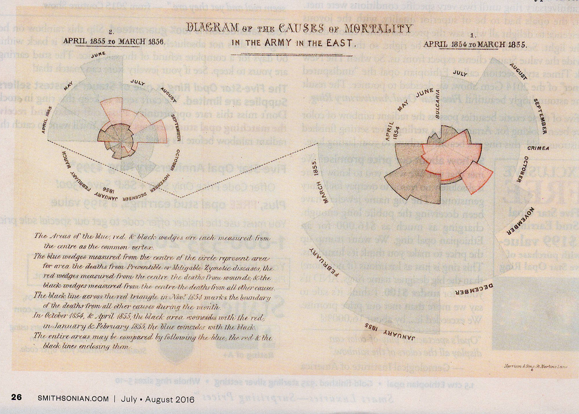 The first step in this direction
was the development of techniques for the visual --
meaning graphical -- representation of data -- what we
now call infographics.
The first step in this direction
was the development of techniques for the visual --
meaning graphical -- representation of data -- what we
now call infographics.
- William Playfair invented the pie chart.
- Florence Nightingale invented the polar chart, and used the one depicted above to convince the British government that more deaths in the Crimean War resulted from poor hygiene than from battle.
For a brief history of infographics, see "How Data Won the West" by Olive Thompson, Smithsonian Magazine, 07-08/2016.
As appealing as they may be to the eye, though, and as persuasive as they might be to the mind, even the most beautiful graphical representation is just a variant on the traumatic interocular test discussed at the beginning of this lecture. In order to be completely persuasive, we need even better ways to think about numbers. That's where statistics come in.
 Whether you're analyzing government data or
basic research, whether you do experimental or correlational
studies, whether those
studies are
simple enough
to be analyzed by a t test or correlation
coefficient, or so complicated as to require analysis of
variance or multiple regression,
the point of statistics is to gather, and present, evidence
for the claims we are trying to make -- whether we're
scientists in the laboratory or policymakers in the real
world. As Robert
P. Abelson
put it, in his 1995 book (which gives this section its
title):
Whether you're analyzing government data or
basic research, whether you do experimental or correlational
studies, whether those
studies are
simple enough
to be analyzed by a t test or correlation
coefficient, or so complicated as to require analysis of
variance or multiple regression,
the point of statistics is to gather, and present, evidence
for the claims we are trying to make -- whether we're
scientists in the laboratory or policymakers in the real
world. As Robert
P. Abelson
put it, in his 1995 book (which gives this section its
title):
[T]he purpose of statistics is to organize a useful argument from quantitative evidence, using a form of principled rhetoric. The word principled is crucial. Just because rhetoric is unavoidable, indeed acceptable, in statistical presentations, does not mean that you should say anything you please. I am not advocating total relativism or deconstructionism in the field of statistics. The claims made should be based clearly on the evidence. And when I say "argument," I am not advocating that researchers should be surly and gratuitously combative. I have in mind spirited debate over issues raised by data, always conducted with respect for the dignity of all parties (p. xiii).
And also, earlier on the same page:
Beyond its rhetorical function, statistical analysis also has a narrative role. meaningful research tells a story with some point to it, and statistics can sharpen the story.
Note for Statistics Mavens
In these examples I have intentionally violated some of the assumptions necessary for testing the significance of a difference between two means (the t- test) and of a correlation (r). That is because I am trying to get across some basic concepts, without getting bogged down in details. In fact, you can violate most of these assumptions with relative impunity, but you don't learn this until your second statistics course, at least. At this level, you don't have to worry about these details at all.
For
a humorous but serious account of the use and misuse of
statistics in public policy discussions, see Damned
Lies and Statistics by Joel Best, and its sequel, More
Damned Lies and Statistics: How Numbers Confuse Pubic
Issues. (both from the University of California
Press). Also a Field Guide to Lies and Statistics
(2017) by Daniel Levitin, a cognitive psychologist who
moonlights as a standup
comedian (he illustrates the difference between the mean
and the median by noting that "on average, humans have
one testicle").
See also Naked Statistics: Stripping the Dread From the Data by Charles Wheelan (2013), which shows how statistics can improve everyday decision-making.
For
a good account of probability theory, see Chance: A
Guide to Gambling, Love, the Stock Market, and Just
About Everything Else by Amir D. Aczel (Thunder's
Mouth Press), 2004).
See also Ten Great Ideas About Chance by Persi Diaconis and Brian Skyrms (2018).
But the best book ever published on statistics has no computational formulas. It's Statistics as Principled Argument by Robert P. Abelson, a distinguished social psychologist who taught statistics to undergraduate and graduate students at Yale for more than 40 years. Herewith are summaries of Abelson's Laws of Statistics (to get the full flavor, you've got to read the book, which I really recommend to anyone who is going to consume statistics).
- Chance is lumpy. "People
generally fail to appreciate that occasional long runs
of one or the other outcome are a natural feature of
random sequences."
- Overconfidence
abhors uncertainty.
"Psychologically, people are prone to prefer false
certitude to the daunting recognition of change
variability."
- Never flout
a convention just once."[E]ither
stick consistently to conventional procedures, or
better, violate convention in a coherent way if
informed consideration provides good reason for so
doing."
- Don't talk
Greek if you don't know the English
translation. "A wise
general practice in the statistical treatment
of complex data arrays is first to display them
graphically, and do rough, simple quantitative
analyses. These will give a feel for the
potential meaning of the results; only
then should you resort to complex refinements."
- If you
have nothing to say, don't say anything.
"When nothing works, nothing works.
The investigator should consider the
possibility. however, that it was not
bad luck that did him in, but a vague,
messy research conception. If this
is true, then it is better to return to
the drawing board to design a cleaner
study than to pile statistics
higgledy-piggledy before befuddled
readers."
- There
is no free lunch.
"[I]t
is fundamental to specify the boundaries
of generalization of one's claims."
- You
can't see the dust if you don't move
the couch.
"[It] is amazing to what
extent investigators hold the
illusion that if some context
variable has not been tried, it
has no effects."
- Criticism
is the mother of methodology.
"In any discipline aspiring to
excellence in its research methods, the
long-run consequence of measures deigned
to protect against criticism will be the
accretion of a body of practices that
become habitualized in its methodology....
This is a major feature of my thesis
that argument is intrinsic to
statistical and conceptual analysis of
research outcomes, and is good for the
health of science."
See also Observation and Experiment: An Introduction to Causal Inference by Paul Rosenblum (2018), which provides a history of statistical inference. While acknowledging the misuse and misunderstanding of null-hypothesis significance testing, Rosenblum argues that testing the null hypothesis looking for the traditional p<.05, "directly and plainly" addresses the most important question: Should we pay any attention to the findings of an experiment?
Do-It-Yourself Statistics
Have a data set and want to do a couple of quick
statistics, without performing all the calculations by
hand? There are a large number of packages of statistical
programs available commercially. Among the most popular of
these is the Statistical Package for the Social Sciences
(SPSS), the Statistical Analysis System (SAS), and the
Biomedical Data Programs (BMDP). MatLab also performs some
statistical analyses.
A very handy set of programs called Simple Interactive Statistical Analysis (SISA) is available free of charge from the SISA website. If you use it, think about making a contribution towards the upkeep of this very valuable resource.
A wonderful introduction to statistics, with instructions for performing basic statistical analyses by hand (the only way to really understand what is going on in them), is the Computational Handbook of Statistics by J.L. Bruning & B.L. Kintz (4th ed., 1997). I have used this book since I was an undergraduate, back when we had to do all our statistics by hand, with the aid of only very primitive calculators, and I still keep it handy.
This page last revised 04/10/2025.